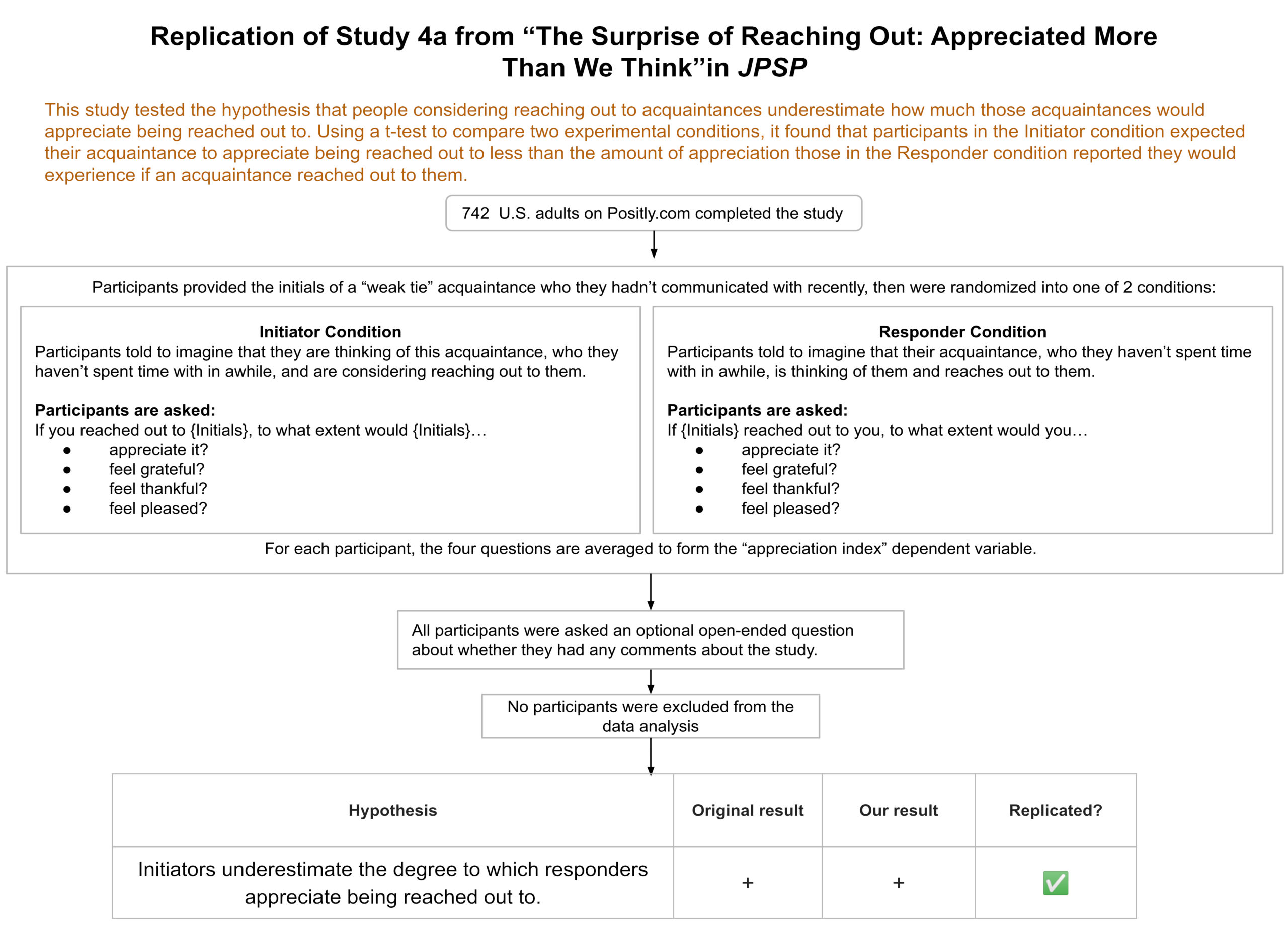
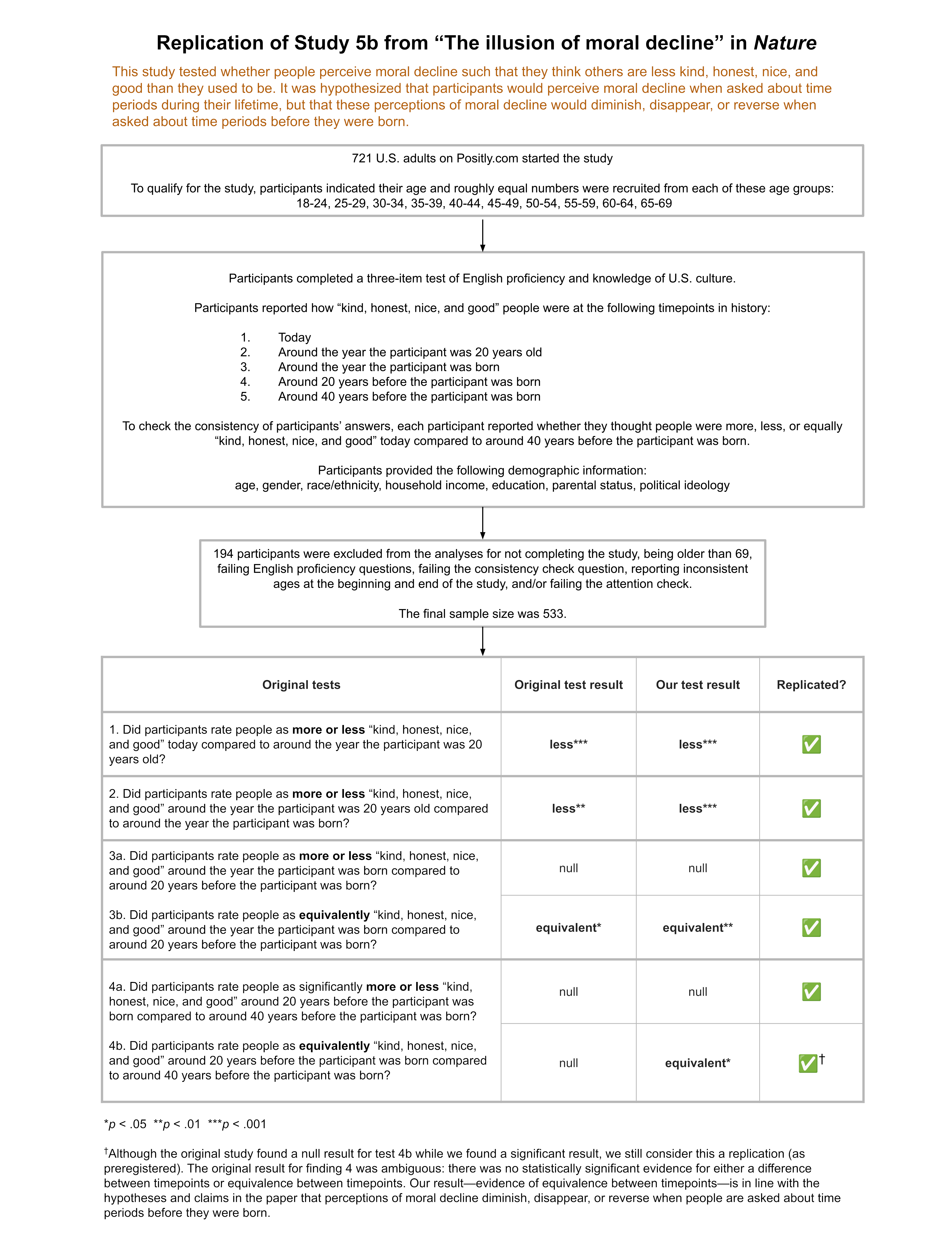
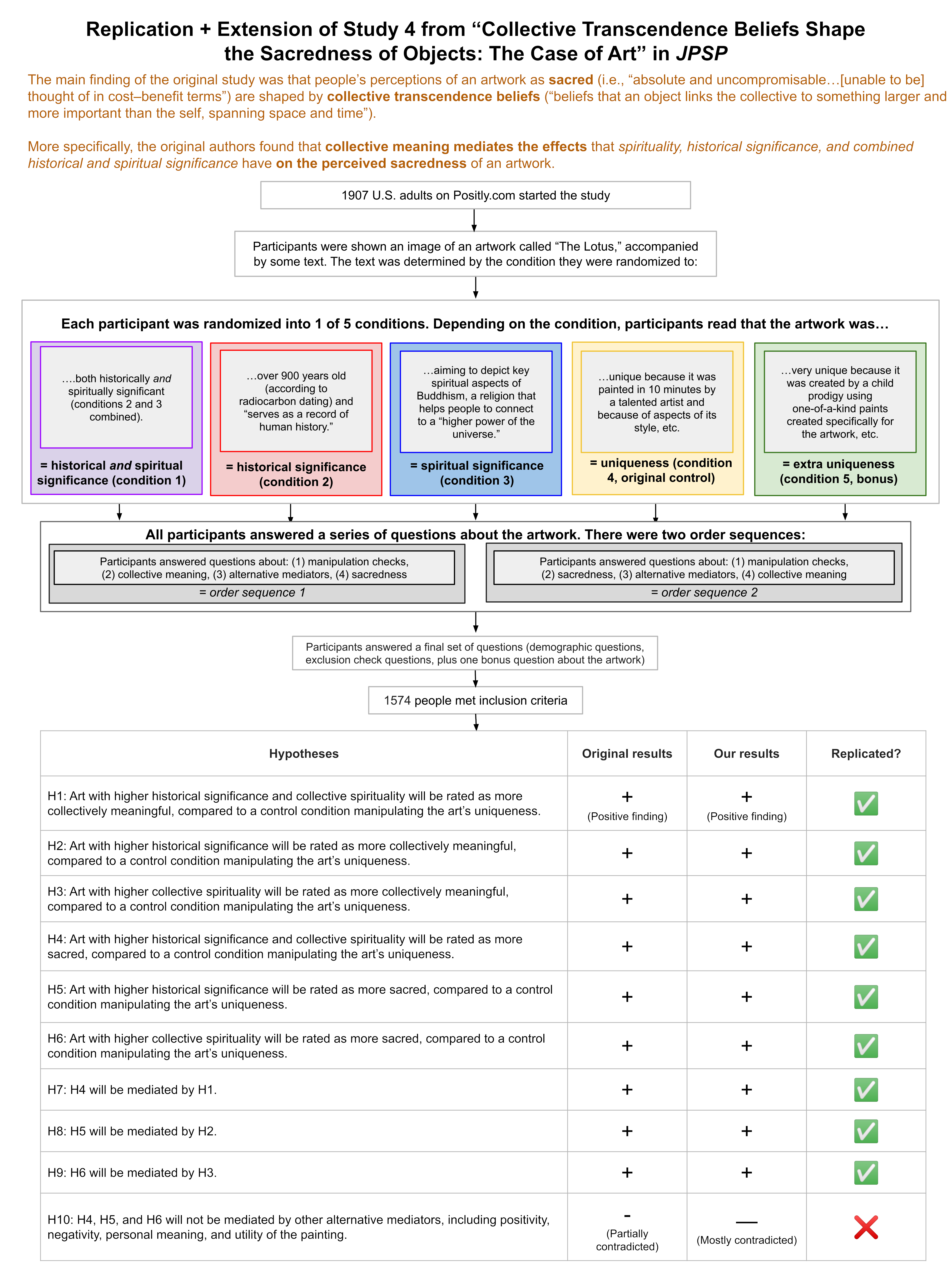
You may have noticed that one of the features of all of our replication reports is the “Study Diagram” near the top. Our Study Diagrams lay out the hypotheses, exactly what participants did in the study, the key findings, and whether those findings replicated.
Why create a Study Diagram?
We create a Study Diagram for each of our reports because we believe that readers should be presented with the key points of the hypotheses, methods, and results in a consistent format that can be understood at a glance. We do this because clear communication is essential to the scientific process functioning well.
Too often in the research literature key pieces of information are spread throughout the text of a paper, making it more time-consuming and difficult to get a clear overall picture of a study. Sometimes the paper itself doesn’t include all of the necessary information, and readers have to refer to supplemental materials to understand what was actually done. This makes it harder for people to find relevant studies, evaluate their claims, and put the information in them to use.
In contrast, imagine a world in which all published empirical research had a Study Diagram. Understanding the gist of a paper would be faster because the Study Diagram takes much less time to review than the whole paper, while also being more standardized and informative than a typical abstract. The Study Diagram would improve the clarity of published research, making it easier to evaluate how well the claims made in the paper correspond to what is being done in the study itself. This would make it easier to identify possible overclaiming or validity issues that can be signs of Importance Hacking. Finally, it would become much easier to sort through literature to find studies that are relevant to your question. At a glance you would be able to compare key features of studies, like their sample size, exclusion criteria, and whether participants were randomly assigned to conditions.
Our goal at Transparent Replications is to incentivize practices that improve quality and robustness of psychology research. We see Study Diagrams as one of those best practices, and would like to see them become widely adopted in the field.
If you’d like to include a Study Diagram in your research, the sections below walk you through how to create one.
How to diagram a study
Here’s an example study diagram from Report #7:

The Study Diagram is in three parts:
- Hypotheses – a few sentences in plain language explaining the main hypotheses being tested in the study.
- Flowchart of the study – the core of the diagram including information about participants, conditions, study tasks, and exclusions.
- Table of findings – a list of results for the key findings.
Making the flowchart of the study
Participants
The first box includes the number of participants, type of participants, and how they participated.
Although this is typically straightforward, here are two things to pay attention to when reporting on participants:
- Sample criteria filtering and stratifying – If a sample is limited by certain characteristics, this box is where that information belongs. If an eligibility filter is being used to only collect data from certain subgroups of the population, or to collect a certain number of participants in certain categories, that information also belongs here.
- Completed vs. started – Depending on the task and the method being used for data collection it may make sense to report only the number of participants who completed the task, or all of the participants who started the task whether they completed it or not. Either option can be reasonable, but make sure to pay attention here so that the number you are reporting is accurate.
Here’s an example from Report #10 for a study with only one experimental condition, but with more complex requirements for participants:

Study tasks
The next section outlines the tasks that participants did in the study. This section might be one box or a few boxes depending on the complexity of the experimental design. The example diagrams above are for a study with simple randomization to two experimental conditions, and a study with a single condition. The example below is from Report #6 for a study with more complex randomization to multiple conditions:

This section always starts with any initial parts of the experiment that all participants see or complete. Then it goes into the main task which, for studies with multiple conditions, is represented by boxes side-by-side showing what participants in each condition see and do. Finally, if there are parts of the experiment that all participants see or do after the main task, those are presented.
Exclusions
This is the final box of the flowchart, and it reports the number of participants whose data were included in the analysis. It also indicates why other participants were excluded. If participants who completed the study are reported in the first box, then the only exclusions reported here are people who completed the study whose data was not used for some other reason, such as not meeting eligibility criteria. If all participants who started the study are reported in the first box, the number of people who started the study but didn’t complete it would also be reported here.
Making the table of findings
The final section of the Study Diagram is the table of findings. The purpose of this table is to allow the reader to see at a glance what the study tested, and whether the results matched those expectations or not.
Determining what to include in this table can be a bit nuanced. Often there are more results calculated and reported in a paper than would be considered main findings, and including those additional results in this table can make it more difficult for readers to get the high-level overview that the Study Diagram is meant to provide. For example, results related to a manipulation check probably shouldn’t be included in this table. Additionally, if there are multiple statistical tests that pertain to the same claim, reporting those as part of a single row might make sense.
This first column lists each main claim that was tested, and the later columns present the findings in a simplified way. Typically those findings should be represented with a single word (like “more,” “less,” or “equivalent”) or with a single symbol such as +, -, or 0 to indicate a positive, negative, or null result. With our replication studies, we focus on whether the result from the original study replicated, so the table is designed to make it easy to see if the first column and the second column match. In the case of a study that isn’t a replication, but has pre-registered hypotheses, the table would have a column for the prediction that was made before data collection, and a column for the result. If there were no predictions made in advance, the table would just report the main findings.
What isn’t included in the diagram
You may have noticed that the Study Diagram doesn’t include information about how the statistical tests were conducted. The diagram also doesn’t include actual numerical findings. When we were developing this tool, we determined that it was simply not feasible to include that information while keeping the diagram manageable and understandable. The Study Diagram is not meant to be a replacement for the entire paper.
The Study Diagram gives the reader a quick overview of what participants did and what claims were tested on that basis. The body of the paper is a better place for the level of detail required to explain the statistical methods used, and provide the detailed numerical results.
This means that the Study Diagram is a good starting point for evaluating a study, but determining whether one should have confidence in the reported findings will, of course, continue to require going beyond this tool.


