Executive Summary
| Transparency | Replicability | Clarity |
|---|---|---|
10 of 10 findings replicated |
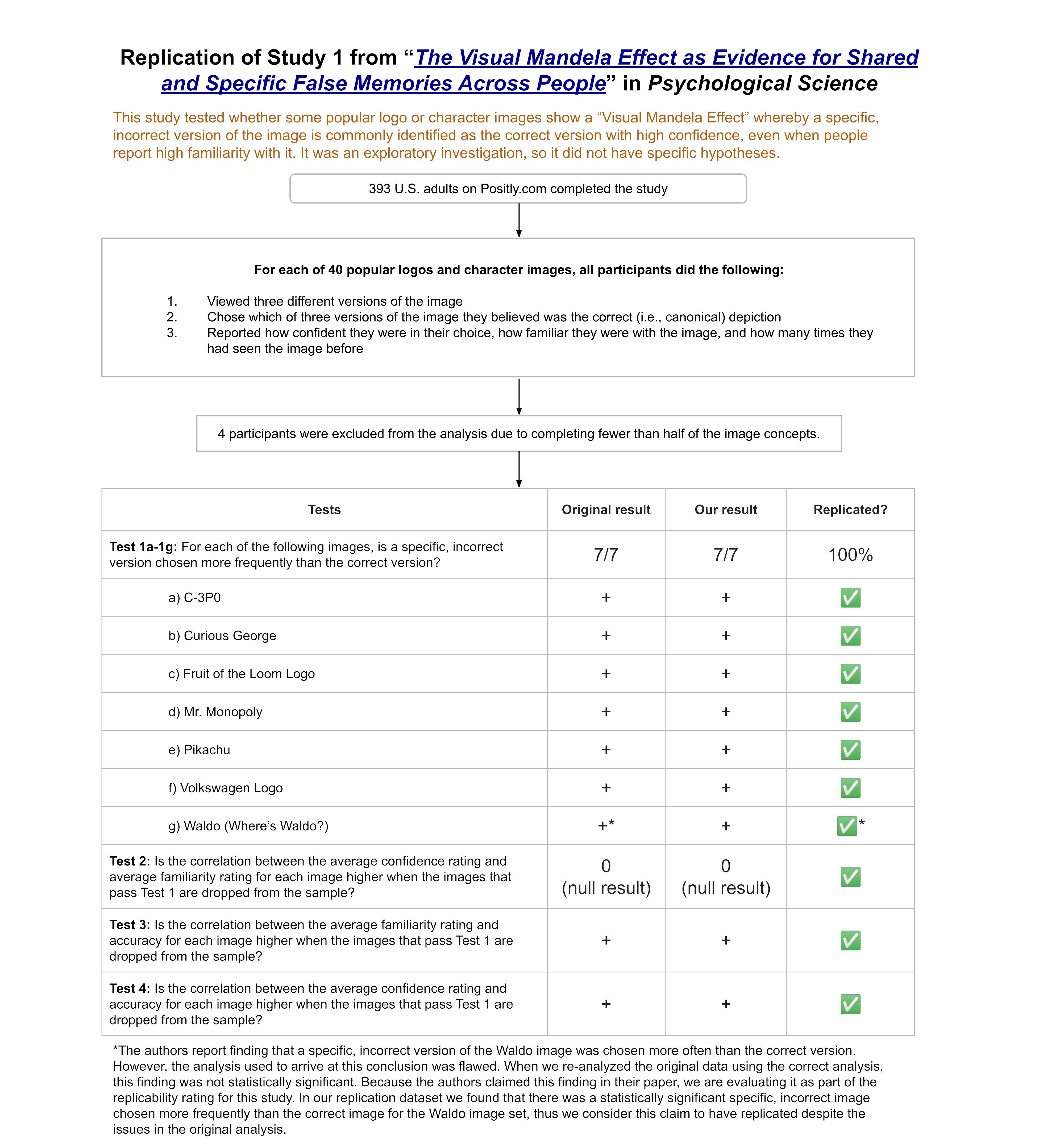
We ran a replication of Study 1 from this paper, which tested whether a series of popular logos and characters (e.g., Apple logo, Bluetooth symbol, Mr. Monopoly) showed a “Visual Mandela Effect”—a phenomenon where people hold “specific and consistent visual false memories for certain images in popular culture.” For example, many people on the internet remember Mr. Monopoly as having a monocle when, in fact, the character has never had a monocle. The original study found that 7 of the 40 images it tested showed evidence of a Visual Mandela Effect: C-3PO, Fruit of the Loom logo, Curious George, Mr. Monopoly, Pikachu, Volkswagen logo, and Waldo (from Where’s Waldo). These results fully replicated in our study.
In the study, participants evaluated one popular logo or character image at a time. For each image, participants saw three different versions. One of these versions was the original, while the other two versions had subtle differences, such as a missing feature, an added feature, or a change in color. Participants were asked to select which of these three versions was the correct version. Participants then rated how confident they felt in their choice, how familiar they were with the image, and how many times they had seen the image before.
If people chose one particular incorrect version of an image statistically significantly more often than they chose the correct version of an image, that was considered evidence of a possible Visual Mandela Effect for that image.
The study received a transparency rating of 3.5 stars because its materials and data were publicly available, but it was not pre-registered and there were insufficient details about some of its analyses. The paper received a replicability rating of 5 stars because all of its primary findings replicated. The study received a clarity rating of 2.5 stars due to errors and misinterpretations in some of the original analyses.
Full Report
Study Diagram
Replication Conducted
We ran a replication of Study 1 from: Prasad, D., & Bainbridge, W. A. (2022). The Visual Mandela Effect as Evidence for Shared and Specific False Memories Across People. Psychological Science, 33(12), 1971–1988. https://doi.org/10.1177/09567976221108944
How to cite this replication report: Transparent Replications, Handley-Miner, I., & Metskas, A. (2024). Report #8: Replication of a study from “The Visual Mandela Effect as Evidence for Shared and Specific False Memories Across People” (Psychological Science | Prasad & Bainbridge 2022). Clearer Thinking. https://replications.clearerthinking.org/replication-2022psci33-12
(Report DOI: https://doi.org/10.5281/zenodo.17715177)
Key Links
- Our Research Box for this replication report includes the pre-registration, study materials, de-identified data, and analysis files.
- Download a PDF of the preprint version of the original paper
- Review the supplemental materials and the data and experimental stimuli for the original paper.
Overall Ratings
To what degree was the original study transparent, replicable, and clear?
| Transparency: how transparent was the original study? | Study materials and data are publicly available. The study was not pre-registered. Analysis code is not publicly available and some analyses were described in insufficient detail to reproduce. |
| Replicability: to what extent were we able to replicate the findings of the original study? | All of the study’s main findings replicated. |
| Clarity: how unlikely is it that the study will be misinterpreted? | The analyses, results, and interpretations are stated clearly. However, there is an error in one of the primary analyses and a misinterpretation of another primary analysis. First, the χ2 test was conducted incorrectly. Second, the split-half consistency analysis does not seem to add reliably diagnostic information to the assessment of whether images show a VME (as we demonstrate with simulated data). That said, correcting for these errors and misinterpretations with the original study’s data results in similar conclusions for 6 out of the 7 images identified in the original study as showing the Visual Mandela Effect. The seventh image dropped below significance when the corrected analysis was run on the original data; however, we evaluated that image as part of the replication since it was claimed as a finding in the paper, and we found a significant result in our replication dataset. |
Detailed Transparency Ratings
| Overall Transparency Rating: | |
|---|---|
| 1. Methods Transparency: | The materials are publicly available and complete. |
| 2. Analysis Transparency: | The analysis code is not publicly available. Some of the analyses (the χ2 test and the Wilcoxon Rank-Sum Test) were described in insufficient detail to easily reproduce the results reported in the paper. The paper would benefit from publicly available analysis code and supplemental materials that describe the analyses and results in greater detail. |
| 3. Data availability: | The cleaned data was publicly available; the deidentified raw data was not publicly available. |
| 4. Preregistration: | Study 1 was not pre-registered; however, it was transparently described as an exploratory analysis. |
Summary of Study and Results
The original study (N=100) and our replication (N=389) tested whether a series of 40 popular logo and character images show evidence of a Visual Mandela Effect (VME). The Mandela Effect is a false memory shared by a large number of people. The name of the effect refers to an instance of this phenomenon where many people remember Nelson Mandela dying in prison during the Apartheid regime in South Africa, despite this not being the case. This article examines a similar effect occurring for specific images. The authors specified five criteria that images would need to meet in order to show a VME:
(a) the image must have low identification accuracy
(Prasad & Bainbridge, 2022, p. 1974)
(b) there must be a specific incorrect version of the image falsely recognized
(c) these incorrect responses have to be highly consistent across people
(d) the image shows low accuracy even when it is rated as being familiar
(e) the responses on the image are given with high confidence even though they are incorrect
To test for VME images, participants saw three versions of each image concept. One version was the correct version. The other two versions were altered using one of five possible manipulations: adding a feature; subtracting a feature; changing a feature; adjusting the position or orientation of a feature; changing the color of a feature. For example, for the Mr. Monopoly image, one altered version added a monocle over one eye and the other altered version added glasses.
For each image, participants did the following:
- Chose the version of the image they believed to be the correct (i.e., canonical) version
- Rated how confident they felt in their choice (1 = not at all confident; 5 = extremely confident)
- Rated how familiar they were with the image (1 = not at all familiar; 5 = extremely familiar)
- Rated how many times they had seen the image before (0; 1-10; 11-50; 51-100; 101-1000; 1000+)
Figure 1 shows what this process looked like for participants, using the Mr. Monopoly image as an example.

Assessing criteria (a) and (b)
Following the general approach used in the original paper, we tested whether each of the 40 images met criteria (a) and (b) by assessing whether one version of the image was chosen more commonly than the other versions. If one incorrect version was chosen more often than both the correct version and the other incorrect version, this was considered evidence of low identification accuracy and evidence that a specific incorrect version of the image was falsely recognized. The original study identified 7 images meeting criteria (a) and (b). Upon reproducing these results with the original data, we noticed an error in the original analysis (see Study and Results in Detail and the Appendix for more information). When we corrected this error, 6 images in the original data met these criteria. In the new data we collected for our replication, 8 images met these criteria, including the 7 identified in the original paper.
Table 1. Original and replication results for VME criteria (a) and (b)
| Test of criteria (a) and (b): For each image, is a specific, incorrect version chosen more frequently than the correct version? | Original result | Replication result |
|---|---|---|
| C-3P0 | + | + |
| Curious George | + | + |
| Fruit of the Loom Logo | + | + |
| Mr. Monopoly | + | + |
| Pikachu | + | + |
| Tom (Tom & Jerry) | 0 | + |
| Volkswagen Logo | + | + |
| Waldo (Where’s Waldo?) | +* | + |
| The other 32 images | – | – |
*The original paper reports finding that a specific, incorrect version of Waldo was chosen more often than the correct version. However, the analysis used to arrive at this conclusion was flawed. When we re-analyzed the original data using the correct analysis, this finding was not statistically significant.
Assessing criterion (c)
We did not run a separate analysis to test whether each image met criterion (c). After conducting simulations of the split-half consistency analysis used in the original study to assess criterion (c), we concluded that this analysis does not contribute any additional reliable information to test whether incorrect responses are highly consistent across people beyond what is already present in the histogram of the data. Moreover, we argue that if an image meets criteria (a) and (b), it should also meet (c). (See Study and Results in Detail and the Appendix for more information.)
Assessing criteria (d) and (e)
Following the general approach used in the original paper, we tested whether each image met criteria (d) and (e) by running a series of permutation tests to assess the strength of three different correlations when a set of images was excluded from the data. Specifically, we tested whether the following three correlations were stronger when the 8 images that met criteria (a) and (b) were excluded compared to when other random sets of 8 images were excluded:
- The correlation between familiarity and confidence
- The correlation between familiarity and accuracy
- The correlation between confidence and accuracy
In line with the authors’ expectations, there was no evidence in either the original data or in our replication data that the correlation between familiarity and confidence changed when the VME-apparent images were excluded compared to excluding other images. By contrast, when examining correlations with accuracy, there was evidence that excluding the VME-apparent images strengthened correlations compared to excluding other images.
The original study found that the positive correlation between familiarity and accuracy was higher when the specific images that met criteria (a) and (b) were excluded, suggesting that those images did not have the strong positive relationship between familiarity and accuracy observed among the other images. Similarly, the original study also found that the positive correlation between confidence and accuracy was higher when the specific images that met criteria (a) and (b) were excluded, suggesting that those images did not have the strong positive relationship between confidence and accuracy observed among the other images. In our replication data, we found the same pattern of results for these correlations.
Table 2. Original and replication results for VME criteria (d) and (e)
| Test of criteria (d) and (e): Is the correlation of interest higher when the images that meet criteria (a) and (b) are dropped from the sample? | Original result | Replication result |
|---|---|---|
| Correlation between confidence and familiarity | 0 | 0 |
| Correlation between familiarity and accuracy | + | + |
| Correlation between confidence and accuracy | + | + |
Study and Results in Detail
This section goes into greater technical detail about the analyses and results used to assess the five Visual Mandela Effect (VME) criteria the authors specified:
(a) the image must have low identification accuracy
(Prasad & Bainbridge, 2022, p. 1974)
(b) there must be a specific incorrect version of the image falsely recognized
(c) these incorrect responses have to be highly consistent across people
(d) the image shows low accuracy even when it is rated as being familiar
(e) the responses on the image are given with high confidence even though they are incorrect
Evaluating images on criteria (a) and (b)
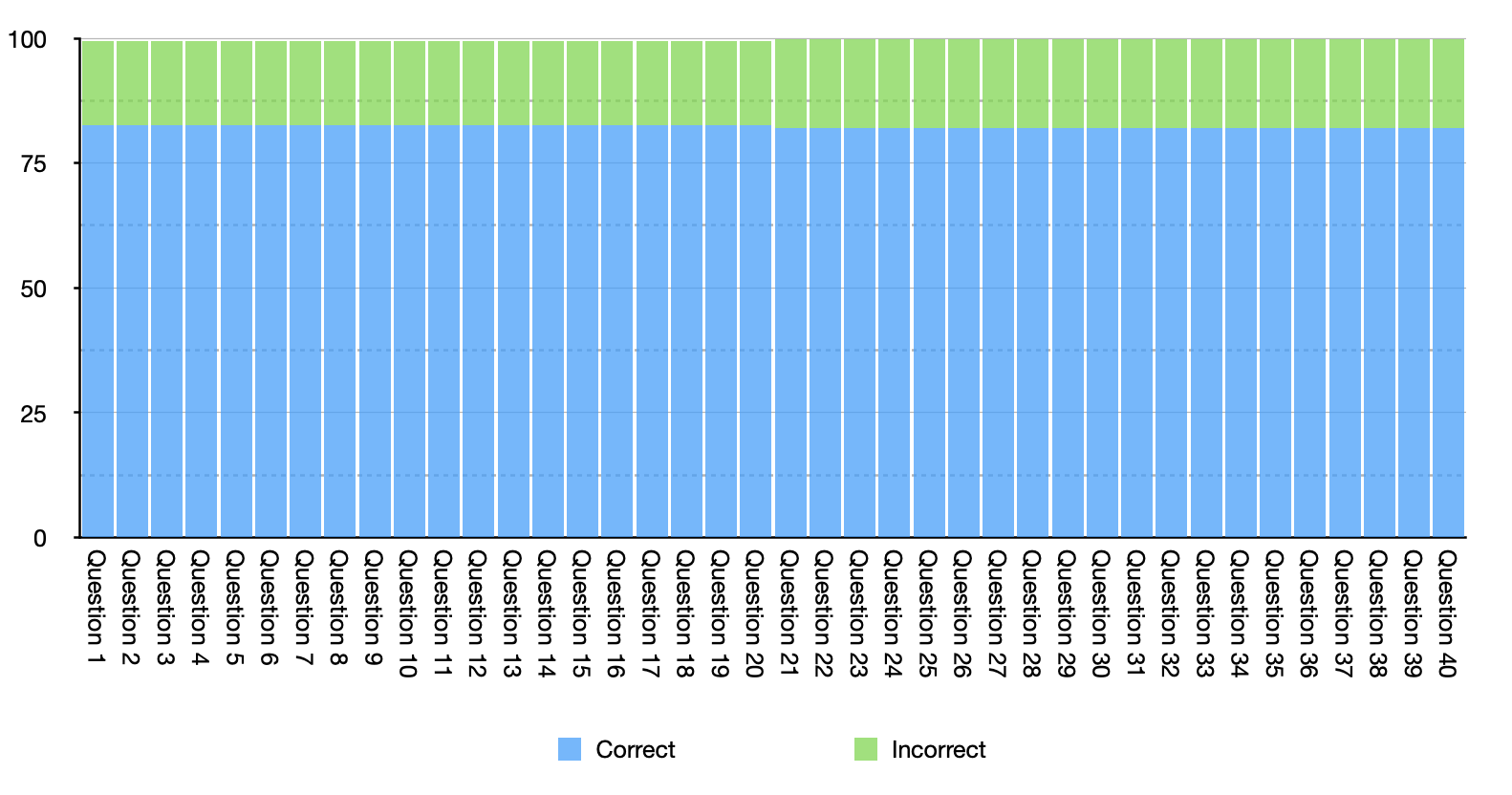
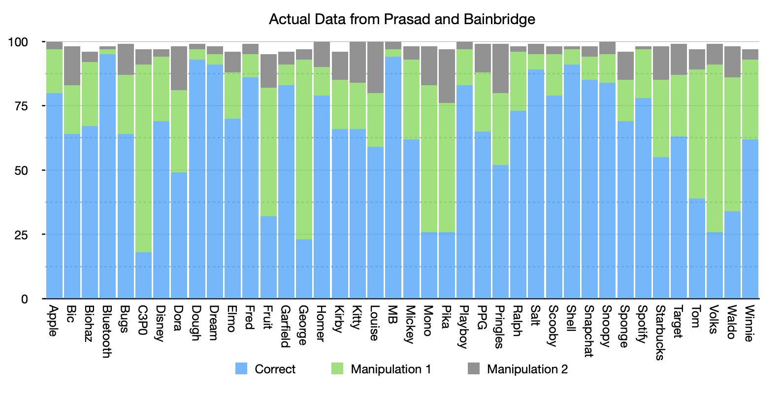
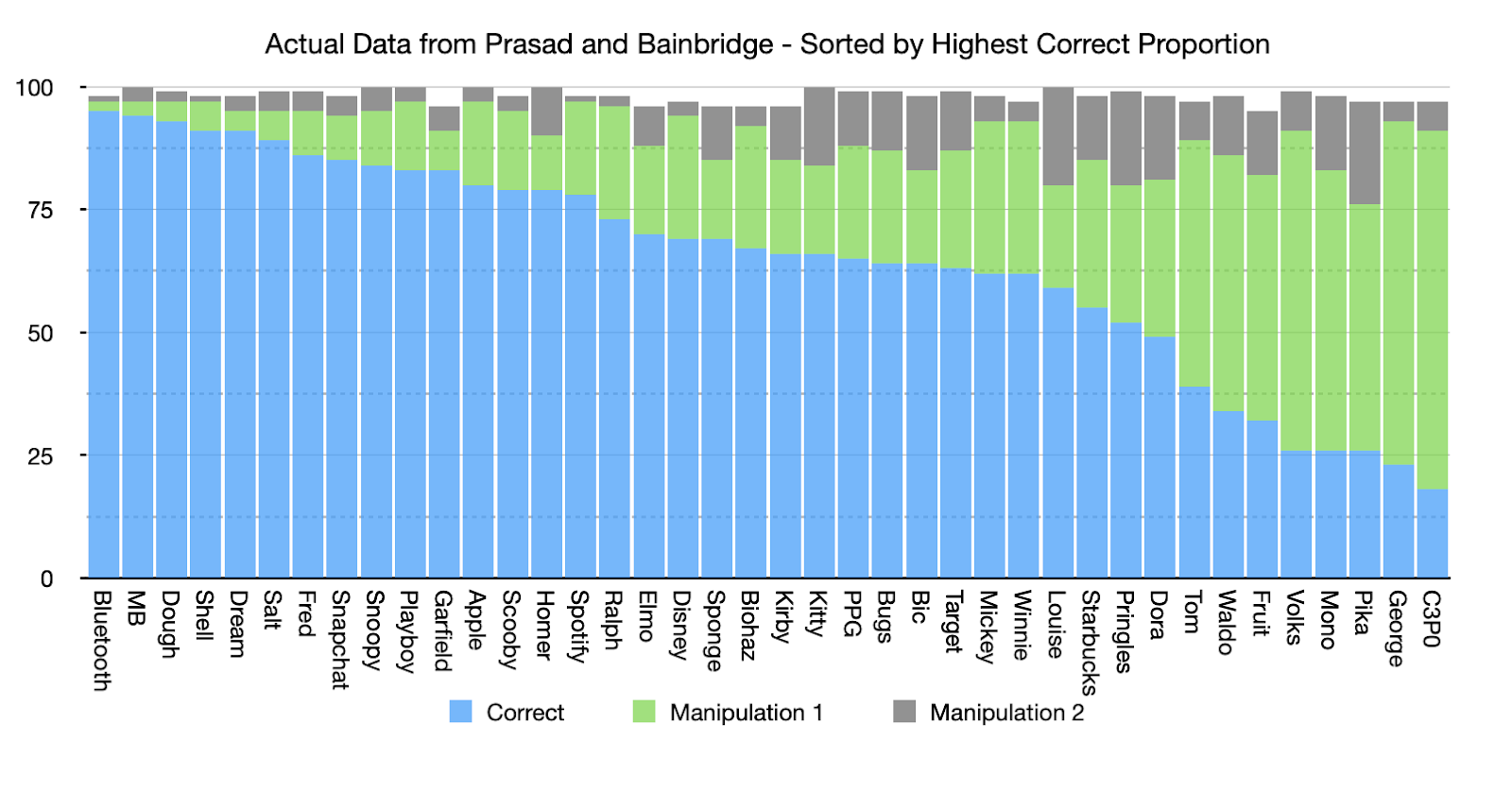
To assess whether each of the 40 images met VME-criteria (a) and (b), we first calculated the proportion of participants who chose each of the three image versions (see Figure 2). Image choices were labeled as follows:
- “Correct” = the canonical version of the image
- “Manipulation 1” = the more commonly chosen version of the two non-canonical versions
- “Manipulation 2” = the less commonly chosen version of the two non-canonical versions
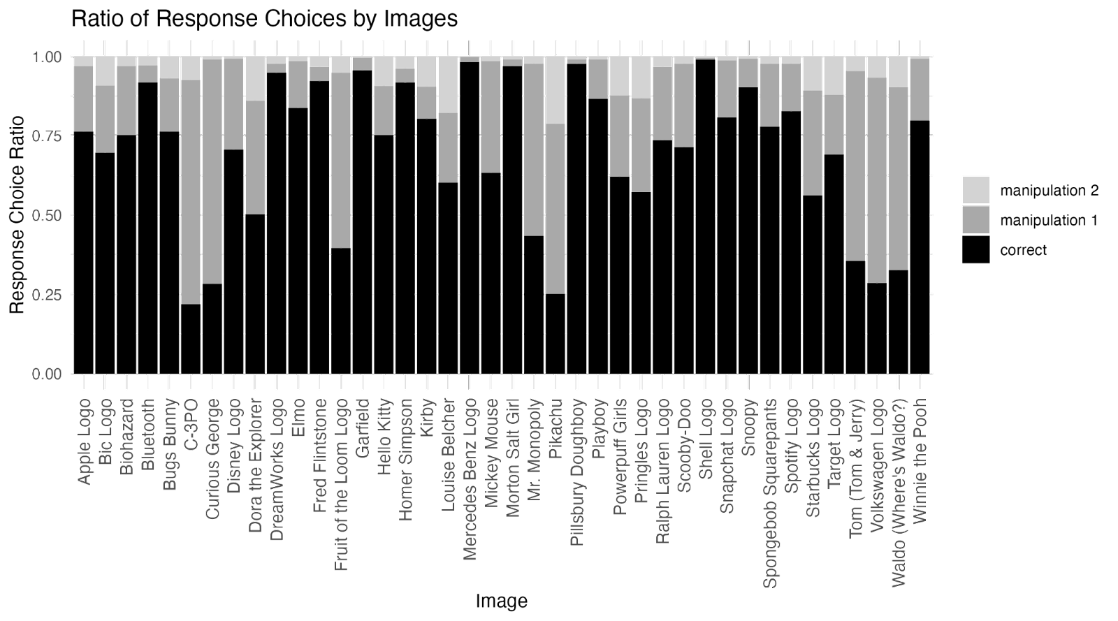
We then ran a χ2 goodness-of-fit test to assess whether, for each image, the Manipulation 1 version was chosen statistically significantly more often than the Correct version. The test revealed that, for 8 of the 40 images, the Manipulation 1 version was chosen statistically significantly more often than the Correct version.
There were no images for which the Manipulation 2 version was chosen more often than the Correct version, so we did not need to formally test whether the Manipulation 1 version was also chosen more often than the Manipulation 2 version for these 8 images. All 7 of the images identified in the original paper as meeting criteria (a) and (b) were among the 8 images we identified (See table 1).
It is important to note that, in the original study, this analysis was conducted using a χ2 test of independence rather than a χ2 goodness-of-fit test. However, using a χ2 test of independence in this situation violates one of the core assumptions of the χ2 test of independence—that the observations are independent. Because participants could only choose one option for each image concept, whether a participant chose the Manipulation 1 image was necessarily dependent on whether they chose the correct image. The way the χ2 test of independence was run in the original study led to an incorrect inflation of the χ2 values. Thus, per our pre-registration, we ran a χ2 goodness-of-fit test (rather than a χ2 test of independence) to assess whether a specific incorrect version of each image was falsely identified as the correct version. For a more thorough explanation of the issues with the original analytical technique, see the Appendix.
In the original study, which used the χ2 test of independence, 7 of the 40 images were classified as meeting criteria (a) and (b). When we reanalyzed the original data using a χ2 goodness-of-fit test, 1 of those 7 images (Waldo from Where’s Waldo) was no longer statistically significant. In our replication data, all 7 of these images (including Waldo) were statistically significant, as was 1 additional image (Tom from Tom & Jerry). Table 3 summarizes these findings.
Table 3. Reported, reproduced, and replicated results for criteria (a) and (b) for each of the images found to be VME-apparent
| Image | Reported results*: | Reproduced results: | Replicated results: |
|---|---|---|---|
| χ2 test of independence (incorrect statistical test) on original data | χ2 goodness-of-fit test (correct statistical test)on original data | χ2 goodness-of-fit test (correct statistical test)on replication data | |
| C-3PO | χ2 (1, N=194) = 62.61, p = 2.519e-15 | χ2 (1, N=91) = 33.24, p = 8.138e-09 | χ2 (1, N=359) = 99.50, p = 1.960e-23 |
| Curious George | χ2 (1, N=194) = 45.62, p = 1.433e-11 | χ2 (1, N=93) = 23.75, p = 1.095e-06 | χ2 (1, N=384) = 70.04, p = 5.806e-17 |
| Fruit of the Loom Logo | χ2 (1, N=190) = 6.95, p = 0.008 | χ2 (1, N=82) = 3.95, p = 0.047 | χ2 (1, N=369) = 10.08, p = 0.001 |
| Mr. Monopoly | χ2 (1, N=196) = 20.08, p = 7.416e-06 | χ2 (1, N=83) = 11.58, p = 6.673e-04 | χ2 (1, N=378) = 4.67, p = 0.031 |
| Pikachu | χ2 (1, N=194) = 12.46, p = 4.157e-04 | χ2 (1, N=76) = 7.58, p = 0.006 | χ2 (1, N=304) = 39.80, p = 2.810e-10 |
| Tom (Tom & Jerry) | χ2 (1, N=194) = 2.51, p = 0.113 | χ2 (1, N=89) = 1.36, p = 0.244 | χ2 (1, N=367) = 23.57, p = 1.207e-06 |
| Volkswagen Logo | χ2 (1, N=198) = 30.93, p = 2.676e-08 | χ2 (1, N=91) = 16.71, p = 4.345e-05 | χ2 (1, N=362) = 54.14, p = 1.864e-13 |
| Waldo (Where’s Waldo?) | χ2 (1, N=196) = 6.71, p = 0.010 | χ2 (1, N=86) = 3.77, p = 0.052 | χ2 (1, N=351) = 26.81, p = 2.249e-07 |
*The only statistics the paper reported for the χ2 test were as follows: “Of the 40 image concepts, 39 showed independence (all χ2s ≥ 6.089; all ps < .014)” (Prasad & Bainbridge, 2022, p. 1974). We analyzed the original data using a χ2 test in various ways until we were able to reproduce the specific statistics reported in the paper. So, while the statistics shown in the “Reported results” column were not, in fact, reported in the paper, they are the results the test reported in the paper would have found. Note that the Ns reported in this column are more than double the actual values for N in the original dataset because of the way the original incorrect test reported in the paper inflated the N values as part of its calculation method.
Evaluating images on criterion (c)
To evaluate images on the VME-criterion of “(c) these incorrect responses have to be highly consistent across people,” the original study employed a split-half consistency analysis. After running simulations with this analysis, we concluded that the analytical technique employed in the original study does not contribute reliable information towards evaluating this criteria beyond what is already shown in the histogram of the data. You can see a detailed explanation of this in the Appendix.
Additionally, whether an image meets criterion (c) is, arguably, already assessed in the tests used to evaluate criteria (a) and (b). When discussing criterion (c), the authors state, “VME is also defined by its consistency; it is a shared specific false memory” (p. 1974). If an image already meets criterion (a) by having low identification accuracy and criterion (b) by having a specific incorrect version of the image be falsely recognized as the canonical version, that seems like evidence of a specific false memory that is consistent across people. This is because in order for some images in the study to meet both of those criteria, a large percentage of the participants would need to select the same incorrect response as each other for those images.
As such, we did not pre-register an analysis to assess criterion (c), and the split-half consistency analysis is not considered in our replication rating for this study.
Evaluating images on criteria (d) and (e)
To evaluate images on the VME-criteria of “(d) the image shows low accuracy even when it is rated as being familiar” and “(e) the responses on the image are given with high confidence even though they are incorrect,” the original study used a series of permutation tests to assess the relationships between accuracy (i.e., the proportion of people who chose the correct image), familiarity ratings, and confidence ratings.
Here’s how the permutation tests worked in the original study, using the permutation test assessing the correlation between confidence ratings and familiarity ratings as an example:
- 7 images were selected at random and dropped from the dataset (this number corresponds to the number of images identified as meeting criteria (a) & (b))
- For the remaining 33 images, the average confidence rating and average familiarity rating of each image were correlated
- Steps 1-2 were repeated for a total of 1,000 permutations
- The specific 7 images that met criteria (a) and (b) were dropped from the dataset (C-3PO, Fruit of the Loom Logo, Curious George, Mr. Monopoly, Pikachu, Volkswagen Logo, Waldo)
- The average confidence rating and average familiarity rating of each of the 33 remaining images were correlated for this specific permutation
- The correlation calculated in Step 5 was compared to the 1,000 correlations calculated in Steps 1-3
The original study used the same permutation test two more times to assess the correlation between average confidence ratings and accuracy and the correlation between average familiarity ratings and accuracy.
The original study found that the correlation between confidence and accuracy and the correlation between familiarity and accuracy were both higher when the 7 specific images that met criteria (a) and (b) were dropped. Additionally, in line with the authors’ predictions for VME images, the original study did not find evidence that the correlation between familiarity and confidence was different when the 7 specific images were dropped.
As noted earlier, when the correct analysis (χ2 goodness-of-fit test) is used to evaluate criteria (a) and (b) on the original data, there is no longer statistically significant evidence that Waldo meets criteria (a) and (b). As such, we re-ran these three permutation tests on the original data, but only dropped the 6 images that met criteria (a) and (b) when using the correct analysis (C-3PO, Fruit of the Loom Logo, Curious George, Mr. Monopoly, Pikachu, Volkswagen Logo). We find similar results to when the 7 images were dropped. See the appendix for the specific findings from this re-analysis.
With our replication data, we conducted the same three permutation tests, with a few minor differences:
- We ran 10,000 permutations (without replacement) rather than 1,000. The additional permutations give the test greater precision.
- We dropped 8 images (C-3PO, Fruit of the Loom Logo, Curious George, Mr. Monopoly, Pikachu, Tom, Volkswagen Logo, Waldo), which correspond to the images that met criteria (a) and (b) in our replication data.
We found the same pattern of results as the reported results.
Table 4. Reported results and replicated results for criteria (d) and (e)
| Permutation test | Reported results (1,000 permutations): Dropping 7 images: C-3PO, Fruit of the Loom Logo, Curious George, Mr. Monopoly, Pikachu, Volkswagen Logo, Waldo (Where’s Waldo) | Replicated results (10,000 permutations): Dropping 8 images: C-3PO, Fruit of the Loom Logo, Curious George, Mr. Monopoly, Pikachu, Tom (Tom & Jerry), Volkswagen Logo, Waldo (Where’s Waldo) |
| Correlation between confidence and familiarity | p = 0.540 | p = 0.320  |
| Correlation between familiarity and accuracy | p = 0.044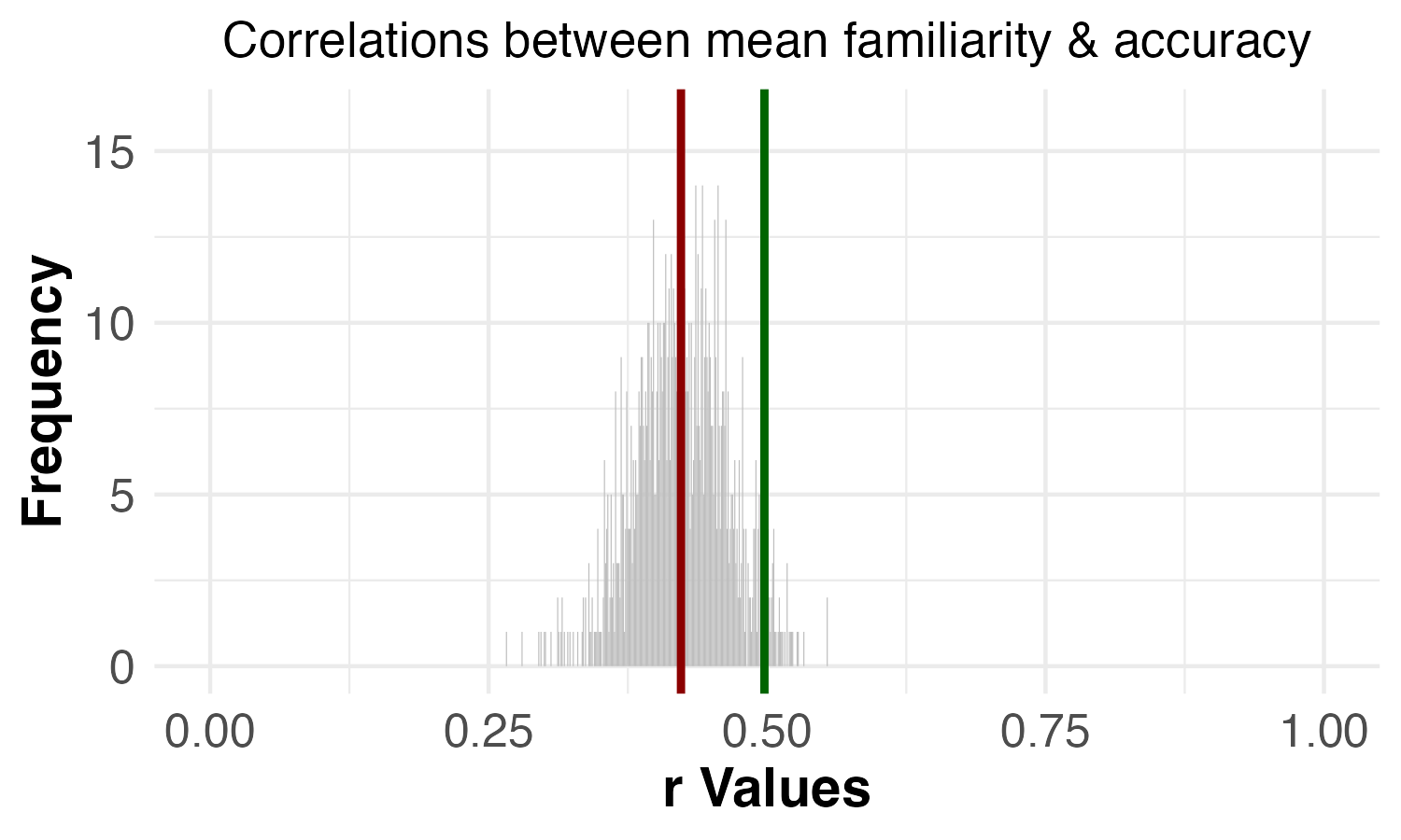 | p = 0.003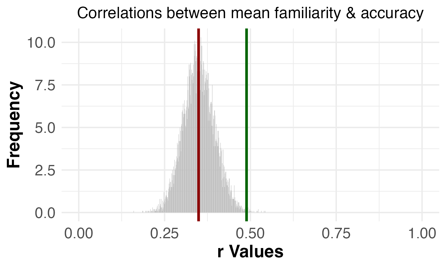 |
| Correlation between confidence and accuracy | p = 0.001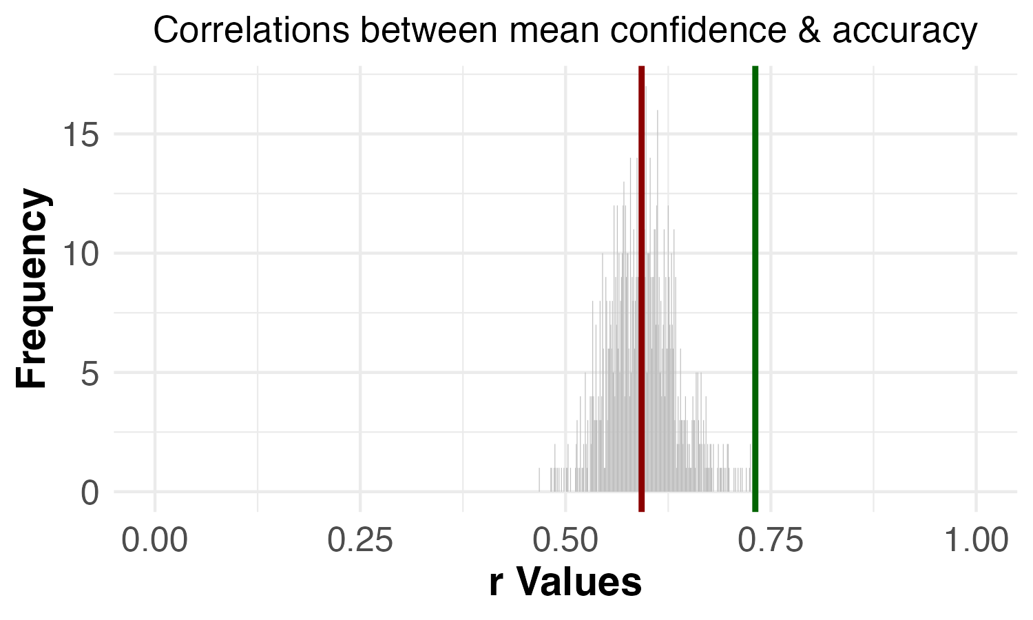 | p = 0.000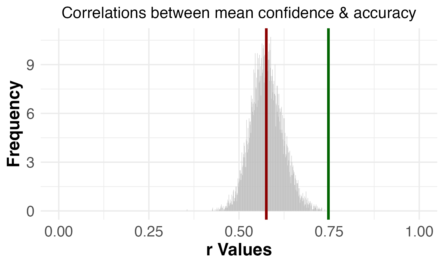 |
Interpreting the Results
All of the primary findings from the original study that we attempted to replicate did indeed replicate.
Interestingly, even the reported finding that Waldo (from Where’s Waldo) showed evidence of a VME replicated, despite the fact that this claim was based on an incorrect analysis in the original paper. It is worth noting that, even though there is not statistically significant evidence that Waldo shows a VME when the correct analysis is performed on the original data, the raw proportions of which versions of Waldo were chosen are directionally consistent with a VME. In other words, even in the original data, more people chose a specific, incorrect version of the image than chose the correct version (but not enough for it to be statistically significant). This, coupled with the fact that we find a statistically significant result for Waldo in the replication data, suggests that the original study did not have enough statistical power to detect this effect.
A similar thing likely happened with Tom (Tom & Jerry). There was not statistically significant evidence that Tom showed a VME in the original data. Nevertheless, even in the original data, more people chose a specific, incorrect version of Tom than chose the correct version. In our replication data, we found statistically significant evidence that Tom showed a VME.
So, even though Waldo and Tom were not statistically significant when using the correct analysis on the original data, but were statistically significant in our replication data, we do not view this as a major discrepancy between the findings in the two studies.
We would also like to note one important limitation of the permutation tests. The way these tests were conducted in the original paper, the correlations between confidence, familiarity, and accuracy were conducted on the average values of confidence, familiarity, and accuracy for each image. Averaging at the image level can obscure important individual-level patterns. Thus, we argue that a better version of this analysis would be to correlate these variables across each individual data point, rather than across the average values for each image. That said, when we ran the individual-level version of this analysis on both the original data and our replication data, we found that the results were all directionally consistent with the results of this test conducted on the image-level averages. See the Appendix for a more thorough explanation of the limitation of using image-level averages and to see the results when using an individual-level analytical approach.
Finally, it’s worth noting that the original paper reports one more analysis that we have not discussed yet in this report. The original study reports a Wilcoxon Rank Sum test to assess whether there was a difference in the number of times participants had seen the images that met the VME criteria versus the images that did not meet the VME criteria. The original paper reports a null result (z = 0.64, p = 0.523). We were unable to reproduce this result using the original data. We ran this test in seven different ways, including trying both Wilcoxon Rank Sum tests (which assume independent samples) and Wilcoxon Signed Rank tests (which assume paired samples) and running the test without aggregating the data and with aggregating the data in various ways. (See the Appendix for the full description and results for these analyses.) It is possible that none of these seven ways of running the test matched how the test was run in the original study. Without access to the original analysis code, we cannot be sure why we get different results. However, because this test was not critical to any of the five VME criteria, we did not pre-register and run this analysis for our replication study. Moreover, our inability to reproduce the result did not influence the study’s replicability rating.
Conclusion
The original paper specifies five criteria (a-e) that images should meet in order to show evidence of a Visual Mandela Effect (VME). Based on these five criteria, the original paper reports that 7 out of the 40 images they tested show a VME.
When we attempted to reproduce the paper’s results using the original data, we noticed an error in the analysis used to assess criteria (a) and (b). When we corrected this error, only 6 of the 40 images met the VME criteria. Additionally, we argued that the analysis for criterion (c) was misinterpreted, and should not serve as evidence for criterion (c). However, we also argued that criterion (c) was sufficiently tested by the analyses used to test criteria (a) and (b), and thus did not require its own analysis.
As such, with our replication data, we ran similar analyses to those run in the original paper to test criteria (a), (b), (d), and (e), with the error in the criteria (a) and (b) analysis fixed. In our replication data, we found that 8 images, including the 7 claimed in the original paper, show a VME. Thus, despite the analysis errors we uncovered in the original study, we successfully replicated the primary findings from Study 1 of Prasad & Bainbridge (2022).
The study received a replicability rating of 5 stars, a transparency rating of 3.5 stars, and a clarity rating of 2.5 stars.
Acknowledgements
We want to thank the authors of the original paper for making their data and materials publicly available, and for their quick and helpful correspondence throughout the replication process. Any errors or issues that may remain in this replication effort are the responsibility of the Transparent Replications team.
We also owe a big thank you to our 393 research participants who made this study possible.
Finally, we are extremely grateful to the rest of the Transparent Replications team, as well as Mika Asaba and Eric Huff, for their advice and guidance throughout the project.
Purpose of Transparent Replications by Clearer Thinking
Transparent Replications conducts replications and evaluates the transparency of randomly-selected, recently-published psychology papers in prestigious journals, with the overall aim of rewarding best practices and shifting incentives in social science toward more replicable research.
We welcome reader feedback on this report, and input on this project overall.
Appendices
Additional Information about the Methods
Error in analysis for criteria (a) and (b): χ2 test of independence
The original study tested whether one version of an image was chosen more commonly than the other versions by using a χ2 test of independence.
In principle, using a χ2 test of independence in this study violates one of the core assumptions of the χ2 test of independence—that the observations are independent. Because participants could only choose one option for each image concept, whether a participant chose the Manipulation 1 image was necessarily dependent on whether they chose the correct image. A χ2 goodness-of-fit test is the appropriate test to run when observations are not independent.
Moreover, in order to run a χ2 test of independence on this data, the authors appear to have restructured their data in a way that led to an incorrect inflation of the data, which in turn inflated the χ2 values. We will use the responses for the Apple Logo image as an example to explain why the results reported in the paper were incorrect.
In the original data, among the 100 participants who evaluated the Apple Logo, 80 participants chose the correct image, 17 chose the Manipulation 1 image, and 3 chose the Manipulation 2 image. The goal of the χ2 analysis was to assess whether participants chose the Manipulation 1 image at a higher rate than the correct image. So, one way to do this analysis correctly would be to compare the proportion of participants who chose the correct image (80 out of 97) and the proportion of participants who chose the Manipulation 1 image (17 out of 97) to the proportions expected by chance (48.5 out of 97). The contingency table for this analysis should look like:
| Response | Number of participants |
|---|---|
| Correct | 80 |
| Manipulation 1 | 17 |
However, because the MatLab function that was used in the paper to conduct the χ2 test of independence required data input for two independent variables, the contingency table that their analysis relied on looked like this:
| Response | Number of participants who provided this response | Number of participants who did not provide this response |
|---|---|---|
| Correct | 80 | 20 |
| Manipulation 1 | 17 | 83 |
In other words, the original study seems to have added another column that represented the total sample size minus the number of participants who selected a particular option. When structured this way, the χ2 test of independence treats this data as if it were coming from two different variables: one variable that could take the values of “Correct” or “Manipulation 1”; another variable that could take the values of “Number of participants who provided this response” or “Number of participants who did not provide this response.” However, these are, in reality, the same variable: the image choice participants made. This is problematic because the test treats all of these cells as representing distinct groups of participants. However, the 80 participants in column 2, row 2 are in fact 80 of the 83 participants in column 3, row 3. In essence, much of the data is counted twice, which then inflates the χ2 test statistics.
As mentioned earlier, the correct test to run in this situation is the χ2 goodness-of-fit test, which examines observations on one variable by comparing them to a distribution and determining if they can be statistically distinguished from the expected distribution. In this case, the test determines if the responses are different from a random chance selection between the correct and manipulation 1 responses.
Misinterpretation of analysis for criterion (c): Split-half consistency analysis
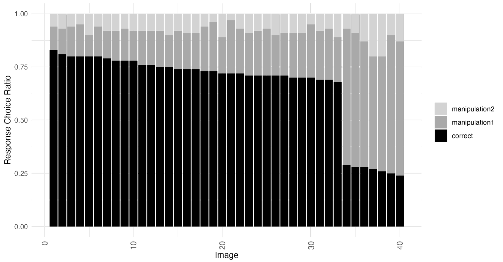
The original study said that a split-half consistency analysis was used “to determine whether people were consistent in the image choices they made” (p. 1974-1975). Here’s how the original paper described the analysis and the results:
Participants were randomly split into two halves; for each half, the proportion of correct responses and Manipulation 1 responses was calculated for each image. We then calculated the Spearman rank correlation for each response type between the participant halves, across 10,000 random shuffles of participant halves. The mean Spearman rank correlation across the iterations for the proportion of correct responses was 0.92 (p < .0001; Fig. 3b). The mean correlation across the iterations for the proportion of Manipulation 1 responses was 0.88 (p < .0001; Fig. 3b). This suggests that people are highly consistent in what images they respond correctly and incorrectly to. In other words, just as people correctly remember the same images as each other, they also have false memories of the same images as each other.
(Prasad & Bainbridge, 2022, p. 1975)
The paper also presents the results visually using the figures below:
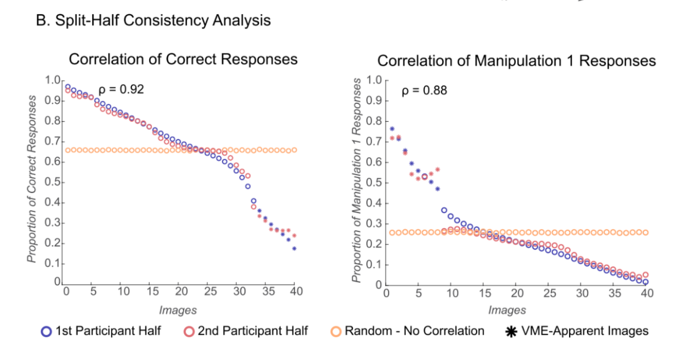
The intention the paper expressed for this analysis was to assess the consistency of responses across participants, but the analysis that was conducted does not seem to us to provide any reliable information about the consistency of responses across participants beyond what is already presented in the basic histogram of the entire sample of results (Figure 2 in our report; Figure 3a in the original paper). The split-half analysis seems to us to be both unnecessary and not reliability diagnostic.
In order to understand why, it may help to ask what the data would look like if respondents were not consistent with each other on which images they got correct and incorrect.
Imagine that you have two datasets of 100 people each, and in each dataset all participants got 7 out of 40 answers incorrect. This could happen in two very different ways at the extreme. In one version, each person answered 7 random questions incorrectly out of the 40 questions. In another version there were 7 questions that everyone answered wrong and 33 questions that everyone answered correctly. It seems like the paper is attempting to use this test to show that the VME dataset is more like the second version in this example where people were getting the same 7 questions wrong, rather than everyone getting a random set of questions wrong. The point is that a generalized low level of accuracy across a set of images isn’t enough. People need to be getting the same specific images wrong in the same specific way by choosing one specific wrong answer.
This is a reasonable conceptual point about what it takes for an image to be a VME image, but the split-half analysis is not necessary to provide that evidence, because the way it’s constructed means that it doesn’t add information beyond what is already contained in the histogram.
Going back to the example above illustrates this point. Here’s what the histogram would look like if everyone answered 7 questions wrong, but those questions weren’t the same as the questions that other people answered wrong:
In the above case the questions themselves do not explain anything about the pattern of the results, since each question generates exactly the same performance. You could also get this pattern of results if 18 people answered every question wrong, and 82 people answered all of them correctly. In that case as well though, the results are driven by the characteristics of the people, not characteristics of the questions.
In the other extreme where everyone answered the exact same questions wrong, the histogram would look like this:
In this case you don’t need to know anything about the participants, because the entirety of the results is explained by characteristics of the questions.
This extreme example illustrates the point that real data on a question like this is driven by two factors – characteristics of the questions and characteristics of the participants. When the number of correct responses for some questions differs substantially from the number of correct responses for other questions we can infer that there is something about the questions themselves that is driving at least some of that difference.
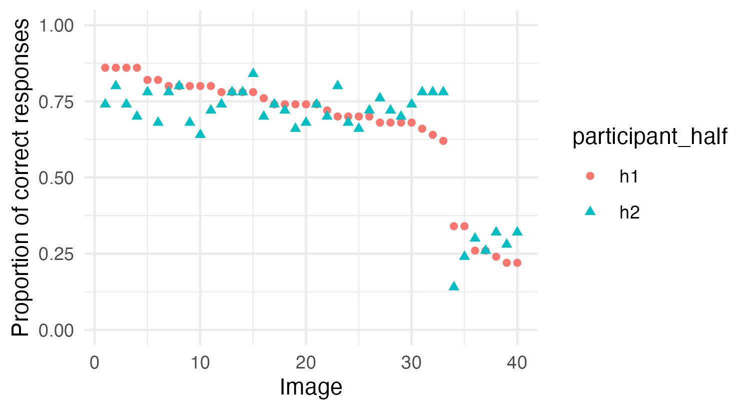
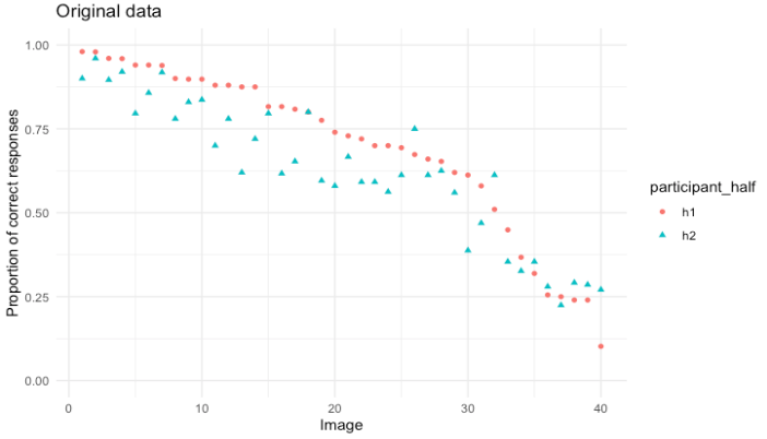
This point, that people perform systematically differently on some of these image sets than others, seems to be what the paper is focusing on when it talks about the performance of participants being consistent with each other across images. And looking at the histogram from the original study we can see that there is a lot of variation from image to image in how many people answered each image correctly:
If we sort that histogram we can more easily see how this shows a pattern of responses where people were getting the same questions correct and the same questions wrong as other people:
From the results in this histogram alone we can see that people are answering the same questions right and wrong as each other. If that wasn’t the case the bars would be much more similar in height across the graph than they are. This is enough to demonstrate that this dataset meets criterion c.
The split-half consistency analysis is an attempt to demonstrate this in a way that generates a statistical result, rather than looking at it by eye, but because of how the analysis is done it doesn’t offer reliably diagnostic answers.
What is the split-half analysis doing?
What the split-half consistency analysis is doing is essentially creating a sorted histogram like the one above for each half of the dataset separately and then comparing the two halves to see how similar the ordering of the images is between them using Spearman’s Rank Correlation. This procedure is done 10,000 times, and the average of the 10,000 values for Spearman’s Rank Correlation is the reported result.
This procedure essentially takes random draws from the same sample distribution and compares them to each other to see if they match. A major problem with this approach is that, as long as the sample size is reasonably large, this procedure will almost always result in split-halves that are quite similar to each other. This is because if the halves are randomly drawn from the whole sample, at reasonably large sample sizes, the results from the halves will be similar to the results from the sample as a whole, and thus they will be similar to each other as well. Since the split-halves approximate the dataset as a whole, the split-half procedure isn’t contributing information beyond what is already present in the histogram of the dataset as a whole. This is the same principle that allows us to draw a random sample from a population and confidently infer things about the population the random sample was drawn from.
In this case, since the two halves of 50 are each drawn and compared 10,000 times, it shouldn’t be at all surprising that on average comparing the results for each image in each half of the sample generates extremely similar results. The halves are drawn from the same larger sample of responses, and by drawing the halves 10,000 times and taking the average, the effects of any individual random draw happening to be disproportionate are minimized.
If the sample was too small, then we wouldn’t expect the two halves of the sample to reliably look similar to each other or similar to the sample as a whole because there would not be enough data points for the noise in the data to be reliably canceled out.
With a large enough sample size the correlation between the two halves will be extremely strong, even if there is barely any difference in the proportions of responses for each image set, because the strength of that correlation is based on the consistency of the ordering, not on any measure of the size of the differences in accuracy between the images. As the noise is reduced by increasing the sample size, the likelihood of the ordering remaining consistent between the two halves, even at very small levels of difference between the images, increases.
The strength of the correlation coming from the consistency of the ordering is due to the way that Spearman’s Rank Correlation works. Spearman’s Rank Correlation is made to deal with ordinal data, meaning data where the sizes of the differences between the values isn’t meaningful information, only the order of the values is meaningful. It accomplishes this by rank ordering two lists of data based on another variable, and then checking to see how consistent the order of the items is between the two lists. The size of the difference between the items doesn’t factor into the strength of the correlation, only the consistency of the order. In the case of this split-half analysis the rank ordering was made by lining up the images from highest proportion correct to lowest proportion correct for each half of the respondents, and then comparing those rankings between the two halves.
Split-half analysis is not diagnostic for the hypothesis it is being used to test
Because increasing the sample size drives the split-half analysis towards always having high correlations, a high correlation is not a meaningful result for showing that the pattern of results obtained is being driven by important differences between the image sets. With a large sample size the rank ordering can remain consistent even if the differences in accuracy between the images are extremely small.
In addition to the test potentially generating extremely high correlations for results that don’t include anything that meaningfully points to VME, the test also could generate much weaker correlations in the presence of a strong VME effect under some conditions. To think about how this could happen Imagine the histogram of the data looks like this:
If the data looked like this we could interpret it as meaning that there are 2 groups of images – regular images that most people know, and VME images where people consistently choose a specific wrong answer.
At modest sample sizes, noise would make the images within each group difficult to reliably rank order relative to each other when you split the data in half. That would result in a lower Spearman’s Rank Correlation for data fitting this pattern compared to the real data, even though this data doesn’t present weaker evidence of VME than the real data. The mean Spearman’s Rank Correlation for split-half analysis on this simulated dataset run 10,001 times is 0.439, which is less than half of the 0.92 correlation reported on the real data.
The evidence that people respond in ways that are consistent with other people in the ways that are actually relevant to the hypothesis is no weaker in this simulated data than it is in the real data. The evidence that there are properties of the images that are resulting in different response patterns is just as strong here as it is in the actual data. Despite this, the split-half consistency test would (when the sample size isn’t too large) give a result that was substantially weaker than the result on the actual data.
These features of this split-half consistency analysis make it non-diagnostic for the criterion that the paper used it to attempt to examine. The results it gives do not offer information beyond what is already present in the histogram, and the results also do not reliably correspond with the level of confidence we should have about whether criterion c is being met.
It is important to note though that this split-half analysis is also not necessary to establish that the data the paper reports meets the criteria for showing a VME in certain images. The histogram of results, chi-squared goodness of fit tests, and permutation tests establish that these images meet the paper’s 5 criteria for demonstrating a Visual Mandela Effect.
Unclear labeling of the Split-Half Figures
In the process of reproducing the analysis and running simulations of this analysis, we also realized that the graphs presenting the split-half figures in the paper are likely mislabeled. The image below is a graph of the proportion of correct responses in the original data split in half with a Spearman’s Rank Correlation of 0.92 between the halves:
In this figure the images are ordered based on their ranking in the first half of the data, and then the second half of the data is compared to see how well the rankings match. This is a reasonable visual representation of what Spearman’s Rank Correlation is doing.
The figure above looks quite different, with much more noise, than the figure presented in the paper. It seems likely the X axis on the figure in the original paper doesn’t represent images numbered consistently between the two halves (meaning Image 1 refers to the same image in both half one and half two), but rather represents the ranks from each half, meaning that the top ranked image from each half is first, then the second, than the third, which is not the same image in each half. The figure below shows the same data plotted that way:
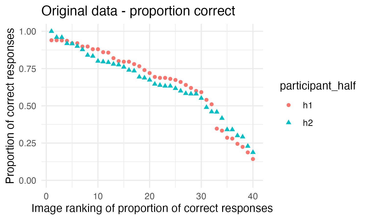
We did not draw the exact same set of 10,000 split-halves that was drawn in the original analysis, so this figure is not exactly the same as the figure in the original paper, but the pattern this shows is very similar to the original figure. This figure doesn’t seem to be as useful of a representation of what is being done in the Spearman’s Rank Calculation because the ranks of the images between the two halves cannot be compared in this figure.
This may seem like a minor point, but we consider it worth noting in the appendix because a reader looking at the figure in the paper will most likely come away with the wrong impression of what the figure is showing. The figure in the original paper is labeled “Images” rather than being labeled “Rankings,” which would lead a reader to believe that it shows the images following the same ordering in both halves, when that is not the case.
Additional Information about the Results
Conducting permutation tests for criteria (d) and (e) with 6 images vs 7 images
As mentioned in the body of the report and detailed in the “Error in analysis for criteria (a) and (b): χ2 test of independence” section in the Appendix, the original paper conducted the χ2 test incorrectly. When the correct χ2 test is conducted on the original data, only 6 of the 7 images reported to show a VME remain statistically significant (Waldo from Where’s Waldo is no longer statistically significant). As such, we ran the permutation tests used to assess criteria (d) and (e) with these 6 images to ensure that the permutation test results reported in the original study held when using only images that show statistically significant evidence of a VME.
We used the original data and followed the same procedures detailed in the “Study and Results in Detail” section. The only difference is that, when running the permutation tests, we dropped 6 images (C-3PO, Fruit of the Loom Logo, Curious George, Mr. Monopoly, Pikachu, Volkswagen Logo) instead of 7 images (C-3PO, Fruit of the Loom Logo, Curious George, Mr. Monopoly, Pikachu, Volkswagen Logo, Waldo).
Here are the results:
Table 5. Results for criteria (d) and (e) in the original data when dropping 7 images versus 6 images
| Permutation test | Reported results (1,000 permutations): Dropping 7 images: C-3PO, Fruit of the Loom Logo, Curious George, Mr. Monopoly, Pikachu, Volkswagen Logo, Waldo (Where’s Waldo) | Reproduced results (1,000 permutations): Dropping 6 images: C-3PO, Fruit of the Loom Logo, Curious George, Mr. Monopoly, Pikachu, Volkswagen Logo |
| Correlation between confidence and familiarity | p = 0.540 | p = 0.539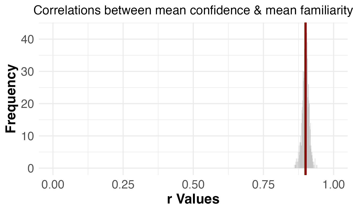 |
| Correlation between familiarity and accuracy | p = 0.044 | p = 0.051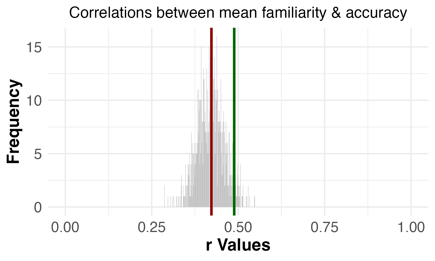 |
| Correlation between confidence and accuracy | p = 0.001 | p = 0.002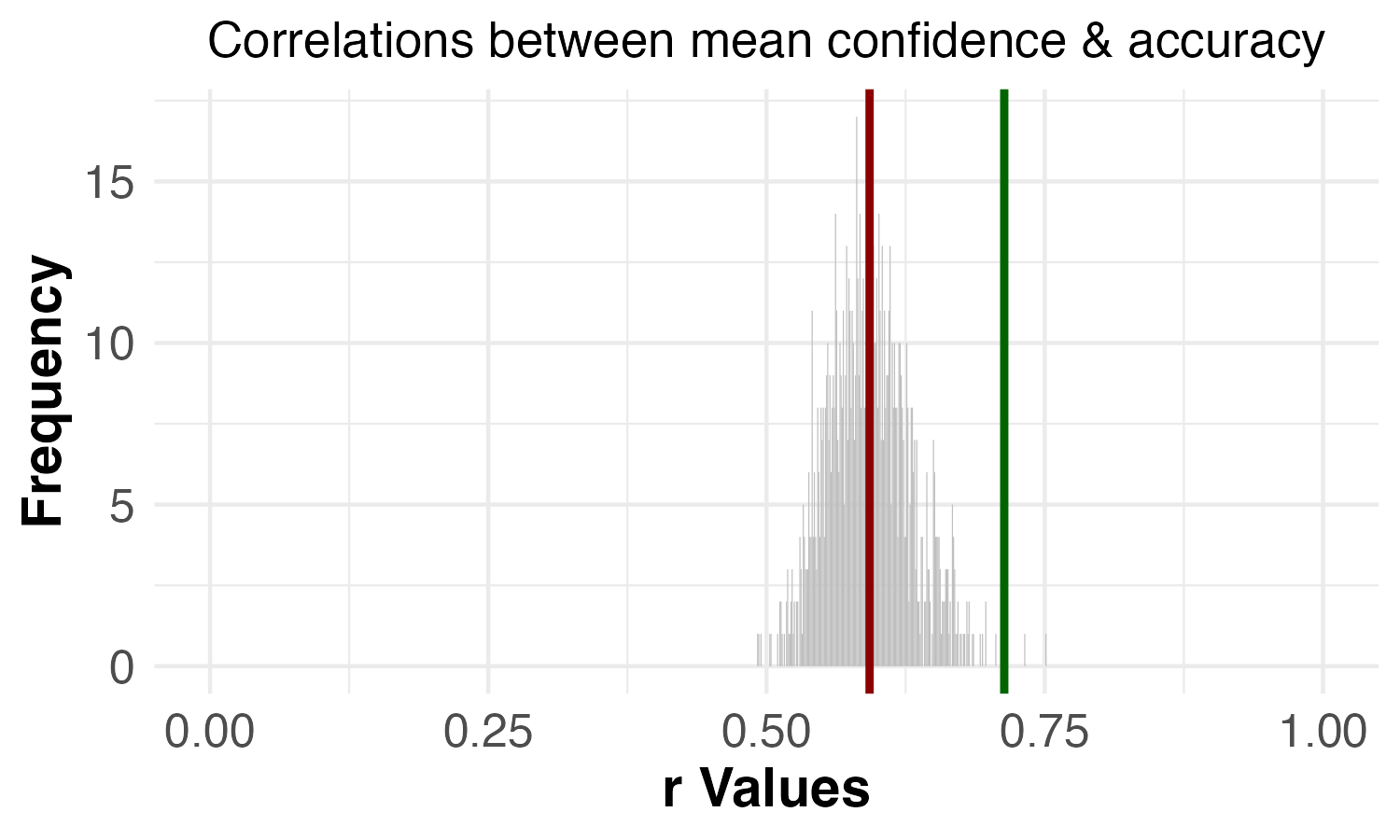 |
Overall, the results are extremely similar when the 7 VME images identified in the paper are dropped versus when the 6 VME images identified in our reproduced analyses are dropped. The one notable difference is that the familiarity-accuracy permutation test goes from statistically significant to non-statistically significant. However, the p-values are quite similar: p = 0.044 and p = 0.051. In other words, the familiarity-accuracy permutation test goes from having a borderline significant p-value to a borderline non-significant p-value. We don’t consider this to be a particularly meaningful difference, especially since our replication found a strong, significant result for the familiarity-accuracy permutation test (p = 0.003).
Another way of thinking about the difference between p = 0.044 and p = 0.051 is to understand how the p-value is calculated for these permutation tests. The p-value for these tests was equal to the proportion of permutations that had a higher correlation than the correlation for the specific permutation in which the VME images were dropped. So, since 1,000 permutations were run, a p-value of 0.044 means that 44 of the 1,000 random permutations had higher correlations than the correlation when all of the VME images were dropped. A p-value of 0.051 means that 51 of the 1,000 random permutations had higher correlations. Thus, the difference between p = 0.044 and p = 0.051 is a difference of 7 more random permutations having a higher correlation than the correlation when all of the VME images are dropped.
Understanding how the p-value is calculated also explains why running more permutations gives the test more precision. Running more permutations affords the test a larger sample of all the possible permutations to compare against the specific permutation of interest—which, in this case, is when all of the VME images are dropped. This is why we pre-registered and ran 10,000 permutations on our replication data, rather than the 1,000 that were run in the original study.
Correlations between accuracy, confidence, and familiarity
As discussed earlier in this report, two of the criteria the original paper used to evaluated whether images showed evidence of a VME were:
(d) the image shows low accuracy even when it is rated as being familiar
(Prasad & Bainbridge, 2022, p. 1974)
(e) the responses on the image are given with high confidence even though they are incorrect
To test criterion (d), the original paper used a permutation test to assess whether the correlation between accuracy and familiarity was higher when the 7 images that met criteria (a) and (b) were excluded compared to when other random sets of 7 images were excluded. Similarly, to test criterion (e), the original paper used a permutation test to assess whether the correlation between accuracy and confidence was higher when the 7 images that met criteria (a) and (b) were excluded compared to when other random sets of 7 images were excluded.
In order to calculate the correlations between accuracy and familiarity and between accuracy and confidence, the original paper first calculated the average familiarity rating, confidence rating, and accuracy for each of the 40 images. The correlation of interest was then calculated using these average ratings for the 40 images. In other words, each correlation tested 40 data points. We will refer to this as the image-level approach.
Another way of running this correlation would be to use each rating from each participant as a single data point in the correlation. For every image, participants made a correct or incorrect choice, and they rated their confidence in the choice and their familiarity with the image. Thus, the correlation could have been run using each of these sets of ratings. 100 participants completed the original study, rating 40 images each, which means each correlation would have tested close to 4,000 data points (it wouldn’t have been exactly 4,000 data points because a few participants did not rate all 40 images.)
While the image-level approach is not necessarily incorrect, we argue that it sacrifices granularity in a way that could, in principle, be misleading. Here’s an extreme example to demonstrate this:
Imagine you run the VME study twice (Study A and Study B), and in each study, you only have 2 participants (participants 1-4). For the Mr. Monopoly image in Study A, participant 1 chooses the incorrect image (accuracy = 0) and gives the lowest possible confidence rating (confidence = 1). Meanwhile, participant 2 in Study A chooses the correct image (accuracy = 1) for Mr. Monopoly and gives the highest possible confidence rating (confidence = 5). If you take the image-level average for each of these variables, you will have an accuracy rating of 0.5 and a confidence rating of 3 for Mr. Monopoly in Study A. Now, in Study B, participant 3 chooses the incorrect image (accuracy = 0) for Mr. Monopoly, but gives the highest possible confidence rating (confidence = 5), and participant 4 chooses the correct image (accuracy = 1) for Mr. Monopoly, but gives the lowest possible confidence rating (confidence = 1). If you take the image-level average for each of these variables, you will have the exact same scores for Mr. Monopoly as you did in Study A: an accuracy rating of 0.5 and a confidence rating of 3. However, these two studies have the exact opposite pattern of results (see Table 6). Averaging at the image level before correlating these ratings across the 40 images means that such differences are impossible to detect in the correlation. However, if each individual set of ratings is included in the correlation, the analysis can account for these differences. Although it’s unlikely, it is possible that the image-level approach could give the same correlation to two different datasets that would have correlations in opposite directions if the individual-level approach was used.
Table 6. Hypothetical scores to demonstrate that averaging at the image-level before running a correlation could mask important individual-level differences
| Hypothetical Study A | Hypothetical Study B | ||||
| Participant | Accuracy | Confidence | Participant | Accuracy | Confidence |
| 1 | 0 | 1 | 3 | 0 | 5 |
| 2 | 1 | 5 | 4 | 1 | 1 |
| Average score | 0.5 | 3 | Average score | 0.5 | 3 |
Given this limitation of the image-level approach, we decided to re-run the correlations and permutation tests using the individual-level approach. We did so for both the original data and our replication data. To account for the repeated-measures nature of the individual-level data (each participant provided multiple responses), we ran repeated-measures correlations (Bakdash & Marusich, 2017) rather than Pearson correlations. You can see the results from these analyses in Table 7.
One important thing to note is that the data for the original paper was structured such that it was not possible to know, with 100% certainty, which ratings were from the same participants. The original data was formatted as 4 separate .csv files—one file for each measure (image choice, confidence rating, familiarity rating, times-seen rating)—with no participant-ID variable. In order to conduct this analysis, we had to assume that participants’ data were included in the same row in each of these files. For example, we assumed the data in row 1 in each of the four files came from the same participant. This was a big limitation of the format in which the data was shared. However, the differences in results between the image-level approach and the individual-level approach are quite similar among both the original data and the replication data. This suggests that we were correct to assume that each row in the original data files came from the same participant.
Table 7. Comparison of correlations for the image-level approach versus the individual-level approach
| Test | Original data | Original data | Replication data | Replication data |
|---|---|---|---|---|
| Image-level correlation (Pearson’s r) | Individual-level correlation (repeated-measures correlation) | Image-level correlation (Pearson’s r) | Individual-level correlation (repeated-measures correlation) | |
| Correlation: confidence and familiarity | r = 0.90 | r = 0.68 | r = 0.90 | r = 0.74 |
| Correlation: familiarity and accuracy | r = 0.42 | r = 0.18 | r = 0.35 | r = 0.23 |
| Correlation: confidence and accuracy | r = 0.59 | r = 0.25 | r = 0.58 | r = 0.33 |
Fortunately, the differences between the image-level results and the individual-level results were either minimal or directionally consistent. For example, the difference between the confidence-accuracy correlation in the original data when calculated with these two methods is fairly large: r = 0.59 vs r = 0.25. However, these correlations are directionally consistent (both positive), and the results for the confidence-accuracy permutation tests in the original data are very similar for the two methods: p = 0.001 and p = 0.007.
Table 8. Comparison of permutation test results for the image-level approach versus the individual-level approach
| Test | Original data: | Original data: | Replication data: | Replication data: |
|---|---|---|---|---|
| Image-level (7 images removed; 1,000 permutations) | Individual-level(7 images removed; 1,000 permutations) | Image-level(8 images removed; 10,000 permutations) | Individual-level(8 images removed; 10,000 permutations) | |
| Permutation test: confidence and familiarity | p = 0.540 | p = 0.100 | p = 0.320 | p = 0.067 |
| Permutation test: familiarity and accuracy | p = 0.044 | p = 0.016 | p = 0.003 | p = 0.001 |
| Permutation test: confidence and accuracy | p = 0.001 | p = 0.007 | p = 0.000 | p = 0.000 |
Wilcoxon Rank Sum test
The original study reports:
There was also no significant difference between the number of times that participants had seen VME-apparent images and the number of times they had seen the images that were correctly identified (Wilcoxon rank sum; z = 0.64, p = .523), supporting the idea that there is no difference in prior exposure between VME-apparent images that induce false memory and images that do not.
(Prasad & Bainbridge, 2022, p. 1977)
We attempted to reproduce this analysis using the original data, but were unable to find the same results. Below, we describe the seven different ways we tried running this test.
There are two important things to contextualize these different ways of running this analysis. First, in the original data file, the responses on the Times Seen measure have values of 0, 1, 11, 51, 101, or 1000 (the response options participants saw for this measure were 0; 1-10; 11-50; 51-100; 101-1000; 1000+). Second, technically a Wilcoxon Rank Sum test assumes independent samples while a Wilcoxon Signed Rank test assumes paired samples (e.g., repeated measures). As shown in the quote above, the paper reports that a Wilcoxon Rank Sum test was run.
1. Individual level (Wilcoxon Rank Sum)
We ran a Wilcoxon Rank Sum test on the individual level data (i.e., the data was not aggregated in any way) comparing the Times Seen ratings on VME images versus non-VME images. The results were: W = 1266471, p = 2.421e-07.
2. Image level – recoded (Wilcoxon Rank Sum)
Another way to analyze this data, consistent with the other analyses the paper reported, is to first calculate the average rating for each image, and then run the test with these image-level values. One potential hiccup in this case is that the values for the Times Seen measure in the original data files were 0, 1, 11, 51, 101, or 1000. It seems problematic to simply average these numbers since the actual options participants chose from were ranges (e.g., 101-1000). If a participant selected 101-1000, they could have seen the image 150 times or 950 times. Treating this response as always having a value of 101 seems incorrect. So, we reasoned that perhaps the authors had first recoded these values to simply be 0, 1, 2, 3, 4, and 5 rather than 0, 1, 11, 51, 101, and 1000.
Thus, we first recoded the variable to have values of 0, 1, 2, 3, 4, and 5 rather than 0, 1, 11, 51, 101, and 1000. We then calculated the average rating for each image. We then ran a Wilcoxon Rank Sum test with these image-level values comparing the Times Seen ratings on VME images versus non-VME images. The results were: W = 163.5, p = 0.091.
3. Image level – not recoded (Wilcoxon Rank Sum)
It also seemed plausible that the authors had not recoded these values before calculating the average rating for each image. So, we also tried this approach by calculating the average rating for each image (without recoding the values), and then running a Wilcoxon Rank Sum test comparing the Times Seen ratings on VME images versus non-VME images. The results were: W = 164, p = 0.088.
4. Within-individual aggregation – recoded (Wilcoxon Rank Sum)
Another way of aggregating the data is to calculate an average value of the Times Seen measure for the VME images and the non-VME images within each participant’s data. In other words, each participant would have an average Times Seen rating for the 7 VME images and an average Times Seen rating for the 33 non-VME images. As with aggregating at the image-level, this raises the question of whether the data should be recoded first.
In this analysis, we first recoded the variable to have values of 0, 1, 2, 3, 4, and 5 rather than 0, 1, 11, 51, 101, and 1000. We then calculated the average Times Seen rating for VME-images for each participant and the average Times Seen rating for non-VME-images for each participant. We then ran a Wilcoxon Rank Sum test with these within-individual aggregated values comparing the Times Seen ratings on VME images versus non-VME images. The results were: W = 5854.5, p = 0.037.
5. Within-individual aggregation – recoded (Signed Rank)
Because of the structure of the Within-individual aggregated data described in test #4, it was also possible to run a Wilcoxon Signed Rank test rather than a Wilcoxon Rank Sum test. We reasoned that it was possible that the original paper used a Wilcoxon Signed Rank test, but it was mislabeled as a Wilcoxon Rank Sum test.
In this analysis, we followed the same steps as in test #4, but we ran a Wilcoxon Signed Rank test rather than a Wilcoxon Rank Sum test—in other words, we treated the data as paired samples, rather than independent samples. (In the case of this study, treating the data as paired samples is actually correct since participants rated both VME images and non-VME images.) The results were: V = 4002.5, p = 3.805e-07.
6. Within-individual aggregation – not recoded (Wilcoxon Rank Sum)
We also attempted test #4 without recoding the values. The results were: W = 6078, p = 0.008
7. Within-individual aggregation – not recoded (Wilcoxon Rank Sum)
We also attempted test #5 without recoding the values. The results were: V = 4030, p = 2.304e-07
As you can see by comparing the p-values, we were not able to reproduce the specific results reported in the paper using the original data. The original paper found a null result on this test. Two versions of our analysis also found null results (although with much smaller p-values than what was reported in the paper). These two versions used image-level averages of the Times Seen rating. If image-level averages were used for conducting this test, that would have the same flaw as the permutation test analyses: averaging at the image level before conducting these analyses sacrifices granularity in a way that could, in principle, be misleading (see the “Correlations between accuracy, confidence, and familiarity” in the Appendix for more information).
We tried running the test in several ways in an attempt to reproduce the original result. Given that we were unable to reproduce that result, it seems likely that none of these seven ways we attempted to run the test matched how the test was run in the original study. The authors reported that they used the ranksum function in MatLab to run the test, but we were unable to determine how the data was structured as input to this function. Without access to the original analysis code or a more detailed description in the paper, we cannot be sure why we were unable to reproduce the original results.
References
Bakdash, J. Z. & Marusich, L. R. (2017). Repeated measures correlation. Frontiers in Psychology, 8, 456. https://doi.org/10.3389/fpsyg.2017.00456
Faul, F., Erdfelder, E., Buchner, A., & Lang, A.-G. (2009). Statistical power analyses using G*Power 3.1: Tests for correlation and regression analyses. Behavior Research Methods, 41, 1149-1160. Download PDF
Prasad, D., & Bainbridge, W. A. (2022). The Visual Mandela Effect as Evidence for Shared and Specific False Memories Across People. Psychological Science, 33(12), 1971–1988. https://doi.org/10.1177/09567976221108944
