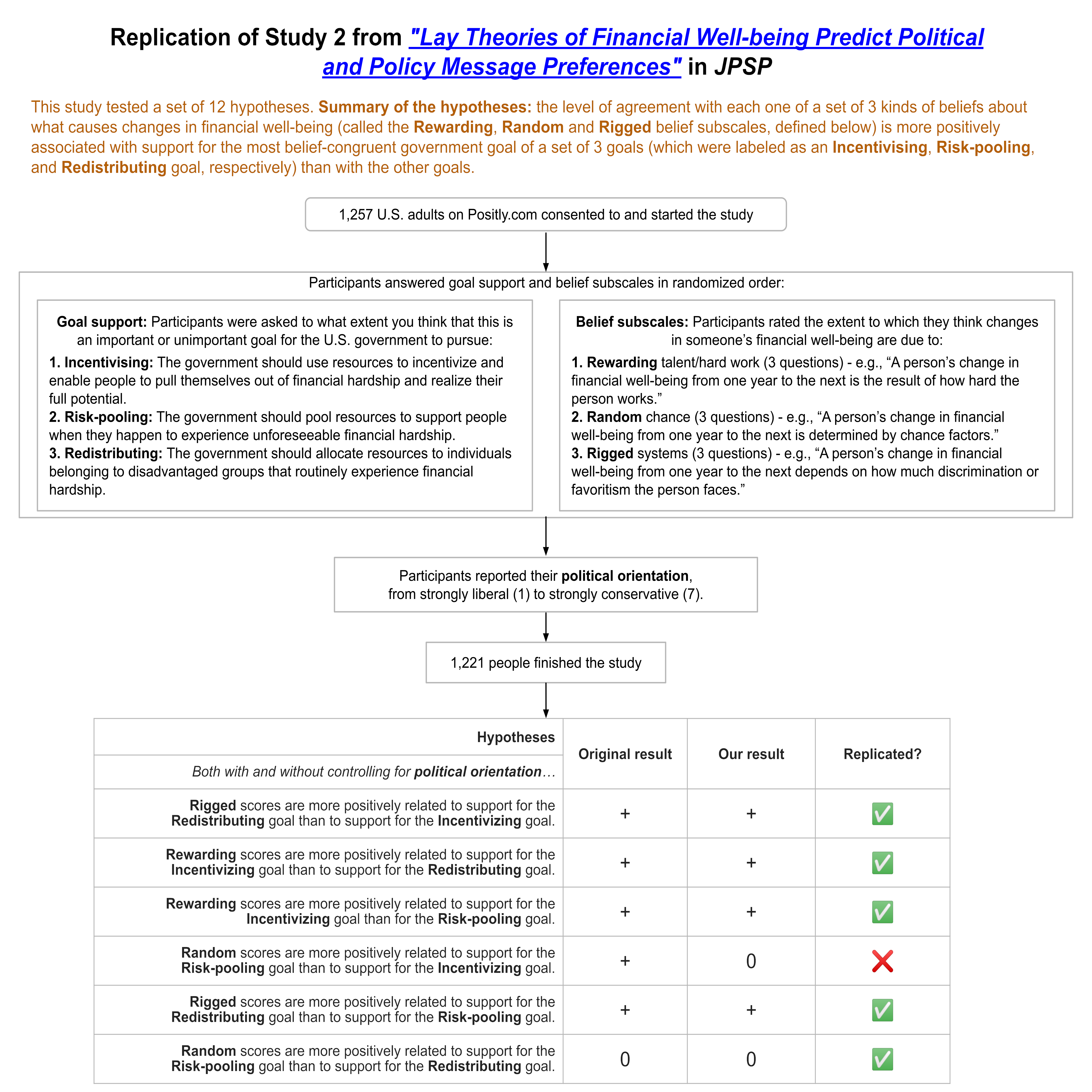
What if there was a simple practice that, if it were used consistently, would improve the reproducibility and rigor of psychology research?
We developed the Simplest Valid Analysis to do exactly that by addressing the problems of Importance Hacking and p-hacking (discussed in Part 3 of this series). The basic idea is that the simplest analysis that provides a valid test of a hypothesis should always be run and reported for any study, even when a more complex analysis has been chosen as the main test of the hypothesis.
In our replication efforts, we’ve found the Simplest Valid Analysis to be a useful technique for determining when claims in a paper may not match the provided evidence, whether due to Importance Hacking, p-hacking, or errors in statistical analyses.
We wanted to find out what academic psychologists thought about the potential value of this technique, so we introduced it in our recent survey of psychology experts, and asked what participants thought about whether the Simplest Valid Analysis should be required for published papers.
We emailed the survey to more than 2,500 academic psychologists, and promoted the survey on relevant listservs and social media. We received 87 fully completed surveys, and another 110 that answered at least some of the substantive questions we asked. These 210 respondents indicated that they were all either experts or experts-in-training in psychology or a related field. There were additional participants who did not meet our screening criteria because they are not experts or experts in training in relevant fields, so their data were excluded from all analyses. For more information about the participants and to access the anonymized data from the study, see the survey demographics appended to Part 1 of this series.
For a technique we were introducing to people for the first time, we were surprised to see how much support there was among experts for making the Simplest Valid Analysis a requirement!
We introduced the concept to academic psychologists in our survey using the following definition:
The Simplest Valid Analysis is the simplest way to analyze the data from a study that provides a valid test of the study’s main claim.
Studies sometimes include complex analyses of their data without reporting the result of the Simplest Valid Analysis.
For instance, studies may use a fancy statistical technique (and not report a simple t-test) when a t-test would have been a valid way to test the study’s main claim, or they may apply a complex machine learning algorithm without reporting the results of ordinary linear regression in a situation where linear regression would be a valid analysis of the hypothesis.
It’s important to be clear that we’re not advocating for using the Simplest Valid Analysis instead of more complex analyses. There are often good reasons for running a complex analysis to account for various features of the data and research question. We propose that, in those cases, researchers run and report the results of the Simplest Valid Analysis alongside their more complex analysis, and explain why they believe the more complex analysis is a superior test of their hypothesis. In cases where the simple and complex analyses agree, this process serves as evidence of the robustness of the hypothesis. In cases where they don’t agree, reporting both provides useful context for interpreting the results in a way that reduces the chances of overclaiming or misinterpretation.
We are also aware that sometimes there isn’t an obvious Simplest Valid Analysis. In cases where it’s not clear what the Simplest Valid Analysis would be, we wouldn’t expect that one be included. This is meant for cases where there is an obvious simple test that could be conducted, which we think is fairly common.
Why is the Simplest Valid Analysis Useful?
We developed the Simplest Valid Analysis to solve a problem we were having when running replications. We saw a number of papers that used complex analyses, and we couldn’t tell why they had chosen that analysis instead of a simpler analysis. When we ran the simple analysis we found that, in some cases, the results weren’t consistent with the results reported from the complex analysis. This discrepancy helped us uncover serious problems in how the complex analysis was being interpreted or implemented.
We believe there are three main reasons why publications are more reliable when researchers include the Simplest Valid Analysis:
Increasing Ease of Interpretation – It is much easier for reviewers and readers to misinterpret the meaning of a result from a complex analysis than from a simple one. If the result of the Simplest Valid Analysis is reported alongside the complex model, and the results of the two analyses are consistent, that increases confidence that the complex analysis is performing as expected and being interpreted correctly.
Reducing researcher degrees of freedom and p-hacking – If a study isn’t pre-registered, and only a complex analysis is reported, it raises a question about whether a simpler analysis was tried, but not reported because it didn’t generate a significant result. The Simplest Valid Analysis reduces researcher degrees of freedom, and reduces opportunities for p-hacking (conscious or unconscious).
Reducing Importance Hacking – If a simple analysis doesn’t lead to a significant result, but a complex analysis does, reporting only the complex analysis can leave readers with the impression that the evidence supporting the substantive claims in the paper is stronger and less equivocal than it really is. It’s possible that a complex analysis is evidence for a more specific and narrow claim than the simple analysis tests, but by leaving out the simple analysis it can be made to seem that the broader claim is also supported by the published results.
We have seen studies that use mixed effects models where the complex analysis doesn’t make it easy for readers to get a baseline understanding of the data. Although the results of the complex analysis may be interpreted correctly by the authors, they can still leave readers with impressions that aren’t supported when a simple analysis is also reported. For example, simple correlations may be lower than readers assume if they only see an analysis that shows that one interaction between two variables is stronger than the other possible interactions it is compared to.
For these reasons we recommend conducting and reporting the Simplest Valid Analysis to researchers and replicators. And we recommend that editors and reviewers ask to see the results of the Simplest Valid Analysis when reviewing papers for publication.
Since we’ve found the Simplest Valid Analysis to be a useful tool, we wanted to find out what academic psychologists thought of it. Did they believe it should be included in published research?
Academic psychologists believe that the “Simplest Valid Analysis” should be included in publications
After providing the definition we gave earlier in this article, we asked participants the following question:
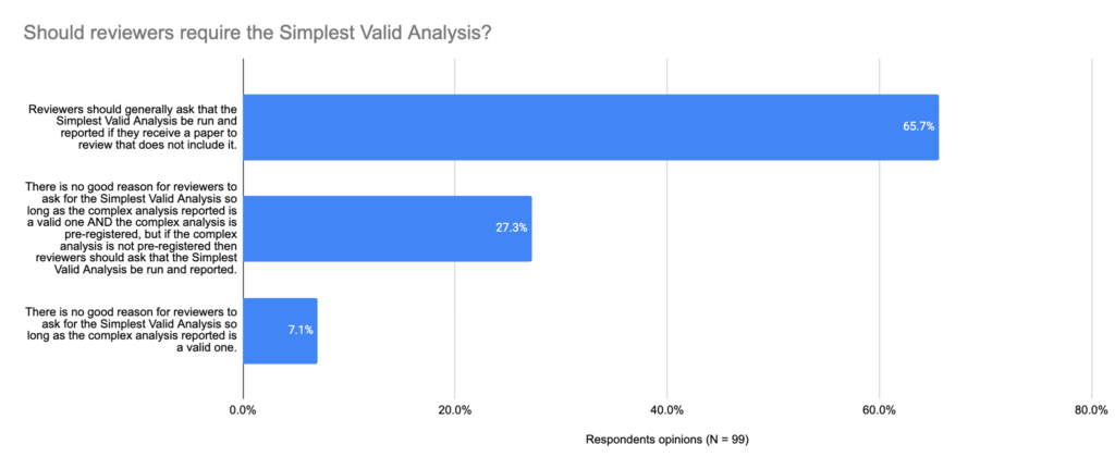
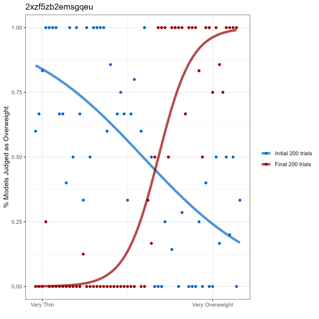
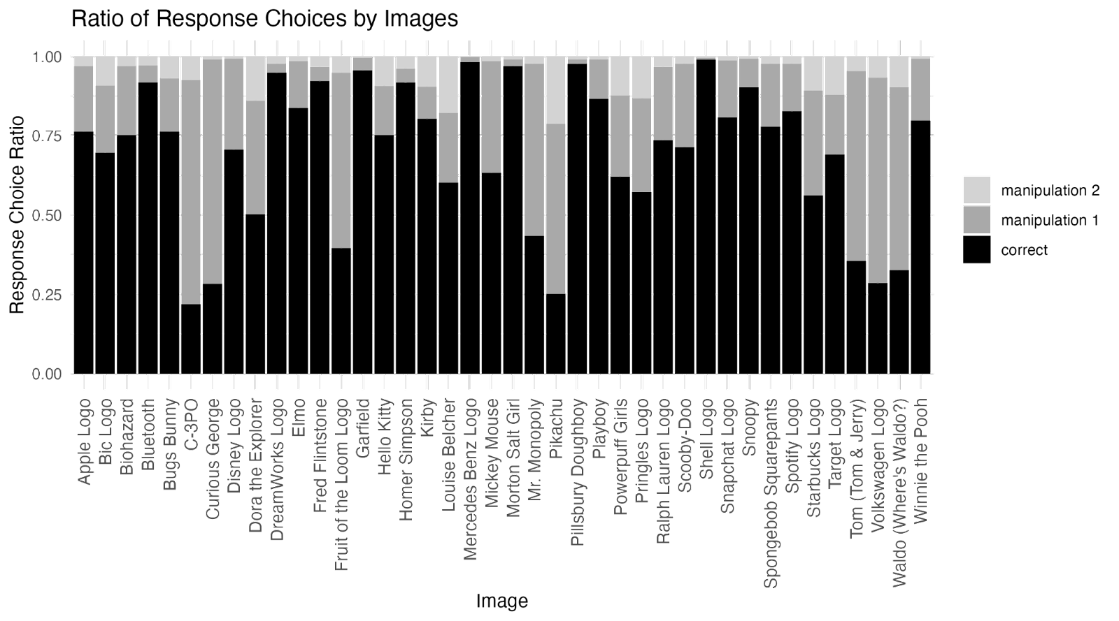
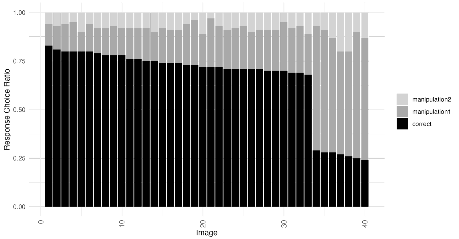
In cases where it’s clear what the Simplest Valid Analysis would be (e.g., there is a standard simple statistical analysis that would be a valid way to test the hypothesis), what is your view on whether peer reviewers should ask submitting authors to run and report the “Simplest Valid Analysis” when they haven’t done so?
In the chart below, you can see the results:
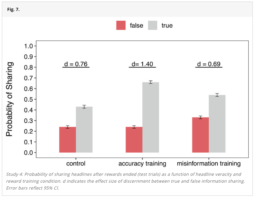
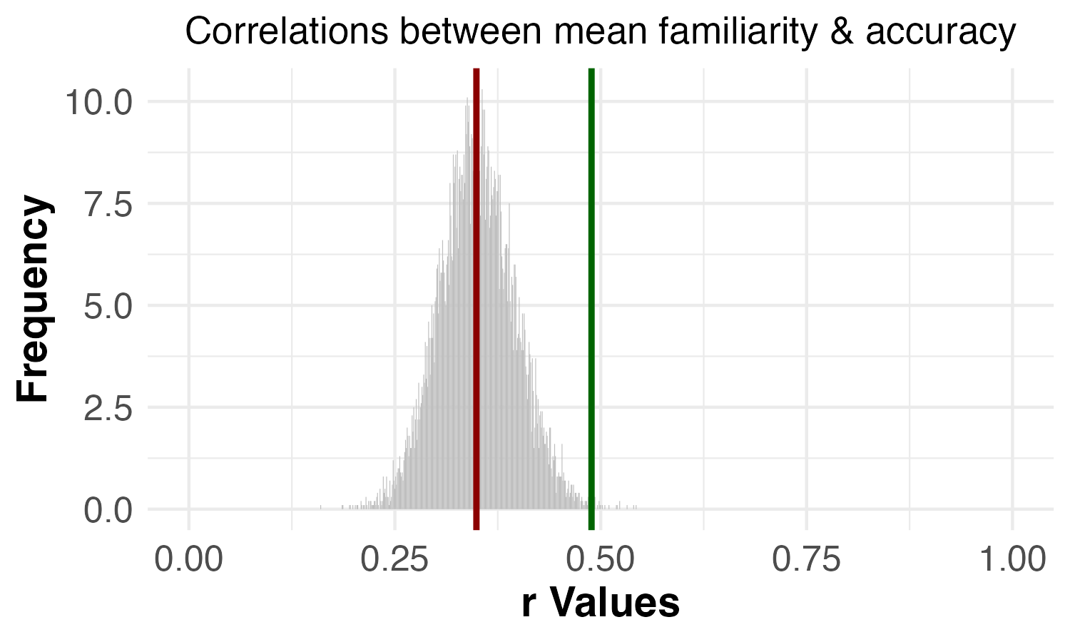
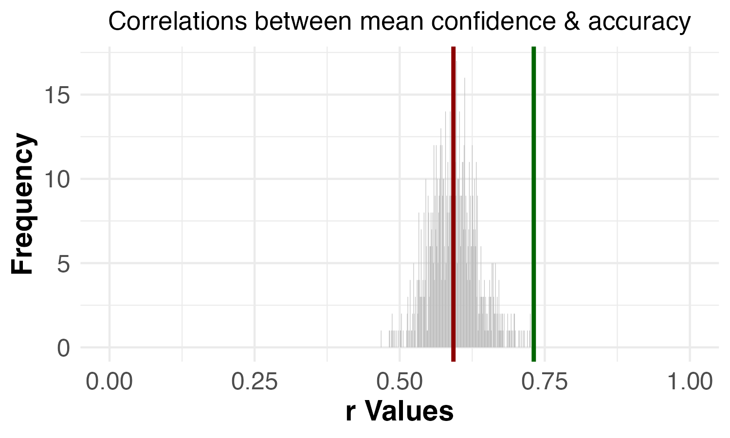
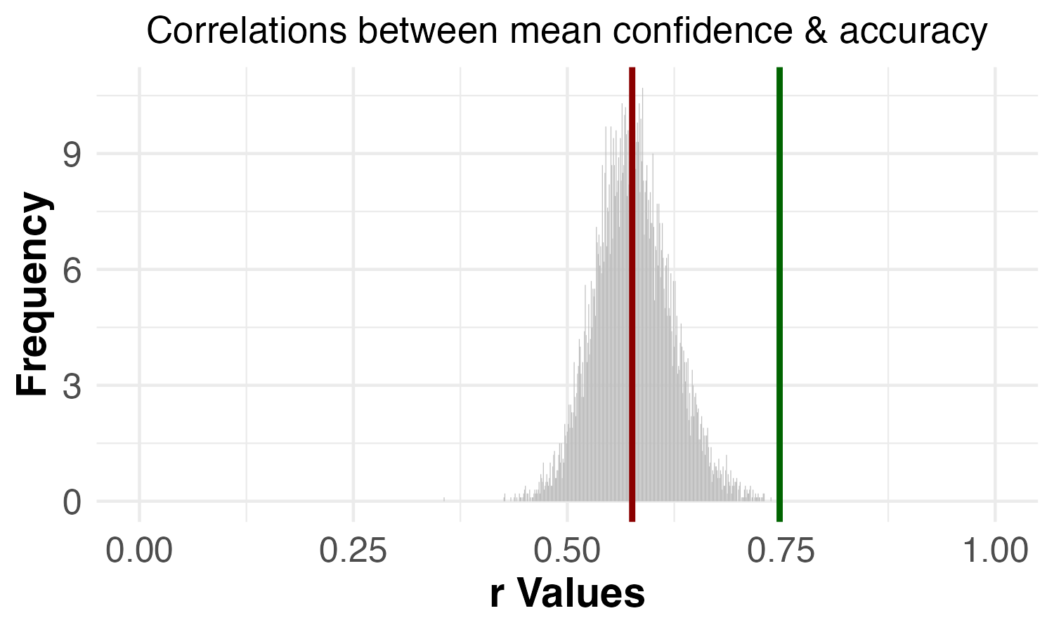
Two-thirds of participants believed that reviewers should ask for the Simplest Valid Analysis to be reported generally, and another 27% thought reviewers should ask for it if the study is not pre-registered. Only 7% thought there generally wasn’t a need for it.
Key Takeaways
There is a very strong consensus in favor of including the Simplest Valid Analysis – 83% of the academic psychologists we surveyed thought that it should be required (at least in the case of studies that are not-pregistered). Given that we were introducing the Simplest Valid Analysis phrase to researchers for the first time, we were surprised to see such a strong endorsement.
Given the strong support for this practice that already exists, and the benefits we have found using it in replication studies, we would encourage the following:
Reviewers should ask researchers to provide results for the Simplest Valid Analysis when it is clear what that analysis would be.
Journal editors should include reporting the results of the Simplest Valid Analysis in their guidelines for authors and reviewers.
Replication efforts should run the Simplest Valid Analysis as part of running a replication, if it is clear what it would be, whether it is included in the original study or not.
Researchers should make use of the Simplest Valid Analysis proactively to diagnose potential limitations or complications of more complex methods they are using.
Including the Simplest Valid Analysis in publications has the potential to substantially improve the reliability and robustness of psychology research by reducing error, preventing p-hacking, and reducing latitude for Importance Hacking. It also already has strong support from experts in the field, as our survey shows. For these reasons, we believe it would make a valuable addition to the open science best practices toolkit.
The Psychologist, the official publication of The British Psychological Society, recently published an article about our work at Transparent Replications.
The article, “What’s the next frontier for improving psychological research?,” is told from the personal perspective of our director Isaac Handley-Miner and offers an overview of our project’s current findings and what we believe to be one of the biggest issues facing psychological research. Check it out!
As always, if you have any feedback or want to get involved, please don’t hesitate to contact us!
In our first dozen replications, we were surprised to find no evidence of p-hacking, and a lot of examples of a problem that didn’t have a name, which we call “Importance Hacking” (as we explored in Part 2).
We wanted to find out if academic psychologists were seeing similar patterns in the field to what we had noticed. Do they perceive p-hacking to still be a common practice in top journals? Were they concerned about Importance Hacking (once we explain clearly what we mean by that phrase), or did they not see it as a serious issue?
To find out, we emailed a survey to more than 2,500 academic psychologists, and promoted the survey on relevant listservs and social media. We received 87 fully completed surveys, and an additional 123 that answered at least some of the substantive questions we asked. These 210 respondents indicated that they were all either experts or experts-in-training in psychology or a related field. There were additional participants who did not meet our screening criteria because they are not experts or experts in training in relevant fields, so their data were excluded from all analyses. For more information about the participants and to access the anonymized data from the study, see the survey demographics appended to Part 1 of this series.
Before asking academic psychologists about p-hacking and Importance Hacking, we wanted to be clear about how we were defining both terms. We provided study participants with these two definitions:
p-hackingis taking advantage of choices available to researchers in data collection or data analysis to generate or selectively report results that meet the statistical significance threshold (e.g., p<0.05), when a result wouldn’t otherwise have been statistically significant. p-hacking can be done consciously or unconsciously, but as defined here it is a separate category from fraud (by which we mean falsifying or making up some or all of the data).
Importance Hackingis obscuring or exaggerating the meaning of results to make them appear to have more value so as to get them published, when in reality the results are not worthy of publication.1A variety of issues could contribute to Importance Hacking including overclaiming, hype, lack of generalizability, or tiny effect sizes that lack real world significance. Importance Hacking can be done consciously or unconsciously, but as defined here it is a separate category from fraud. Unlike with p-hacking, results that are Importance Hacked doreplicate, they just don’t have the meaning that is claimed about them.
These definitions highlight that p-hacked results are unlikely to replicate, while Importance-Hacked results (while not meaning what they are described as meaning) do still replicate. Hence, false positives (including p-hacked results) and Importance Hacked results (as defined here) are mutually exclusive categories.
Importance Hacking and p-hacking as strategies for publishing
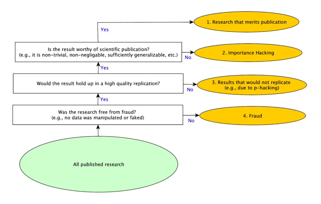
As we conducted our replications, we realized that there are basically four strategies for getting research published. Producing good research is the most obvious one, but it is also the most difficult to do. The easiest and quickest one is committing fraud (for example by making up data and results), but this is obviously immoral, there are strong norms against it, and serious penalties if one is caught. A common “solution” to the difficulty of producing publishable research without resorting to fraud used to be p-hacking, but as more attention has been paid to the problem of p-hacking, that approach appears to be less commonly used because it is considered less acceptable than in the past. With p-hacking in decline, and researchers still under equally intense pressure to publish, it seems likely that other methods for making work appear more valuable to reviewers would increase. That led us to consider whether other methods exist, at which point we identified Importance Hacking as the missing fourth strategy for publication.
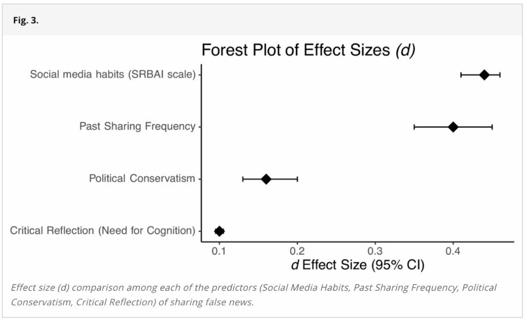
We shared the diagram below with psychology experts in our survey to illustrate these four different mutually exclusive, collectively exhaustive types of published studies:
While 10 of the 12 studies we randomly selected replicated and we didn’t find evidence of p-hacking in any of the 12, we saw many studies that were being described (whether consciously or subconsciously) in ways that made the results seem like they meant something different than they actually did. Often, we wouldn’t even realize this until we had carefully rebuilt the study from scratch (as part of our replication efforts). While some attention has been paid to specific problems that fall within this broader category, like overgeneralizing or validity issues, there wasn’t an overall term that encompassed the use of these and related techniques as a strategy to publish papers that would otherwise not be seen as worthy of publication. Much like p-hacking encompasses several more specific techniques, including selectively reporting results after running multiple tests, Importance Hacking is a term for a set of research practices that inflates the value of a research finding by making it seem more novel, clean, or impactful than it really is. For more about the types of Importance Hacking see Spencer Greenberg’s Clearer Thinking article.
Did the experts that we surveyed also see Importance Hacking as a common publication strategy? We were surprised to find out that they did, even though this survey was the first time the term was introduced to them.
Finding 1: Importance Hacking was perceived to be at least as common as p-hacking
We wanted to assess how academic psychologists perceived the literature in the field, so after presenting them with the figure above, we asked them to estimate what percentage of published papers fell into each of the 4 mutually exclusive and collectively exhaustive categories, including papers that present real findings that lack merit for publication due to Importance Hacking (what we now refer to as “Importance-Hacked acceptances”), and papers that are non-replicating for reasons including p-hacking. Here is the question we asked:
Considering only empirical studies that were published in the last 12 months in what you consider to be the top 5 psychology journals: what’s your best guess as to what percentage of them fall into each category?
Please make sure your answers sum to 100%.
1. Real Findings that Merit Publication– studies that report real findings that make a sufficiently valuable contribution to merit publication
2. Real Findings that Lack Merit for Publication due to Importance Hacking– studies that report findings that *would* replicate, but the paper obscures the fact that the findings reported are not worthy of publication
3. Results that would Not Replicate– non-fraudulent studies that report results that wouldn’t replicate (e.g., false positives due to p-hacking, honest mistakes, or bad luck)
4. Fraud– studies that report fraudulent results (e.g., some or all of the data is purposely manipulated or faked)
Participants divided published studies into these four categories, and here is the average percentage assigned to each category:
Academic psychologists believe Importance-Hacked acceptances make up more than a quarter of the papers published in the top 5 journals in the last 12 months. They rated such papers to be as common as non-replicating papers. The non-replicating category includes p-hacking and other causes of non-replication, meaning that the predicted rate of p-hacking is less than 26% of studies. This suggests that people may believe that Importance Hacking is more common than p-hacking.
It is worth noting that the percentage of papers that participants believed would replicate in these questions (the Importance-Hacked acceptances and Real Contribution categories combined), was about 68%, which is 13 percentage points higher than the 55% participants said would replicate in response to the earlier question in this survey asking what percentage of studies published in the top 5 journals in the last 12 months would replicate. It seems possible that this question prompted more thorough reflection because participants’ answers needed to sum to 100%, and the category of replicable findings that lack merit for publication due to Importance Hacking was explicitly introduced, and that difference in context may explain the discrepancy.2
Fraud was suspected to account for almost 6% of articles, which is a small but concerning amount. It’s worth noting that suspecting that nearly 6% of articles are fraudulent is not the same as suspecting that percentage of researchers commit fraud. Since creating fraudulent data is a lot less work than collecting real data, researchers who commit fraud may submit articles more frequently, and also can make more novel claims because the fraudulent data can be used to support whatever conclusions they wish to advance.
After considering the percentage of papers that were problematic in one of these 3 ways, psychologists judged only 41% of papers published in top journals in the last 12 months to be real contributions to the field.
We also asked directly about how serious of a problem psychologists perceived p-hacking and Importance hacking to be in the field.
Finding 2: Importance Hacking was seen as a more severe problem by academic psychologists than p-hacking
We asked two questions about severity, one about p-hacking and one about Importance Hacking:
“How severe of a problem do you think that [p-hacking / Importance Hacking] is in papers published in the last 12 months in what you consider to be the top 5 psychology journals?”
The response scale for these questions ranged from “Not at all” (coded as 0) to “Extremely severe” (coded as 4). The chart below compares the mean response for the two questions:
For recently-published studies in top journals, Importance Hacking was seen by academic psychologists as a more serious problem than p-hacking.
This further underscores that the next frontier in improving psychology research may be Importance Hacking.
Finding 3: Exaggerated claims are a top reason psychology experts say they would reject papers
We also asked psychologists to check boxes next to possible reasons that they would reject papers if they were a reviewer. Of the 7 reasons for rejecting a paper that participants could check, most people checked 3 (35%) or 4 (32%) of them.
The table below shows which reasons were checked most to least frequently by participants:
Suppose you are a reviewer on a paper – which of these (if any) would you take as grounds for rejecting the paper (if the submitter can’t or won’t correct them)?
% of People Checked
Number of times checked
The paper makes exaggerated claims that go beyond what was demonstrated by the actual findings
85.9%
85
The methodology section lacks sufficient detail to replicate the study
85.9%
85
The main analysis was pre-registered but the authors did not stick to the pre-registration plan for the main analysis and did not acknowledge this deviation
73.7%
73
The sample size for an experiment with two groups is n=30 per group (i.e., n=60 in total), which is underpowered for the effect size reported
58.6%
58
The paper does not report the Simplest Valid Analysis
18.2%
18
The analysis used for the main result was not pre-registered
14.1%
14
The p-value on the main result is p=0.04
12.1%
12
Exaggerated claims (which may be indicative of Importance Hacking) was tied for the most commonly selected reason to reject a paper, with 86% of participants saying that “the paper makes exaggerated claims that go beyond what was demonstrated by the actual findings” was a reason that they would reject a paper as a reviewer.
This shows just how strong a consensus there is that exaggerated claims can be grounds for rejecting a paper, further demonstrating that academic psychologists see Importance Hacking (which is closely linked to exaggerated claims) as a serious issue that needs to be addressed.
It’s a little less clear how this pattern of responses could relate to rates of p-hacking. Of the options in the question, rejecting papers that didn’t follow their pre-registration, rejecting papers with small sample sizes, or rejecting papers with p=0.04 could all potentially be reviewer-driven reasons why p-hacking would be on the decline. Given that respondents say they largely don’t reject papers with p=0.04 on the main result, that is unlikely to be part of the explanation. It’s possible that rejecting papers with small sample sizes, which reduces the potential impacts of removing outliers or other methods for fiddling with the dataset, may be a reviewer-driven reason that fewer papers with p-hacking are being published. Although a large number of respondents said they would reject a paper with undisclosed deviations from its preregistration, it’s not clear how often this problem comes to the attention of reviewers for most journals, since comparing the paper and the preregistration is not a standard part of a reviewer’s workflow. Psychological Science added checking for deviations from preregistrations to their editorial process at the beginning of 2025, but this practice isn’t in place at many other journals to our knowledge.
Key Takeaways
Importance Hacking is seen as a common, and serious problem in the psychology literature. Academic psychologists view it as a more severe problem than p-hacking in top journals currently. This perception is consistent with what we found in our first dozen replications, where we noticed Importance Hacking frequently, but found no instances of suspected p-hacking.
Although we don’t know what the rates of p-hacking were in the past, the lower replication rate found in major replication projects looking at prominent earlier findings suggests that it may have been much more common than it is now. It seems plausible that both the widespread awareness of why p-hacking is a problem, and the adoption of pre-registration as a technique for reducing it, may have led the practice to drop dramatically in recent publications in top journals. This could be driven by researchers improving their own practices, by reviewers being more attuned to p-hacking, or a combination of both. This is a reason for optimism that open science reforms are changing research practices, leading to a more robust and rigorous published literature.
If p-hacking is on the decline, and researchers are still held to the same standard for number of publications in top journals, there may be increased incentives to engage in Importance Hacking. It is difficult to do high quality research, so if one of the easy shortcuts to publication is eliminated, people may be pushed to use another workaround. You can think of the challenge of achieving high research quality as analogous to a pipe with multiple leaks. When you patch one hole (e.g. reducing the amount of p-hacking), more water will spray out of the remaining holes (e.g. importance hacking). To really solve the problem, you need to address all of the holes in the pipe. We believe the next biggest hole is Importance Hacking.
Our next article in this series is about a technique that we developed that can be used to help address Importance Hacking called the Simplest Valid Analysis. Watch for Part 4 in our series to learn what academic psychologists think about the Simplest Valid Analysis, and how it can be used to improve published research.
Note: This article was updated on May 7, 2026 to reflect a more refined definition of Importance Hacking.
Note we now use the term “Importance Hacking” to refer to the broader practice of making real, replicable findings appear more valuable or worthy of publication than they really are. The definition used in the survey is consistent with what we now call “Importance-Hacked acceptances,” to refer to cases where Importance Hacking makes the difference between acceptance and rejection of the paper. ↩︎
144 participants answered the earlier question, while 103 participants answered this question much later in the questionnaire. We don’t have reason to think the respondents who continued with the survey would have systematically different responses from those who didn’t, but wanted to note the difference in participants between the two questions. ↩︎
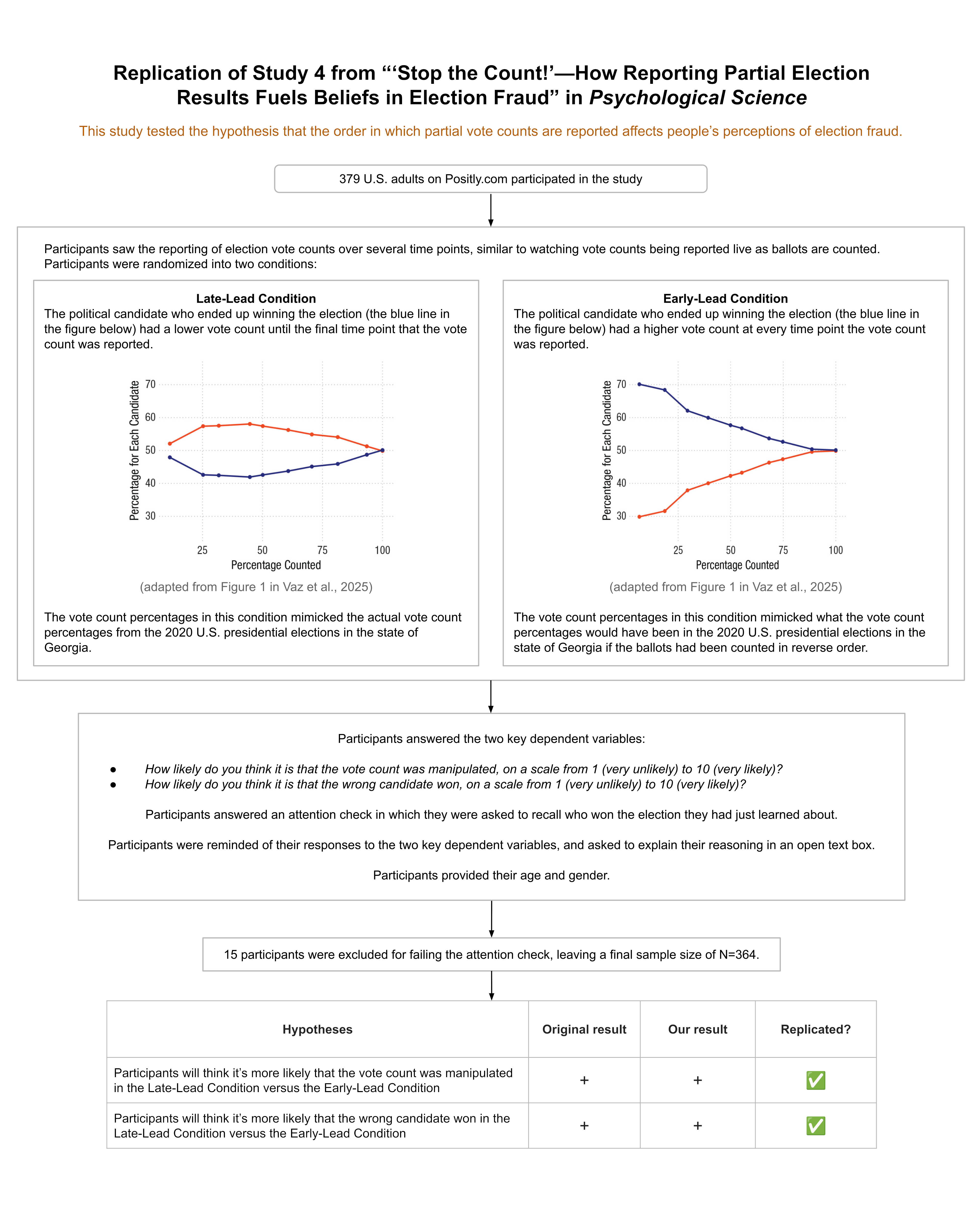
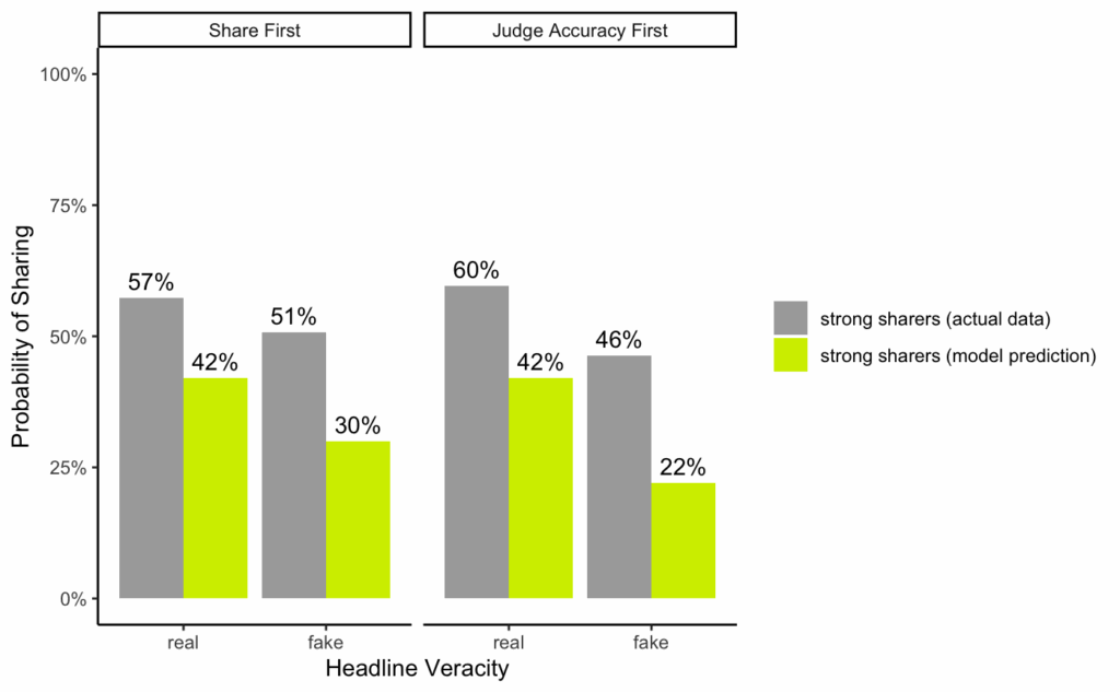
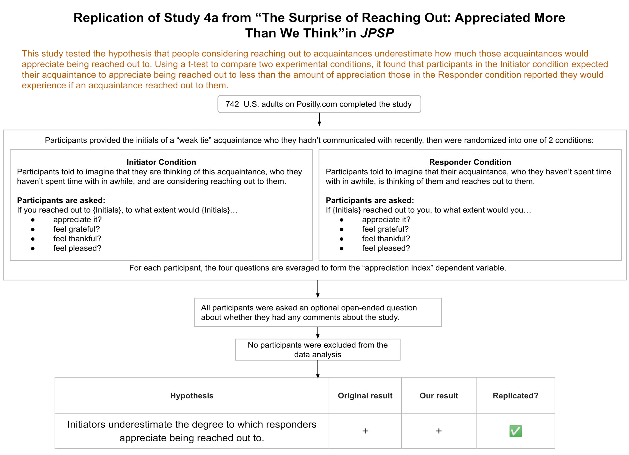
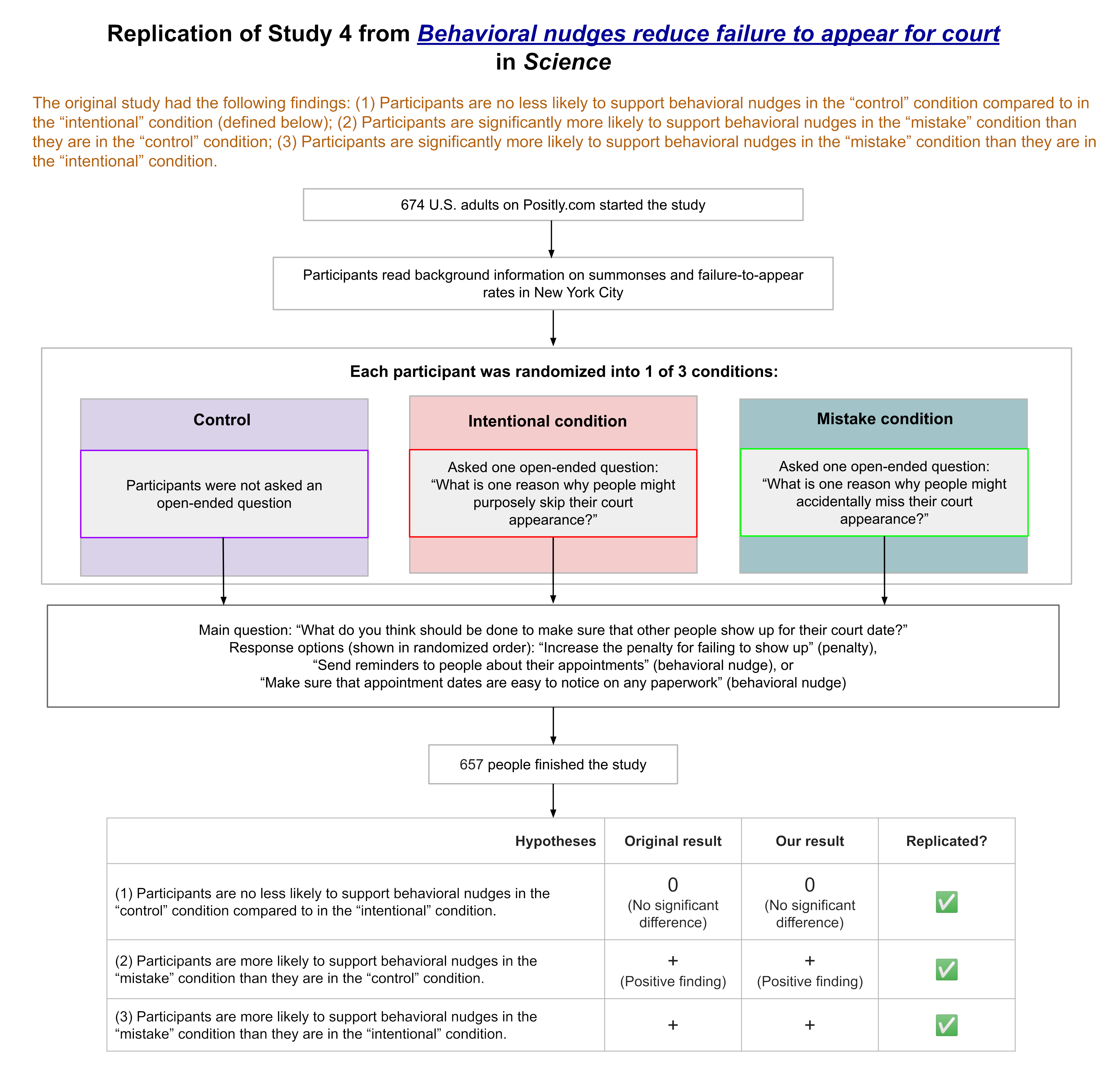
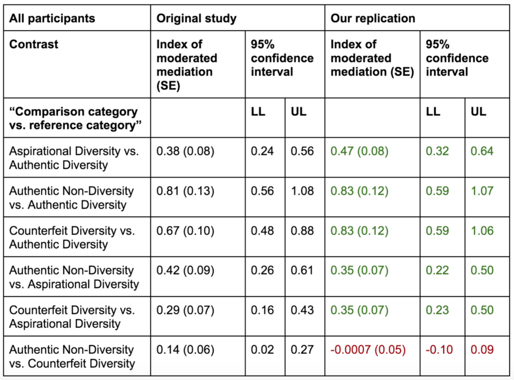
We ran a replication of Study 4 from this paper, which found that the order in which partial vote counts are reported during an election can affect people’s perceptions of election fraud.
During an election, partial vote totals are often reported as votes are counted across different municipalities. Inevitably, some municipalities are faster or slower to report electoral results given factors such as poll closing times or the volume of votes to be counted. This can cause candidates who ultimately lose the race to appear ahead at certain periods as vote counts are continuously updated.
The authors of this study hypothesized that people would be more likely to believe election fraud occurred when the electoral candidate who ultimately won took a late lead, rather than an early lead, during the continuous reporting of partial election returns. The authors hypothesized this given research on the Cumulative Redundancy Bias (CRB)—the finding that people harbor better impressions of competitors who were leading during a competition, regardless of the competition’s final outcome (see Summary of the methods for a more detailed definition).
The results from the original study confirmed the authors’ predictions: When the winning candidate took a late lead versus an early lead in the partial reported vote counts, participants were more likely to think that election fraud had occurred and that the wrong candidate had won.
Our replication found the same results.
The study received a transparency rating of 5 stars because its materials, cleaned data, and analysis code were publicly available, and it adhered to its preregistration. The paper received a replicability rating of 5 stars because all of its primary findings replicated. The study received a clarity rating of 5 stars because the claims were well-calibrated to the study design and statistical results.
We ran a replication of Study 4 from: Vaz, A., Ingendahl, M., Mata, A., & Alves, H. (2025). “Stop the Count!”—How Reporting Partial Election Results Fuels Beliefs in Election Fraud. Psychological Science, 36(8), 676-688. https://doi.org/10.1177/09567976251355594
How to cite this replication report: Transparent Replications by Clearer Thinking (2025). Report #14: Replication of a study from “‘Stop the Count!’—How Reporting Partial Election Results Fuels Beliefs in Election Fraud” (Psychological Science | Vaz et al 2025) https://replications.clearerthinking.org/2025psci36-8
Key Links
Our Research Box for this replication report includes the pre-registration, study materials, de-identified data, and analysis files.
Subscribe?
Would you like to be the first to know when a new replication report
is published or when the prediction market opens for a new
replication? If so, then subscribe to our email list! We promise not
to email you too frequently. Expect to hear from us 1 to 4 times per
month.
Overall Ratings
To what degree was the original study transparent, replicable, and clear?
Transparency: how transparent was the original study?
Materials, analysis code, and cleaned data were publicly available, and raw data was provided upon request. The study was pre-registered and the preregistration was adhered to.
Replicability: to what extent were we able to replicate the findings of the original study?
All primary findings from the original study replicated.
Clarity: how unlikely is it that the study will be misinterpreted?
This study is explained accurately, the statistics used for the main analyses are straightforward and interpreted correctly, and the claims were well-calibrated to the study design and statistical results.
Detailed Transparency Ratings
Overall Transparency Rating:
1. Methods Transparency:
The materials were publicly available and were complete.
2. Analysis Transparency:
The analysis code was publicly available and complete.
3. Data availability:
The cleaned data were publicly available and complete. The raw data were provided upon request.
4. Preregistration:
The study was preregistered and the preregistration was adhered to.
Summary of Study and Results
Summary of the methods
During an election, partial vote counts are often reported as votes are being tallied up across different municipalities. If municipalities report their votes in different orders, the trajectory of vote counts could look radically different, even though the final tally is the same.
The original study (N=195) and our replication (N=364) examined whether the order in which partial vote counts are reported affect people’s perceptions of election fraud.
The original authors hypothesized that people would be more likely to attribute election fraud when the candidate who ultimately wins gains the lead towards the end of the vote count reporting period. For example, a candidate who was trailing for most of the night as partial vote counts rolled in, but then ended up gaining a late lead and winning the election, might be more likely to be accused of election fraud than a winning candidate who led the vote count the whole night.
The authors hypothesized this given their previous research on the Cumulative Redundancy Bias. The Cumulative Redundancy Bias is a cognitive bias that occurs when people observe the progression of a competition in a cumulative format (e.g., votes added to a running total). In such a cumulative format, any new observation already contains the data from previous standings, such that a rational individual should ignore previous standings and only rely on the end result in their judgment. However, people are nevertheless influenced by interim standings and judge a “leading” competitor more positively, even if the end result is the same. As the authors state, “The repeated observation of a competitor being ahead seems to leave a lasting impression on observers that is not entirely erased by the final result” (Vaz et al., 2025, p. 677).
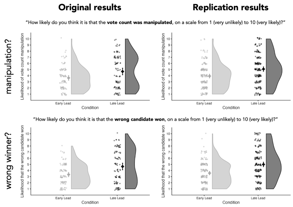
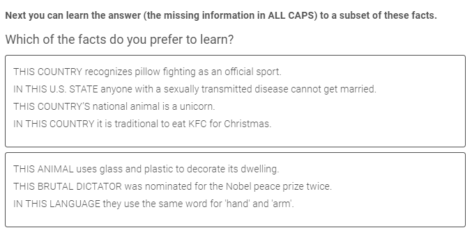
To test their hypothesis about attributions of election fraud, the authors showed participants the progression of partial vote counts of an alleged election in Eastern Europe. Participants saw the accumulated vote counts for two different candidates across 10 timepoints, where each timepoint corresponded to roughly 10% more of the vote coming in. For example, below are screenshots of the final three timepoints that some participants saw.
Figure 1. Depiction of the partial vote count information participants received in this study. The three screenshots displayed above show the final three timepoints witnessed by participants in the Late Lead Condition.
Importantly, however, there were two different patterns of results participants might see.
Participants in the Late Lead Condition saw accumulated vote counts such that the candidate who ultimately won was trailing at each of the first 9 timepoints before gaining the lead at the 10th and final timepoint.
Participants in the Early Lead Condition saw accumulated vote counts such that the candidate who ultimately won was leading during all 10 of the timepoints.
The final timepoint that participants saw, which presented 100% of the vote count, was the exact same in both conditions. The key difference between the conditions was that the candidate who ultimately won appeared to be losing up until the final timepoint in the Late Lead condition, but appeared to be winning the whole time in the Early Lead Condition.
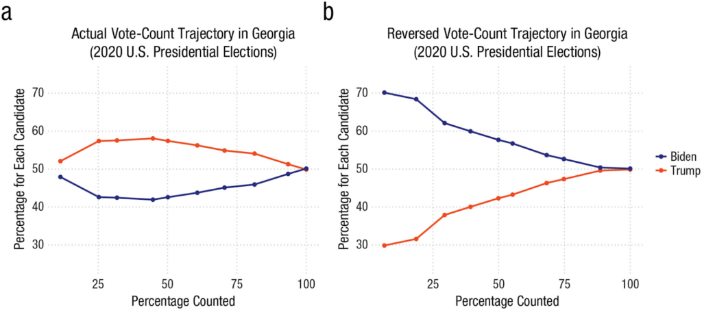
Even though participants thought they were seeing vote counts from an Eastern European election, the vote accumulations in both conditions were derived from the real election data for the state of Georgia during the 2020 U.S. presidential election. The accumulated vote counts shown in the Late Lead Condition reflected the actual order in which the vote count was reported during the election coverage. The accumulated vote counts shown in the Early Lead Condition presented roughly what the partial vote counts would have been if precincts had been reported in reverse order.
These two different vote count trajectories are displayed in a figure from the original paper, copied below:
Figure 2. Afigure copied from the original paper displaying the actual and reversed vote count trajectories in Georgia during the 2020 U.S. presidential election. The actual vote count trajectory (shown in Panel a) was used to derive the partial vote counts participants saw in the Late Lead Condition. The reversed vote count trajectory (shown in Panel b) was used to derive the partial vote counts participants saw in the Early Lead Condition. (Note that the final three timepoints denoted in Panel a align with the partial vote counts displayed above in Figure 1.)
After participants saw the vote counts at all 10 timepoints, they were told:
Shortly after the vote count was finished, rumours emerged that the vote count may have been rigged and that the wrong candidate won as a result. The people responsible for the vote count, however, denied the allegation.
Participants then answered the two primary questions of interest:
How likely do you think it is that the vote count was manipulated, on a scale from 1 (very unlikely) to 10 (very likely)?
How likely do you think it is that the wrong candidate won, on a scale from 1 (very unlikely) to 10 (very likely)?
On the next page, participants were asked to recall which of the candidates won the election:
You’re almost done.
Before you finish, we want to check if you remember who won the election.
* Lukas P. * Miroslav K. * Don’t Remember
This question served as an attention check; any participants who failed it were dropped from our analyses.
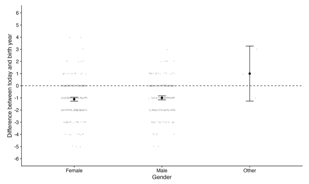
In the original study, participants then provided their age and gender to complete the study. In our replication, before participants provided their age and gender, we asked them one additional question:
Here’s how you answered two of the questions you were asked earlier:
Question: “How likely do you think it is that the vote count was manipulated, on a scale from 1 (very unlikely) to 10 (very likely)?” Your response: {this displayed the participant’s response}
Question: “How likely do you think it is that the wrong candidate won, on a scale from 1 (very unlikely) to 10 (very likely)?” Your response: {this displayed the participant’s response}
Can you briefly explain your reasoning?
We included this open-ended question so that we could assess whether the rationales participants provided were in line with the hypotheses put forth by the original paper.
Summary of the results
In the original study, participants in the Late Lead Condition thought it was more likely that the vote count was manipulated (p = .002) and more likely that the wrong candidate won (p < .001), on average.
Our replication found the same general pattern:
Dependent variable
Mean difference between Late Lead and Early Lead conditions
Finding replicated?
Findings from original study
Findings from our replication
“How likely do you think it is that the vote count was manipulated, on a scale from 1 (very unlikely) to 10 (very likely)?”
Mean diff: 1.04
t(170.66) = -3.14,
p = .002
Mean diff: 1.14
t(351.29) = -4.78,
p < .001
✅
“How likely do you think it is that the wrong candidate won, on a scale from 1 (very unlikely) to 10 (very likely)?”
Mean diff: 1.31
t(160.49) = -4.06,
p < .001
Mean diff: 1.41
t(335.45) = -6.05,
p < .001
✅
Table 1: Comparing statistical results between the original study and our replication
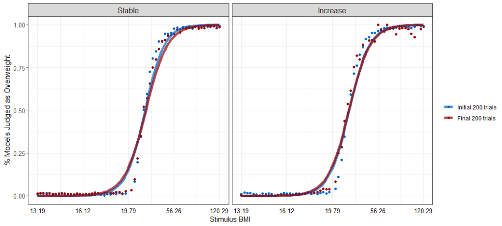
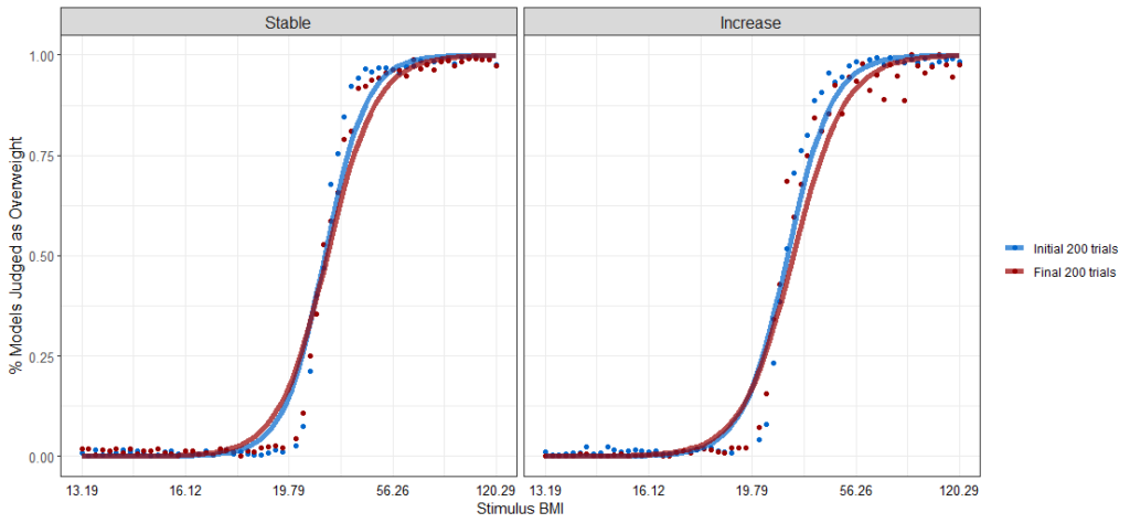
Figure 3. Comparison of results in the original study to results in our replication study. The large diamond-shaped dots represent the average values for each condition, with error bars representing the 95% confidence interval. The small dots represent each individual’s response. The curved portions represent the distribution of individuals’ responses for each condition. (We created the plots for the original results using the data made publicly available by the original authors.)
Study and Results in Detail
This section provides details about participant recruitment, minor study design differences between the original study and the replication, differences in response distributions between the original study and the replication, and results from the open-ended question.
Additional details about the methods
Participant recruitment
We aimed to have a final sample size of 366, which would provide 90% power to detect an effect that was 75% of the size of the smaller of the two effect sizes reported in the original paper. We anticipated an exclusion rate of 3% based on that observed in the original study. As a result, we recruited 377 participants on Positly.com to complete the study.
In total, 379 participants completed the study (occasionally, a few more participants complete a study than the number recruited on the platform). After excluding any participants who failed the attention check (i.e., those who couldn’t recall which candidate won the election), we were left with a final sample size of N=364 (the sample size of the original study was N=195).
Minor design differences between the original study and the replication
We kept the study design nearly identical to that of the original study, but we made three tiny alterations. We verified our study plan, including our planned alterations, with the original authors before collecting data.
Alteration 1
In the original study, the order in which the candidate names were listed was randomized and which candidate was the winner was randomized, but the candidate who ended up winning was always listed on the top row of the table that displayed the partial election counts.
We felt that it would be better to counterbalance the order of the winner, rather than the order in which the names were listed. So we tweaked the display order such that the candidates names were always displayed in alphabetical order (Lukas first, Miroslav second), but which candidate wins—and thus whether the winner is listed first or second—was randomized.
Alteration 2
In the original study, all three response options for the attention check (Lukas P.; Miroslav K.; Don’t remember) were displayed in a random order. We thought it looked strange when it was randomized such that “Don’t remember” was the middle option. We changed the randomization such that “Don’t remember” was always the third option and “Lukas P.” and “Miroslav K.” were randomly assigned to be the first and second option.
Alteration 3
As mentioned earlier, we thought it would be helpful to have participants explain why they answered the dependent variables as they did, so we included a question asking them to explain their reasoning. This question came after the two dependent variables and the attention check, such that it would not affect the results of the study in any way.
We thought this question could provide more insight into participants’ thinking process. However, we stated in our preregistration that participants’ responses to this question would not impact the replicability score the paper received.
Additional details about the results
Differences in distributions of participant responses
Even though the results from the statistical tests run on the original data and our replication data returned very similar results (see Table 1), some of the distributions of participants’ responses looked different between the two datasets.
As you can see in Figure 3, copied below, the distribution of participants’ responses in the Early Lead Condition look pretty similar between the original data and the replication data. However, the distributions of responses in the Late Lead Condition differ. In the original data, participants’ responses in the Late Lead Condition appear bimodal, such that there are two common responses (values in the lower-middle part of the scale, and values in the upper-middle part of the scale). In the replication data, participants’ responses appear unimodal, such that there is a single most common response (values in the middle of the scale).
Figure 3. Comparison of results in the original study to results in our replication study. The large diamond-shaped dots represent the average values for each condition, with error bars representing the 95% confidence interval. The small dots represent each individual’s response. The curved portions represent the distribution of individuals’ responses for each condition. (We created the plots for the original results using the data made publicly available by the original authors.)
It is not clear what to attribute this difference to, but future research should focus on this discrepancy because different distributions of responses tell different stories.
The original data seem to suggest that, in the Late Lead Condition, a sizable group of people think it’s likely that election fraud occurred and another sizable group of people think it’s unlikely that election fraud occurred. These data could mean that there’s a sizable group of people that are quite sensitive to whether a candidate takes a late lead, and there’s another sizable group that are insensitive to late-lead situations.
On the other hand, our replication data seems to suggest that, in the Late Lead Condition, the most common response is that people are unsure whether election fraud occurred. These data could mean that most people are slightly sensitive to whether a candidate takes a late lead.
However, because this study used a between-subjects design, it is difficult to precisely assess how many people were affected by the experimental manipulation and in what way they were affected. A within-subjects design would be needed to assess how each individual participant’s ratings differed in the Late Lead Condition compared to the Early Lead Condition. This would allow us to more accurately estimate what percentage of people are likely to be unaffected, mildly affected, and strongly affected by a candidate taking a lead late rather than an early lead.
Future work that employs a within-subjects design could provide more information about individuals’ sensitivity to late-lead dynamics, which could help contextualize the distributions observed in the Late Lead Condition.
Results from open-ended question
As described earlier, we asked participants to explain why they answered the two key questions as they did. Here’s the exact question we asked them:
Here’s how you answered two of the questions you were asked earlier:
Question: “How likely do you think it is that the vote count was manipulated, on a scale from 1 (very unlikely) to 10 (very likely)?” Your response: {this displayed the participant’s response}
Question: “How likely do you think it is that the wrong candidate won, on a scale from 1 (very unlikely) to 10 (very likely)?” Your response: {this displayed the participant’s response}
Can you briefly explain your reasoning?
We included this open-ended question so that we could assess whether the rationales participants provided were in line with the hypotheses put forth by the original paper. We preregistered that, since this question was not included in the original study, we would not factor participants’ responses to this question into our replicability rating.
To get a high-level sense of how participants answered this question, we ran their responses through a large language model (LLM)—specifically, ChatGPT-5.2-thinking.
It’s important to say upfront that the results from the LLM we present below should not be interpreted as rigorous, well-vetted findings. Rather, it’s akin to having a human read through all of the responses and providing their own idiosyncratic grouping of people’s explanations. That said, we still think it’s a helpful way to get an approximation of what participants were thinking. Anyone interested in doing more formal analyses on this free response data is welcome (and encouraged!) to do so. This data is publicly available here. Additionally, we’ve included the exact prompts we used and links to the full responses from the model in the Appendix (see the section titled “Additional Information about the Results”).
We asked the LLM to summarize the different types of explanations participants provided. We fed the model the responses from participants in the Early Lead Condition and the Late Lead Condition separately. In other words, we gave the model the same prompt twice and in one instance it had access to the Early Lead Condition data and in the other instance it had access to the Late Lead Condition data.
Here’s how the model summarized the responses from participants in the Early Lead Condition:
ChatGPT’s breakdown of typical responses in the Early Lead Condition
1) “It was very close, so anything could have tipped it”
Many explanations anchored on the small final margin: a close race was seen as inherently more vulnerable to manipulation, counting error, or late-breaking irregularities (often paired with “should be investigated/recounted”).
2) “The winner led the whole time / the trajectory looked normal”
A common reasoning pattern was: the vote totals progressed consistently and the eventual winner was ahead throughout (or at least not showing a shocking reversal), which participants treated as evidence that the count was probably legitimate.
Approx. prevalence: ~28% referenced a steady lead / consistent progression.
3) Baseline trust in electoral administration
Some participants relied primarily on a prior belief that elections are generally fair (or that large-scale rigging is unlikely / would be detected), and therefore rated manipulation and “wrong winner” as unlikely absent concrete evidence.
Approx. prevalence: ~28%.
4) Baseline distrust / “elections (especially here) are often rigged”
Another major cluster leaned on a general cynicism about elections (sometimes explicitly tied to the setting—e.g., “Eastern Europe,” corruption, “politicians cheat,” etc.). These explanations treated the rumor as plausible because it fits a broader worldview.
Approx. prevalence: ~26%.
5) “The pattern looked suspicious” (gap-closing, odd shifts, “fishy” dynamics)
A smaller set pointed to features of the time series—e.g., one candidate steadily closing the gap, a late surge, or otherwise “weird/odd” dynamics—as suggestive of manipulation (even if they acknowledged alternative explanations).
Approx. prevalence: ~11%.
6) “Reporting order / geography can explain shifts”
Some participants explicitly invoked benign process explanations, such as different regions (urban vs rural, city vs country) reporting at different times, which could naturally produce changing margins as additional votes come in.
Approx. prevalence: ~7%.
7) “Rumor isn’t evidence / not enough information to know”
A distinct explanation style emphasized epistemics: participants said the prompt provides no proof, so they cannot confidently infer manipulation or a wrong winner; they often landed on mid-scale ratings (“could go either way”) or low ratings due to lack of evidence.
Approx. prevalence: ~8–10%.
8) Separation of the two judgments: manipulation vs wrong winner
A smaller subset explicitly distinguished: some manipulation could be possible without it being enough to flip the outcome (or conversely, the outcome could be wrong even if manipulation is uncertain).
Approx. prevalence: ~3% were very explicit about this distinction.
9) “If it were rigged, they wouldn’t make it that close”
A few participants used a strategic argument: if an actor rigged the election, they would likely engineer a clearer margin; the fact that the result was tight was interpreted as evidence against manipulation.
Approx. prevalence: ~3%.
Here’s how the model summarized the responses from participants in the Late Lead Condition:
ChatGPT’s breakdown of typical responses in the Late Lead Condition
1. Suspicious Late Shift / “Come-from-Behind” Narrative Many participants focused on the temporal pattern of the vote count. Explanations in this category emphasize that one candidate led for most of the count, only to lose near the end.
Typical reasoning: * A large or sudden swing in the final timepoints “felt suspicious.” * The winner’s late surge was described as “illogical,” “unlikely,” or “not natural.” * The timing of the shift (e.g., in the last 10–20% of votes) was taken as prima facie evidence of manipulation.
This was the most common explanation among participants who rated manipulation or a wrong winner as likely.
2. Stability Expectations / Linear Trend Heuristics Closely related, but conceptually distinct, some participants argued that vote shares should remain relatively stable as more votes come in.
Typical reasoning: * Percentages “shouldn’t change that much” once a large portion of votes is counted. * Large deviations late in the count violate expectations of smooth or linear accumulation. * Participants implicitly assumed early trends are representative of the final outcome.
This reflects a heuristic expectation of convergence that does not account for heterogeneous vote sources.
3. Benign Explanations: Geographic or Demographic Differences Many participants explicitly rejected fraud explanations by invoking real-world electoral processes.
Typical reasoning: * Different regions or population centers report results at different times. * Urban vs. rural areas, or regions favoring different candidates, may be counted later. * A late swing is therefore plausible without manipulation.
These explanations often referenced: * Population density * Regional political preferences * Order of precinct reporting
This category was especially common among participants who judged manipulation as unlikely.
4. Close Race / Margin-Based Reasoning Some participants focused primarily on how close the election was overall.
Typical reasoning: * Because the margin was small, late changes could realistically flip the outcome. * Close races are inherently volatile, so reversals are not surprising. * Conversely, some argued that a close margin makes manipulation easier and therefore more plausible.
Thus, closeness was used both to argue for and against fraud, depending on the participant.
5. Lack of Evidence / Epistemic Caution A substantial number of responses emphasized uncertainty and insufficient information.
Typical reasoning: * “There’s no proof either way.” * Rumors alone are not strong evidence. * Without concrete data or corroboration, strong conclusions are unwarranted.
These participants often gave moderate likelihood ratings and explicitly acknowledged ambiguity.
6. Trust in Institutions or Electoral Norms Some explanations relied on generalized trust assumptions.
Typical reasoning: * Election authorities denied wrongdoing, which carries weight. * Large-scale manipulation would be difficult to hide. * Elections are usually fair, even if imperfect.
This reasoning often appeared in combination with skepticism toward rumor-based allegations.
7. Contextual or Cross-National Analogies A smaller subset of participants referenced broader political contexts.
Typical reasoning: * Comparisons to elections in other countries (e.g., “this wouldn’t happen where I live”). * Assumptions about corruption levels in Eastern Europe (sometimes explicit, sometimes implied). * General beliefs about how “rigged elections” usually look.
These explanations relied more on background beliefs than on the specific vote trajectory shown.
These summaries raise a few interesting points.
First, some of the common explanations in both conditions support the hypothesis from the original paper. According to the LLM, a common explanation in the Late Lead Condition was that it was suspicious that the winner only gained the lead towards the end of the vote count reporting cycle. Moreover, a common explanation in the Early Lead Condition was that it was unlikely that manipulation occurred given that the eventual winner was in the lead throughout the vote count reporting. Both of these explanations are consistent with the original paper’s cumulative-redundancy-bias account for why people would think manipulation is more likely in the Late Lead Condition.
Second, some participants seemed savvy to more benign reasons a candidate might gain a late lead in the vote count reporting cycle. Although these explanations were less common than those discussed in the paragraph above, some participants noted that the order in which geographic areas report vote counts can cause late-lead dynamics.
Finally, a lot of participants seemed to justify their responses by simply appealing to their prior beliefs about how common or uncommon election manipulation is.
Overall, the fact that some of the most common explanations participants provided were directly aligned with the authors’ cumulative-redundancy-bias account corroborates the authors’ hypothesis, especially for the subset of participants who provided that explanation explicitly.
It is also possible that the original paper’s account accurately explains the judgments of participants who provided explanations that do not align with the Cumulative Redundancy Bias. After all, it’s possible that some participants were influenced by the Cumulative Redundancy Bias, but didn’t realize it. Interestingly, in Study 6 of the paper (which we did not attempt to replicate), participants were provided a benign explanation for swings in the vote count totals—that votes were counted first in the rural areas where the losing candidate was more popular. The study found that, even with this explanation in hand, participants in the Late Lead Condition still thought election manipulation was more likely.
As such, it’s difficult to estimate from these explanations alone how many people’s judgments were influenced by the Cumulative Redundancy Bias. Even with this explanation data, we don’t know whether the observed differences between conditions were driven by a subset of participants responding strongly, or by a large proportion of participants responding mildly. As mentioned in the previous subsection, a within-subjects design would provide more insight into how many participants showed the hypothesized effect and to what degree. Coupled with participants’ explanations for their ratings, a within-subjects design would allow researchers to examine questions like: how many participants who were sensitive to the winning candidate taking a late lead provided an explanation consistent with this experimental manipulation? Ultimately, the fact that so many participants conjured explanations that directly align with the Cumulative Redundancy Bias supports the main hypothesis in the paper.
Interpreting the Results
All of the results from the original study replicated when analyzed on the data we collected. In addition to finding the same general patterns, the mean values and differences between conditions we observed were very similar to the original study (see Figure 3).
When assessing this study in isolation, one might wonder if the observed effects are really attributable to whether the candidate gained a late lead versus an early lead. After all, if you inspect the sequence of partial vote counts participants saw in both conditions (see Figure 2), there were other differences beyond the early-lead/late-lead factor. For example, in the Late Lead condition, the race appears fairly close at every timepoint, whereas, in the Early Lead condition, the race only becomes close towards the end. This represents a difference between the conditions that was not experimentally controlled for. From this study alone, we can’t know whether such differences mattered. However, the original paper has a total of seven studies, many of which rule out alternative explanations. For example, Study 5 uses almost exactly the same sequence of partial vote counts in both conditions, and still finds a similar effect to that observed in Study 4. We recommend reviewing the other studies in the original paper for those interested in alternative explanations for these results.
Another thing to note is that because this study used a between-subjects design, we are not able to directly assess what percentage of the participants were influenced by the order in which partial vote counts were reported. For example, it could be the case that the differences in average ratings between the conditions were due to a small number of participants being strongly affected by the partial vote count order or due to a large number of participants being mildly affected by the partial vote count order. This could be useful for future research to untangle.
Finally, it is worth mentioning that Psychological Science, the academic journal that published the original paper, has recently instituted a series of transparency requirements. They now require authors to publicly share data, study materials, analysis code, and deviations from preregistrations. They also ensure that the results in a paper are computationally reproducible and emphasize the importance of not overclaiming. These are not simply stated policies of the journal, but are elements actively assessed by specific editors at the journal whose role is to evaluate the transparency of submitted articles. (You can read about these policies in more detail, and the rationale behind them, in this editorial.)
This was the first Psychological Science paper we replicated that was published after these policies were implemented. Many of the issues we’ve run into when replicating previous studies—e.g., overclaiming, coding errors, deviations from preregistrations that went unacknowledged—were not present in this paper. We cannot, of course, attribute the quality of this paper to the new policies at Psychological Science since the authors might have taken the same actions regardless of the journal’s policies. Nevertheless, Psychological Science’s policies seem likely to substantially improve the transparency and clarity of articles published in this journal.1
1It is important to acknowledge that I (the author of this report) volunteer as a reproducibility checker for Psychological Science, which could be biasing my view on the positive potential of these policies instituted at Psychological Science.
Conclusion
Overall, we successfully replicated the two primary findings from the original study. Both the original study and our replication found that participants were more likely to think election fraud had occurred and that the wrong candidate had won when the winning candidate took a late lead, rather than an early lead.
The study received a transparency rating of 5 stars, a replicability rating of 5 stars, and a clarity rating of 5 stars.
It is important to note that the study we replicated was one of seven studies reported in the original paper. As such, our replication only directly assesses a small proportion of the findings reported in the paper.
Acknowledgements
We want to thank the authors of the original paper for making their data and materials publicly available, and for their quick and helpful correspondence throughout the replication process. Any errors or issues that may remain in this replication effort are the responsibility of the Transparent Replications team.
We also owe a big thank you to our 364 research participants who made this study possible.
Finally, we are extremely grateful to the rest of the Transparent Replications team for their advice and guidance throughout the project.
Purpose of Transparent Replications by Clearer Thinking
Transparent Replications conducts replications and evaluates the transparency of randomly-selected, recently-published psychology papers in prestigious journals, with the overall aim of rewarding best practices and shifting incentives in social science toward more replicable research.
We welcome reader feedback on this report, and input on this project overall.
Appendices
Additional Information about the Methods
The table below displays the full set of partial vote counts participants witnessed, depending on the experimental condition they were assigned to.
The “% of votes reported” column displays the percentage of votes that participants learned had been counted at that point.
The “Vote count” column displays the running total of the votes each candidate had received.
In this table, we have denoted the candidates as “Winner” or “Loser” which refers to whether the candidate ended up winning or losing once the final votes were in (participants did not see these terms; instead they saw the names of the candidates).
See Figure 1 in the Summary of the methods section to see how these numbers were presented to participants at each timepoint.
Timepoint
Late Lead Condition
Early Lead Condition
% of votes reported
Vote count
% of votes reported
Vote count
1
11.37%
Winner: 47.92% Loser: 52.08%
6.54%
Winner: 70.13% Loser: 29.87%
2
25.22%
Winner: 42.61% Loser: 57.39%
18.65%
Winner: 68.40% Loser: 31.60%
3
31.76%
Winner: 42.46% Loser: 57.54%
29.45%
Winner: 62.10% Loser: 37.90%
4
44.71%
Winner: 41.94% Loser: 58.06%
39.28%
Winner: 59.95% Loser: 40.05%
5
50.10%
Winner: 42.58% Loser: 57.42%
49.90%
Winner: 57.69% Loser: 42.31%
6
60.72%
Winner: 43.76% Loser: 56.24%
55.29%
Winner: 56.74% Loser: 43.26%
7
70.55%
Winner: 45.12% Loser: 54.88%
68.24%
Winner: 53.68% Loser: 46.32%
8
81.35%
Winner: 45.93% Loser: 54.07%
74.78%
Winner: 52.65% Loser: 47.35%
9
93.46%
Winner: 48.72% Loser: 51.28%
88.63%
Winner: 50.40% Loser: 49.60%
10
100.00%
Winner: 50.12% Loser: 49.88%
100.00%
Winner: 50.12% Loser: 49.88%
Table 2. Partial vote counts shown at each timepoint in each condition
Additional Information about the Results
Below is the prompt we fed to ChatGPT-5.2-thinking (on December 22, 2025) in order to have it summarize the explanations participants provided in the study. As described in the section titled “Results from open-ended question,” we fed the model the responses from participants in the Early Lead Condition and the Late Lead Condition separately.
I have attached data from a study about election fraud. In this study, participants saw the progression of partial vote counts of an election in Eastern Europe. Participants saw the accumulated vote counts for two different candidates across 10 timepoints, where each timepoint corresponded to roughly 10% more of the vote coming in. The final timepoint showed the official, final vote count.
After participants saw the vote counts at all 10 timepoints, they were told:
“Shortly after the vote count was finished, rumours emerged that the vote count may have been rigged and that the wrong candidate won as a result. The people responsible for the vote count, however, denied the allegation.”
Participants then answered the two primary questions of interest:
“How likely do you think it is that the vote count was manipulated, on a scale from 1 (very unlikely) to 10 (very likely)?” (in this dataset, this is the column “likely_manipulated”)
“How likely do you think it is that the wrong candidate won, on a scale from 1 (very unlikely) to 10 (very likely)?” (in this dataset, this is the column “likely_wrong_candida”)
Participants were then asked to explain their reasoning for their responses to these questions (in this dataset, these explanations are shown in the column “explanation”).
Can you please summarize the different types of explanations participants provided?
You can view the full response from ChatGPT-5.2-thinking for the Late Lead Condition here (https://chatgpt.com/share/694981bd-8460-8006-ad49-a9030c424918) and the Early Lead Condition here (https://chatgpt.com/share/69504a28-95cc-8006-a90a-8c314ddd4b53).
References
Faul, F., Erdfelder, E., Buchner, A., & Lang, A.G. (2009). Statistical power analyses using G*Power 3.1: Tests for correlation and regression analyses. Behavior Research Methods, 41, 1149-1160. https://doi.org/10.3758/BRM.41.4.1149
Vaz, A., Ingendahl, M., Mata, A., & Alves, H. (2025). “Stop the Count!”—How Reporting Partial Election Results Fuels Beliefs in Election Fraud. Psychological Science, 36(8), 676-688. https://doi.org/10.1177/09567976251355594
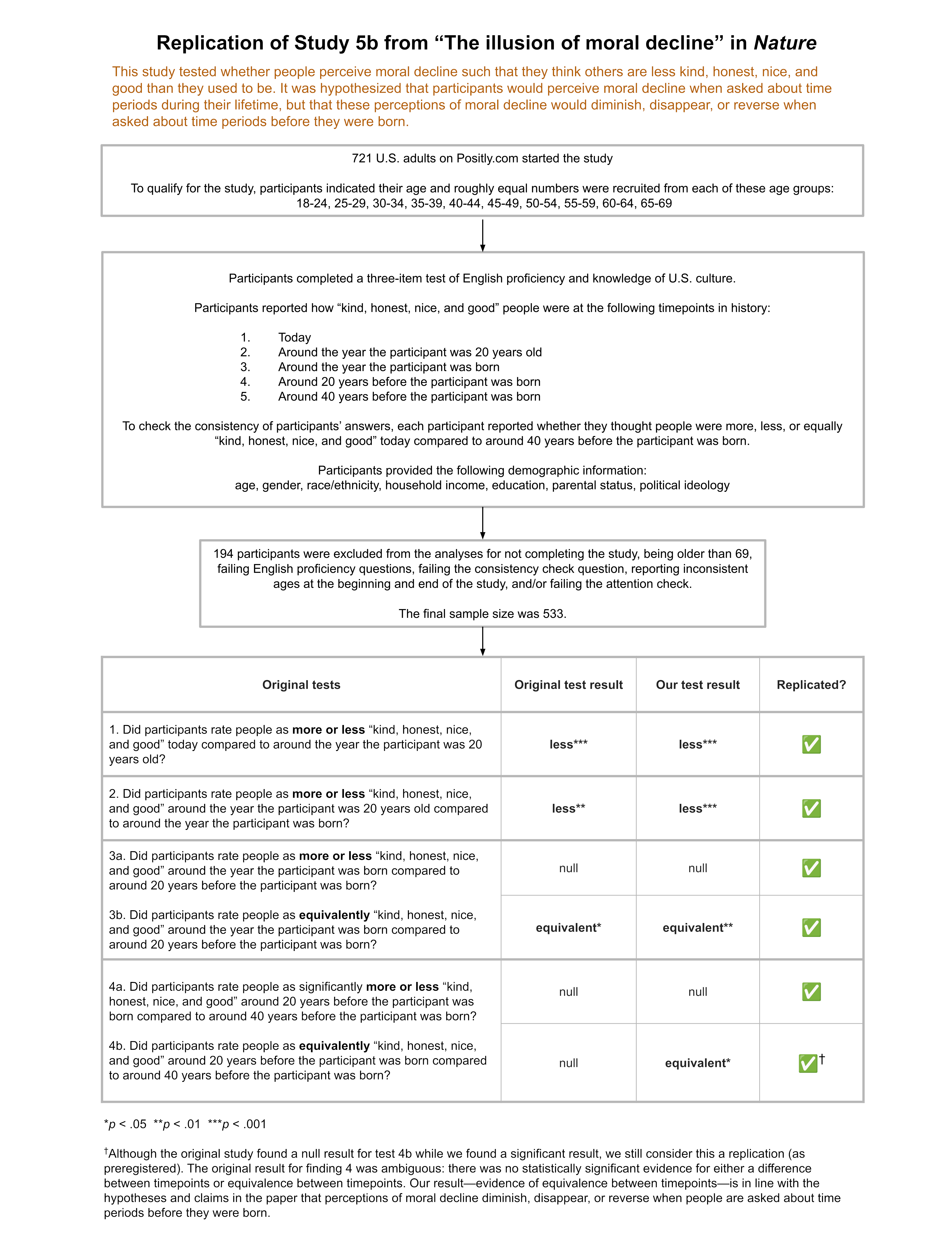
How has the replication rate of psychology studies changed in recent years?
Are we still experiencing a “replication crisis,” where only 40-60% of results replicate when the study is conducted again?
Psychology experts who we surveyed predicted that 55% of recently published studies published in top journals would replicate, suggesting that they think the field is still experiencing a serious replication crisis, although they also believe that substantial progress has been made, as we discussed in Part 1. Is their assessment accurate?
We completed our first dozen replication attempts on recent papers selected randomly1 from top journals, and what we found really surprised us! As we’ll explore in the rest of this article, while the research looked much better than we expected on one metric, results on another metric (that’s rarely discussed) are more discouraging.
Unlike other replication projects, which have focused on prominent older findings or have been limited to a single journal, our project focuses on recent papers, randomly selected from the top journals in the field. By selecting papers randomly and focusing on recent publications at the top of the field, we can use these replication results to reflect on the state of the field right now.
In addition to using a different selection process for papers, at Transparent Replications we don’t look at replicability in isolation. We rate studies on three criteria:
The Transparency rating assesses the availability of study materials, data, and analysis code; as well as whether study was pre-registered and how well the pre-registration was followed.
The Replicability rating reports how many of the main findings reported in the study replicated when we conducted the study again with new data.
The Clarity rating evaluates how likely we believe a reader is to come away with an accurate impression of the study and results from reading the paper.
We rate studies on these three categories because replicability alone doesn’t tell the whole story of what makes papers useful and reliable.Transparency makes it possible to understand a result, and is often necessary for a faithful replication or reproduction. Clarity, which is a novel rating that we developed, allows us to assess factors that could be a problem even in papers that replicate – for example, overclaiming, validity issues, or other errors in the paper that would lead readers to misunderstand the implications of a result.
The table below shows the distribution of ratings on Transparency, Replicability, and Clarity for the first dozen reports that we conducted. Ratings under 4 stars are in bold. The ratings are on a scale of 0 to 5 stars.
Report
Transparency
Replicability
Clarity
#1
5
4.25
3.5
#2
4.25
4
3.5
#3
4
2
5
#4
4
5*
3.75
#5
3
5
1
#6
3.75
4.5
3.5
#7
5
5
4.5
#8
3.5
5
2.5
#9
4.25
5
3
#10
4.25
5
5
#11
4.5
0
2.5
#12
3.75
N/A
0
Average:
4.1
4.1
3.1
* We selected 2 studies from this paper, both of which completely replicated.
We found our results on all three of these ratings to be somewhat unexpected, but the replication rate is especially at odds with psychology experts’ perceptions about the field.
Surprise 1: Replication rates are higher than experts predicted and p-hacking is much less common than we expected!
One of the most surprising things to us is how well the studies replicated. We’ve completed 12 reports (with a number of others currently in progress). In the replication studies that we conducted, 10 of them completely or mostly replicated, and only 2 had primary findings that mostly did not replicate.2 This is a rate of 83%, compared to the experts prediction of 55%. Of course 12 is a small number, so these should be considered preliminary findings until we have completed more replication reports.
The replicability rating score is the percent of study’s main findings that replicated, converted into a 0 to 5 star range. A study that received a rating of 4 had four-fifths (or 80%) of its main findings replicate, while a study with a rating of 2 only had two-fifths (or 40%) of its main findings replicate. Many studies only had one main finding, which means they could only receive a score of 5 (100%) if the finding replicated, or a score of 0 (0%) if the finding did not replicate.
Here’s a summary of the replicability scores:
In addition to the high replicability rate overall, it’s informative to look into the reasons why the 2 studies that largely failed to replicate didn’t replicate.
In one case we believe that the lack of replication was due to the statistical power issues.3 For that reason, we don’t take it as meaningful evidence that we should reduce our confidence in the original paper’s findings. That report was instructive for demonstrating how much impact subtle experimental design decisions can have on statistical power, especially in more complex statistical models.
In the other case of replication failure, we think the study’s main finding didn’t replicate because the original sample had a peculiar characteristic that the authors diagnosed and acknowledged, but that influenced the results in an unanticipated way. In this case we do think the lack of replication should reduce confidence that the claimed effect in the paper is real, but we don’t see any evidence of p-hacking in this paper. This finding not replicating demonstrates the value of replicating research findings even when no p-hacking is suspected – spurious results can occur even when researchers do their work carefully, and replication is how those results are detected.
That means that in our first 12 completed replications, we did not find a single case where we believe substantial p-hacking meaningfully impacted the results! (As a reminder, p-hacking is consciously or unconsciously taking advantage of choices available to researchers in data collection or data analysis to generate or selectively report results that meet the statistical significance threshold (e.g., p<0.05), when a result wouldn’t otherwise have been statistically significant.)
The lack of evidence of p-hacking is shocking when you compare it to large replication studies, like the Open Science Collaboration’s replication of 100 studies from the 2008 issues of three prominent journals, the replication of 21 papers published from 2000-2015 in Nature and Science, or the Many Labs project’s multiple replications of prominent findings that were originally reported from 1936 to 2014. In these replication projects, covering papers from ten or more years ago, roughly 40%-60% of papers failed to replicate, with many (and perhaps the vast majority) of those failures seemingly due to p-hacking.
While 12 is obviously a small number (and we’ll have more data over time), if we assume that rates of substantial p-hacking for main findings is 40% – which we believe is a reasonable estimate of what they were 15 years ago based on data from large-scale replication studies, then there would only be about a half of a percent chance that we would find no cases of substantial p-hacking out of 12 replications conducted! Even if we are mistaken and 1 of the studies we replicated had substantial p-hacking influencing the finding, that would still indicate less than a 3% chance of having that few (or fewer) such cases out of 12 if the base rate was 40%! (Supporting calculations for this paragraph are in the Appendix.)
This suggests to us that p-hacking may now be substantially less common than it used to be. Increasing transparency, preregistration, and awareness of the problem may have influenced reviewer comments, and editor decisions. Additionally, as p-hacking has come to be considered less acceptable and the problems with it more widely understood, researchers may simply be holding themselves to a higher standard in their own research.
Surprise 2: Public availability of data and materials is widespread, yet deviations from pre-registration are commonly not acknowledged
In addition to higher than expected replication rates, we were pleasantly surprised by how strong transparency practices are in recent papers in top journals, although more work needs to be done to ensure that deviations from pre-registration are acknowledged in published papers.
Looking at the chart below, you can see that the lowest transparency rating so far has been a 3 out of 5. The average transparency rating of our reports overall is 4.1. At least from this limited dataset, what this tells us is that, in top journals in the field, data, analysis code, and experimental materials are usually publicly shared. This may be due to top journals expecting that these materials are shared. Preregistration is fairly common, but far from universal.
Our Transparency rating includes 4 sub-ratings. The first three assess the availability and completeness of study materials (1), analysis code (2), and data (3). The fourth is about pre-registration, including whether the study is pre-registered, how well the pre-registration is followed, and whether deviations from the pre-registration are acknowledged in the paper. In practice, a study receiving a 3 for Transparency may have study materials and data publicly available, but not have analysis code available, and have major undisclosed deviations from the preregistration. A study receiving a 4 likely has materials, data, and code that are available, but the study wasn’t pre-registered. A study receiving a 5 follows its pre-registration (or acknowledges and explains any deviations), and has study materials, analysis code, and data that are complete and publicly available. A full explanation of our Transparency rating system is available here.
This level of transparency is a serious improvement over past practices, and makes it much more possible for replication and reproduction of studies to be conducted. Open science norms about transparency appear to be much more widespread than they used to be.
The most serious transparency issue that we ran into is that a study may be pre-registered, but deviate from the pre-registered analysis plan without acknowledging the changes that were made. In the first dozen reports, seven of the studies were preregistered; however, of those seven studies, only two followed their preregistration without any unacknowledged deviations. One had minor deviations in exclusion criteria that weren’t disclosed, two more had moderate unacknowledged deviations from their preregistration, and two had major unacknowledged deviations.
Sometimes it is appropriate to deviate from a preregistration, but when that happens, the paper should acknowledge the changes and explain why they were made. Preregistration can only do its job of reducing researcher degrees of freedom and preventing questionable research practices like p-hacking and unreported instances of HARKing (Hypothesizing After the Results are Known) if the preregistration is followed.
When journals evaluate submitted papers, it should be standard practice to compare the preregistration to the paper to see if they are consistent, and if there are inconsistencies ensure that they are disclosed and explained. It’s excellent to see that Psychological Science has started doing exactly that with all published papers starting at the beginning of this year. We hope to see more journals implement that best practice.
Since top journals are starting to require submissions to meet many of these transparency benchmarks, we think it is likely that we’ll continue to see high transparency ratings for papers as we conduct more replications. Hopefully other journals will follow the lead of Psychological Science and check for deviations from pre-registration and include a report of those deviations with the published paper. That would go a long way to improving the main transparency issue that we found in our first twelve replication reports.
Surprise 3: Importance Hacking and/or errors affect most papers, and appear to be much bigger issues than p-hacking!
The rating area where we see the most need for improvement is Clarity. From looking at the chart you can see that Clarity ratings vary much more widely than Transparency ratings. The Clarity rating averaged over our first dozen reports was 3.1, an entire point lower than the averaged Transparency rating.
The clarity rating addresses how likely we believe a reader is to come away with an accurate impression of the study and results from reading the paper. Low clarity suggests that a reader may be likely to misunderstand key aspects of the research or its implications.
There are two main classes of issues that reduce the clarity of a paper. Only two of the twelve papers we evaluated had neither type of clarity issue.
Clarity Issue 1: Errors (and imprecision)
The first clarity issue we look for are errors or imprecision in the study materials, analyses, and paper. We also evaluate the severity of errors and impressions. For example, an error that is minor or that doesn’t impact the main takeaway of a study impacts the clarity rating much less than an error that changes the study’s takeaway, and much less than if the study involved a long list of small errors.
A total of eight of the twelve papers we evaluated had issues of this type, three of which we would consider to have major issues.
For example, across different studies that we investigated, we found composite variables that were miscalculated, incorrect statistical tests being used, and experimental materials which included mistakes in key questions.
We also evaluated studies where key features of the study that would be important to the reader understanding and interpreting the results were not clearly described in the paper. We found five papers with minor issues in communicating information the reader would need to understand the study and results. These issues included inaccuracies in descriptions of study procedures, incorrect numbers in results tables, and omissions of important information about key variables.
We consider these issues of error and imprecision together because the distinction can be difficult to make in practice. For example, if a variable is calculated differently in an analysis than how it seems to be described in the paper, it’s possible that the calculation was done that way incorrectly (in error), or that the explanation in the paper is an unclear (or imprecise) description of what was done. Ultimately, whether such an occurrence is an error (they did a calculation that was different than they intended) or an example of imprecision (they did what they intended but misexplained it to the reader) comes down to the intention of the researchers, which usually can’t be evaluated from the paper and its materials.
We were surprised by the amount of error that we encountered in published papers (which, recall, were all published in top peer-reviewed journals). This suggests that improvements need to be made to editorial processes so that these issues are detected and addressed prior to publication.
Along these lines we are pleased to see that, in addition to reporting on deviations from preregistration, Psychological Science has started reproducing statistical results prior to publication for many of their papers. While some of the errors that we encountered would have required a more in-depth investigation to detect, we suspect that at least two of the three cases of serious errors we found would have been detected had they been subjected to this review process.
If other journals implement more rigorous pre-publication checks, that would go a long way to addressing the more severe cases of this issue. If the analysis code doesn’t run properly, the analysis has issues (like the model failing to converge), the paper mislabels the statistical tests used, or there are discrepancies in the reported results, this kind of check would have a good chance of detecting it.
Clarity Issue 2: Importance Hacking
The second issue that reduces the clarity of a paper is what we call, “Importance Hacking.” Oddly, we do not believe this concept had a standard name before we gave it one, despite it being commonplace. We think it’s critical to have a name for this phenomenon, because we believe it is not only common, but important to address for making further improvements in how science is practiced.
Seven of the twelve studies had at least a minor Importance Hacking issue in our analysis, three of which were more severe.
Importance Hacking occurs when real, replicable findings are made to appear more valuable or worthy of publication than they really are. In some cases, Importance Hacking pushes a paper across the threshold from unpublishable to publishable by convincing journal editors and reviewers that a paper merited publication when, in fact, it didn’t. We refer to those as “Importance-Hacked acceptances.”
Importance Hacking can include a variety of problematic research practices such as overclaiming, hype, lack of generalizability, claims that don’t actually follow from the statistical results, and/or tiny effect sizes that lack real world significance. For more about the types of Importance Hacking see Spencer Greenberg’s Clearer Thinking article.
We found lack of generalizability and insufficient engagement with plausible alternative explanations were the most common Importance Hacking issues in the first dozen papers. In addition to those more common issues, we found a study that used a complex analysis implying a result that wasn’t supported if a simple (but still valid) analysis was done. Another study made central claims that did not match the evidence provided.
Although there have been some calls for attention to issues of generalizability, ecological validity of experiments, and small effect sizes; addressing Importance Hacking hasn’t yet gotten the attention that tackling p-hacking and other questionable research practices has received. Our preliminary findings suggest this is the next major frontier for improving research.
To tackle Importance Hacking we need to change norms and develop new techniques. For example, requiring papers to include the Simplest Valid Analysis addresses some types of Importance Hacking as well as p-hacking. Studies being presented in a consistent way using a Study Diagram may address another kind of Importance Hacking by making the critical aspects of a study clearer at a glance, which makes overgeneralizing and making unjustified claims more difficult to do without it being noticed.
Conclusions
This chart combines the Transparency, Replicability, and Clarity ratings charts from above, showing the number of studies with each rating on each of the three criteria.
Our overall take on these first dozen reports is that there is a lot of reason for optimism about psychology as a field, and yet major hurdles remain.
The Replication rate in these randomly-selected recent papers from top journals (83%) appears to be substantially higher than in papers from fifteen or more years ago (40-60%), and substantially higher than what the experts we surveyed predicted (55%). Although this is a small sample of papers, the fact that they were selected through a randomized process and that we didn’t find a single clear-cut instance of p-hacking means we can take this as preliminary evidence suggesting meaningful improvement.
The widespread adoption of transparency practices for papers in top journals is another reason for optimism. Additionally, at least one journal, Psychological Science, is addressing unacknowledged deviations from the study’s preregistration. By checking for deviations from the preregistration, reporting whether any were found at the end of the paper, and including a table in the supplemental materials listing them, Psychological Science is likely to be able to largely prevent the most serious issue we found in transparency – a paper claiming that a study is preregistered, but our review revealing substantial undisclosed discrepancies between the paper and preregistration. Sometimes deviations from the preregistration are done for good reason, but they should always be disclosed, and this approach ensures that.
As Replicability and Transparency seem to have improved, there is more need to focus on the Clarity issues that continue to plague published research. Addressing the error portion of Clarity should be relatively straightforward – making it standard practice for journals to check results prior to publication, as Psychological Science does, would take a big step towards solving this problem.
We believe the next frontier in improving psychology research is tackling Importance Hacking, which will require changing norms and developing techniques to tackle problems with validity, generalizability, overclaiming, small effect sizes, and other ways that a study can be made to seem more valuable than it truly is.
The problem of Importance Hacking also struck the experts we surveyed as a serious issue meriting greater attention from the field. We will address what psychology experts think about the severity of the problem of Importance Hacking compared to the problem of p-hacking in the field today in Part 3 of this series.
Note: This article was updated on May 7, 2026 to reflect a more refined definition of Importance Hacking.
Appendix
Chi-Squared Goodness of Fit Test Results for P-Hacking Estimates
For 0 suspected p-hacking instances out of 12 observations, when the expected rate is 40%, the p-value of the Chi-Squared Test of Goodness of Fit is .00468, or a 0.468% chance of achieving a result that extreme or more extreme by chance if the true rate of p-hacking is 40%.
If we missed one that we should have suspected, and there was 1 suspected p-hacking instance out of 12 observations, the p-value of the Chi-Squared Goodness of Fit test is .02514, or a 2.514% chance of achieving a result that extreme or more extreme by chance if the true rate of p-hacking is 40%.
Additional information about Psychological Science’s STAR editors’ responsibilities from their Contributor FAQ:
STAR (Statistics, Transparency, & Rigor)editors are not handling editors – they do not make decisions on submitted manuscripts. STAR editors do a few other things:
Ad hoc advice. STAR editors provide advice to handling editors on a case-by-case basis, typically during Tier 1 and Tier 2 review. This advice could be about statistics, methods, ethics, integrity, equity/inclusion, and transparency, and typically supplements or fills in gaps not covered by the handling editors’ and external reviewers’ expertise.
Transparency checks. STAR editors conduct routine transparency checks at two stages of review.
Light transparency checks (during Tier 2 review). When a handling editor decides to send a manuscript out for external review, a STAR editor is also assigned to do a light transparency check. This includes checking that the Research Transparency Statement is complete, that links to data, analysis scripts, materials, and preregistrations point to relevant-looking documents, and a quick skim of the manuscript to confirm that the level of transparency is accurately represented. The STAR Editor will return a report to the handling editor, flagging any issues or concerns, and any requests from authors for exemptions from transparency requirements. The handling editor will consult with the STAR Editor as needed, and factor this information into their decision.
In-depth transparency checks (during Tier 3 review). When a handling editor is ready to conditionally accept a manuscript, a STAR editor is tasked with completing an in-depth transparency check. This includes a more thorough check of the data, analysis scripts, materials, and preregistrations, driven by the principles of findability, accessibility, interoperability, and reusability (see FAIR principles). How in-depth these checks are will depend on the capacity of the STAR Editor team. The waiting time at Tier 3 review can be markedly reduced by authors following best practices for making their data, analysis scripts, materials, and preregistrations easy for others to understand and use, and providing thorough documentation and meta-data (e.g., a codebook or read-me file explaining how the dataset is structured, what the variables and their levels are, etc.).
If authors have applied for a Computational Reproducibility Badge, the STAR Editor will spend about one hour attempting to computationally reproduce the main findings in the manuscript. After that, the STAR Editor may work with the author if they feel that computational reproducibility would be achievable with little more effort.
STAR Editors may also conduct random checks of computational reproducibility even for submissions where the authors did not apply for a computational reproducibility badge. Our goal is to work towards being able to conduct computational reproducibility checks for all conditionally accepted manuscripts.
For more on this see “What We Do” on our website, which explains our selection process and the constraints on which papers we consider eligible, which take into account ethical, logistical, and cost considerations. ↩︎
Note that the chart contains one report (#12) for which we did not attempt a replication due to methodological issues with the original study. The chart also contains one report (#4) for which we selected 2 studies, both of which replicated. That is why we report 10 out of 12 studies mostly replicating, despite the chart only showing replication ratings for 11 of the 12 reports. ↩︎
The main finding was not replicated, but there was a trend toward significance and the effect was in the same direction in our replication dataset as in the original study.
We replicated an experiment from this PNAS paper. Adults participated in a computerized (simulated) apple-picking (foraging) task and completed an adverse childhood experiences (ACEs) questionnaire. The original study found those with high levels of adverse childhood experiences (ACEs) tended to spend longer picking apples before moving to a new tree in the simulated foraging task compared to adults with fewer ACEs. From this, it was inferred that people with high ACEs tend to explore less than those with low ACEs. The main finding didn’t replicate in our study, although there was a trend in the same direction as the original experiment.
The paper received a moderate transparency rating. Experimental materials and scripts were shared transparently, although the public materials were missing important data cleaning steps, and the experiment and analysis scripts required substantial editing in order to run properly. The primary weakness in transparency was that the paper described the study as pre-registered, but there were major deviations from the pre-registration which were not acknowledged in the paper or supplementary materials.
Several factors limited the paper’s clarity. Firstly, we think the findings have more limited generalizability than the paper suggested. The paper could also have discussed several alternative explanations for the findings. Finally, certain terms were used in ways that were counterintuitive and also inconsistent with the paper from which the terms were derived.
Lloyd, A., McKay, R. T., & Furl, N. (2022). Individuals with adverse childhood experiences explore less and underweight reward feedback. Proceedings of the National Academy of Sciences, 119(4), e2109373119.
How to cite this replication report: Transparent Replications, Harris C.D., & Svoboda, J. (2025). Report #13: Replication of “Individuals with adverse childhood experiences explore less and underweight reward feedback” (PNAS | Lloyd, McKay & Furl, 2022) https://replications.clearerthinking.org/replication-2022pnas119-4
Key Links
Our Research Box for this replication report includes the pre-registration, de-identified data, and analysis files.
Subscribe?
Would you like to be the first to know when a new replication report
is published or when the prediction market opens for a new
replication? If so, then subscribe to our email list! We promise not
to email you too frequently. Expect to hear from us 1 to 4 times per
month.
Overall Ratings
To what degree was the original study transparent, replicable, and clear?
Transparency: how transparent was the original study?
The data, code, and materials were publicly shared; however, the shared materials were missing important data cleaning steps, and the analysis scripts required substantial editing in order to reproduce the original results. The experiment also had a bug which we fixed. The primary weakness in transparency was that the study was described as pre-registered, but there were major deviations from the pre-registration, and these were not acknowledged in the paper or supplementary materials. We outline the discrepancies in a table.
Replicability: to what extent were we able to replicate the findings of the original study?
The main finding did not replicate, but there was a trend toward significance and the effect was in the same direction in our replication dataset as in the original study.
Clarity: how unlikely is it that the study will be misinterpreted?
We think the findings have more limited generalizability than the paper suggested, and several alternative explanations for the findings could have been discussed. Finally, certain terms were used in ways that were counterintuitive and also inconsistent with the paper from which the terms were derived.
Detailed Transparency Ratings
Overall Transparency Rating:
1. Methods Transparency:
There were some missing elements, but we were provided with further materials on request, and the missing information did not prevent us from replicating the study. The authors hadn’t provided the original Gorilla code on their online repository, or the specific wording of the ACE questionnaire, but they provided these promptly following specific requests. The Gorilla code still required several changes before it was able to function as expected. The authors also hadn’t included their participant-facing description of the study (including how the bonus system was described to participants), but they provided details about how they told participants about the bonus on request.
2. Analysis Transparency:
We outline ways in which analysis transparency could have been improved in a table in the appendix.
3. Data availability:
A cleaned version of the dataset was publicly available and we were able to reproduce the original results using it.A de-identified version of the raw dataset, however, was not publicly available, so we confirmed that the data cleaning steps worked by doing them on freshly generated data.
4. Preregistration:
The original paper stated that the study was pre-registered, but there were major deviations from the pre-registration, none of which were acknowledged in the paper or supplementary materials. We outline the discrepancies in a table in the appendices of this report.
Summary of Study and Results
The study we replicated sought to investigate how decision-making in adults is impacted by childhood experiences of adversity. The scientific aim of the original paper was to “inform our understanding of the computational mechanisms underlying different decision-making strategies associated with early adversity and their relationship with risk-taking behaviors.” The authors also recognized the ethical implications of this research, highlighting “the need for children to be protected from these experiences.”
The titular result of the original paper (which we refer to hereafter as the “headline result” or “main result”) was that adults “with adverse childhood experiences explore less and underweight reward feedback.” In their concluding paragraph, the authors summarize their study as having “demonstrated that ACEs are associated with reduced exploration and with underweighting positive-reward feedback in a patch-foraging paradigm.”
The authors reached this conclusion by recruiting people from both trauma support groups and the general population, then administering a widely-used computerized apple-picking task intended to track differences in individuals’ tendencies to explore (versus exploit) environments with different distributions of rewards (different distributions of apples per “harvest”). They also administered an ACEs questionnaire to all participants.
To put the original paper’s main result more precisely: participants with scores of four or above in the study’s ACEs questionnaire (i.e., those classified as being in the “high ACE” group) explored less in the experimental task than individuals in the “low ACE” group. The authors made that claim based on a mixed analysis of variance (ANOVA), with the richness of the digital foraging environment as the factor that varied within all participants (i.e., the within-subjects factor) and ACE group as the factor that distinguished one group from another (i.e., the between-subjects factor).
The analysis evaluated the average number of apples left at the time a participant switched from one tree to the next, for the last two trees of that environment; the authors refer to this as the “leaving threshold”. In the original dataset, there was a statistically significant main effect of group (having high vs. low ACEs): the high ACE group had fewer apples left in each tree on average (i.e., staying longer) before they switched to new trees (i.e., they tended to “exploit” for longer and didn’t tend to “explore” the next tree until later).
We did the same analysis in our replication dataset. In our replication, the main effect of group was not significant, although our dataset did show a trend toward significance [F(1,144) = 2.975, p = 0.087, η² = 0.019], with effects in the same direction as in the original study.
ANOVA results
Original study
Replication
Result: Main effect of group (high vs. low ACE groups’ leaving thresholds)
F(1,137) = 4.460, η² = 0.027
F(1,144) = 2.975, η² = 0.019
p value
0.037 *
0.087
* p < 0.05
The original pre-registration did not include a plan to run an ANOVA but instead had said that t-tests would be the analyses of interest. So, although t-tests were not reported in the original paper or supplementary materials, we did run t-tests on both datasets, comparing leaving thresholds between ACE groups (within both environments separately and also on average overall). The tables below show the results.
T-test results – poor environments
Original study
Replication
Result: Difference in average leaving thresholds between independent groups (high vs. low ACE groups’ leaving thresholds) within the poor environments
t(143) = 2.067
t(144) = 1.602
p value
0.041 *
0.111
* p < 0.05
T-test results – rich environments
Original study
Replication
Result: Difference in average leaving thresholds between independent groups (high vs. low ACE groups’ leaving thresholds) within rich environments
t(137) = 1.577
t(144) = 1.750
p value
0.117
0.082
* p < 0.05
As seen in the tables above, the original study had different degrees of freedom for the t-test comparison within the rich environment compared to the poor environment. That was because there were six participants who had missing leaving thresholds in the rich environment.1
T-test results – average leave thresholds across both environments
Original study – excluding participants with missing rich environment data2
Replication
Result: Difference in average leaving thresholds between independent groups (high vs. low ACE groups’ leaving thresholds) overall
t(137) = 2.11
t(144) = 1.725
p value
0.037 *
0.087
* p < 0.05
In the original study, participants also completed an additional questionnaire after the experimental task, but as described in the next section, that questionnaire wasn’t administered in the replication study, since the analyses involving that questionnaire produced null results in the original study.
In the in-depth sections that follow, we explain aspects of the original study design that meant that some alternative explanations for the headline results couldn’t be tested until we amended certain aspects of the study design. We also discuss the t-test results in more depth and suggest reasons that the generalizability of the original study findings may be limited.
Study and Results in Detail
This section explains the recruitment procedures, study tasks, exclusion criteria, data cleaning, and data analysis steps, as well as going into more detail about the results presented above.
Recruitment methods
The original study used two complementary recruitment methods:
“To selectively recruit participants who had been exposed to ACEs, we advertised among four international charities and support groups for adult survivors of childhood trauma. These were the following: Survivors South West Yorkshire, the National Association for People Abused in Childhood (NAPAC), The Survivor’s Trust, and one anonymous support group. Control participants were recruited from a recruitment platform (Sona Systems; https://www.sona-systems.com/) hosted by a United Kingdom–based university and through Prolific (https://www.prolific.co/). The Prolific sample was recruited from the same regions that the charities were based in the United Kingdom and Europe”
We clarified this with the authorship team, and they informed us that most participants in the high ACE group were recruited from the charities/support groups, while a small proportion of them were recruited through Sona/Prolific.
In our study, all participants were recruited via Positly. We also used complementary recruitment strategies, including some specifically targeting those who’d be expected to have higher ACE scores. More specifically:
For some of our experiment “runs” on Positly, the only participants who were shown the study or able to participate were those who had previously completed an ACE questionnaire in a past study on the same platform and who had a score of at least 4 recorded on our system from that past study.
The other “runs” on Positly allowed any participants to participate.
All participants were recruited via Positly, and at the end of our study, all participants still completed the same ACE questionnaire version as the one in the original study.
Consent and study description
In both the original study and our replication, participants were told (as part of the consent form) that they would complete some computerized tasks and that they would answer questions about their childhood, which might be stressful. The original authors rightly highlighted the importance of considering the ethical implications of a study like this. As part of the consent form, participants were informed that they could withdraw from the study at any time without penalty. A copy of the consent form is in the appendices.
Those who consented were then given instructions on the simulated apple foraging task. They completed a practice run followed by the actual task. At the completion of the task, participants were directed to questionnaires. (The differences between their questionnaires and ours, which did not affect the replicability rating, are explained in a later section.)
Overview of the task
The task was administered in GorillaTM Experiment Builder. We requested and obtained the original code from the original authors. Screenshots of the experiment are included below as well as in the original paper.
The foraging task instructed participants that they would be presented with a “tree” of “apples” and that they’d have to choose whether to “stay” at the tree (by pressing “S”) to collect apples or to “leave” the tree (by pressing “L”) to move to another tree.
If a participant chose to “stay” at a given decision point, they were next presented with a picture of a set of apples (representing the number that they had “picked” due to having selected to “stay”) and were simultaneously shown a number on the screen (representing an overall cumulative score so far).
If they chose to “leave,” participants were presented with a stationary cartoon of a person walking before being presented with the next tree and the next decision point (to stay or leave). If they didn’t make a decision within 3 seconds, this was treated as a timeout, and they were presented with the still image of the walking person to symbolize moving to the next tree.
Each tree had progressively fewer apples to “pick” each time the participant “stayed” at a given tree, and the rate at which apples were depleting depended on which “environment” the participant was in for that part of the experiment (explained below).
The number of apples left at the point where a participant moved to the next tree was called the “leaving threshold.” The “average” leaving threshold for a given environment was the average number of apples “from the last two harvests,” which is also what Constantino & Daw (2015) did in their stochastic depletion experiments.
S keypress (“stay” decision)
S keypress (“stay” decision)
L keypress (“leave” decision)
Instructions given to participants
After consenting, participants were presented with the following instructions:
“Your aim is to collect as many apples as possible within the time limit. The more apples you collect, the larger your score at the end of this experiment and the bigger your prize will be.
You can either stay to continue picking apples from the current tree or leave and find a new tree. If you leave and travel to a new tree, you have to wait a fixed amount of time. This time is fixed and has nothing to do with your internet connection or page loading.
You will only need your keyboard for this task. You can either press ‘S’ to stay with the tree or ‘L’ to leave the tree and find a new one.
You will not know how many apples are on a new tree until you stay and pick them, so it is a good idea to stay with each tree at least once before moving on.
The number of apples left on a tree will decrease with time, meaning there will be fewer apples left on the tree to collect the longer you stay there. Apples do not grow back on each tree, so your job is to decide how long you want to spend at each tree.
After seven minutes you will move into a completely new environment (think of it as a new orchard). This environment may be richer or poorer than the others. In some environments it may be better to stay with a tree for longer and in others it may be better to stay with a tree for less time.
After completing the study, you will earn an additional bonus payment of up to $3, based on your score!
You will now begin a quick practice run of the study. Your practice score will not count towards your score in the main task. The task should take 16 minutes altogether (including the practice).”
“Rich” and “Poor” Environments
In both the original study and our replication, each participant was exposed to two different environments. In both the original and in our replication, the order of the two environments was counterbalanced across participants.
In the original study, the environments were distinguished by the following features:
Rich environment: apples reduced more gradually; travel time between trees was 6 seconds
Poor environment: apples reduced more rapidly; travel time between trees was 12 seconds
In our replication, the environments had the following characteristics:
Rich environment: apples reduced more gradually (consistent with original study); travel time between trees was 6 seconds (consistent with original study)
Poor environment: apples reduced more rapidly (consistent with original study); travel time between trees was 6 seconds (shorter than original study to maintain consistency in travel time between environments)
The reason we kept travel time the same between the environments (6 seconds between trees for both environments) was so that the only characteristic that differed between the environments was the rewardingness of the trees, not the costs of switching trees. We thought it was important, like the original paper mentioned in its introduction, to just vary one of those things at a time.3
This point seems especially important given that the original study demonstrated that people in the high ACE group tended to stay longer (compared to those in the low ACE group) when harvesting from trees in the poor environment, but the same did not apply in the rich environment. That finding could have been consistent with either those with high ACEs having higher sensitivity to costs, or reduced reward sensitivity, or a combination of both, but because both costs and rewards were being varied concurrently, we can’t disentangle the effects based on the original study. The replication study only varied rewards between environments, to simplify the interpretation of results.4
Questions after the experimental task
Following the task, participants in the original experiment did both an ACE questionnaire and the Domain-Specific Risk-Taking scale (DOSPERT) survey (Blais & Weber, 2006). We did not administer the DOSPERT survey because the analyses of data from that survey yielded null results in the original study. As we discuss in the Clarity section, instead of the hypothesis that involved the DOSPERT-related analyses, we are instead only focusing on the headline result from Hypothesis 1a for the replicability rating of this study.
Instead of the DOSPERT, we administered a cognitive task. We administered the cognitive task prior to the ACE questionnaire to avoid potentially negatively impacting participants’ performance by reminding them of adverse childhood experiences (where applicable).5
Cognitive Task
The original study collected information pertaining to educational attainment among the participants but did not investigate the possibility that cognitive abilities differed between the two groups. Since we hypothesized that this could have been one of the potential explanations behind their findings, we included a three-minute-long cognitive task based on a study of over 3,000 people by Clearer Thinking. An intelligence quotient (IQ) was predicted for each participant based on their performance in those tasks.
Data exclusion criteria
For our main analysis, we used the same rules for excluding observations as the original study. We note that the original study’s pre-registration ( https://osf.io/8znyx/registrations ) stated that “During the task, trials where participants timeout (i.e. do not provide a response in the allocated time) will be excluded, as this does not provide information about participants’ leaving values and is therefore uninformative in the analysis.” However, following further correspondence with the original authors, it became clear that their final exclusion criteria for timeouts differed from their pre-registration. Timeouts in the original study resulted in the exclusion of both the individual timed out trial and all preceding trials for that particular foraging patch (i.e., a given apple tree). In their words:
“It is important that patches where participants timed out are not included in the leavingthreshold analysis, as they do not tell us anything about when participants chose to leave their current patch and explore a new one. Therefore, it is important to exclude data from patches (not just trials) where participants timed out. This process can be quite laborious. However, it is a necessary step.”
In accordance with what the original study did and the authors’ recommendations, our replication excluded all trials from any foraging patch (tree) where a participant timed out.
After a set number of forages on a given tree (33 in the poor environment and 60 in the rich environment), participants were forced to advance. These thresholds represent the number of forages required to receive zero apples for more than one screen for any possible tree for that environment. These were treated as timeouts in our analysis. For our main analysis, even if a participant stayed in one or more of their runs until there were zero apples left, we still included their other data from other runs. For our supplementary analysis, we excluded participants if they attempted to continue to select “stay” after zero apples had already displayed for more than one trial, since that suggested they were not being adequately attentive.
Lastly, anyone who didn’t complete the whole study was excluded. As a result of the exclusion criteria above, two people were excluded from the dataset. These two participants never chose to pick apples and always timed out.
Data cleaning and analysis
The data cleaning steps were not shared on the original OSF site with the study materials. Fortunately, the original authorship team readily shared them with us upon request. Data cleaning instructions were shared as a word document with written instructions for spreadsheet manipulation to prepare data for analysis. The manual and non-standard data cleaning materials introduced unnecessary labor and opportunities for human error, reducing the original study’s transparency rating. The rating could have been improved by sharing a more standardized, accessible version of data cleaning materials, such as an R script.
The analysis code was provided on the OSF site with study materials, but was not sufficient on its own to reproduce their results – significant additional editing was required to be able to reproduce their results.
The study was pre-registered, and that fact was mentioned in the paper. However, the specific statistical tests reported in the paper had no overlap with the tests listed in pre-registration; this change in analysis methods was not acknowledged in the paper or supplementary materials.
Results in detail
The main finding did not replicate in our dataset, although there was a trend in the same direction as the original results.
The mixed ANOVA described earlier was run on our replication dataset (once again comparing the average number of apples left before a participant switched to another tree, with foraging environment as the within-subjects factor and ACE group as the between-subjects factor). Consistent with the original study, we did find a significant main effect of environment [F(1,144) = 28.576, p < .001, η² = 0.011]; participants switched to the next tree when there were more apples left (on average) in the rich environment compared to the poor environment. The headline result, though – the main effect of group – was not significant in our replication, although our dataset did show a trend toward significance [F(1,144) = 2.975, p = 0.087, η² = 0.019], with effects in the same direction – i.e., participants classified into the high-ACE group had a trend towards leaving when there were fewer apples left (i.e., they took longer to switch trees – they “explored” less) than those in the low-ACE group. As in the original study, there was again no significant interaction between environment type and ACE exposure [F(1,144) = 0.071, p = 0.791, η² < 0.001].
Here is another copy of the results table from the summary section (included again here to spare our readers from scrolling).
ANOVA results
Original study
Replication
Result: Main effect of group (high vs. low ACE groups’ leaving thresholds)
F(1,137) = 4.460, η² = 0.027
F(1,144) = 2.975, η² = 0.019
p value (* means p < 0.05)
0.037 *
0.087
Simplest Valid Analysis: t-test results
We also ran t-tests on both the original and replication datasets, comparing leaving thresholds between ACE groups (within both environments separately and also on average overall). The tables below show the results (shown here again for convenience).
T-test results – poor environments
Original study
Replication
Result: Difference in average leaving thresholds between independent groups (high vs. low ACE groups’ leaving thresholds) within the poor environments
t(143) = 2.067
t(144) = 1.602
p value (* means p < 0.05)
0.041 *
0.111
T-test results – rich environments
Original study
Replication
Result: Difference in average leaving thresholds between independent groups (high vs. low ACE groups’ leaving thresholds) within rich environments
t(137) = 1.577
t(144) = 1.750
p value (* means p < 0.05)
0.117
0.082
As mentioned, the original study had different degrees of freedom for the t-test comparison within the rich environment compared to the poor environment because there were six participants who had missing leaving thresholds in the rich environment.
T-test results – average leave thresholds across both environments
Original study – excluding participants with missing rich environment data6
Replication
Result: Difference in average leaving thresholds between independent groups (high vs. low ACE groups’ leaving thresholds) overall
t(137) = 2.11
t(144) = 1.725
p value (* means p < 0.05)
0.037 *
0.087
Interpretation of the results
The original paper made it very clear in their abstract and in the body of the paper that some of their hypotheses had not been supported by their experimental findings. They also clearly communicated what the experiment involved and what the effect sizes were; the graphs were particularly clear in that they displayed key variables using violin plots and included outliers (instead of displaying box plots alone, for example).
However, the paper’s clarity suffered with respect to its discussion of the model they used and the implications of their findings. The implications of the findings deserve special mention, so they are discussed in detail below.
Generalizability and validity concerns
The paper did not go into much detail discussing the limits of the study’s face validity and ecological validity, or the related topic of its generalizability. With respect to the findings contained in the original paper, there was already some tension between the headline result and the lack of significant results for hypothesis 2, which is arguably the most directly connected with real-world outcomes (since the survey asks about participants’ real-world behaviors). In the original paper, hypothesis 2 was “that ACE-related decision strategies would lead to real-world problematic outcomes in the form of a positive relationship between ACEs and self-reported risk-taking.”
The original paper described a series of regressions – each one focused on a different subscale of the DOSPERT (which assesses risk-taking in financial, health/safety, recreational, ethical, and social domains). Each DOSPERT subscale was entered as the outcome variable of a regression, with ACE score, gender, and age as predictors in each case. None of these regressions yielded significant results. These null findings were only briefly explored in the results and discussion, without the further implications of this being elaborated upon.
The lack of significant findings in those regressions casts doubt on the degree to which the results in favor of hypothesis 1a can be taken to represent something with real-life implications. This point might have been interesting to explore further, especially given that reward networks appear to be involved in risk-taking behaviors in other studies (e.g., Wang et al., 2022). Even if reward pathways were different between the two groups (which was the implied explanation for hypothesis 1a), it seems they weren’t different enough to result in significant findings in the regressions testing hypothesis 2.
This tension might point to a broader problem with the paradigm used in this experiment. We would argue that it has limited face and ecological validity for testing individual differences in adults’ general tendencies towards exploration in everyday life. If so, this would substantially limit the generalizability of the original paper’s results, even if those results had replicated. To be clear, this problem does not uniquely apply to this paper, but to many that use this paradigm.7 We are also far from the first to write about this. For example, Hall-McMaster & Luyckx (2019) pointed out that “current task designs involving random encounters with choice items do not reflect situations in which animals can make use of their knowledge in the environment to encounter items strategically.” Real-life choices between exploration and exploitation involve leveraging experience and expectations about unexplored environments. Decision-makers also understand that these environments are dynamic, potentially offering varying rewards over time and/or in relation to other variables. It may be that simplified tasks (such as the current apple foraging task) are too far removed from practical decision-making to be a representative measure of exploration.
Even setting aside real-world generalizability, it also remains to be seen whether findings from the apple foraging task would consistently generalize to other experimental explore-vs-exploit tasks. Some evidence suggests that task-specific factors can prevent generalizability between different paradigms. An example is given in von Helversen et al. (2018). In that study, 261 participants completed three different paradigms, each designed to study “exploration–exploitation trade-offs.” None of those tasks used the apple-picking paradigm, but all of them were designed to study participants’ tendencies towards exploration. Structural equation modelling suggested that there “was no single, general factor underlying exploration behavior in all tasks, even though individual differences in exploration were stable across the two versions of the same task.” This study is only indirectly suggestive, but it at least raises questions about the degree to which psychological explore-exploit paradigms can specifically isolate and measure tendencies towards exploration, as opposed to also eliciting individual differences related to other (non-exploration-related) tendencies (which could interact with task-specific factors).
Robustness concerns
The original paper could have been clearer if they had also explained the pre-registration deviations and their implications – including the paper’s lower generalizability in the context of the non-robust significant finding. The paper does not discuss the fact that the originally-planned t-tests yield a null result within the rich environment. If this had been discussed, the potential non-robustness of the main results could have been clearer to readers.
Lack of clear explanations for missing data
There were six participants in the original study whose leave thresholds in the rich environment were missing and who had “NA” recorded there instead in the file on OSF. These missing rich environment leave thresholds were not explained in the paper or supplementary materials as far as we could see. An understanding of why that data were missing may have helped with interpreting the original study results.
Comments on model specification
The paper states that the study’s findings “demonstrate the negative impacts on reward-processing that are associated with adversity in childhood.” It also states: “Using computational modeling, we identify that reduced exploration is associated with ACE-exposed individuals underweighting reward feedback, which highlights a cognitive mechanism that may link childhood trauma to the onset and maintenance of psychopathology.” Some readers might interpret these statements as if the authors had ruled out more hypotheses than they actually had.The paper implies that the explanation for the study findings was that those in the high ACEs group were underweighting reward feedback. However, there were other possible explanations.
The original paper’s explanation that they were employing one specific model of learning in this task – and that other models could also have been used – was made quite clear in their methods section. As the original paper notes, the Marginal Value Theorem employed to describe learning in an apple foraging task first introduced by Constantino & Daw (2015) – is “a prominent” one. This, of course, does not imply that the model employed in their analyses was the only model that could have been used. For example, they also noted (in the methods section) that they “compared this model, which uses only a single learning rate for all outcomes, to a model in which the learning rate was split for better-than-expected and poorer-than- expected outcome.” Although that wasn’t covering all the comparisons they said they would make in their pre-registration, they avoided leaving the reader with the false impression that the model tested was the only thing that could have explained the data collected.
Notwithstanding that, the potential for other explanations of participants’ foraging behavior (aside from MVT) was not explained as much as it could have been in the current study. Only one other potential model was mentioned (and the calculations for it were only shown in the supplementary materials). The authors only briefly discussed the possibility of other models explaining the ways in which participants may have been engaging with the task, but this was part of the description of the methods and was not discussed in more detail elsewhere. That is despite the fact that a lot of the later discussion depended on the model on which they chose to focus.
Alternative hypotheses
Beyond the choice of computational model, there are other explanations for the original headline result that can’t be ruled out based on the original study design. Below, we list some examples that could have at least partly contributed to the differences between groups in the original study. Some of these possible explanations were discussed in the original paper, which is noted where applicable.
Cognitive differences – The study looked at educational attainment as a possible variable that could explain performance differences between the groups, but did not look at cognitive differences. A recent meta-analysis showed small-to-medium negative associations between ACEs and overall cognitive control (g = −0.32), as well as between ACEs and each of the following domains of cognitive control: working memory (g = −0.28), cognitive flexibility (g = −0.28), and inhibitory control (g = −0.32) (Rahapsari et al., 2025).To briefly explore this possible explanation, we included a three-minute cognitive task after the foraging task (and before the ACE questionnaire). We did not find significant differences in the cognitive performance of the two groups in our dataset. This is discussed further in the appendix.
Cost Sensitivity – The groups could have differed in their sensitivity to costs, in addition to or instead of rewards. The paper acknowledges that the original study varied two things (both rewards and costs) between the two environments, but in its overall conclusions does not address the possibility of costs having contributed. It seems to us that the original study results could have been related to either different reward processing, or different processing of costs, or both, or neither.
Travel time – We made the travel time between trees consistent between the two environments in our replication in order to remove the potential confounding effect of different costs across environments. But the fact that there was more than one thing varying between environments in the original experiment introduced additional explanations for the original study results which were inadequately explored in the original discussion, and that reduced the clarity of the paper.
Stress levels – The original paper discusses differences in stress level between the two groups as a possible alternative explanation that could not be ruled out by the study design. To quote from the paper: “We did not control for rates of stress, which mediate the association between ACEs and adult psychopathology (49). State and trait stress have been associated with decreased exploration in a foraging paradigm.” The clarity of the paper is improved by acknowledging this potential confound.
Undetected confounds – Differences in recruitment methods between the two groups could have potentially introduced other confounding variables we haven’t considered (e.g., different levels of access to online spaces, different socioeconomic backgrounds, and so on). The original study did conduct a comparison between the groups checking for differences in age or educational levels, which showed no significant difference between the groups). This suggests the authors were aware of potential confounds, and took reasonable steps to evaluate whether differences (other than ACE group membership) could have influenced the findings. We include the risk of undetected confounds here because that is always a possibility with study designs of this type.
Other issues relating to clarity
In addition to the generalizability and validity, robustness, and potential alternative explanations, there were a few more minor issues relating to how easily a reader may understand and interpret the paper. The most important of these is the mis-labeling of a key variable used in the paper’s computational model.
As mentioned above, the original paper based their conceptualization of the task and the application of the marginal value theorem (MVT) to it on Constantino & Daw (2015). In that paper, Constantino & Daw introduce a depletion parameter (κ). In the current paper, that parameter is instead called the depletion rate, even though the depletion rate is actually inversely proportional to the depletion parameter. This would introduce unnecessary confusion to readers, since they would wonder why an environment labeled as having a higher depletion “rate” has, in fact, a lower depletion rate. Using the same term as Constantino and Daw (i.e., depletion parameter) could have avoided some of that confusion.
In other words, the paper uses the term “depletion rate” when referring to what the original study called a “depletion parameter,” which had a different meaning (i.e., it is not a synonym for “depletion rate”). When apples depleted faster, the current paper labeled this as having a lower “depletion rate,” which is the direct opposite to what readers would intuit. Instead, the paper could have stayed with the original term of “depletion parameter” and could have thereby avoided that confusion.
The other smaller clarity issues that we identified are discussed in the appendix.
Conclusion
We attempted to replicate a study that had shown that adults with high levels of adverse childhood experiences (ACEs) tend to spend longer picking apples before moving to a new tree in a computerized foraging task, compared to adults with fewer ACEs. This finding was used to infer that people with high ACEs tend to explore less than those with low ACEs. The main finding didn’t replicate in our study, although there was a trend in the same direction as the original experiment.
The paper received a moderate rating for transparency because the experimental materials, analysis code, and data for the study were publicly shared; however, major pre-registration deviations were not disclosed. We also found that several factors limited the paper’s clarity. We concluded that the findings have more limited generalizability than the paper suggests. The paper could also have benefited from more discussion of possible alternative explanations for the findings. Finally, there were some more minor clarity issues, such as mis-labeling a key term.
Acknowledgements
We thank the participants for their valuable time. We also thank the original authorship team, who were responsive, helpful, polite, and always ready to review our replication materials and report when we asked. Many thanks go to Amanda Metskas and Spencer Greenberg for leading Transparent Replications and providing invaluable guidance and feedback throughout this replication.
Authors’ Response
Thank you to the Transparent Replications Team for their important work, though we are of course disappointed that our findings did not replicate in this sample. We will take their feedback on board to improve our Open Science practices in the future.
One potential reason for the lack of replication may be due to the differences in recruitment methods between our original study and the replication. The sample from our 2022 paper were recruited through charities that support individuals for specific traumatic events (e.g., physical or sexual abuse), meaning our sample of individuals with 4 or more ACEs would have had high rates of threatening experiences (as defined in dimensional models of childhood adversity; McLaughlin et al., 2016, Current Directions in Psychological Science). It may be that cases of threatening experiences are lower in the community sample recruited for the replication project and that their high-ACE sample comprised participants reporting more experiences of neglect or family disruption (e.g., parental divorce, having an incarcerated parent). These potential differences between the samples are important to consider as it has been proposed that specific forms of childhood trauma may differentially impact processes relevant to these studies (McLaughlin et al., 2016). However, we recognise this explanation would need empirical testing in future research.
We think the alternative explanations proposed for our findings would be interesting to consider in future longitudinal work on this topic and whether processes such as cognitive differences or cost sensitivity may mediate the association between ACEs and explore/exploit choices in adulthood.
Once again, we thank the Transparent Replications Team for their careful work.
Signed,
Alex Lloyd on behalf of the authors
Purpose of Transparent Replications by Clearer Thinking
Transparent Replications conducts replications and evaluates the transparency of randomly-selected, recently-published psychology papers in prestigious journals, with the overall aim of rewarding best practices and shifting incentives in social science toward more replicable research. We welcome reader feedback on this report, and input on this project overall.
Appendices
Additional information about transparency ratings
Analysis transparency
Aspect of analysis transparency
Comments
Analysis code
The analysis code and the comment-based explanations of the analyses were available but had major components (such as the generation of Figure 2, and multiple steps for the other analyses) missing. The rest of the analysis code was done by our team, and after that, we were able to successfully reproduce all their original results with their original cleaned dataset.
Data cleaning
The data cleaning instructions were absent from the public repository. The cleaning instructions were provided when we requested them, but they included many manual steps, which meant that the decision points that the original team faced when cleaning their data were not as transparent as they could have been if an automated cleaning process had been used. As a more minor point, there were also modifications to the original Gorilla materials that had been required to get the study to run, which resulted in requirements to adapt the cleaning steps accordingly.
“Participants with four or more ACEs will be coded as high ACE exposure whereas three or fewer will be coded as low ACE exposure. Independent sample t tests (or Mann-Whitney if parametric assumptions are violated) will then be conducted using the leaving thresholds from the rich and poor-quality environments as the dependent variables.”
“We predict the following hypotheses: 1a) Participants with higher rates of adverse childhood experience (ACE) will exploit patches more compared to those in the low ACE group”
“We will conduct confirmatory analysis to examine differences in leaving values between environments using a paired sample t test (or a Wilcoxon’s test if parametric assumptions are violated). The independent variable for this analysis will be the task environment (2 levels), while the outcome variable will be the average leaving value for that patch. This will serve to indicate whether there is a significant difference in foraging strategies between environments. We will conduct confirmatory tests of association (Pearson’s correlation or Spearman’s rho if parametric assumptions are violated) to examine the relationship between the number of historic ACEs and: Leaving threshold Deviation from the optimum leaving threshold Learning rate Self-reported risk taking”
Neither t-tests nor Mann-Whitney tests are reported on in the paper. Results from such tests do not appear in the results in the paper or supplementary materials.
We have reported on the t-test results in our report above.
The authors report ANOVA results despite the fact that their pre-registration did not mention ANOVAs, and they don’t acknowledge any of the deviations between their pre-registered plans and what they did.
Apart from the lack of correlation between ACE scores and self-reported risk taking, the other analyses are not mentioned in the paper, including the t-test results (including the null findings in the case of the rich environment) and the non-significant correlation results.
“During the task, trials where participants timeout (i.e. do not provide a response in the allocated time) will be excluded, as this does not provide information about participants’ leaving values and is therefore uninformative in the analysis”
The paper did not mention any changes to this rule. But in our further correspondence with the authorship team, they said: “it is important to exclude data from patches (not just trials) where participants timed out.”
Based on that correspondence, we noticed that the exclusion criteria changed between pre-registration and the actual analyses. These changes are not mentioned in the paper or supplementary materials.
The original pre-registration specified the following about their recruitment methods: “we will recruit roughly equal numbers from word of mouth advertisement and prolific to ensure there are no systematic differences between recruitment methods.”
Based on the description of the methods in the paper, it had sounded to us as if all of the participants in the low-ACE group were recruited via Sona or Prolific instead of via word of mouth. It also sounded as if all or most of the participants in the high-ACE group were recruited via support groups rather than via Sona or Prolific.
When we checked in with them about this, the lead author clarified as follows: “Because SONA is a platform that allows advertisement of studies and individuals to register their interest for studies, I had an earlier conception that this was closer to ‘word of mouth’ than a streamlined participant recruitment platform such as Prolific. However, I acknowledge that others may view SONA differently and do not have any issue if you keep the comment in the table as it currently is.”
Other notes
Quote from the pre-registration
What was done and described in the paper?
In the pre-registration and original paper, the authors explained that they would test the Marginal Value Theorem (MVT) Learning Model (please also see the earlier sections of this report about the study hypotheses).
In the pre-registration, the authors also implied that they would test multiple models, by stating the following: “In line with best practice recommendations (see Lee et al., 2019), a log of the model development process will be kept, detailing model alterations and exclusions from the final model comparison.”
They also stated that they may test other models as well. More specifically, they said:
“As we will be taking a computational modelling approach, we may conduct exploratory analysis using additional models. This will involve introducing further parameters that may explain participants’ performance on the task. For example, exploratory analysis may be conducted on variations of MVT used in the ecology literature, such as Bayesian updating (Marshall et al., 2013). If these models display a greater fit the to the data than MVT, we will conduct follow up analyses to determine whether there are differences between adolescents and adults on key parameters in these models. All additional models will be detailed in a “postregistration” document which will be made publicly available along with the data and analysis scripts for this study”
The steps mentioned in the quote are not mentioned in the paper or pre-registration.
To our knowledge, there were no adolescents in this study. It seems that this part of the pre-registration may have been an accidental inclusion carried over from another study, but if so, this has not been noted anywhere that we could find.
Please read this consent statement carefully before deciding whether to participate.
About this study
Participation will involve playing a virtual apple foraging game where your goal is to explore different foraging patches and gather as many apples as you can. You will have an opportunity to gain additional compensation based on your score in the foraging game.
Participating in this study will take no longer than 25 minutes.
Risks in participating:
The principal disadvantage of participating in this study is the time it will take you to participate in the testing session. After the computerized tasks, you will be asked some questions about your childhood, which might be stressful to read. If these questions cause you distress, you may withdraw from the study at any point.
Benefits of participating:
This research is not intended to benefit you personally. The main benefit of participation is the monetary compensation you’ll receive for participation. (In addition to an initial sum of $4.50 for taking part, you could make up to an additional $3, dependent on your score on the study task. Higher scores on the task will mean you get a bigger payment at the end of the study.)
Confidentiality:
Any information you provide will not be personally linked back to you. Any personally identifying information will be removed and not published. By participating in this study, you are agreeing to have your anonymized responses and data used for research purposes, as well as potentially used in write-ups and/or publications.
Participation and Withdrawal:
Your participation in this study is completely voluntary, and you have the right to withdraw at any time without penalty, though you will not be paid if you do so. To withdraw, simply close this browser tab at any time.
Contact Information:
For general questions about the study or what it involves, or if you have any technical problems relating to completing the questions, please contact us at: replications@clearerthinking.org
If you have questions about your rights as a research participant, contact the Human Research Ethics Committee, HKU (+852 2241-5267). Approval number: EA240437
Additional methodological differences between the original study and the replication
Travel Time
We kept the travel time the same (6 seconds) across the rich and poor environments so that only the reward rate (rather than also the time cost involved) was changing across environments. We did this because, as the authors pointed out in their introduction, it seems useful to vary the reward independent of cost in order to isolate the effects of differences in rewards. We note the original authorship team’s comment on this change: “With regards to the changes you have made to the experiment, I don’t have any concerns about the proposed changes – thank you for checking. However, I would flag that by only changing the reward rate (and not the travel time as well), there is likely to be a smaller effect size of the environment quality (rich versus poor) on participants’ leaving thresholds. Therefore, you may need a larger sample size to detect this effect. However, as this is not the primary aim of the replication then it may not be a concern and your exploratory analysis would be sufficient to examine the difference in leaving thresholds between those with 4 or more ACEs, and those with fewer/no ACEs.”
A note about the number of apples per row
For the visual depiction of how many apples had just been “picked” every time a participant chose to “stay,” we displayed eight apples per row instead of six. Everything else about the visuals was kept the same as the original. We did this just in case having six apples per row had been giving participants a visual cue which encouraged them to prefer a five or six apple leaving threshold.
The original experiment had up to six apples displayed per row (when apples were displayed at each “foraging” turn), which was close to the optimal number of apples after which participants “should” switch trees, on average (for an optimal number of points, according to the equations that the authors theorized that participants’ decisions might be well-modeled by, the optimal threshold was 7.04 in rich environments and 5.07 in poor environments). Our experiment included eight apples per row and yet still showed similar leaving thresholds to the original experiment. This strengthens the original authors’ claim that their decision-making equation can be used to model participants’ decisions, since it appeared to predict behavior even when the maximum number of apples per row was disentangled from the optimal leaving threshold.
The score bug
In the course of setting up the study, we uncovered a bug affecting how the original scores were displayed beyond a certain number of trials. We found that the score displayed to participants became inaccurate after 32 trials (at a given tree) in the rich environment. This seems related to a bug in the task script which caused later trials to refer to incorrect cells in the spreadsheet used to populate score values and stimuli.
For example, choosing to “stay” for the 35th time might display zero apples, but the total score still increased from trial to trial (as if the participant had moved on to a new tree). In light of that bug, we let the original authorship team know and then altered the task script to accurately display the total score in the rich environment regardless of the number of “stay” decisions.
In the course of replicating this study, we discovered a bug affecting how some scores were displayed in the original experiment. In response to the email where we told the original authorship team about this, they said:
“I must admit I haven’t seen the bug affecting the scores in my data, so thank you for bringing this to my attention. My suggestion for fixing this bug would be to i) add additional columns to the spreadsheet to calculate the depletion from scores after 32. To do this, you will need to add three columns for each new score drawn.”
Extending the maximum number of forages
This was done in the process of fixing the score bug that we found in the original experiment. The original experiment forced participants to advance after fewer “stay” decisions. We ensured that all possible trees would reach a forced advance only after every possible tree had passed more than one forage producing zero apples.
Early task completion bug
Some participants experienced a bug which would interrupt the foraging task and direct participants to a screen erroneously displaying a “Task Complete” message, and interfering with redirection toward the cognitive task. This was fixed by including timed screens in the Gorilla builder. As a result, participants occasionally spent a few extra seconds in each environment as Gorilla processed the screen timer transitions. As opposed to an abrupt cut-off exactly seven minutes into a foraging environment, participants who reached the seven-minute mark were allowed to complete the current tree before being advanced to the next environment. Participants who encountered the bug were not included in our data set. It is not clear to us whether this bug did or did not affect any participants in the original study.
Notes on sample size
Regarding sample sizes: as per our pre-registration, using GPower, we calculated the effect size in the result in the original study to be 0.1758631 (for an eta squared of 0.03), and 75% of that effect size is 0.132 (rounded to 3 decimal places).
Putting 0.132 into GPower, along with 2 groups (high and low ACEs) and 2 measures (average patch residency in rich and poor environments respectively) with a correlation between the average patch residency in those 2 environments being 0.70 (rounded to 2 decimal places, based on the data from their original study), we found a total required sample size minimum of 94. This would correspond to 47 people per group. In this project, in cases where our sample size calculations are lower than the original experiment sample size, we tend to default to the higher of the two values (i.e., in this case, the original experiment sample size) as the minimum sample unless there are good reasons not to do so. In other words, we defaulted to being well above the required sample size to have adequate power to find an effect that could have even been smaller than the original study.
The original authors had 47 people in the high ACE group and 98 in the low ACE group for a total of 145 across the two groups. For our replication, we decided to collect data from at least 47 eligible people per group and 145 in total across the two groups.
We stopped data collection after a data check had shown that each group had exceeded the minimum number of eligible participants, and the total number of participants had exceeded 145. Then we conducted the analyses as pre-registered.
Additional Analyses
Exploratory results
Results relatively unchanged with different exclusion criteria
In our pre-registration, we said: “For our supplementary analysis, we may exclude people if they attempted to continue to select “stay” after zero apples had already displayed for at least one trial.” Though this was an optional point, we did check to see how many would be excluded if they attempted to continue to select “stay” after zero apples had already been displayed for at least one trial. It turned out that only two participants were excluded following that criterion, and when we reran the main ANOVA with those two participants removed, we still obtained a non-significant result but with the effect still trending in the expected direction. The main effect of ACE group was F(1,142) = 1.473, p = 0.227. (So our replicability rating would have been the same whether we used our main or supplementary analyses.)
No significant differences in learning rates or cognitive performance between the groups
For all of the following other exploratory findings, Shapiro-Wilk tests showed significant deviations from normality (p < 0.001) so we performed Mann-Whitney U tests.
Learning rates
We checked for differences in alpha values derived from the MVT model described in the paper, for which lower values imply higher learning rates (as explained in the methods section of the original paper). We did not find statistically significant differences. The mean alpha parameter in environment 1 (referred to here as sym_alpha_en1 as in the original study) among those in the high ACE group was 0.389, and in the low ACE group it was 0.345; U = 2126, n1 = 91, n2 = 55, p = 0.129. The mean alpha parameter in environment 2 (sym_alpha_en2 for those in the high ACE group was 0.400, and for those in the low ACE group it was 0.363; U = 2215, n1 = 91, n2 = 55, p = 0.246).
Cognitive task results
In our pre-registration, we wrote: “We will also assess the estimated IQ (based on the scoring methods associated with the screening test we are using from Clearer Thinking) in both the high and low ACE group, and we will conduct an independent t-test comparing IQ estimates between the two groups. If there is a difference or a trend towards a difference between the groups, we may conduct follow-up analyses examining whether IQ correlates with task performance and/or implied learning rate.”
If there had been intelligence differences between groups in the original study (which we cannot rule in or out based on our results), it would have been an open question as to the degree to which factors contributed to the results in that study (e.g., underweighting reward feedback, general cognitive differences, or other factors).
In our replication dataset, we did not achieve the original headline result, so there is less to explain in the first place. However, we still went forward with our comparison, as per our pre-registration. We compared the estimated intelligence quotient (IQ) between the two groups in our dataset. There was no significant difference in the mean normalized scores on the cognitive tasks between those in the high ACE group (M = 105.160, SD = 2.080) and those in the low ACE group (M = 105.860; SD = 2.213); U = 2962, p = 0.064.
Additional notes about clarity
Overall, we gave this paper a Clarity rating of 2.25 stars. The main reasons for this have been outlined in the body of this report. There were some additional (more minor) points that informed this study’s Clarity rating. These are explained below.
Visual clarity issues: As shown in the images of the task earlier, if participants had not read the experimental instructions carefully, they may have been confused about some aspects of the experiment. For example, participants may have focused on either the number of apples, or the number shown as the cumulative score, or both. Whether they focused on one, the other, or both could have affected their behavior in the experiment.
Additional terminology issue: The body of this piece explained how one of the parameters was mis-labeled in the paper. There was an additional, less important terminology issue as well: the original paper referred to higher and lower “leave thresholds” in a way that was technically correct but which could be misinterpreted by some readers. In the paper, a “high” leaving threshold referred to the tendency to leave sooner while there were still more apples left, i.e., leave more readily. A “low” leaving threshold referred to the tendency to leave later, when there were fewer apples left, i.e., leave less readily. Some readers might think that a “low” leaving threshold would instead refer to leaving more readily. It may have been preferable for the authors to instead refer to the “average remaining apples per trial” or something else that more literally communicated what the variable in question represented.
Supplementary table error: Supplementary Table 1 appears to have swapped the labels for the rows for the “dual learning rate” and the “single learning rate” models. The text implies that lower values were obtained for the single learning rate model, which would be consistent with the paper, which also states this. If that’s the case, though, then the table rows that have been mis-labeled.
References
Blais, A. R., & Weber, E. U. (2006). A Domain-Specific Risk-Taking (DOSPERT) scale for adult populations. Judgment and Decision making, 1(1), 33-47.
Constantino, S. M., & Daw, N. D. (2015). Learning the opportunity cost of time in a patch-foraging task. Cognitive, Affective, & Behavioral Neuroscience, 15, 837-853.
Faul, F., Erdfelder, E., Buchner, A., & Lang, A. G. (2009). Statistical power analyses using G* Power 3.1: Tests for correlation and regression analyses. Behavior research methods, 41(4), 1149-1160.
Hall-McMaster, S., & Luyckx, F. (2019). Revisiting foraging approaches in neuroscience. Cognitive, Affective, & Behavioral Neuroscience, 19(2), 225-230.
von Helversen, B., Mata, R., Samanez-Larkin, G. R., & Wilke, A. (2018). Foraging, exploration, or search? On the (lack of) convergent validity between three behavioral paradigms. Evolutionary Behavioral Sciences, 12(3), 152.
Lloyd, A., McKay, R. T., & Furl, N. (2022). Individuals with adverse childhood experiences explore less and underweight reward feedback. Proceedings of the National Academy of Sciences, 119(4), e2109373119.
Rahapsari, S., & Levita, L. (2025). The impact of adverse childhood experiences on cognitive control across the lifespan: A systematic review and meta-analysis of prospective studies. Trauma, Violence, & Abuse, 26(4), 712-733.Wang, M., Zhang, S., Suo, T., Mao, T., Wang, F., Deng, Y., Eickhoff, S., Pan, Y., Jiang, C. & Rao, H. (2022). Risk‐taking in the human brain: An activation likelihood estimation meta‐analysis of the balloon analog risk task (BART). Human brain mapping, 43(18), 5643-5657.
We asked the authorship team about this. The lead author responded: “Thank you for bringing this to my attention. I do not have a record of reasons for these missing data, so have no additional context to provide.” ↩︎
The results shown in the table are the ones derived after excluding the six participants in the dataset who had missing leaving thresholds in the rich environment. If those people were instead included, the t-test results would have been different: t(143) = 1.825, p = 0.070. ↩︎
The original authors already pointed out that varying both depletion rates and travel time represented an issue with the original study. To quote the original paper: “Future research could address this limitation by comparing environments with long and short travel times, while independently manipulating fast and slow depletion rates (e.g., ref. 24). Administering environments more than once (e.g., ref. 50) might further enhance the effect of environment quality on foraging behavior that we observed in the current study.”↩︎
As we found out later, in the replication, in which the costs of switching trees were consistently lower across environments, there was no statistically significant difference between the leaving thresholds between those in the high versus low ACE groups (whether we look at rich or poor environments separately or look at the results overall). This could be consistent with sensitivity to costs driving the original results, but since we did not test that hypothesis directly in the replication, this is only speculation at this point. ↩︎
As per our pre-registration, the analyses involving the cognitive tasks were only relevant to the Clarity rating of this paper, and did not affect the replicability rating at all. ↩︎
The results shown in the table are the ones derived after excluding the six participants in the dataset who had missing leaving thresholds in the rich environment. If those people were instead included, the t-test results would have been different: t(143) = 1.825, p = 0.070. ↩︎
Please note that the paradigm has been widely used and cited. The paper introducing it has been cited 279 times since its publication in 2015, according to Google scholar. ↩︎
We conducted a survey of academic psychologists about their views on the state of the field, including their opinions on the severity of the replication crisis, whether the field has improved in recent years, and what reforms to research practices would be useful.
After emailing the survey to more than 2,500 academic psychologists and promoting it on relevant listservs, our newsletters, and social media, we received 87 fully completed surveys and another 123 that answered at least some of the substantive questions we asked. These 210 respondents indicated that they were all either experts or experts-in-training in psychology or a related field. There were additional participants who did not meet our screening criteria because they are not experts or experts in training in relevant fields, so their data were excluded from all analyses.
Question: Are you an expert in psychology?
Number of included participants
% of included participants
I am an expert in psychology or a related field (e.g., I have a PhD, am a practitioner, or am a professor)
136
64.76%
I am an expert in training or have a master’s degree (e.g., I am currently doing my master’s or PhD or already have a master’s degree)
74
35.24%
I am not an expert or expert in training.
Excluded From Data Analysis
Total Participants:
210
100%
While we attempted to reach a wide range of academic psychologists without biasing the sample in any particular direction, our sample of respondents is, of course, not going to be perfectly representative of the field. For example, we can’t rule out the possibility that those who chose to respond were more likely to have certain opinions than a perfectly random sample of academic psychologists. For more information about the participants and to access the anonymized data from the study, see the appendix.
Here’s what we learned about how psychologists think the field is doing:
1. They believe the replication crisis is real and still happening, but that meaningful progress has been made
Nearly two-thirds of the participants in our study believed that the replication crisis was a real, serious issue, but that substantial progress has been made to address it. Nearly one-third believed it was a serious issue, but that little progress has been made. Only 5% of participants believed it was either never an issue, or that it was an issue that had been completely solved.
It’s striking to see how strong a majority there is for the belief that there still is a replication crisis ongoing, though most with that view also believe that substantial progress has been made.
2. Psychologists predict that 55% of new studies in top journals would replicate (median estimate). The median prediction increases to 75% if the field were healthy.
In order to get a more quantitative assessment of how academic psychologists believed the field was doing with respect to replicability, we asked them to predict how likely a study in a top journal would be to replicate under different conditions. The question we asked was:
What percent of studies published in the last 12 months in what you consider to be one of the top 5 psychology journals do you think would replicate in a high powered (i.e., 99% power) replication that is completely faithful to the original study design?
The first version of the question established participants’ baseline prediction when considering “all such studies.” We then modified the question by asking about more specific circumstances to see how that changed psychologists’ predictions about replicability (with the conditions of the baseline question still applying, such as just considering recent published papers in the top 5 psychology journals). The list of circumstances we asked about in order was:
All such studies [baseline question]
All such pre-registered studies
All such studies with a main finding with p<0.001
All such studies with a main finding with p between 0.001 and 0.01
All such studies with a main finding with p between 0.01 and 0.04
All such studies with a main finding with p between 0.04 and 0.05
All such studies if the field were in a healthy state
The overall question and each of the 7 circumstances were displayed on screen at the same time, and participants responded to each one using a slider ranging from 0% to 100% in 1% increments. The chart below shows the median percentage of studies that academic psychologists predicted would replicate under each of the circumstances, with the red bar showing the median replication prediction for the baseline circumstance “All such studies.”
The median estimated replication rate for the studies “if the field were in a healthy state” was 75%, 20 percentage points higher than the 55% median for the current replicability rate. Studies with p < 0.01 and those that are pre-registered were predicted to be more likely to replicate overall (than the baseline), while those with p-values between 0.01 and 0.05 being estimated to be less likely to replicate. Interestingly, respondents see pre-registered studies and also studies where a main finding has p<0.001 as being fairly close to as likely to replicate as if the field were in a healthy state (70% and 70% compared to 75%).
This suggests that academic psychologists believe that the field has some work left to do, but that they believe that pre-registration is an effective tool for improving replicability, and that very small p-values are a meaningful indicator of replicability.
It is worth noting that the median values for the predicted replication rate were a little bit higher than the mean values for the top three questions. The means and medians were consistent with each other for the other four questions. From the distributions of responses it appeared that there were low outliers that were skewing the mean values for the top three questions. For that reason, we decided to focus on the median values in this discussion. The chart below displays the mean and median values for comparison.
What Percent of Published Studies in top journals would replicate? (N = 146)
Mean %
Median %
All such studies if the field were in a healthy state
68.2%
75%
All such studies with a main finding with p<0.001
65.0%
70%
All such pre-registered studies
64.8%
70%
All such studies with a main finding with p between 0.001 and 0.01
59.2%
60.5%
All such studies
55.0%
55%
All such studies with a main finding with p between 0.01 and 0.04
49.4%
50%
All such studies with a main finding with p between 0.04 and 0.05
41.8%
40%
Interestingly, in an analysis we conducted on an unrelated data set, where we examined 325 studies that had undergone replication, when the original study’s p-value was less than or equal to 0.01, about 72% of the papers replicated (very slightly higher than the 60.5% to 70% range of estimates in this study). But when p was larger than 0.01, only 48% replicated (within the 40% to 50% range of estimates in this study). However, exact numbers are likely to vary depending on the data set used, as it likely varies with field and topic.
We were somewhat surprised that the median replicability given “if the field were in a healthy state” is only about 75% – our team anticipated people would say that a healthy replicability would be more like 80%-90%. To determine these numbers, consider our chart below. If studies are designed to have a reasonable level of statistical power (e.g., 80%), and there is a 50% prior chance of a hypothesis that’s studied being true, and p<0.05 is achieved on the first try, 94% of such results should be replicable.
3. Researchers report that they have changed their own research practices, and indicate that they estimate 5 to 7 percentage points higher replicability for their future papers compared to their past papers.
Consistent with the belief that the field is improving, the vast majority of academic psychologists reported that they had made changes to their research practices in the last 10 years to improve the quality, rigor, or robustness of their research. Of the 139 people who responded to this question, 115 reported that they had conducted research in the last 10 years. In addition to these participants, there were 24 people who said they had not conducted research in the last 10 years, who aren’t included in the chart below. Among respondents who had conducted research in the last 10 years, 88% said they had made changes to improve their research during that time.
We asked an open-ended follow-up question to those who reported that they had made changes to their research, asking, “What are the most important changes you have made over the last 10 years to improve the quality, rigor, or robustness of your research?” The most common change researchers reported making was pre-registering their studies. Participants also mentioned publicly sharing data, materials, and analysis code; as well as increasing sample sizes and conducting power analyses.
We asked a checkbox follow-up question to those who indicated that they had done research in the past 10 years, but had not made changes, about why they hadn’t made changes. The most common response was that they were already using best practices (9 out of 14 people).
In addition to asking psychologists about changes to their research practices, we also asked them to assess the replicability of their own past and planned future work. Below are the mean, median and modal percentages of their own work that academic psychologists expect would replicate in a high-powered replication.
Question
Mean
Median
Mode
What percentage of your own (already published) empirical psychology studies do you think would replicate in high-powered (i.e., 99% power) replications that are completely faithful to your original study designs? (N = 115)
68.1%
72.0%
75.0%
Considering future empirical psychology studies you may one day run, what percentage of them do you think would replicate in high-powered (i.e., 99% power) replications that are completely faithful to your original study designs? (N = 115)
74.7%
79.0%
80.0%
Change in estimated replicability (future study replicability minus past study replicability)
6.6%
7.0%
5.0%
There were 24 participants who answered the question about future studies, but who aren’t included in the table above because they indicated that they had not published empirical studies in the past, and were not asked to predict the replicability of previously published studies.
Comparing the mean, median, and modal responses, psychologists assigned a higher likelihood of replication to their planned future work than to their past work by 5 to 7 percentage points.
A paired-samples t-test shows that the higher mean predicted replicability for psychologists’ planned future studies compared to their predictions about their past studies is modest, but statistically significant (p < 0.001), suggesting that academic psychologists are slightly more optimistic about the replicability of their future work than their past work.
Participants, on average, predicted that their own past work would replicate at a higher rate than their predicted replication rate for top journals in the field overall, and they predicted that their future work’s replicability rate would exceed the replicability rate for top journals if the field were in a healthy state. Perhaps it’s not surprising that people perceive their own work to be above average, but it does suggest that the “healthy state” prediction participants made may be a little low or their assessment of their own future work may be excessively high.
Since people are likely to be overly positive in their assessments of their own work, we don’t think the baseline replicability assessments people provide for their own work are especially useful for understanding the state of the field; however, we do think comparisons between participants’ assessments of their own past work and their own future work may provide useful insights. For example, if participants thought their future work would replicate at the same rate as their past work, it would suggest that they planned to use the same research practices in future work as they used in the past. Researchers saying that they expect their future work would be more likely to replicate than their past work suggests that they are changing their research practices in ways they believe will improve the replicability of their future work compared to their past work.
4. Academic psychologists believed that, if there were a substantial likelihood of a visible replication soon after publication, that would change colleagues’ research practices
We asked participants to consider how their colleagues’ research practices might change if there was a substantial chance of a highly visible replication of their paper being performed shortly after publication. The bulk of respondents chose either “moderately likely” (40%) or “highly likely (29%).
When given a list of 12 possible research practices that people might change, with the ability to check any number of them that they thought their colleagues might be more likely to do if replication was more common, the most popular answers were larger sample sizes, power analysis, not submitting findings researchers lacked confidence in, and pre-registration. The full list is in the table below:
Research Practice
% of participants who checked (N=96)
Number of participants who checked
Using larger sample sizes
67.7%
65
Using a power analysis to determine an adequate sample size for the study
65.6%
63
Not submitting findings that they aren’t confident will replicate
65.6%
63
Pre-registering study design and planned analyses
61.5%
59
Clearly reporting effect sizes for key findings
55.2%
53
Making study materials publicly available
55.2%
53
Making data publicly available
53.1%
51
Making analysis code publicly available
50.0%
48
Running confirmatory studies to check the reliability of results prior to submitting
47.9%
46
Including multiple studies in the paper testing the same hypotheses
40.6%
39
Reporting all of the variables that were collected
39.6%
38
Including the “Simplest Valid Analysis”
28.1%
27
Key Takeaways
The academic psychologists who responded to our survey still see the replication crisis as an ongoing, serious problem; however, they also see improvement over the last decade. This is most clearly reflected in nearly two-thirds of psychologists selecting the response, when asked about the replication crisis in psychology, “There currently still is one, but substantial progress has been made toward improving the situation during the last ten years, so it’s not as bad as it used to be.”
We also see this belief about the state of the field reflected in the psychologists’ answers to other questions in our survey. Academic psychologists predicted that, at present, only 55% of studies published in top five psychology journals would replicate, whereas the median prediction if the field were in a healthy state was that 75% would replicate. There is a 20 percentage point gap between where psychologists believe the field is today, and where they believe it should be in terms of replicability, which serves as additional evidence that academic psychologists see the replication crisis as an ongoing issue.
There is also further evidence in this survey that academic psychologists believe that progress has been made in addressing the replication crisis. The vast majority (88%) of participants who conducted research over the last decade reported that they have made quality, rigor, or robustness improvements to their own research practices. Experts also predicted a 5 to 7 percentage point improvement in the replicability rate of their own planned future studies compared to their own previously published studies, suggesting that participants believe that their future research practices will be more robust than those used in some of their previously published work.
Additionally, more than three-quarters of academic psychologists surveyed reported that they believe their colleagues would be at least moderately likely to make changes to their research practices if there was a substantial chance of a highly visible replication attempt shortly after publication. This suggests that academic psychologists believe that their colleagues respond to incentives when making research decisions, and that sufficiently large changes in the incentives around the use of best practices may have a good chance of increasing adoption of these practices.
How do psychologists’ perceptions of the field compare to how the field is actually doing? We ran replications on 12 randomly-selected, recently published, studies from top journals, and what we found diverges in a few unexpected ways from the predictions of experts in the field. Part two of this series explores those results.
Appendix: Demographics of Survey Participants and Anonymized Data
Demographics
Education in Psychology or a related field
Of the 210 participants who considered themselves experts or experts in training, participants listed the following education levels:
Question: What is the highest position or degree you’ve obtained in psychology, behavioral science or other related fields?
Number of Participants
% of Participants
Tenured professor
50
23.81%
Professor but not tenured
34
16.19%
Completed PhD but have never been a professor
31
14.76%
Started or have a PhD in progress but haven’t finished it
31
14.76%
Completed a Masters degree but have not started a PhD
34
16.19%
Started a Masters degree but haven’t finished it
17
8.10%
Completed an undergraduate degree but have not started a higher degree
2
0.95%
Started an undergraduate degree but have not finished it
4
1.90%
None of the above
7
3.33%
Total:
210
100.00%
Note that a few of these participants may not seem to qualify as experts or experts in training on the basis of their answer to this question. We used participants’ self-identification for the main data analysis. The main data analysis excluded 63 people who participated in the survey, but indicated that they were not experts or experts in training in psychology or a related field.
Subfield
Question: What field best describes your expertise?
Number of participants
% of participants
Social and Personality Psychology
63
30.0%
Clinical, Health, and Forensic Psychology
32
15.2%
Cognitive and Neuropsychology / Neuroscience
27
12.9%
Developmental and Educational Psychology
23
11.0%
Judgment and Decision Making
21
10.0%
Industrial-Organizational Psychology / Management
11
5.2%
Behavioral Economics
4
1.9%
Other
29
13.8%
Total:
210
100.0%
We asked a few more basic demographic questions at the end of the survey, so the responses below only include participants (N = 87) who made it all the way to the end of the study.
Age
Participant Age
(N = 86)
Mean
41.34
Median
39
Mode
42
Note that one participant’s age was excluded because it was reported as 10, outside of the reasonable range for the study.
Gender
Question: Which gender do you identify most with?
Number of participants
% of participants
Male
57
65.52%
Female
27
31.03%
Other (fill in the blank)
1
1.15%
Prefer not to say
2
2.30%
Total:
87
100.00%
Ethnicity
Participants were asked “Which of these categories describe you? (Select all that apply).”
Race, Ethnicity or Origin
Number of participants
% of participants
White, Caucasian or European
71
81.61%
Latino, Hispanic or Spanish origin
5
5.75%
More than one race/ethnicity*(these participants checked more than one box)
4
4.60%
East Asian (e.g. Chinese, Japanese)
3
3.45%
Some other race or ethnicity** / Prefer not to respond
2
2.30%
American Indian or Alaska Native
1
1.15%
Southeast Asian (e.g. Indonesian, Filipino)
1
1.15%
Black, African or African Descent
0
0.00%
Middle Eastern, Arab or North African
0
0.00%
Pacific Islander or Native Hawaiian
0
0.00%
South Asian (e.g. Indian, Pakistani)
0
0.00%
Total
87
100.00%
* Two of these participants selected American Indian or Alaska Native/White, Caucasian or European; one selected Middle Eastern, Arab or North African/White, Caucasian or European, and one selected Some other race or ethnicity [Jewish]/White, Caucasian or European. ** These two participants checked the box “Some other race or ethnicity” but indicated in the text field that they preferred not to respond or that the question was irrelevant
Anonymized Dataset and Open Ended Responses
Anonymized .csv dataset
This .csv file includes anonymized closed-ended survey responses for the 210 participants included in the main data analysis. Note that most demographic information is not included in the anonymized dataset file to prevent the identification of individual participants.
This .pdf includes the open-ended responses to the survey from the 210 participants included in the main dataset. The order of these responses has been randomized so they do not correspond to the order of the anonymized dataset. These responses have been lightly redacted to remove specific examples and other comments that may have allowed the identification of participants.
Study 2 from this paper tested whether prompting people to rate the accuracy of news headlines would affect how likely people were to share false headlines versus true headlines—especially among people who habitually share news on Facebook.
While trying to reproduce the results from the study using the original paper’s data and analysis code, we found many different issues. These issues included claims that did not match the provided evidence, statistical results that could be unreliable, group comparisons based on values beyond a scale’s possible range, inflated effect sizes due to a statistical artifact, and numbers we could not reproduce with the original data and code. Given these issues, we decided not to replicate the study. To be clear, the findings of Study 2 could be true, but we consider the evidence presented inadequate for supporting the claims made in the paper.
Generally, when the Transparent Replications team conducts replications, we focus on only one study within a paper (you can learn more about our process here). This can be thought of as similar to a spot-checking approach. If the work in a scientific paper is reliable, it shouldn’t matter which study we choose. That said, it’s of course possible that, by chance, we choose a study that is far less reliable than the other studies in the paper. In this case, we briefly reviewed the other three studies in the original paper to see if they had the same issues as Study 2. Each of the other studies contained some, but not all, of the same issues as Study 2. These are described at the end of the report. Only study 2 was reviewed thoroughly, and it is the study on which the ratings are based.
This study received a transparency rating of 3.75 stars because the materials, data, and code were publicly available and the study was preregistered, but the preregistration was not followed and these deviations were not acknowledged in the paper. The paper did not receive a replicability rating because we did not attempt to replicate it. The paper received a clarity rating of 0 stars because the quantity and severity of the issues we encountered would almost certainly cause readers to misinterpret the results of the study.
Finally, it is important to highlight that the authors of the original paper disagree about the severity of many of the issues we describe. You can see their full response here, and we have included each point they make at the end of every corresponding section in our report.
We evaluated study 2 from: Ceylan, G., Anderson, I.A., & Wood, W. (2023). Sharing of misinformation is habitual, not just lazy or biased. Proceedings of the National Academy of Sciences, 120(4). https://doi.org/10.1073/pnas.2216614120
You can review the supporting materials for the original paper including the preregistration, data, analysis code, and experimental stimuli.
Subscribe?
Would you like to be the first to know when a new replication report
is published or when the prediction market opens for a new
replication? If so, then subscribe to our email list! We promise not
to email you too frequently. Expect to hear from us 1 to 4 times per
month.
Overall Ratings
To what degree was the original study transparent, replicable, and clear?
Transparency: how transparent was the original study?
The study materials, analysis code, and data were publicly available. The study was preregistered, but the preregistered analyses were not followed. Deviations from the preregistration were not acknowledged (the paper states, “We preregistered all hypotheses, primary analyses, and sample sizes.”)
Replicability: to what extent were we able to replicate the findings of the original study?
N/A
Clarity: how unlikely is it that the study will be misinterpreted?
We uncovered many significant issues with how the study was conducted, analyzed, and reported. These issues include claims that don’t match the provided evidence, statistical results that could be unreliable, group comparisons based on values beyond a scale’s possible range, inflated effect sizes due to a statistical artifact, and numbers we cannot reproduce with the original data and code. We think that these issues, collectively, will almost certainly cause readers to misinterpret the results of the study.
Detailed Transparency Ratings
Overall Transparency Rating:
1. Methods Transparency:
The materials were publicly available and were complete
2. Analysis Transparency:
The analysis code was publicly available and complete, but could not successfully run on the provided data
3. Data availability:
The data were publicly available and almost complete, and authors gave remaining data on request
4. Preregistration:
The study was preregistered, but the preregistration was not followed, and the fact that the preregistration was not followed was not acknowledged
Summary of Study and Results
Summary of methods and results
In Study 2, 839 participants recruited from Amazon Mechanical Turk saw 16 news headlines (8 false headlines and 8 true headlines). Participants were asked to imagine that they were seeing these news headlines while scrolling their Facebook newsfeed.
Participants completed two tasks for each headline:
The Share Task asked participants, “If you were to see the article on Facebook, would you share it?”
The Accuracy Task asked participants, “To the best of your knowledge, is the claim in the above headline accurate?”
Half of the participants completed the share task first for all of the headlines (control condition) and the other half of participants completed the accuracy task first for all of the headlines (treatment condition).
Screenshots from the original study depicting one of the 16 news headlines as it appeared in the Share Task (left) and Accuracy Task (right)
Study 2 had two stated outcomes of interest: spread of misinformation and discernment. Spread of misinformation was operationalized as the number of false headlines that participants chose to share. Discernment was operationalized as the relationship between whether a news headline was shared and whether it was true. Participants who shared more true headlines and fewer false headlines were considered more discerning.
After completing both tasks, participants completed several measures. Of those measures, the only important one for understanding Study 2 was the news sharing habit measure. This measure asked participants to answer four questions on a 7-point scale (1 = disagree; 7 = agree):
Sharing news on Facebook is something I do without thinking
Sharing news on Facebook is something I do automatically
Sometimes I start sharing news on Facebook before I realize I’m doing it
Sharing news on Facebook is something I do without having to consciously remember
(Note: as described later, there was an error in the wording of one of these questions; the wording above is the wording the measure was reported in the paper to have had.)
The primary analysis conducted on the data was a generalized linear mixed effects model that predicted whether participants chose to share or not share each headline by the three-way interaction between the following variables:
Veracity: whether the news headline was true or false
Condition: whether the participant completed the share task (control condition) or the accuracy task (treatment condition) first
News Sharing Habit: theparticipant’s score on the news sharing habit measure
This analysis approach meant that discernment was assessed via the relationship between veracity and sharing. The more likely participants were to share true articles and not share false articles, the greater their discernment.
Study 2 reports the following results:
no significant three-way interaction between veracity, condition, and news sharing habit
a significant two-way interaction between veracity and news sharing habit, such that discernment (the relationship between veracity and sharing) was lower among participants with higher news sharing habit scores
a significant two-way interaction between veracity and condition, such that discernment (the relationship between veracity and sharing) was higher when participants rated accuracy first
a significant effect of condition, such that participants shared fewer headlines when they completed the accuracy task first
Study 2 also reports several direct comparisons of the amount of true and false news headlines shared between participants who had a news sharing habit score of at least one standard deviation below the average (“weak habitual sharers”) and participants one standard deviation above the average (“strong habitual sharers”).
Study 2 concludes by stating, “Thus, highlighting accuracy proved useful in reducing the spread of misinformation but not among the most habitual users. Echoing the first study, 15% of the strongest habit participants were responsible for sharing a disproportionate amount of misinformation—39% across all experimental conditions (habit estimated from SRBAI, 30% with habit estimated from past frequency).”
Our overall assessment of Study 2
The role Study 2 plays in the narrative of the paper is to claim that prompting social media users to consider accuracy does not cause habitual sharers to share less misinformation. In fact, the study’s title is “Considering Accuracy Does Not Deter Habitual Sharing: Study 2.” Here are other examples of this claim from the paper:
“Thus, highlighting accuracy proved useful in reducing the spread of misinformation but not among the most habitual users.”
“Once sharing habits have formed, they are relatively insensitive to changing goals through accuracy primes (4) and the display of metrics such as how many people scrolled over a post (29). Thus, existing individual-frame interventions remain relatively ineffective for the habitual sharers who are most responsible for misinformation spread on these platforms.”
Our conclusion is that this general claim is based on an incorrect interpretation of a nonsignificant 3-way interaction in a statistical model that had the following issues:
It used a measure of news sharing habit that had an error in the question wording
It was run on Amazon Mechanical Turk data that had no quality checks
It did not converge
It was underpowered
It was not an analysis included in the preregistration (but was claimed to be)
Additionally, we found many issues with the reported results, including:
Almost all of the numbers reported were model predictions, but were not stated to be so
The reported results (which turned out to be model predictions) for weak habitual sharers are misleading because it was not possible for a participant to have a low enough sharing score to be considered a weak habitual sharer
The way discernment was calculated may have inflated the differences between stronger and weaker habitual sharers
Figure 3 is reported as being Study 1 data, but it appears to be created using Study 2 data
There were many numbers we could not reproduce or that were calculated incorrectly
Many of these issues cannot be fully corrected without the collection of new data (e.g., the lack of data quality checks, the low statistical power, the lack of preregistration for the primary model). Although, in principle, a replication could solve these issues, we feel that there is insufficient conceptual clarity regarding the hypotheses and claims of the study to know what a replication should test. Additionally, given the number of errors we found, it is unclear what should count as successfully replicating the findings. Given these issues, we do not plan to conduct a replication of the study.
It is also important to note that after encountering the issues described above in Study 2, we did a quick review of the other three studies in the paper to see if they contained any of the most significant issues we detected in Study 2. We detected many of the same Study 2 issues in Studies 1 and 3, but fewer issues in Study 4. Nevertheless, Study 4 still contained several minor instances of some of the Study 2 issues and also had some numerical errors.
The next section provides specific details for all of the issues we encountered in the paper.
Study and Results in Detail
Description of issues with Study 2
After reading through the paper and trying to reproduce the results from Study 2 using the original data and analysis code, we encountered many issues with the implementation, analysis, reporting, and interpretation of the study. The following issues are described in detail in the subsections below:
The primary claims don’t match the provided evidence
The primary claims are based on statistical results that could be unreliable
There was an error in one of the key measures
Participants were not evaluated with quality checks
The statistical model failed to converge
Central claims rely on null results, but the study is likely underpowered
The preregistration was not followed, but was claimed to have been followed
Most numbers supplied in the paper are model predictions, not direct descriptions of the data
The way discernment was calculated may have inflated the difference between strong and weak habitual sharers
The study contains errors and numbers we cannot reproduce
Figure 3 reports the wrong study’s data and contains errors
There were many numbers we could not reproduce
There were many issues in the analysis code
We consider the fact that the primary claims don’t match the provided evidence to be the most significant individual issue.
We think the next most significant issues are that (a) Amazon Mechanical Turk participants were not evaluated with quality checks, (b) the study regularly discusses “low habitual sharers,” who are a group that cannot exist because they are defined as having a News Sharing Habit score that is below the lowest possible score (explained in the section titled “Most numbers supplied in the paper are model predictions, not direct descriptions of the data”), and (c) the way discernment was calculated may have inflated the difference between strong and weak habitual sharers.
While the remaining issues are more minor, we think that the quantity and diversity of issues is perhaps the biggest concern for this study because it is difficult to tell how they, collectively, impacted the study results.
That said, it is important to point out that the authors of the original paper disagree about the severity of many of the issues we describe. You can see their full response here, and we have included each point they make at the end of every corresponding section in our report.
The primary claims don’t match the provided evidence
The main claim put forward in Study 2 is stated in the study’s title: “Considering Accuracy Does Not Deter Habitual Sharing: Study 2.” The paper makes several similar claims when discussing the results from Study 2:
“Thus, highlighting accuracy proved useful in reducing the spread of misinformation but not among the most habitual users.”
“Priming accuracy concerns prior to sharing had only a modest impact on the discernment of everyone and did not ameliorate high habitual sharing of misinformation (Study 2).”
“Once sharing habits have formed, they are relatively insensitive to changing goals through accuracy primes”
As a reminder, the claims are based on a statistical model (a generalized linear mixed effects model) that predicted whether participants shared a given news headline by the three-way interaction between headline veracity (i.e., whether the news headline was true or false), experimental condition (i.e., share task first or accuracy task first), and the participant’s score on the news sharing habit measure. The following results from this model were reported in the paper:
no significant three-way interaction between veracity, condition, and news sharing habit
a significant two-way interaction between veracity and news sharing habit, such that discernment (the relationship between veracity and sharing) was lower among participants with higher news sharing habit scores
a significant two-way interaction between veracity and condition, such that discernment (the relationship between veracity and sharing) was higher when participants rated accuracy first
a significant effect of condition, such that participants shared fewer headlines when they completed the accuracy task first
The full fixed-effects results of the model are shown in the table below:
Fixed-effect results from the primary statistical model run in Study 2—a generalized linear mixed effects model predicting whether or not a given headline was shared by a given participant. Highlighted predictors indicate the specific results from this model that are discussed in the paper.
Taken at face value, the non-significant three-way interaction means that the study did not find evidence that the experimental condition affected the relationship between participants’ news sharing habit scores and their sharing discernment. Here’s another way of thinking about this: According to the results from the statistical model, people with higher news sharing habit scores showed worse discernment than people with lower habitual sharing scores and the model did not find strong evidence that asking people to rate accuracy first changed this difference in discernment between higher and lower habitual sharers.
However, the non-significant three-way interaction does not mean that “considering accuracy does not deter habitual sharing.” For example, imagine that rating accuracy first caused a large and equal increase in discernment for every single participant. This would not produce a significant three-way interaction because higher habitual sharers would still show relatively worse discernment than lower habitual sharers. But, it would have still improved discernment for higher habitual sharers—it just would have also improved discernment for low habitual sharers.
The study does, however, come close to interpreting the results correctly elsewhere: “In general, rating accuracy first did not increase the discernment of strongly habitual users any more than less habitual ones.” This interpretation is not perfectly correct because it interprets the null result as evidence of no difference (i.e., “did not increase the discernment”). This is a very common error in scientific papers, encapsulated by the adage, “absence of evidence is not evidence of absence” (Aczel et al., 2018). That aside, the paper’s interpretation does, in this instance, correctly note that the three-way interaction speaks to whether the experimental condition had different effects on participants’ sharing discernment depending on their Sharing Habit Scores.
In sum, the provided evidence does not support the titular claim, “Considering Accuracy Does Not Deter Habitual Sharing: Study 2.” Similar claims should be revised to reflect the finding that the experimental condition caused participants to be more discerning (on average) and that the study did not find evidence that this differed by participants’ news sharing habit scores.
In communication with the authors after drafting this report, they noted:
We interpreted the lack of three-way interaction based on the data pattern I shared with you in the reactions document.
You are making a thought experiment but frankly, you can just examine the pattern of the data.
The data is showing us that everybody (both high and low habitual users) their sharing slightly, supporting the lack of three-way interaction.
(Note that the referenced “reactions document” refers to the document linked to in the “Response from the Original Authors” section.)
The primary claims are based on statistical results that could be unreliable
In addition to the primary claims not matching the provided evidence, we identified several methodological and statistical issues that suggest that the results from the main analysis may not be a reliable test of the primary questions of interest.
As a reminder, the statistical model used in Study 2 is a generalized linear mixed effects model and one of the central claims in the study is based on a null result for the three-way interaction between headline veracity, experimental condition, and news sharing habit score.
The five issues we identified—an error in the news sharing habit measure, an Amazon Mechanical Turk sample that wasn’t vetted for response quality, a generalized linear mixed effects model that didn’t converge, low statistical power, and a preregistration that wasn’t followed—suggest that interpretation of the null result on the three-way interaction that the primary claims in Study 2 rely on should be done cautiously, if at all.
The subsections below explain each of these five issues in detail.
There was an error in the news sharing habit measure
The primary claims in this study concern how people’s decisions about whether to share news headlines differ depending on their scores on the news sharing habit measure. This measure is described in the paper as follows:
“In all studies, habit strength was measured with four 7-point scales (1 = never to 7 = always, adapted from the self-report habit index, (36): “Sometimes I start sharing news on Facebook before I realize I’m doing it,” “Sharing news on Facebook is something I do without thinking,” “Sharing news on Facebook is something I do automatically,” and “Sharing news on Facebook is something I do without having to consciously remember.” The items were averaged into a composite measure of habit strength (ɑ = 0.89).”
As can be seen in the publicly available materials for Study 2, one of the four sharing habit questions mistakenly says “reading” instead of “sharing” in the survey:
Screenshot from the Study 2 survey showing that the second question for the news sharing habit measure was worded incorrectly.
This error was mentioned by at least three participants in comments they provided at the end of the survey. For example, one participant said:
“There is one matrix that asks about your news sharing, specifically how automatic sharing/reading news is. The first battery was all about reading news,. The second matrix was mostly about sharing news, but there was one that was about reading news, that I think may have been an error (not changed when the question was copied/pasted)”
Given this error, one of the four questions that comprised a key independent variable for Study 2 measured a different psychological construct. In theory, this should make the news sharing habit measure a worse measure of participants’ news sharing habits.
In communication with the authors after drafting this report, they noted:
As you pointed out, there is a typo in one of the measures. However, all 4 items in the scale are highly correlated. If you drop this item, you will see that the results still hold. We also used other habits measures (reading habits and frequency of sharing). While reading habits are a weaker predictor compared to sharing habits but the results hold using any of these scales.
Amazon Mechanical Turk participants were not evaluated with quality checks
Study 2 recruited 839 participants from Amazon Mechanical Turk, and used the responses from all 839 participants in the analyses.
Amazon Mechanical Turk is an online crowdsourcing platform that is well-known for having high proportions of inattentive and/or fraudulent participants (i.e., bots or people who click through surveys at random in order to receive study payments) (see Chmielewski & Kucker, 2020; Stagnaro et al., 2024; Webb & Tangney, 2022). It is still a useful platform for collecting data, but careful quality checks are needed to weed out unreliable participants (Cuskley & Sulik, 2022). The Transparent Replications team has a lot of experience running studies on similar web-based platforms, and we find that it is common to have high rates of spam if no quality checks are implemented. This study did not use any quality checks, so a portion of the data could be noise from people or bots randomly clicking through the study. All else equal, adding random noise to a dataset will make null results more likely (e.g., for the three-way interaction tested in the statistical model).
Moreover, Study 2 finds that participants with higher news sharing habit scores tend to be less discerning—i.e., they are worse at distinguishing between true news and false news—compared to those with lower news sharing habit scores. If a group of inattentive participants took this survey completely at random, one would expect them to have an average news sharing habit score of about 4 (the midpoint of the scale) and to not discern between true and false news headlines. The distribution of scores on the news sharing habit measure is highly skewed such that most participants have very low scores:
Distribution of scores on the news sharing habit measure.
So, scores around the midpoint of the scale are “high” relative to most participants. As such, having a group of inattentive participants might make it more likely that you would find the effect that participants with higher news sharing habit scores tend to be less discerning.
To be clear, this does not mean that the effect observed in Study 2 was generated by inattentive participants—we cannot know without knowing which participants were inattentive. However, it demonstrates one of the issues with not using data quality checks.
In communication with the authors after drafting this report, they noted:
We have replicated these results many, many times, and it is implausible that the result is due to noise instead of habit strength. We even built habits in Study 4 to demonstrate causality of the effect. We have included quality checks such as attention checks and elimination of duplicate ip addresses in subsequent research, and we have obtained comparable results to those in the set of studies published in PNAS.
The statistical model failed to converge
Generalized linear mixed effects models estimate many parameters, and thus will sometimes fail to converge on a solution. When a model fails to converge, the results can be inaccurate. So, it’s good practice to resolve convergence errors to ensure the model results are reliable (Seedorff et al., 2019). The version of the model run in Study 2 failed to converge and, judging by the code shared by the authors, there were no attempts to find a version of the model that successfully converged to ensure the results were accurate.
In communication with the authors after drafting this report, they noted:
We computed many models including participants and headline fixed effects and decided to report the most comprehensive and conservative model. We also computed a model without random effects, and with an optimizer (control = glmerControl(optimizer = “bobyqa”). In all these cases, models converged and results remained virtually identical. The consistent results despite different models attest to the robustness of the effect. We did not include these in the web appendix because our focus was on reporting the other models including the various covariates requested by reviewers.
Central claims rely on null results, but the study is likely underpowered
When describing the statistical power for Study 2, the paper states,
“For Studies 2 and 3, with multiple experimental conditions, we increased the sample size to 400 per condition. With 16 stimuli and a sample size of 400 per condition, these studies have a power of at least 0.75 to detect an effect (d) of approximately 0.45.”
To put the effect size of d = 0.45 into context, we can examine Figure 3 in the paper, which shows the size of the relationship between the amount of false news participants shared and various measures used throughout this paper:
Figure 3 from the original paper.
The two largest effect sizes come from the news sharing habit measure (referred to as “Social media habits (SRBAI scale)” in the figure) and Past Sharing Frequency. Because the amount of false news shared is measured in the study as the number of false headlines shared—not as the amount of false news relative to true news shared—one would expect the news sharing habit measure and Past Sharing Frequency to have a strong relationship with the amount of false news participants shared. After all, both measures tap into how readily participants share news. If people share more news, they will likely share more false news articles, in total. The effect size for both of these measures was less than d = 0.45.
(Note: The structure of the paper implies that the data in Figure 3 come from Study 1. However, we are confident that this data is in fact from Study 2, which we explain in detail later. As such, the news sharing habit measure has the wording error discussed earlier. This could have affected the effect size presented in Figure 3.)
The main claims in Study 2 rest on a nonsignificant three-way interaction between the news sharing habit measure, the experimental condition, and the veracity of the news headline. It seems unlikely that a three-way interaction between these variables would exceed the effect size of the simple relationship between the news sharing habit measure and the amount of false news one shares. As such, we think this statistical model was likely underpowered to detect a significant effect for the three-way interaction.
Improving the statistical power of this study would likely require including more stimuli. As Westfall et al. (2014) demonstrate, statistical power for study designs and statistical models like the ones used in this paper depend equally on how many participants and how many stimuli are used in the study. In other words, having low numbers of participants or stimuli can put an upper bound on the achievable statistical power. As shown in Figure 2 of Westfall et al. (2014), if a study has 16 stimuli, increasing the number of participants beyond 200 does very little to increase the statistical power.
In communication with the authors after drafting this report, they noted:
The power analysis we reported is for the focal effect, which is the interaction between habits scale and headline veracity. We are able to detect this effect even with 200 participants. Since we added a between-subjects variable (question order), we increased the sample size 4 times, which is in line with standard practices in the field. New approaches to power analysis with mixed effects offer various recommendations on how to calculate power. Even a recent paper suggests that power analysis does not lead to reliable results especially for mixed effect models (Pek, Pitt, and Wegener 2024).
Pek, J., Pitt, M. A., & Wegener, D. T. (2024). Uncertainty limits the use of power analysis. Journal of Experimental Psychology: General, 153(4), 1139.
The preregistration was not followed, but was claimed to have been
The paper says, “We preregistered all hypotheses, primary analyses, and sample sizes (except Study 1).” Study 2 was indeed preregistered, but the preregistered hypotheses and analyses were not what was reported in the paper.
Here is the hypothesis section of the preregistration:
Hypothesis section from the Study 2 preregistration.
According to this section, Study 2 was concerned only with the relationships between habitual sharing and false news sharing and between habitual sharing and “truth discernment.” (Note: we assume “truth discernment” was meant to be “sharing discernment” given the context of the preceding sentence in the preregistration. “Truth discernment” generally refers to correctly identifying headlines as true or false, whereas “sharing discernment” generally refers to preferentially sharing true headlines over false headlines.)
There were no hypotheses related to the experimental manipulation of prompting participants to share first or rate accuracy first. Yet, the paper frames the experimental manipulation as central to the goals of Study 2. Study 2 opens with:
“One potential explanation for habitual sharing is that people share indiscriminately when they are not able or motivated to assess the accuracy of information. In this account, habitual sharers spread misinformation just because strong habits limit attention to accuracy. To test this possibility, we examined whether highlighting accuracy prior to sharing would reduce the habitual spread of misinformation and increase sharing discernment (4).”
And here is the analysis section of the preregistration:
Analysis section from the Study 2 preregistration.
The primary preregistered statistical model predicts participants’ sharing behaviors by the news sharing habit measure, headline veracity, and the interaction between the two. However, the primary statistical model reported in the paper predicts participants’ sharing behaviors by the news sharing habit measure, headline veracity, experimental condition, and all two-way and three-way interactions between those variables.
We think that the statistical model reported in the paper is a more parsimonious way to test the various relationships the authors appear interested in testing given the other preregistered analyses. It is possible the authors came to the same conclusion after preregistering this study. However, the primary purpose of preregistering analyses in advance is to limit analytical flexibility. Thus, if deviations from the preregistration are made, the original preregistered analyses should still be reported and analyses that were not preregistered need to be labeled as such. Instead, this paper claimed, “We preregistered all hypotheses, primary analyses, and sample sizes (except Study 1).”
Since the primary analysis was not preregistered and there were no preregistered hypotheses related to the experimental condition, we think the results from this model are less likely to be reliable.
In communication with the authors after drafting this report, they noted:
This is an interesting claim. Our central prediction was for a two-way interaction. We did not expect that this effect would be modified by question order, and thus we did not specify the three-way interaction in the preregistration. Instead, we outlined the core, central effect we expected to be significant. We are unaware of any guidelines specifying that nonsignificant effects need to be preregistered.
Summary of reasons why the statistical results might be unreliable
Taken together, these five issues—an error in a key measure, an Amazon Mechanical Turk sample that wasn’t vetted for response quality, a model that didn’t converge, low statistical power to detect effects under d = 0.45, and a preregistration that wasn’t followed—cast doubt on whether the null result on a three-way interaction that the primary claims in Study 2 rely on should be interpreted as evidence for the study’s claims.
Most reported numbers were model predictions, but were not stated as such
The paper frequently reports numbers for Study 2 that sound like descriptive statistics. For example:
“Habitual participants shared 42% of the true headlines and 26% of the false headlines”
“weak habit participants were 1.9 times more discerning than strong habit ones”
“rating accuracy first reduced participants’ sharing of false headlines (Maccuracy first = 9%; Msharing first = 13%)”
“15% of the strongest habit participants were responsible for sharing a disproportionate amount of misinformation—39% across all experimental conditions”
Additionally, the figure used to represent the results from Study 2 (Figure 4), depicts the probability of sharing true and false headlines among “strong” and “weak” habitual sharers in the two experimental conditions:
Figure 4 from the original paper.
The most straightforward interpretation of statements like, “Habitual participants shared 42% of the true headlines and 26% of the false headlines” is that if you tallied up the number of true and false headlines that habitual participants shared, you would find that they shared 42% of the true headlines and 26% of the false headlines.
However, as far as we can tell from the results generated by the authors’ analysis code, almost every number reported in Study 2 comes from the fixed effects results from the generalized linear mixed effects model they ran or estimated marginal means calculations for specific values of the dependent variables. In other words, almost all of the numbers provided in Study 2 are model predictions.
One of the biggest issues this presents for Study 2 is that many of the statistics reported are for a group of participants that cannot exist.
The paper often contrasts “strong habitual sharers” and “weak habitual sharers.” For example, Figure 4 (shown above) directly compares strong habitual sharers (green bars) to weak habitual sharers (blue bars). To define these groups, the study considers all participants whose score on the habitual sharing measure is at least one standard deviation above the mean as strong habitual sharers and all those whose score is at least one standard deviation below the mean as weak habitual sharers.
However, in this sample of participants, the news sharing habit measure, which ranged from 1-7, had a mean of 2.26 and a standard deviation of 1.40. So, one standard deviation below the mean was a score of 0.87. However, the lowest possible score on the scale was 1. So, no participant could have had a score of at least 1 standard deviation below the mean. The figure below shows the distribution of scores on the sharing habit measure, with the cut-offs for the strong and weak habitual sharers.
Distribution of scores on the news sharing habit measure. The blue line represents one standard deviation below the mean. Any participants with a score below this line were deemed “weak habitual sharers” (however, in practice, it was impossible to score below this line). The red line represents one standard deviation above the mean. Any participants with a score above this line were deemed “strong habitual sharers.” The gray line represents the mean.
So, statements like “Less habitual participants shared 13% of the true headlines and 3% of the false headlines” are misleading, because it was impossible for a participant to meet the criterion for being a “less habitual participant.”
More generally, if you calculate statistics directly from the data, instead of using model predictions, many of the numbers are quite different. For example, the figure below compares the numbers provided in the study’s main figure for strong habitual sharers (in yellow-green), side-by-side with the actual data for strong habitual sharers (in gray). (Note: we did not plot bars for weak habitual sharers because there are no weak habitual sharers in the actual data.)
The proportion of real and fake news headlines shared by strong habitual sharers in the Share First condition versus the Judge Accuracy First condition. The yellow-green bars represent the model-predicted average values and are taken directly from Figure 4 in the original paper (see Figure 4 earlier in this section). The gray bars represent the actual average values when calculated directly from the original data.
As shown in the figure, for each of the estimates for strong habitual sharers, the model prediction data was between 15 and 24 percentage points different from the actual data.
Although there is nothing wrong, in principle, with only reporting model predictions, we think the way this study reported model predictions led to three major issues.
First, the study provides statistics about a group of participants that do not exist (“weak habitual sharers”).
Second, the study does not specify that the reported numbers are model predictions. It only became apparent to us that the reported numbers were model predictions after trying to reproduce all of the numbers in the paper. We think readers would assume that descriptions about how often participants shared news headlines would be numbers calculated directly from the study data.
Third, using model predictions instead of actual descriptive statistics is a less direct approach to measuring what the study purports to measure. For example, the model predictions about how often participants shared false news were reported instead of how often participants actually shared false news.
In communication with the authors after drafting this report, they noted:
Since we used the prediction model, we can still report 1 SD deviation below the mean. Technically, this is an appropriate way to analyze the data. More importantly, the results are nearly identical if we compare the predicted probabilities at sharing habit 1 and sharing habit 0.87 (-1SD below the mean). An alternative way to analyze the data would be determining Johnson Neyman points. But this approach would not have changed any of our conclusions, as shown by the results below
Sharing habit
Predicted probabilities of sharing – Fake
Predicted probabilities of sharing – Real
Control condition (share-first)
0.87 (reported)
0.05415136
0.15707102
1
0.07847644
0.19628033
Treatment condition (accuracy-first)
0.87 (reported)
0.04381390
0.16599442
1
0.04824283
0.17620217
We reported predicted probabilities, and these are clearly marked in our graphs. However, I plotted predicted and actual sharing at every habit bin. As you can see, on average, they are aligned, which simply means that our model successfully recovered the data. They are aligned across the different question order conditions and for real and fake headlines. If anything, in the accuracy first condition (cond_r = 1), actual sharing seems slightly ahead of predicted sharing especially for fake headlines at high levels of habits. In general, the area under the curve is pretty similar for predicted and actual values.
The way discernment was calculated may have inflated the difference between strong and weak habitual sharers
The primary outcome of interest in the paper is participants’ sharing discernment. We believe the way it was calculated may have inflated the difference between strong and weak habitual sharers.
Conceptually, in the context of misinformation, sharing discernment can be thought of as the tendency to share news that is true and not share news that is false. Given this, there are at least two reasonable approaches to calculating discernment.
The first approach is to assess how the veracity of a news headline affects each decision to share or not share the headline. Higher discernment, in this case, would mean that headlines are more likely to be shared when they are true (and less likely to be shared when they are false). This is the general approach used by this paper (and many other misinformation papers).
The second approach is to simply calculate, for each participant, what proportion of their decisions were the “discerning decision” (i.e., sharing a news headline when it is true or not sharing a news headline when it is false). Scores closer to 1 would signify participants who are more discerning (i.e., made the discerning decision a higher proportion of the time) and scores closer to 0 would signify participants who are less discerning (i.e., made the discerning decision a lower proportion of the time).
In many cases, it shouldn’t matter which approach is used. Both approaches conceptualize discernment similarly—sharing a true headline and not sharing a false headline are discerning decisions, and sharing a false headline and not sharing a true headline are non-discerning decisions. However, we believe that the first approach presents an issue in this particular study.
In brief, the issue stems from two features:
This study tests whether participants who have different news sharing habits have different levels of discernment
Participants who have higher news sharing habits tend to share a medium amount of news headlines, while participants who have lower news sharing habits tend to share a small amount of news headlines.
These two features, when combined with the underlying assumptions of the statistical test, can make it appear that the group who shares a small amount of news headlines is more discerning than the group who shares a medium amount of articles—even if both groups make the exact same proportion of discerning decisions. If you want to read about the statistical reasons for this, see the appendix section titled “Additional information about the issue with how discernment was calculated.”
To illustrate this issue, we simulated data to mirror the structure of the data in Study 2. We simulated 839 participants who decided whether to share or not share 8 true headlines and 8 false headlines (same as the original study). We gave each participant a 50-50 chance of being a strong habitual sharer or a weak habitual sharer.
We then created three different scenarios:
Scenario 1:
every strong habitual sharer decided to:
share 5 true headlines and not share 3 true headlines
share 4 false headlines and not share 4 false headlines
every weak habitual sharer decided to:
share 2 true headlines and not share 6 true headlines
share 1 false headline and not share 7 false headlines
Scenario 2:
every strong habitual sharer decided to:
share 7 true headlines and not share 1 true headline
share 6 false headlines and not share 2 false headlines
every weak habitual sharer decided to:
share 2 true headlines and not share 6 true headlines
share 1 false headline and not share 7 false headlines
Scenario 3:
every strong habitual sharer decided to:
share 7 trueheadlinesand not share 1 true headline
share6 falseheadlines and not share 2 false headlines
every weak habitual sharer decided to:
share5 trueheadlines and not share 3 true headlines
share4 falseheadlines and not share 4 false headlines
Discerning decisions are denoted by green text and non-discerning decisions are denoted by red text.
Note, that this means that every single participant, across all three scenarios, made the exact same number of discerning decisions (9) and non-discerning decisions (7). Additionally, every participant shared the same net number of true headlines—the number of true headlines shared was one more than the number of false headlines shared.
The only difference between strong and weak habitual sharers in each scenario was that strong habitual sharers always shared more headlines in total than the weak habitual sharers did.
We then ran a generalized linear mixed effects model (the same type of statistical model used in the paper) that predicted whether participants shared the headline by the interaction between the veracity of the headline (true or false) and whether participants were in the strong or weak habitual sharer group. This analysis, like the one used in the paper, uses the first approach to calculating discernment described above.
The table below shows the odds ratios and associated p-values for the effect of this interaction in each of the three scenarios.
Weak habitual sharers have worse discernment than strong habitual sharers
What these simulations show is that the sheer number of headlines the different groups shared mattered for the model’s evaluation of which group had better discernment (so much so that the results flipped direction between Scenarios #1 and #3). This happened even though every single participant made the same proportion of discerning decisions.
In Scenario 1, where weak habitual sharers shared very few headlines (3 of 16) and strong habitual sharers shared a medium amount of headlines (9 of 16), the results of the model suggest that weak habitual sharers have better discernment. This scenario is similar to the pattern of sharing observed in the real data.
But in Scenario 3, where weak habitual sharers shared a medium amount of headlines (9 of 16) and strong habitual sharers shared a high amount of headlines (13 of 16), the results flipped, suggesting that weak habitual sharers have worse discernment.
Whereas in Scenario 2, when weak and strong habitual sharers were on perfectly opposite sides of the sharing distribution (sharing 3 of 16 versus 13 of 16), there was an odds ratio of exactly 1, suggesting no difference between weak and strong habitual sharers.
So, it’s not the case that comparing high versus low habitual sharers has to lead to weak habitual sharers appearing to have higher discernment—it depends on the amount of total sharing each of these groups does.
If discernment had instead been calculated as the proportion of times participants made the discerning decision (the second approach discussed early on in this section), there would be exactly zero difference in discernment between the strong habitual sharers and weak habitual sharers in all three of these scenarios.
Of course, the simulation we ran was different from the actual study in several meaningful ways:
The statistical model in Study 2 treated news sharing habits as a continuous variable, not a binary variable
The statistical model in Study 2 also included the effect of experimental condition
In our simulation, participants labeled as strong habitual sharers always shared more news headlines than participants labeled as weak habitual sharers. In the actual Study 2 data, because the news sharing habit measure was self-report, it was possible for participants to score highly on the measure but share very few headlines in the actual study (and vice versa)
As such, using the real Study 2 data, we calculated a discernment score for each participant as the proportion of times they made the discerning decision (i.e., the second approach to calculating discernment discussed above). We then ran a linear regression predicting these discernment scores by experimental condition, news sharing habit scores, and the interaction between the two. (We structured this model to be as conceptually close to the original model as possible.) This allowed us to see whether the effect size found using the original analytical approach might be inflated, as our simulations suggest.
We found results that were directionally similar to those of the original model—people in the accuracy condition tended to show greater discernment, people who had higher news sharing habit scores tended to show lower discernment, and no significant interaction between condition and news sharing habit scores on discernment:
Variable
Coefficient
Std. Error
p-value
Interpretation
Condition (accuracy first vs share first)
0.009
0.004
0.031*
Participants in the accuracy-first condition tended to show greater discernment
News sharing habit score(scale of 1-7)
-0.006
0.003
0.035*
Participants who had higher news sharing habit scores tended to show lower discernment
Condition * News sharing habit score (the interaction between condition and news sharing habit)
0.004
0.003
0.149
There was no statistically significant evidence that the effect of condition on participants’ discernment differed by participants’ news sharing habit scores
* p < .05, ** p < 0.01, *** p < 0.001
However, the effects observed in this new model were, arguably, much weaker than the effects in the original model.
It is important to note that it is difficult to precisely compare the size of the relationship between discernment and news sharing habit scores observed in the original model and our model. Primarily, this is because the models are estimating different quantities—log-odds of sharing an article in the original model and proportion of discerning decisions made in the new model.
However, we can look at a couple different indicators to get a rough sense of how they compare. First, the p-value for this relationship in the original model is <0.001, whereas it is 0.035 in the new model. Second, if we standardize the model coefficient for the relationship between discernment and news sharing habit score (the coefficient that has a value of -0.006 in the model results above), the standardized coefficient has a value of -0.41 in the original model, but -0.07 in the new model.
Perhaps the best way to get an intuition for the effect size found in the new model is to see the relationship between participants’ news sharing habit scores and their discernment plotted:
A scatter plot with a best-fit linear line demonstrating the relationship between participants’ news sharing habit scores and their discernment scores (the proportion of the trials on which they made the discerning decision). Each individual dot represents a single participant and the gray bar around the blue line represents the 95% confidence interval.
According to the results of the new model we ran, the expected difference in discernment score between someone with the lowest news sharing habit score (score of 1) and someone with the highest news sharing habit score (score of 7) is 0.036 (on average, all else equal). In other words, the strongest possible habitual sharers would be expected to make a discerning decision 3.6% less often than the weakest possible habitual sharers. This effect size feels at odds with descriptions in the paper, such as “As predicted, and replicating Study 1, strongly habitual participants continued to share with limited sensitivity to the veracity of headlines.”
In sum, it appears that the analytical approach used throughout the paper to assess discernment may have caused inflated effect sizes because of the fact that stronger habitual sharers tended to share a medium amount of the headlines while weaker habitual sharers tended to share very few of the headlines. That said, the general finding that higher habitual sharers had worse discernment held even when calculating discernment differently. The effect was just weaker.
The study contains errors and numbers we cannot reproduce
Throughout Study 2, there were several instances where the numbers reported in the paper differed from the numbers we reproduced with the authors’ data and code. Sometimes, these deviations were caused by identifiable errors, but other times we could not identify what led to the differences. The deviations were usually small and inconsequential, but the frequency of numbers we could not reproduce was concerning and could suggest that there are other errors we did not detect. This section will not provide an exhaustive list of these issues, but will highlight a handful.
Figure 3 reports the wrong study’s data and contains errors
Figure 3 in the paper (see figure below) is reported as displaying results from Study 1. However, the publicly available code for Study 2 has a section at the end that creates Figure 3. If you run that code using the data from Study 2, it perfectly recreates this figure. Thus, it appears that Figure 3 displays results from Study 2, despite the paper suggesting that these results are from Study 1.
Figure 3 from the original paper.
In addition to using data from the wrong study, there are a few errors in Figure 3.
First, the magnitude of the effect size value for “Critical Reflection (Need for Cognition)” is miscalculated (as described in detail later in this section).
Second, the effect size for “Critical Reflection (Need for Cognition)” should be in the opposite direction from the other other measures (there is a negative relationship between sharing false news and Critical Reflection, whereas the other variables have a positive relationship with sharing false news). It would be reasonable to present these effect sizes as absolute values, but it was not specified in the paper that these were absolute values.
Third, the 95% confidence interval for the effect of ‘Critical Reflection (Need for Cognition)’ appears to be extremely narrow. The generalized linear mixed effects model used to estimate this effect did not converge, which likely caused the implausibly narrow confidence interval. The model output shows a confidence interval width of zero, and the z-value for Critical Reflection is -834.71, suggesting that the effect estimate is 834 standard deviations away from zero (see the first screenshot below).
Such an extreme z-value is implausible and suggests that the model’s fit is problematic. This is the type of issue that can arise with mixed effects models that don’t converge, which is concerning since most of the mixed effects models run in Study 2 (including those reported in the supplementary information) do not converge. The 95% confidence interval for the effect of ‘Critical Reflection (Need for Cognition)’ should almost certainly have a width greater than 0.
There were many numbers we could not reproduce
There are many numbers reported in Study 2 that we cannot reproduce. This report does not document every such instance both for the sake of time and because, even if the numbers were reproducible, they would still suffer from all of the issues noted above.
But, as an example of numbers we could not reproduce, take the numbers reported in the main figure for Study 2:
Figure 4 from the original paper.
These numbers appear to be estimated marginal means that were calculated to compare the average probability of sharing in each experimental condition, broken down by the four possible combinations of weak habitual sharers versus strong habitual sharers and true headlines versus false headlines. Here is a screenshot of the results from the authors’ code that we believe was used to calculate these values:
Here’s how to read these results:
“Sharehabit = 0.9” refers to weak habitual sharers
“Sharehabit = 3.7” refers to strong habitual sharers
“iv_credf = real” refers to true headlines
“iv_credf = fake” refers to false headlines
“cond_r = 1” refers to the judge accuracy first condition (treatment condition)
“cond_r = -1” refers to the share first condition (control condition)
So, for example, the bottom value in the screenshot of 0.1931 should be the value shown in the Figure for strong habitual sharers when evaluating false headlines in the judge accuracy first condition. The value in the figure is 22%, but these results suggest it should be 19%. There are a couple of other values in the figure that are off by a few percentage points, but several of the other values in the figure align with the results in the screenshot.
The numbers used to create the Figure 4 plot were hard-coded in the authors’ code, so we cannot be certain where they came from. Our best guess is that these discrepancies were either a transcription error or that a slightly different version of the model was run and used to calculate the numbers for the plot, and then the model was updated at a later point but these numbers were not.
It is also worth discussing the numbers mentioned in the Figure 4 caption. The caption states, “In the sharing first condition (4A), weak habit participants were 2.2 times more discerning than strong habit ones. In the judge accuracy first condition (4B), this difference reduced slightly to 1.7 times.” We did not find these numbers calculated in the analysis code, and at first we were not able to reproduce them because we assumed they were based on the numbers in the figure. Eventually, however, we were able to arrive at the stated numbers if we did the following: First, calculate the marginal effect of headline veracity on the likelihood of sharing for both weak and strong habitual sharers in both the share first condition and the judge accuracy first condition. Second, convert the odds ratios from this analysis into d values. Third, compare the d values for weak and strong habitual sharers in the share first condition to arrive at the number 2.2, and compare the d values for weak and strong habitual sharers in the judge accuracy first condition to arrive at the number 1.7. If that is how these numbers were calculated, it seems unclear to describe them as how many “times more discerning” some participants are than others. This is also an example of why it can be difficult to reproduce specific numbers if they are not explicitly calculated in the analysis code.
It is important to note that failure to reproduce specific numbers is not necessarily due to errors in the paper. It is possible that we made mistakes when attempting to reproduce the numbers or that numbers were calculated through a complex procedure that was not documented, as illustrated by the example above. There are also more benign reasons for irreproducible numbers, such as packages used in the analysis code that changed between the time the analyses were originally run and the time we ran them.
There were many issues in the analysis code
Even though our inability to reproduce some numbers does not necessarily reflect issues with the paper, the analysis code had several issues that suggest that some of the difficulty reproducing numbers could be because of the code.
First, the code did not allow for seamless reproduction of the analyses. It seemed to have been written to run on a different version of the data because it called column numbers that do not exist in the publicly available version of the data. (However, the authors very promptly shared the raw data file with us when we asked, which allowed us to identify the columns in question.) There were also typos in model names and variable names, and variables called that weren’t created until later in the script. This suggests that the script was never run all the way through, which can be a cause of irreproducible numbers.
Second, there were calculation errors in the code that did or could have led to reporting incorrect numbers. For example, the analysis for the Critical Reflection effect in Figure 3 discussed above yields an odds ratio of 0.80 (suggesting a negative effect). The analysis code specifies that this was converted to an odds ratio for a positive effect of the same magnitude by using the formula “(1-0.80+1 = 1.20)” (see screenshot below). This is not the correct way to convert odds ratios. The correct conversion would be 1 / .80 = 1.25. This incorrect odds ratio was then converted to a d effect size and reported in Figure 3.
Third, there were some results reported for Study 2 in the supplement for which there was no code in the analysis script (specifically, the section titled “Supporting Text S2: Study 2 Predicting Truth Judgment from Three-Way Interaction Models”).
Collectively, these issues suggest that some of the irreproducible numbers reported in the paper could have come from errors in the code.
Summary of issues discovered in Study 2
In sum, through the process of trying to reproduce the results from Study 2, we encountered many issues with the implementation, analysis, reporting, and interpretation of the study, including:
The primary claims don’t match the provided evidence
The primary claims are based on statistical results that could be unreliable
There was an error in one of the key measures
Participants were not evaluated with quality checks
The statistical model failed to converge
Central claims rely on null results, but the study is likely underpowered
The preregistration was not followed, but was claimed to have been followed
Most numbers supplied in the paper are model predictions, not direct descriptions of the data, which causes comparisons with an “impossible” group of participants
The way discernment was calculated may have inflated the difference between strong and weak habitual sharers
The study contains errors and numbers we cannot reproduce
(Later in the report, we detail some similar issues that we encountered in the other studies in the paper.)
We consider the most significant individual issue in Study 2 to be that the primary claims don’t match the provided evidence. Even if there were no other issues in the paper, incorrect claims cause the paper (and thus readers) to draw incorrect conclusions from the provided evidence.
We think the following three issues are the next most significant.
(a) The fact that Amazon Mechanical Turk participants were not evaluated with quality checks seems particularly problematic for this study because, as explained in the section “Participants were not evaluated with quality checks,” inattentive/spam participants could make it more likely to find a null result for the three-way interaction, while also making it more likely to find a relationship between participants’ News Sharing Habits and their discernment.
(b) The study regularly discusses “low habitual sharers,” who are a group that cannot exist because they are defined as having a News Sharing Habit score that is below the lowest possible score (as explained in the section titled “Most numbers supplied in the paper are model predictions, not direct descriptions of the data”). This causes the results presented in the study to be, in our view, misleading because high habitual sharers (a group that exists in the study) are regularly compared against low habitual sharers (a group that does not exist in the study)—for example, Study 2 states, “weak habit participants were 1.9 times more discerning than strong habit ones.”
(c) As argued in the section “The way discernment was calculated may have inflated the difference between strong and weak habitual sharers,” the observed relationship between News Sharing Habit and discernment is much smaller when calculated using an approach that doesn’t suffer from the statistical artifact we identified. Although the general relationship described in the paper is still present when correcting for this, we think the smaller effect size makes it unclear if the effect is practically meaningful. We say “unclear” because we acknowledge that assessing whether an effect size is “meaningful” is challenging and, ultimately, a subjective judgment.
While the remaining issues are more minor, and may not individually affect the general pattern of results, we think that the overall quantity and diversity of issues is perhaps the biggest concern for this study because it is difficult to tell how they, collectively, impacted the study results.
Although, in theory, a replication could address some of these issues with Study 2, we have decided not to replicate the study. This decision is explained in the next subsection.
Why we are not replicating Study 2
The primary reason we are choosing not to replicate Study 2 is that it is unclear precisely what Study 2 was trying to test.
Broadly, Study 2 examines the relationships between whether people share a news headline, the veracity of that headline, whether people are prompted to judge the accuracy of that headline before deciding whether to share it, and how people score on the news sharing habit measure.
The paper motivates Study 2 by stating:
“One potential explanation for habitual sharing is that people share indiscriminately when they are not able or motivated to assess the accuracy of information. In this account, habitual sharers spread misinformation just because strong habits limit attention to accuracy. To test this possibility, we examined whether highlighting accuracy prior to sharing would reduce the habitual spread of misinformation and increase sharing discernment.”
This suggests that the primary tests of interest should be whether the experimental manipulation—prompting participants to judge accuracy first or decide what to share first—causes habitual sharers to share less misinformation and improve their sharing discernment.
Yet, the three-way interaction tested in the primary statistical model assesses whether the experimental condition influenced sharing discernment differently for people depending on how habitual of a sharer they were. Based on the results, the paper states, “In general, rating accuracy first did not increase the discernment of strongly habitual users any more than less habitual ones.” Contrary to the stated motivation for Study 2, this analysis suggests that Study 2 aims to test whether rating accuracy first is more effective for habitual sharers than for non-habitual sharers.
The paper notes that the two-way interaction between headline veracity and the experimental manipulation is significant such that the accuracy intervention appeared to improve sharing discernment among the whole participant sample, on average. But it then concludes by stating, “Thus, highlighting accuracy proved useful in reducing the spread of misinformation but not among the most habitual users.” One way to interpret this statement is that the study is primarily focused on how the intervention affects the most habitual users, consistent with the stated motivation for the study. However, the paper never reports a statistical test that directly assesses whether the experimental manipulation improved the spread of misinformation among habitual users. So, our best guess is that this conclusion was an (incorrect) callback to the results of the three-way interaction.
The closest the study comes to assessing whether the experimental manipulation improved the spread of misinformation among habitual users is a plot (Figure 4) that purportedly shows the probability of participants sharing a headline, broken down by the headline’s veracity, the experimental condition, and whether the participant is a strong or weak habitual sharer:
Figure 4 from the original paper.
On its face, this plot seems to show that the experimental manipulation led the strong habitual sharers to improve their discernment and share less false news—the probability of sharing was 42% for true news and 30% for false news in the Share First condition versus 42% for true news and 22% for false news in the Judge Accuracy First condition. (We do not recommend taking this plot at face value as described earlier in the report, but we highlight it because it was used as evidence in the paper for the study’s claims.) So, this figure seems to go against the conclusion from Study 2, “Thus, highlighting accuracy proved useful in reducing the spread of misinformation but not among the most habitual users.”
Between the stated goals of the study, the analyses conducted, the results presented, and the interpretations of the results, it is unclear to us what the study is trying to test. This is further complicated by the fact that the preregistration does not mention the experimental condition in its hypotheses. The hypotheses section centers on testing for differences in sharing behavior between habitual sharers and non-habitual sharers:
Hypothesis section of Study 2 preregistration
The preregistration suggests that there was no a priori motivation for including the experimental manipulation (although it could have been mistakenly left out of the preregistration).
Two smaller, but still important, challenges to the conceptual clarity of this study are caused by the variables used in the analyses.
First, throughout the paper, participants are discussed as being strong habitual sharers or weak habitual sharers. The framing around strong habitual sharers suggests that strong habitual users are a distinct type of person, whose sharing discernment needs to be improved (e.g., “habitual users were responsible for sharing a disproportionate amount of false information”). Study 2 seems particularly concerned with improving outcomes for strong habitual sharers.
Yet, judging from the distribution of scores on the news sharing habit measure (see figure below) as well as the relationship between the proportion of discerning decisions made and news sharing habit scores (see figure below), the data does not seem to motivate a special focus on those with scores +1 SD above the mean on the news sharing habit measure. Perhaps if there was a bimodal distribution of news sharing habit scores or if those with medium-to-high news sharing habit scores were far less discerning, then it would be straightforward to dichotomize participants into “strong” and “weak” sharers.
Distribution of scores on the news sharing habit measure.A scatter plot with a best-fit linear line demonstrating the relationship between participants’ news sharing habit scores and their discernment scores (the proportion of the trials on which they chose the discerning action). Each individual dot represents a single participant and the gray bar around the blue line represents the 95% confidence interval.
Although, the study splits participants into “strong” and “weak” habitual sharers and compares model predictions about headline sharing rates among these groups, the primary analysis in Study 2 treats habitual sharing as a continuous measure, and the study does not report any direct tests of the effect of the experimental manipulation on strong habitual sharers (as mentioned earlier). This makes it challenging to know whether the goal of this study is to assess the effects on strong habitual sharers, or whether the study is interested, more generally, in the relationship between sharing habits and sharing outcomes.
A second challenge to the conceptual clarity of the study is that sometimes the focus of a particular statistical test is sharing discernment, while other times it is the amount of false news shared. (While these are related concepts, they are not the same: one could reduce the amount of false news they share, but if they also proportionally reduce the amount of true news they share, they would have the same sharing discernment.) Because results for both are not always tested and/or reported, it is unclear whether Study 2 is always interested in outcomes for both or whether it depends on the test in question.
In sum, it is difficult to pin down what analysis one should run if they wanted to test the central hypotheses and verify the claims made in this study. Moreover, it is unclear what it would mean to “replicate” the results from the original study given that many of the reported results had errors or other issues. As such, we have decided not to replicate the study.
There are similar issues in the other studies in the paper
This paper has 4 studies in total. After encountering the issues described above in Study 2, we did a quick review of the other studies to see if some of the most significant issues we detected in Study 2 were also present in the other studies.
The table below summarizes what we found. The first column lists each issue we assessed. The other columns indicate whether that issue was present in Studies 1, 3, and 4.
Type of Issue identified in Study 2
Issue present in Study 1?
Issue present in Study 3?
Issue present in Study 4?
There was an error in the news sharing habit measure
Issue present
Issue not present
Issue not present
Amazon Mechanical Turk participants were not evaluated with quality checks
Issue present
Issue present
Issue not present
The statistical model failed to converge
Issue not present
Issue present
Issue somewhat present
Central claims rely on null results, but the study is likely underpowered
N/A
N/A
Issue somewhat present
The preregistration was not followed, but was claimed to have been
N/A
Issue present
Issue somewhat present
Most reported numbers were model predictions, but were not stated as such
Issue present
Issue present
Issue somewhat present
The cut-off value to qualify as a weak habitual sharer is impossible for any participant to score
Issue present
Issue present
N/A
The primary claims don’t match the provided evidence
Issue not present
Issue somewhat present
Issue somewhat present
In the subsections below, we provide details for each of the issues indicated by this table. To fully understand how these issues may have impacted the results in Studies 1, 3, and 4, we recommend reading through these studies in the original paper to understand the study designs and reported results.
Studies 1 & 3
Studies 1 & 3 were quite similar to Study 2 and had many of the same issues as those identified in Study 2. The table below explains the issues in detail.
Type of Issue identified in Study 2
Issue present in Study 1?
Issue present in Study 3?
There was an error in the news sharing habit measure
Issue present – According to the publicly shared survey file for Study 1, the same wording error identified in Study 2 was present in Study 1
Issue not present – According to the publicly shared survey file for Study 3, the wording error identified in Study 2 was not present in Study 3
Amazon Mechanical Turk participants were not evaluated with quality checks
Issue present – Participants did not appear to be evaluated with any quality checks. This poses the same issues as it did in Study 2—namely, that participants selecting options at random would be expected to have higher news sharing habit scores, on average, than most participants (given the right-skewed distribution). Participants choosing at random would also be expected to show less discernment, on average.
Issue present – Participants did not appear to be evaluated with any quality checks. This poses similar issues as it did in Study 2—namely, that participants selecting options at random would be expected to have higher news sharing habit scores, on average, than most participants (given the right-skewed distribution). Participants choosing at random would also be expected to show less of a bias towards sharing headlines that align with their reported political leanings, on average.
The statistical model failed to converge
Issue not present – The primary statistical model did not fail to converge
Issue present – The primary statistical model failed to converge
Central claims rely on null results, but the study is likely underpowered
N/A – The claims don’t rely on a null result
N/A –The claims don’t rely on a null result
The preregistration was not followed, but was claimed to have been
N/A – Study 1 was not preregistered
Issue present – there were several discrepancies between the preregistered analyses and those reported in the paper, including: (a) not preregistering using headline veracity as one of the key predictors in the model; (b) not preregistering that all participants who identified as political moderates would be dropped from the model; (c) it was preregistered that the same model would be tested with a different dependent variable (sharing frequency), but those results were not reported in the paper
Most reported numbers were model predictions, but were not stated as such
Issue present – Many of the descriptive statistics provided appear to be model predictions. For example, the paper reports: “those with stronger habits (+1 SD) shared a similar percentage of true (M = 43%) and false headlines (M = 38%)…” These numbers are model predictions rather than the actual percentage of headlines shared by those with stronger habits.
Issue present – Many of the descriptive statistics provided appear to be model predictions. For example, the paper reports: “weak habit participants (−1 SD) shared more concordant (M = 21%) than discordant headlines (M = 3%)…” These numbers are model predictions rather than the actual percentage of headlines shared by weak habit participants.
The cut-off value to qualify as a weak habitual sharer is impossible for any participant to score
Issue present – the cut-off value of participants’ news sharing habit score to qualify as a weak habitual sharer (one standard deviation below the mean) was 0.79. The lowest possible value participants could have is 1.
Issue present – the cut-off value of participants’ news sharing habit score to qualify as a weak habitual sharer (one standard deviation below the mean) was 0.47. The lowest possible value participants could have is 1.
The primary claims don’t match the provided evidence
Issue not present – the claims were correct interpretations of the model results
Issue somewhat present – Many of the claims matched the model results, but there were issues with at least two claims: (a) this claim was not directly tested and is not obvious from the plotted data: “Even when rating the political orientation of headlines before sharing, habitual sharers were less discriminating in the politics of what they shared.” (b) this claim goes beyond what the study assessed: “our findings reveal that sharing misinformation is part of a broader response pattern of insensitivity to informational outcomes that results from the habits formed through repeated social media use.”
Study 4
Study 4 used a substantively different study design from Studies 1-3 and did not seem to have the same quantity or severity of issues as those identified in Study 2. The table below explains the issues in detail.
Type of Issue identified in Study 2
Issue present in Study 4?
There was an error in the news sharing habit measure
Issue not present – The news sharing habit measure did not have a wording error
Amazon Mechanical Turk participants were not evaluated with quality checks
Issue not present – Participants who did not pass a manipulation check were excluded from analyses
The statistical model failed to converge
Issue somewhat present –The primary model converged, but the model used to make the following claim did not converge: “Finally, training had comparable influence on the sharing of weak and strong habit participants as measured by our two indices of habit strength (SI Appendix, section 20).”
Central claims rely on null results, but the study is likely underpowered
Issue somewhat present – Most claims did not rely on a null result, but the following claim did: “Finally, training had comparable influence on the sharing of weak and strong habit participants as measured by our two indices of habit strength (SI Appendix, section 20).” Although the statistical power for Study 4 was not reported, we can infer that it couldn’t have been higher than Study 2 (which was reported to have 75% power to detect an effect of d = .45) since Study 4 had fewer participants and the same number of stimuli for this analysis.
The preregistration was not followed, but was claimed to have been
Issue somewhat present – The primary preregistered analysis was mostly followed. However, the preregistration does not specify testing an interaction between headline veracity and experimental condition, even though the primary reported model does test this. But, the hypotheses section of the preregistration predicts a significant interaction between these variables so it is likely that not specifying the interaction in the analysis was simply an error. Other minor deviations from the preregistered analyses include: (a) using estimated marginal means to assess simple effects instead of the preregistered t-tests (b) including random intercepts for stimuli in the model despite not preregistering this
Most reported numbers were model predictions, but were not stated as such
Issue somewhat present – Many of the descriptive statistics do not appear to be model results. However, there is a section where the means for three different measures of participants’ goals for sharing information are reported. These values appear to be model predictions calculated using estimated marginal means. Fortunately, the actual means and the model-predicted means only differ by between 0.01 and 0.15 on a 1-7 scale.
The cut-off value to qualify as a weak habitual sharer is impossible for any participant to score
N/A – The study does not binarize news sharing habit scores into low and high habitual sharers.
The primary claims don’t match the provided evidence
Issue somewhat present – Many of the claims match the model results, but the following two claims treat a null result as evidence for no effect: “training had comparable influence on the sharing of weak and strong habit participants as measured by our two indices of habit strength (SI Appendix, section 20).” “our proposed intervention impacted both weakly and strongly habitual users—the ones who are disproportionately responsible for spreading misinformation on social platforms. Thus, this intervention had broad effects.”
We did not try to fully reproduce all of the results for Studies 1, 3, & 4 as we did for Study 2. However, in the course of checking whether Study 4 contained any of the same major issues as Study 2, we came across a number of minor errors, as well. Although we think these errors do not affect the high-level pattern of results, they do add to our general concern about the reliability of the findings reported in the paper (to see examples of these errors, see the Appendix section titled “Additional information about errors detected in Study 4”).
Summary of issues in other studies
In sum, from a quick review of Studies 1, 3, and 4, we detected many of the same Study 2 issues in Studies 1 & 3, but fewer issues in Study 4. Nevertheless, Study 4 still contained several minor instances of some of the Study 2 issues and also had a handful of numerical errors.
Conclusion
Because of the issues we encountered when trying to reproduce the results reported in Study 2 (described above), we chose not to replicate the study. Based on a quick review, the other studies in the paper have some, but not all, of the same issues as Study 2. Study 2 did not receive a replicability rating since we did not attempt to replicate it.
The materials, pre-processed data, and analysis code were publicly available for Study 2. The analysis code did not successfully run on the provided pre-processed data, but the authors readily provided the raw data upon request. The study was preregistered, but the preregistered analyses were not followed and these deviations were not mentioned in the paper. The study received 3.75 stars for transparency.
The issues with Study 2 documented above led to unreliable results and/or incorrect claims. We think these issues will cause readers to come away with an inaccurate impression of what the study shows. The study received 0 stars for clarity.
Purpose of Transparent Replications by Clearer Thinking
Transparent Replications conducts replications and evaluates the transparency of randomly-selected, recently-published psychology papers in prestigious journals, with the overall aim of rewarding best practices and shifting incentives in social science toward more replicable research.
We welcome reader feedback on this report, and input on this project overall.
Author Response
Our feedback process with the original authors proceeded in a few rounds of communication. They are presented in order below.
First Round
The lead author submitted the following response on behalf of the authorship team. The numbered points correspond to the section in the report being addressed.
We appreciate you taking the time to analyze our paper.
However, we respectfully but firmly disagree with the majority of your critiques.
As detailed in our attached response, we have extensively replicated these findings across multiple studies using various measures and methods. While you correctly identified a typo in one habits measure, this does not impact our results’ robustness, as demonstrated through multiple replications and alternative measures.
Your analysis examines a single study in isolation, overlooking the paper’s comprehensive evidence across multiple studies that collectively support our conclusions. This approach does not align with standard scientific practice of evaluating evidence holistically.
We have provided detailed responses to each point raised and consider this matter closed. We respect your right to publish your analysis, though we believe doing so would not serve the scientific discourse productively.
Best,
Gizem (on behalf of the authors)
The study used a measure of news sharing habit that had an error in the question wording
As you pointed out, there is a typo in one of the measures. However, all 4 items in the scale are highly correlated. If you drop this item, you will see that the results still hold. We also used other habits measures (reading habits and frequency of sharing). While reading habits are a weaker predictor compared to sharing habits but the results hold using any of these scales.
The study data were collected on Amazon Mechanical Turk with no quality checks
We have replicated these results many, many times, and it is implausible that the result is due to noise instead of habit strength. We even built habits in Study 4 to demonstrate causality of the effect. We have included quality checks such as attention checks and elimination of duplicate ip addresses in subsequent research, and we have obtained comparable results to those in the set of studies published in PNAS.
The model did not converge
We computed many models including participants and headline fixed effects and decided to report the most comprehensive and conservative model. We also computed a model without random effects, and with an optimizer (control = glmerControl(optimizer = “bobyqa”). In all these cases, models converged and results remained virtually identical. The consistent results despite different models attest to the robustness of the effect. We did not include these in the web appendix because our focus was on reporting the other models including the various covariates requested by reviewers.
The study was underpowered
The power analysis we reported is for the focal effect, which is the interaction between habits scale and headline veracity. We are able to detect this effect even with 200 participants. Since we added a between-subjects variable (question order), we increased the sample size 4 times, which is in line with standard practices in the field. New approaches to power analysis with mixed effects offer various recommendations on how to calculate power. Even a recent paper suggests that power analysis does not lead to reliable results especially for mixed effect models (Pek, Pitt, and Wegener 2024).
Pek, J., Pitt, M. A., & Wegener, D. T. (2024). Uncertainty limits the use of power analysis. Journal of Experimental Psychology: General, 153(4), 1139.
Our central analysis was not included in the preregistration (but was claimed to be)
This is an interesting claim. Our central prediction was for a two-way interaction. We did not expect that this effect would be modified by question order, and thus we did not specify the three-way interaction in the preregistration. Instead, we outlined the core, central effect we expected to be significant. We are unaware of any guidelines specifying that nonsignificant effects need to be preregistered.
Predicted probabilities 1SD below the mean
Since we used the prediction model, we can still report 1 SD deviation below the mean. Technically, this is an appropriate way to analyze the data. More importantly, the results are nearly identical if we compare the predicted probabilities at sharing habit 1 and sharing habit 0.87 (-1SD below the mean). An alternative way to analyze the data would be determining Johnson Neyman points. But this approach would not have changed any of our conclusions, as shown by the results below
Sharing habit
Predicted probabilities of sharing – Fake
Predicted probabilities of sharing – Real
Control condition (share-first)
0.87 (reported)
0.05415136
0.15707102
1
0.07847644
0.19628033
Treatment condition (accuracy-first)
0.87 (reported)
0.04381390
0.16599442
1
0.04824283
0.17620217
Predicted probabilities vs. actual sharing
We reported predicted probabilities, and these are clearly marked in our graphs. However, I plotted predicted and actual sharing at every habit bin. As you can see, on average, they are aligned, which simply means that our model successfully recovered the data. They are aligned across the different question order conditions and for real and fake headlines. If anything, in the accuracy first condition (cond_r = 1), actual sharing seems slightly ahead of predicted sharing especially for fake headlines at high levels of habits. In general, the area under the curve is pretty similar for predicted and actual values.
(Ceylan, email published with permission, 1/26/2025)
We interpreted the lack of three-way interaction based on the data pattern I shared with you in the reactions document.
You are making a thought experiment but frankly, you can just examine the pattern of the data.
The data is showing us that everybody (both high and low habitual users) their sharing slightly, supporting the lack of three-way interaction.
(Ceylan, email published with permission, 1/30/2025)
Transparent Replications Team Response to First Round
After receiving this response the Transparent Replications team included those points in the relevant sections of the report as well as at the end, and made changes to the executive summary clarifying the scope of our claims to make more clear that the Clarity rating is our attempt to evaluate the presentation of the evidence in the paper itself, and how likely a reader may be to misinterpret what is presented in the paper.
We communicated to the authorship team that we included their responses in the relevant sections of the report in order to allow their critique to speak for itself, without a reader having to get to the end of the report to see it.
Second Round
The original authorship team was not satisfied with the The Transparent Replications team’s level of engagement with their critique, and asked that we include the following statement:
“As the original authors, we are deeply disappointed by the level of engagement Clearer Thinking has demonstrated in this critique. Despite providing detailed clarifications and transparent analyses, the report persists in promoting conclusions that appear driven more by prior beliefs than a fair reading of the evidence. We view this as a significant misrepresentation of our work and not in line with the standards of rigorous scientific evaluation. We urge greater care and intellectual honesty in future engagements with scholarly work.”
(Ceylan, email published with permission, 4/1/2025)
Transparent Replications Team Response to Second Round
In response to this concern, our team drafted brief responses to each of the points raised by the original authorship team in the first round of feedback. Our response is below:
We appreciate you granting permission to share your responses, and will add the statement you request to the report. I wanted to address your concern about us not engaging enough with your comments and feedback.
We initially opted to simply share your comments as you wrote them in the report, rather than providing a response to them because we felt like it was most fair to offer readers your perspective alongside our perspective. After reading your message, I can see how that came across as us not engaging with your feedback, and I apologize for that. I wanted to offer a brief response to your feedback to give you more of a sense of why it didn’t result in more of a change to our report.
I think there may be a bit of a misunderstanding about our process and how we evaluate papers. Our Clarity evaluation of the study is focused fundamentally on how likely we believe readers are to come away with accurate impressions of the evidence presented in the paper from reading the paper itself. Several of your responses point to additional tests run by the authorship team that were not included in the paper, and other studies the team conducted on this topic. That is certainly valuable information for someone evaluating the claims about habits and misinformation made in the paper, and we’re happy to be able to include that information in our report. At the same time, that information doesn’t change our clarity rating which is about evaluating the evidence as it was presented in the paper itself, rather than how likely it is that the underlying hypotheses are true. Our goal in the revisions we made to the Executive Summary after your initial feedback was to make sure the scope of our claims is clearly defined.
With that said, the attached document contains our brief responses to your specific points. Again, apologies for not offering these before. Our intention is to include these responses following your responses at the very end of our report.
(Email from Metskas on behalf of TR team, 8/11/2025)
Additional analyses we preregistered and ran on the original data
After we had first attempted to reproduce the analyses reported in Study 2, we thought that the primary analysis conducted in the paper—a generalized linear mixed effects model predicting headline sharing by the three-way interaction between veracity, condition, and news sharing habit—was an overly complex analysis given the stated goals of Study 2. So we decided to run what we considered to be the simplest valid analyses on the data.
After running these analyses, we uncovered other issues with the study (e.g., an error in the news sharing habit measure, no participant quality checks, low statistical power, mixed messages about what exactly the study is supposed to test) that led us to believe that the simplest valid analyses we ran were also probably unreliable and/or uninformative.
As such, we think these analyses should be taken with a grain of salt, but we include them here for transparency.
Description of the simplest valid analyses
The original paper stated the goal of Study 2 as follows:
“One potential explanation for habitual sharing is that people share indiscriminately when they are not able or motivated to assess the accuracy of information. In this account, habitual sharers spread misinformation just because strong habits limit attention to accuracy. To test this possibility, we examined whether highlighting accuracy prior to sharing would reduce the habitual spread of misinformation and increase sharing discernment.”
We thought that the most direct way to test the questions of interest in this study were to assess whether highlighting accuracy prior to sharing would:
reduce the spread of misinformation among habitual sharers
increase sharing discernment of habitual sharers
Because we interpreted this study as being primarily concerned with the effect of the accuracy intervention on the behavior of habitual sharers, we thought the simplest valid analyses should test only habitual sharers (those who had a news sharing habit score of at least one standard deviation above the mean). Since we were focusing only on habitual sharers, we did not use news sharing habit as an independent variable, which simplified the analyses.
Another way to simplify the analyses used in the paper was to create two scores for each participant:
Spread of misinformation score: how much misinformation each participant shared, which we calculated as the proportion of the false headlines they shared
Sharing discernment score: how discerning each participant was, which we calculated as the proportion of discerning sharing decisions they made—in other words, the proportion of true headlines a participant shared and the proportion of false headlines a participant did not share
Creating a single score for each participant meant that, instead of using generalized linear mixed effects models, we could run independent samples t-tests—a simpler statistical model. (The original paper’s approach treated each decision to share or not share as a single data point. This meant that each participant had multiple data points, which required a model that accounted for the clustering of observations within participants; e.g., a mixed effects model.)
Additionally, as discussed in the section titled “The study contains errors and numbers we cannot reproduce,” creating a single discernment score for each participant meant that we no longer needed to include veracity as an independent variable in the model.
In sum, this approach allowed us to run two simple analyses addressing what we interpreted as the questions of interest:
Did highlighting accuracy prior to sharing reduce the spread of misinformation among habitual sharers? – tested via an independent samples t-test assessing whether habitual sharers’ spread of misinformation scores differed between experimental conditions
Did highlighting accuracy prior to sharing increase sharing discernment of habitual sharers? – tested via an independent samples t-test assessing whether habitual sharers’ sharing discernment scores differ between experimental conditions
For comparison, we also ran versions of the original generalized linear mixed effects model used in the paper to test the two questions of interest. Here’s a description of these models:
Did highlighting accuracy prior to sharing reduce the spread of misinformation among habitual sharers? – a generalized linear mixed effects model, run on only habitual sharers, predicting sharing as a function of condition, among only the 8 trials in which participants evaluated false headlines
Did highlighting accuracy prior to sharing increase sharing discernment of habitual sharers? – a generalized linear mixed effects model, run on only habitual sharers, predicting sharing as a function of the interaction between headline veracity and condition
We preregistered these four analyses here (see preregistration for greater detail about the analyses, including random effects structure, variable coding, etc).
In brief, all four analyses found null results. Below are more detailed results.
Did highlighting accuracy prior to sharing reduce the spread of misinformation among habitual sharers?
Simplest valid analysis
The results of the independent samples t-test assessing whether habitual sharers’ spread of misinformation scores differed between experimental conditions indicated that there was no significant difference between the two groups, t(131.99) = 0.84, p = .400.
Comparison of spread of misinformation scores between the two experimental conditions. The large black dot represents the condition mean and the error bars represent 95% confidence intervals. The small gray dots represent each participants’ score.
Generalized linear mixed effects model for comparison
The results of the generalized linear mixed-effects model (run on only habitual sharers) predicting sharing as a function of condition among only the 8 trials in which participants evaluated false headlines indicated that condition was not a significant predictor of sharing, b = -0.12, SE = 0.14, z = -0.82, p = .414.
Did highlighting accuracy prior to sharing increase sharing discernment of habitual sharers?
Simplest valid analysis
The results of the independent samples t-test assessing whether habitual sharers’ sharing discernment scores differ between experimental conditions indicated that there was no significant difference between the two groups, t(125.11) = -1.48, p = .141.
Comparison of spread of sharing discernment scores between the two experimental conditions. The large black dot represents the condition mean and the error bars represent 95% confidence intervals. The small gray dots represent each participants’ score.
Generalized linear mixed effects model for comparison
The results of the generalized linear mixed-effects model (run on only habitual sharers) predicting sharing as a function of the interaction between headline veracity and condition indicated that the interaction between headline veracity and condition was not significant, b = 0.16, SE = 0.12, z = 1.34, p = .180.
Low statistical power
It is difficult to interpret the null results for each of these analyses because the analyses were likely underpowered.
Because only 134 of the 839 participants met the criteria for being a habitual sharer, according to sensitivity power analyses conducted with G*Power 3.1 (Faul et al., 2009), these t-tests only had 95% power to detect an effect size of at least d = .63 and 80% power to detect an effect size of at least d = .49. As discussed in the section titled “Central claims rely on null results, but the study is likely underpowered,” these effect sizes are quite large given other documented effects in the study.
Moreover, as discussed in the section titled “Central claims rely on null results, but the study is likely underpowered,” the primary model in the original study was probably underpowered, so the two generalized linear mixed effects models we ran that resembled the primary analyses, but only tested habitual sharers, were probably at least as underpowered.
Summary
We ran two preregistered analyses that met our criteria for simplest valid analyses and two preregistered comparison analyses designed to mirror the original analytical approach. These analyses found null effects. However, we do not think these results should be interpreted strongly given that they were underpowered and given the other issues we identified with Study 2 after completing these analyses (e.g., an error in the news sharing habit measure, no participant quality checks, mixed messages about what exactly the study is supposed to test). Nevertheless, we have reported the analyses here for full transparency.
Additional information about the issue with how discernment was calculated
Throughout the paper, discernment was calculated as the relationship between the decision to share a headline and the headline’s veracity. A stronger relationship between a headline being true and it being shared means greater discernment.
In order to assess the relationship between participants’ news sharing habits and discernment, the paper ran statistical models with the decision to share a headline as the dependent variable and the veracity of the headline, participants’ news sharing habit scores, and the interaction between the two as the independent variables.
In this model, a significant interaction between veracity and news sharing habit scores would suggest that people with different news sharing habit scores have different discernment levels.
Because the dependent variable in this statistical model is binary and because there are multiple trials per participant, the study uses a generalized linear mixed effects model. This class of model—generalized linear models—fit S-shaped curves (a sigmoid function) to the data when there are binary outcomes. These curves represent the predicted probabilities of a binary outcome.
The sigmoid function
In principle, this statistical approach makes sense for this data. The problem, however, is that participants who score low on the news sharing habit measure tend to share very few of the 16 headlines they see in the study, while participants who score high on the news sharing habit measure tend to share closer to half of the 16 headlines.
Under the hood, these types of statistical models do not estimate effects on the probability scale directly. Instead, they use a linear predictor (a weighted sum of predictors) that is then mapped onto probabilities using a sigmoid (S-shaped) function. This mapping is nonlinear: equal shifts in the linear predictor translate into different changes in probability, depending on whether the baseline probability is near 0%, near 50%, or near 100% (notice how the sigmoid curve is steeper in the middle and flatter at either end).
For participants who share very few articles, their baseline probability of sharing (regardless of veracity) may be close to the lower end of the S-curve. In this region, even a small linear increase in the underlying predictor—reflecting differences between true and false headlines—can translate into a relatively large proportional change in the odds of sharing because going from a very low probability to a slightly higher one represents a big relative jump. In contrast, participants who share about half of the articles start near the midpoint of the S-curve. Here, the same increase in the probability of sharing true headlines vs. false headlines represents a smaller proportional change in the odds of sharing.
To make this concrete, here’s an example. Suppose we have two groups, both making the same absolute difference in “discerning” behavior.
For simplicity, we’ll use one of the examples from the simulations we ran (discussed in the section titled “The way discernment was calculated may have inflated the difference between strong and weak habitual sharers”):
High Sharer Group:
True headlines shared: 5 out of 8 = 0.625 probability
False headlines shared: 4 out of 8 = 0.5 probability
Absolute difference: 0.625 – 0.5 = 0.125
Low Sharer Group:
True headlines shared: 2 out of 8 = 0.25 probability
False headlines shared: 1 out of 8 = 0.125 probability
Absolute difference: 0.25 – 0.125 = 0.125
On the raw probability scale, both have the same 0.125 difference in discerning behavior. Yet the model concludes that the low sharers are more “discerning.” Why? Because logistic regression doesn’t directly model probability differences. It models differences in log-odds:
logit(p) = log(p/(1-p))
If we compute the log-odds for these probabilities, we get:
High Sharer Group:
For True: logit(0.625) = log(0.625/0.375) = 0.51
For False: logit(0.5) = log(0.5/0.5) = log(1) = 0
Difference in log-odds: 0.51 – 0 = 0.51
Low Sharer Group:
For True: logit(0.25) = log(0.25/0.75) = -1.10
For False: logit(0.125) = log(0.125/0.875) = -1.95
Difference in log-odds: (-1.10) – (-1.95) = 0.85
So, even though both groups have the same 0.125 absolute difference in probability, the difference in log-odds is much larger for the low sharers (0.85) than for the high sharers (0.51).
This happens because, at extreme ends of the sigmoid function, a small absolute increase represents a much bigger relative change in odds.
In other words, the statistical model “sees” that for the low sharers, the difference between how they respond to true vs. false headlines is, in terms of log-odds, more pronounced. Even though the raw probability difference is the same, the low sharers look like they’re making a bigger relative change in their sharing behavior. This gets captured as a stronger effect of discernment in the model output.
So, in the example we provided, it’s not that one group truly has better or worse discernment. Rather, the nonlinear transformation imposed by the logistic model combined with different baseline sharing tendencies can cause identical levels of discernment to appear different once expressed as odds ratios. This phenomenon is a statistical artifact reflecting how the logistic curve and the odds ratio metric interact with varying baseline probabilities.
Additional information about errors detected in Study 4
As mentioned earlier in the report, we did not try to fully reproduce all of the results for Studies 1, 3, & 4 as we did for Study 2. However, in the course of checking whether Study 4 contained any of the same major issues as Study 2, we came across a number of minor errors, as well. Although we think these errors do not affect the high-level pattern of results, they do add to our general concern about the reliability of the findings reported in the paper. Below are three examples.
Minor error – example 1
The primary discernment effect sizes that are reported in Study 4 appear to be incorrect based on the results in the analysis script. Here is Figure 7 from Study 4, which reports the effect sizes of the probability of sharing false versus true headlines in each of the conditions:
These d effect sizes are calculated in the code by converting odds ratios to d values. These specific d values are arrived at by converting odds ratio values that are hard-coded in the analysis script:
However, there is no code in the analysis script that calculates those specific values of 12.64, 4.00, and 3.48. Moreover, the code immediately preceding this effect size conversion is code that appears to calculate the odds ratios for the comparisons of interest:
So, as far as we can tell, the odds ratios calculated in the first part of this output (3.54; 9.74; 3.15) should be the odds ratio values to convert, instead of the hard-coded values (12.64; 4.00; 3.48).
Minor error – example 2
The results for Study 4 state: “Also as expected, discernment was lower in the control and misinformation training conditions, although participants still shared more true headlines (control: 40%; misinformation: 54%)…”
From re-running the analysis code, it appears that the correct number for the control condition is 43%, not 40%. This is also apparent from examining the gray bar for the control condition in Figure 7: it is clearly above 40% (.40).
Minor error – example 3
The error bars in Figure 6 are stated to be 95% confidence intervals (see figure caption):
However, it is clear from the analysis script that the error bars represent standard errors instead (the highlighted line shows the error bars being calculated by adding and subtracting the standard error):
Minor errors – conclusion
Again, it is important to emphasize that these errors do not meaningfully change the interpretation of the results. But, they do represent reproducibility issues and some of these errors could, in theory, affect future meta-analyses that use the results reported in the paper.
References
Aczel, B., Palfi, B., Szollosi, A., Kovacs, M., Szaszi, B., Szecsi, P., … & Wagenmakers, E. J. (2018). Quantifying support for the null hypothesis in psychology: An empirical investigation. Advances in Methods and Practices in Psychological Science, 1(3), 357-366. https://doi.org/10.1177/2515245918773742
Chmielewski, M., & Kucker, S. C. (2020). An MTurk crisis? Shifts in data quality and the impact on study results. Social Psychological and Personality Science, 11(4), 464-473. https://doi.org/10.1177/1948550619875149
Cuskley, C., & Sulik, J. (2022). The burden for high-quality online data collection lies with researchers, not recruitment platforms. Perspectives on Psychological Science, 17456916241242734. https://doi.org/10.1177/17456916241242734
Faul, F., Erdfelder, E., Buchner, A., & Lang, A.G. (2009). Statistical power analyses using G*Power 3.1: Tests for correlation and regression analyses. Behavior Research Methods, 41, 1149-1160. https://doi.org/10.3758/BRM.41.4.1149
Seedorff, M., Oleson, J., & McMurray, B. (2019). Maybe maximal: Good enough mixed models optimize power while controlling Type I error. PsyArXiv. https://doi.org/10.31234/osf.io/xmhfr
Stagnaro, M. N., Druckman, J., Berinsky, A. J., Arechar, A. A., Willer, R., & Rand, D. (2024). Representativeness versus attentiveness: A comparison across nine online survey samples. PsyArXiv. https://doi.org/10.31234/osf.io/h9j2d
Webb, M. A., & Tangney, J. P. (2022). Too good to be true: Bots and bad data from Mechanical Turk. Perspectives on Psychological Science, 17456916221120027. https://doi.org/10.1177/17456916221120027
Westfall, J., Kenny, D. A., & Judd, C. M. (2014). Statistical power and optimal design in experiments in which samples of participants respond to samples of stimuli. Journal of Experimental Psychology: General, 143(5), 2020-2045. https://doi.org/10.1037/xge0000014
You may have noticed that one of the features of all of our replication reports is the “Study Diagram” near the top. Our Study Diagrams lay out the hypotheses, exactly what participants did in the study, the key findings, and whether those findings replicated.
Why create a Study Diagram?
We create a Study Diagram for each of our reports because we believe that readers should be presented with the key points of the hypotheses, methods, and results in a consistent format that can be understood at a glance. We do this because clear communication is essential to the scientific process functioning well.
Too often in the research literature key pieces of information are spread throughout the text of a paper, making it more time-consuming and difficult to get a clear overall picture of a study. Sometimes the paper itself doesn’t include all of the necessary information, and readers have to refer to supplemental materials to understand what was actually done. This makes it harder for people to find relevant studies, evaluate their claims, and put the information in them to use.
In contrast, imagine a world in which all published empirical research had a Study Diagram. Understanding the gist of a paper would be faster because the Study Diagram takes much less time to review than the whole paper, while also being more standardized and informative than a typical abstract. The Study Diagram would improve the clarity of published research, making it easier to evaluate how well the claims made in the paper correspond to what is being done in the study itself. This would make it easier to identify possible overclaiming or validity issues that can be signs of Importance Hacking. Finally, it would become much easier to sort through literature to find studies that are relevant to your question. At a glance you would be able to compare key features of studies, like their sample size, exclusion criteria, and whether participants were randomly assigned to conditions.
Our goal at Transparent Replications is to incentivize practices that improve quality and robustness of psychology research. We see Study Diagrams as one of those best practices, and would like to see them become widely adopted in the field.
If you’d like to include a Study Diagram in your research, the sections below walk you through how to create one.
Hypotheses – a few sentences in plain language explaining the main hypotheses being tested in the study.
Flowchart of the study – the core of the diagram including information about participants, conditions, study tasks, and exclusions.
Table of findings – a list of results for the key findings.
Making the flowchart of the study
Participants
The first box includes the number of participants, type of participants, and how they participated.
Although this is typically straightforward, here are two things to pay attention to when reporting on participants:
Sample criteria filtering and stratifying – If a sample is limited by certain characteristics, this box is where that information belongs. If an eligibility filter is being used to only collect data from certain subgroups of the population, or to collect a certain number of participants in certain categories, that information also belongs here.
Completed vs. started – Depending on the task and the method being used for data collection it may make sense to report only the number of participants who completed the task, or all of the participants who started the task whether they completed it or not. Either option can be reasonable, but make sure to pay attention here so that the number you are reporting is accurate.
Here’s an example from Report #10 for a study with only one experimental condition, but with more complex requirements for participants:
Study tasks
The next section outlines the tasks that participants did in the study. This section might be one box or a few boxes depending on the complexity of the experimental design. The example diagrams above are for a study with simple randomization to two experimental conditions, and a study with a single condition. The example below is from Report #6 for a study with more complex randomization to multiple conditions:
This section always starts with any initial parts of the experiment that all participants see or complete. Then it goes into the main task which, for studies with multiple conditions, is represented by boxes side-by-side showing what participants in each condition see and do. Finally, if there are parts of the experiment that all participants see or do after the main task, those are presented.
Exclusions
This is the final box of the flowchart, and it reports the number of participants whose data were included in the analysis. It also indicates why other participants were excluded. If participants who completed the study are reported in the first box, then the only exclusions reported here are people who completed the study whose data was not used for some other reason, such as not meeting eligibility criteria. If all participants who started the study are reported in the first box, the number of people who started the study but didn’t complete it would also be reported here.
Making the table of findings
The final section of the Study Diagram is the table of findings. The purpose of this table is to allow the reader to see at a glance what the study tested, and whether the results matched those expectations or not.
Determining what to include in this table can be a bit nuanced. Often there are more results calculated and reported in a paper than would be considered main findings, and including those additional results in this table can make it more difficult for readers to get the high-level overview that the Study Diagram is meant to provide. For example, results related to a manipulation check probably shouldn’t be included in this table. Additionally, if there are multiple statistical tests that pertain to the same claim, reporting those as part of a single row might make sense.
This first column lists each main claim that was tested, and the later columns present the findings in a simplified way. Typically those findings should be represented with a single word (like “more,” “less,” or “equivalent”) or with a single symbol such as +, -, or 0 to indicate a positive, negative, or null result. With our replication studies, we focus on whether the result from the original study replicated, so the table is designed to make it easy to see if the first column and the second column match. In the case of a study that isn’t a replication, but has pre-registered hypotheses, the table would have a column for the prediction that was made before data collection, and a column for the result. If there were no predictions made in advance, the table would just report the main findings.
What isn’t included in the diagram
You may have noticed that the Study Diagram doesn’t include information about how the statistical tests were conducted. The diagram also doesn’t include actual numerical findings. When we were developing this tool, we determined that it was simply not feasible to include that information while keeping the diagram manageable and understandable. The Study Diagram is not meant to be a replacement for the entire paper.
The Study Diagram gives the reader a quick overview of what participants did and what claims were tested on that basis. The body of the paper is a better place for the level of detail required to explain the statistical methods used, and provide the detailed numerical results.
This means that the Study Diagram is a good starting point for evaluating a study, but determining whether one should have confidence in the reported findings will, of course, continue to require going beyond this tool.
*Note: Lack of replication is likely due to an experimental design decision that made the study less sensitive to detecting the effect than was anticipated when the sample size was determined.
We ran a replication of the experiment from this paper which found that as women were exposed to more images of thin bodies, they were more likely to consider ambiguous bodies to be overweight. The finding was not replicated in our study, but this isn’t necessarily evidence against the hypothesis itself.
The study asked participants to make many rapid judgments of pictures of bodies. The bodies varied in body mass index (BMI) with a range from emaciated to very overweight. Each body was judged by participants as either “overweight” or “not overweight”. Participants were randomized into two conditions: “increasing prevalence” and “stable prevalence”. The increasing prevalence condition saw more and more thin bodies as the experiment progressed. Meanwhile, stable prevalence participants saw a consistent mixture of thin and overweight bodies throughout the experiment. The original study found support for their first hypothesis; compared to participants in the stable prevalence condition, participants in the increasing prevalence condition became more likely to judge ambiguous bodies as “overweight” as the experiment continued. The original paper also examined two additional hypotheses about body self-image judgements, but did not find support for them – we did not include these in our replication.
The original study received a high transparency rating due to being pre-registered and having publicly available data, experimental materials, and analysis code, but could have benefitted from more robust documentation of its exclusion criteria. The primary result from the original study failed to replicate; however, this failure to replicate is likely due to an experimental design decision that made the study less sensitive to detecting the effect than anticipated. The images with BMIs in the range where the effect was most likely to occur were shown very infrequently in the increasing prevalence condition. As such, it may not constitute substantial evidence against the hypothesis itself. The clarity rating could have been improved by discussing the implications of hypotheses 2 and 3 having non-significant results for the paper’s overall claims. Clarity could also have been improved by giving the reader more information about the BMIs of the body images shown to participants and the implications of that for the experiment.
We ran a replication of the main study from: Devine, S., Germain, N., Ehrlich, S., & Eppinger, B. (2022). Changes in the prevalence of thin bodies bias young women’s judgments about body size. Psychological Science, 33(8), 1212-1225. https://doi.org/10.1177/09567976221082941
Our Research Box for this replication report includes the pre-registration, de-identified data, and analysis files.
Our GitLab repository for this replication report includes the code for running the experiment.
Subscribe?
Would you like to be the first to know when a new replication report
is published or when the prediction market opens for a new
replication? If so, then subscribe to our email list! We promise not
to email you too frequently. Expect to hear from us 1 to 4 times per
month.
Overall Ratings
To what degree was the original study transparent, replicable, and clear?
Transparency: how transparent was the original study?
All materials were publicly available or provided upon request, but some exclusion criteria deviated between pre-registration and publication.
Replicability: to what extent were we able to replicate the findings of the original study?
The original finding did not replicate. Our analysis found that the key three-way interaction between condition, trial number, and size was not statistically significant. In this case, lack of replication is likely due to an experimental design decision that made the study less sensitive to detecting the effect than was anticipated, rather than evidence against the hypothesis itself. This means that the original simulated power analysis underestimated the sample size needed to detect the effect with this testing procedure.
Clarity: how unlikely is it that the study will be misinterpreted?
The discussion accurately summarizes the findings related to hypothesis 1 but does not discuss potential implications of lack of support for hypotheses 2 and 3.It is easy to misinterpret the presentation of the spectrum of stimuli used in the original experiment as they relate to the relative body mass indexes of the images shown to participants. Graphical representations of the original data only include labels for the minimum and maximum model sizes, making it difficult to interpret the relationship between judgements and stimuli. The difficulty readers would have determining the thin/overweight cutoff value, and the range of results for which judgements were ambiguous from the information presented in the paper could leave readers with misunderstandings about the study’s methods and results.
Detailed Transparency Ratings
Overall Transparency Rating:
1. Methods Transparency:
All materials are publicly available. There were some inconsistencies between the exclusion criteria reported in the paper, supplemental materials, and analysis code provided. We were able to determine the exact methods and rationale for the exclusion criteria through communication with the original authors.
2. Analysis Transparency:
Analysis code is publicly available.
3. Data availability:
The data are publicly available.
4. Preregistration:
We noted two minor deviations from pre-registered exclusion criteria: The preregistration indicated that participants would be excluded if they record 5 or more trial responses where the time between the stimulus display and participant response input is greater than 7 seconds. This criteria diverges slightly from both the final supplemental exclusion report and the exclusions as executed in the analysis script. Additionally, The preregistration indicated that participants with greater than 90% similar judgements across their trials would be excluded. One participant who met this criteria was included in the final analysis. Overall, these inconsistencies are minor and likely had no bearing on the results of the original study.
Summary of Study and Results
Both the original study (n = 419) and our replication (n = 201) tested for evidence of the cognitive mechanism prevalence-induced concept change as an explanation for shifting body type ideals in the context of women’s body image judgments.
The original paper tested 3 main hypotheses, but only found support for the first hypothesis. Since the original study didn’t find support for hypotheses 2 or 3, our replication focused on testing hypothesis 1: “…if the prevalence of thin bodies in the environment increases, women will be more likely to judge other women’s bodies as overweight than if this shift did not occur.” Our pre-registration of our analysis plan is available here.
Prevalence-induced concept change happens when a person starts seeing more and more cases of a specific conceptual category. For example, we can consider hair color. Red hair and brown hair are two different conceptual categories of hair color. Some people have hair that is obviously red or obviously brown, but there are many cases where it could go either way. We might call these in-between cases “auburn” or “reddish-brown” or even “brownish-red”. If a person starts seeing many many other people with obviously red hair, then they might start thinking of auburn hair as obviously brown. Their conceptual class of “red hair” has shrunk to exclude the ambiguous cases.
To test prevalence induced concept change in women’s body image, both the original study and our replication showed participants computer-generated images of women’s bodies and asked participants to judge whether they thought any given body was “overweight” or “not overweight”. The image library included 61 images, ranging from a BMI minimum of 13.19 and a maximum BMI of 120.29. Each participant was randomly assigned to one of two conditions: stable-prevalence or increasing-prevalence. Stable-prevalence participants saw an equal 50/50 split of images of bodies with BMIs above 19.79 (the “overweight” category)1 and images of bodies with BMIs below 19.79 (the “thin” category). Increasing-prevalence participants saw a greater and greater proportion of bodies with BMIs below 19.79 as the experiment proceeded. If participants in the increasing-prevalence condition became more likely to judge thin or ambiguous bodies as overweight in the later trials of the experiment, compared to participants in the stable-prevalence condition, that would be evidence supporting the hypothesis of prevalence-induced concept change affecting body image judgements.
Overview of Main Task
During the task, participants were shown an image of a human body (all images can be found here). The body image stimulus displays on screen for 500 milliseconds (half of a second), followed by 500 milliseconds of a blank screen and finally a question mark, indicating to participants that it is time to input a response. Participants then recorded a binary judgment by pressing the “L” key on their keyboard to indicate “overweight” or by pressing the “A” key to indicate “not overweight”. Judgements were meant to be made quickly, between 100 and 7000 milliseconds, for each trial. This process was repeated for 16 blocks of 50 iterations each, meaning that each participant recorded 800 responses.
Additionally, participants completed a self-assessment once before and once after the main task. For this assessment, participants chose a body image from the stimulus set which most closely resembled their own body. Participants were asked to judge the self-representative body from their first self-assessment as “overweight” or “not overweight” before completing their second and final self-assessment. These self-assessments were used for testing hypothesis 2, hypothesis 3, and the exploratory analyses in the original paper. We focused on hypothesis 1 so did not include self-assessment data in our analysis.
Figure 1: Example frames from the task
A (Introduction)
B (Example instruction frame)
C (Block 1 start)
D (Stimulus display [500ms])
E (Prompt to respond)
Results
The original study found a significant three-way interaction between condition, trial, and size (β = 3.85, SE = 0.38, p = 1.09 × 10⁻²³), meaning that participants were more likely to judge ambiguous bodies as “overweight” as they were exposed to more thin bodies over the course of their trials. Our replication, however, did not find this interaction to be significant (β = 0.53, SE = 1.81, p = 0.26). Although it was not significant, the effect was in the correct direction, and the lack of significance may be due to an experimental design decision resulting in lower-than-estimated statistical power.
Study and Results in Detail
Main Task in Detail
Both the original study and our replication began with a demographic questionnaire. In our replication, the demographic questionnaire from the original study was pared down to only include questions relevant for exclusion criterion and a potential supplemental analysis regarding the original hypothesis 3. The maintained questions are listed below.
What is your gender?
Options: Female, Male, Transgender, Non-Binary
What is your age in years?
For statistical purposes, what is your weight?
For statistical purposes, what is your height?
Please enter your date of birth.
Please enter your (first) native language.
We included an additional screening question to ensure recruited participants were able to complete the task.
Are you currently using a device with a full keyboard?
Options: “Yes, I am using a full keyboard”, “No”
The exact proportion of bodies under 19.79 BMI presented out of the total bodies per block for each condition are detailed in Figure 2. Condition manipulations relative to stimuli BMI can be seen in Figure 3.
Figure 2: Stimuli Prevalence by Condition and Block, Table
Proportion of thin body image stimuli
Block #
Increasing Prevalence
Stable Prevalence
1
0.50
0.50
2
0.50
0.50
3
0.50
0.50
4
0.50
0.50
5
0.60
0.50
6
0.72
0.50
7
0.86
0.50
8
0.94
0.50
9
0.94
0.50
10
0.94
0.50
11
0.94
0.50
12
0.94
0.50
13
0.94
0.50
14
0.94
0.50
15
0.94
0.50
16
0.94
0.50
Figure 3: Estimated BMI of Stimuli and World Health Organization Categories
Stimulus
Categorization for Study Conditions
BMI
WHO Classification**
T300
Thin
13.19
Thin
T290
Thin
13.38
Thin
T280
Thin
13.47
Thin
T270
Thin
13.77
Thin
T260
Thin
13.86
Thin
T250
Thin
14.10
Thin
T240
Thin
14.28
Thin
T230
Thin
14.46
Thin
T220
Thin
14.65
Thin
T210
Thin
14.87
Thin
T200
Thin
15.06
Thin
T190
Thin
15.24
Thin
T180
Thin
15.49
Thin
T170
Thin
15.67
Thin
T160
Thin
15.74
Thin
T150
Thin
16.12
Thin
T140
Thin
16.40
Thin
T130
Thin
16.64
Thin
T120
Thin
16.81
Thin
T110
Thin
17.08
Thin
T100
Thin
17.28
Thin
T090
Thin
17.56
Thin
T080
Thin
17.77
Thin
T070
Thin
18.01
Thin
T060
Thin
18.26
Thin
T050
Thin
18.50
Normal Range
T040
Thin
18.77
Normal Range
T030
Thin
19.1
Normal Range
T020
Thin
19.3
Normal Range
T010
Thin
19.61
Normal Range
N000
NA*
19.79
Normal Range
H010
Overweight
21.55
Normal Range
H020
Overweight
23.35
Normal Range
H030
Overweight
25.37
Overweight
H040
Overweight
27.37
Overweight
H050
Overweight
29.57
Overweight
H060
Overweight
31.84
Overweight
H070
Overweight
34.13
Overweight
H080
Overweight
36.58
Overweight
H090
Overweight
39.10
Overweight
H100
Overweight
41.76
Overweight
H110
Overweight
44.55
Overweight
H120
Overweight
47.37
Overweight
H130
Overweight
50.23
Overweight
H140
Overweight
53.21
Overweight
H150
Overweight
56.26
Overweight
H160
Overweight
59.31
Overweight
H170
Overweight
62.64
Overweight
H180
Overweight
66.04
Overweight
H190
Overweight
69.56
Overweight
H200
Overweight
73.30
Overweight
H210
Overweight
76.95
Overweight
H220
Overweight
80.98
Overweight
H230
Overweight
85.49
Overweight
H240
Overweight
89.89
Overweight
H250
Overweight
94.40
Overweight
H260
Overweight
99.27
Overweight
H270
Overweight
104.4
Overweight
H280
Overweight
109.45
Overweight
H290
Overweight
114.82
Overweight
H300
Overweight
120.29
Overweight
* N000 was not included in either the original study or our replication. ** Labels for BMI categories defined by WHO guidelines. (WHO, 1995)
Data Collection
Data were collected using the Positly recruitment platform and the Pavlovia experiment hosting platform. Data collection began on the 15th of May, 2024 and ended on the 5th of August, 2024.
In consultation with the original authors we determined that a sample size of 200 participants after exclusions would provide adequate statistical power for this replication effort. In the simulations for the original study the authors determined that 140 participants would provide 89% power to detect their expected effect size for hypothesis 1. Typically for replications we aim for a 90% chance to detect an effect that is 75% of the size of the original effect size. To emulate that standard for this study we decided on a sample of 200 participants. It is important to note that the original study had 419 participants after exclusions. This final sample size for the original study was set by simulation-based power analyses for hypotheses 2 and 3 requiring a sample size of ~400 participants for adequate statistical power. Because our replication study did not test hypotheses 2 and 3–since they weren’t supported in the original analysis–we did not need to power the study based on those hypotheses.
While a sample size of 200 subjects was justified at the time, we later learned that the original simulation-based power analysis relied on faulty assumptions, which could only be determined from the empirical data in the original sample. The sample size needed to provide adequate statistical power for hypothesis 1 was underestimated. Because the original study used a larger sample size to power hypotheses 2 and 3, the underestimate of the sample size needed for hypothesis 1 wasn’t detected. As a result, our replication study may have been underpowered.
Excluding Participants and/or Observations
For participants to be eligible to take part in the study, they had to be:
Female
Aged 18-30
English speaking
After data collection, participants were excluded from the analysis under the following circumstances:
Participants who took longer than 7 seconds to respond in more than 10 trials.
Participants who demonstrated obviously erratic behavior e.g. repeated similar responses across long stretches of trials despite variation in stimuli (see Additional Information about the Exclusion Criteria appendix section).
Participants who did not complete the full 800 trials.
Participants who do not meet the eligibility criteria.
Additionally, at the suggestion of the original authors, we excluded any observations in which the response was given more than 7 seconds after the display of the stimulus.
249 participants completed the main task. 8 participants did not have their data written due to technical malfunctions (these participants were still compensated as usual). 8 participants were excluded for reporting anything other than “Female” for their gender on the questionnaire. 23 participants were excluded for being over 30 years old. 6 participants were excluded for taking longer than 7 seconds to respond on more than 10 trials. 4 participants were excluded for obviously erratic behavior. Note that some participants fall into two or more of these exclusion categories, so the sum of exclusions listed above is greater than the total number of excluded participants.
Analysis
Both the original paper and our replication utilized a logistic multilevel model to assess the data:
Where Size is the ordinal relative BMI of computerized model images. That is, the degree to which each body image stimulus is thin or overweight.
Yij represents the log odds of participant j making an “overweight” judgment for trial i.
Uoj are random intercepts per participant. U1j are random slopes per participant. Ɣxx represents fixed effects.
Results in Detail
The original study found a significant three-way interaction between condition, trial number, and size (β = 3.85, SE = 0.38, p = 1.09 × 10⁻²³), indicating that as the prevalence of thin bodies in the environment increased, participants were more likely to judge ambiguous bodies (not obviously overweight and not obviously underweight) as overweight. The authors note that this effect is restricted to judgements of “thin and average-size stimuli” due to the increasing-prevalence condition requiring a low frequency of “overweight” stimuli.
Figure 4: Original Results Table
Predictors
Log Odds
95% CI
p
Intercept
-1.90
-2.01 – -1.78
<0.001
Condition
0.08
-0.04 – 0.20
0.173
Trial0
-0.62
-0.77 – -0.47
<0.001
Size0
21.21
20.82 – 21.59
<0.001
Condition x Trial0
-0.65
-0.81 – -0.50
<0.001
Condition x Size0
-0.48
-0.85 – -0.11
0.011
Trial x Size0
2.05
1.26 – 2.85
<0.001
Condition x Trial0 x Size0
3.85
3.10 – 4.61
<0.001
Figure 5: Original Results Data Representations
From “Changes in the prevalence of thin bodies bias young women’s judgments about body size,” by Devine, S., Germain, N., Ehrlich, S., & Eppinger, B., 2022, Psychological Science, 33(8), 1212-1225.
Figure 6: Replication Results Table
Predictors
Log Odds
95% CI
p
Intercept
-1.59
-1.73–-1.45
<0.001
Condition
0.15
0.2–0.29
0.028
Trial0
-0.80
-0.99–-0.61
<0.001
Size0
20.01
19.50–20.51
<0.001
Condition x Trial0
-0.68
-0.87–-0.49
<0.001
Condition x Size0
-0.43
-0.91–0.06
0.084
Trial x Size0
-0.24
-1.19–0.71
0.626
Condition x Trial0 x Size0
0.53
-0.38–1.43
0.255
Figure 7: Replication Results Data Representation
Interpreting the Results
The failure of this result to replicate is likely to be due to characteristics of the study design that made the experiment a less sensitive test of the hypothesis. For that reason the failure of this study to replicate should not be taken as strong evidence against the original hypothesis that prevalence induced concept change occurs for body images.
The main study design issue that could possibly account for the non-replication of the results is the categorization of “thin” and “overweight” images for the condition manipulation: “thin” images were 19.61 BMI and below, and “overweight” images were 21.55 BMI and above. This low threshold means that participants in the increasing prevalence condition would have seen a very small number of images of bodies that were in the ambiguous or normal range of BMI in which prevalence induced concept change is most likely to occur. Unfortunately, we did not notice this issue with the BMI cutoff between the thin and overweight groups until after we had collected the replication data. This means that our replication, while having the benefit of being faithful to the original study, has the drawback of being affected by the same study design issue.
We presented this issue to the authors after determining that it may explain the lack of replication. The authors explained their rationale for setting the image cutoff at the baseline image:
“In designing the study, we anticipated the most “ambiguous” stimuli to be those near the reference image (BMI of 19.79; the base model). This was based on two factors. First, WHO guidelines suggest that a “normal” BMI lies between 18.5 and 24.9—hence a BMI of 19.79 fell nicely within this range and, as mentioned, allowed for a clean division of the stimulus set into two equal categories. Second, irrespective of the objective BMI, we anticipated participants would judge the reference image as maximally ambiguous in the context of the stimulus set, owing to the range available to participants’ judgements when completing the experiment. Accordingly, the power analysis we conducted was based on this assumption that responses most sensitive to PICC would be those to images near in size to the reference image. But this turned out not to be the case when we acquired the data from our sample. As you point out, increased sensitivity to PICC was at a slightly higher (and evidently under-sampled) range of size (BMI 23.35 – 31.84). As such, the sample size required to detect effects in these ranges with sufficient power may be higher than previously thought.” (Devine, email communication 9/11/24)
Understanding the Categorization Used
It took us some time to recognize this issue because the original paper does not clearly explain how the “thin” and “overweight” image categories correspond to BMI values of the images, and none of the figures in the original paper show BMI values along the axes representing image sizes. From the paper alone it is not possible for a reader to determine what BMI values the stimuli presented correspond to, with the exception of the endpoints. The paper says:
Specifically, the proportion of thin to overweight bodies had the following order across each block in the increasing-prevalence condition: .50, .50, .50, .50, .60, .72, .86, .94, .94, .94, .94, .94, .94, .94, .94, .94. In the stable-prevalence condition, the proportion of overweight and thin bodies in the environment did not change; it was always .50 (see Fig. 1b). Bodies were categorized as objectively thin or overweight by Moussally et al. (2017) according to World Health Organization (1995) guidelines. Body mass index (BMI) across all bodies ranged from 13.19 (severely underweight) to 120.29 (very severely obese). (Devine et al, 2022) [Bold italics added for emphasis]
From the information provided in the paper, a reader would be likely to assume that the images in the “overweight” category had BMIs of greater than 25, because a BMI of 25 is the dividing line between “healthy/normal” and “overweight” according to the WHO. Another possible interpretation of this text in the paper would suggest that the bodies that were categorized as thin and/or median in the Moussally et al. (2017) stimulus validation paper were the ones increasing in prevalence in that condition, and those categorized as overweight in the validation study were diminishing in prevalence. Either of these likely reader assumptions would also be supported by the presentation of the results in the original paper:
Most importantly, we found a three-way interaction between condition, trial, and size (β = 3.85, SE = 0.38, p = 1.09 × 10⁻²³). As seen in Figure 2a, this result shows that when the prevalence of thin bodies in the environment increased over the course of the task, participants judged more ambiguous bodies (average bodies) as overweight than when the prevalence remained fixed. We emphasize here that this effect is restricted to judgments of thin and average-size stimuli because the nature of our manipulation reduced the number of overweight stimuli seen by participants in the increasing-prevalence condition (as reflected by larger error bars for larger body sizes in Fig. 2a). (Devine et al, 2022) [Bold italics added for emphasis]
Moussally et al. developed the stimuli that were used in this study by using 3D modeling software. They started with a default female model (corresponding to 19.79 BMI according to their analysis), scaling down from that default model in 30 increments of the modeling software’s “thin/heavy” dimension to get lower BMIs (down to a low of 13.9), and then scaling up from that default model by 30 increments to get higher BMIs (up to a high of 120.29). They then validated the image set by asking participants to rate images on a 9 point Likert scale where 1 = “fat” and 9 = “thin”. Based on those ratings they established three categories for body shape: “thin, median, or fat.”
Figure 8: Ratings of Body Shape for all Stimuli from Moussally et al. (2017)
Stimulus
BMI
Mean Rating (Likert 1-9)
Validation Study Classification
T300
13.19
8.94
Thin
T290
13.38
8.95
Thin
T280
13.47
8.97
Thin
T270
13.77
8.88
Thin
T260
13.86
8.91
Thin
T250
14.10
8.86
Thin
T240
14.28
8.77
Thin
T230
14.46
8.70
Thin
T220
14.65
8.63
Thin
T210
14.87
8.67
Thin
T200
15.06
8.59
Thin
T190
15.24
8.56
Thin
T180
15.49
8.37
Thin
T170
15.67
8.18
Thin
T160
15.74
8.22
Thin
T150
16.12
8.11
Thin
T140
16.40
8.12
Thin
T130
16.64
8.05
Thin
T120
16.81
7.95
Thin
T110
17.08
7.90
Thin
T100
17.28
7.79
Thin
T090
17.56
7.90
Thin
T080
17.77
7.79
Thin
T070
18.01
7.88
Thin
T060
18.26
7.74
Thin
T050
18.50
7.84
Thin
T040
18.77
7.76
Thin
T030
19.1
7.74
Thin
T020
19.3
7.78
Thin
T010
19.61
7.50
Thin
N000
19.79
7.63
Thin
H010
21.55
7.28
Thin
H020
23.35
6.21
Median
H030
25.37
5.65
Median
H040
27.37
5.26
Median
H050
29.57
4.85
Median
H060
31.84
4.28
Median
H070
34.13
3.63
Fat
H080
36.58
3.62
Fat
H090
39.10
3.10
Fat
H100
41.76
2.78
Fat
H110
44.55
2.65
Fat
H120
47.37
2.45
Fat
H130
50.23
2.32
Fat
H140
53.21
2.02
Fat
H150
56.26
1.95
Fat
H160
59.31
1.68
Fat
H170
62.64
1.56
Fat
H180
66.04
1.59
Fat
H190
69.56
1.44
Fat
H200
73.30
1.45
Fat
H210
76.95
1.30
Fat
H220
80.98
1.23
Fat
H230
85.49
1.17
Fat
H240
89.89
1.16
Fat
H250
94.40
1.11
Fat
H260
99.27
1.06
Fat
H270
104.4
1.09
Fat
H280
109.45
1.10
Fat
H290
114.82
1.06
Fat
H300
120.29
1.05
Fat
* “Median” defined by Moussally et al. (2017) as stimuli whose average rating across participants on a scale from 1 to 9 (1 = fat, 9 = thin) was within ±1.5 of the mean of ratings for the entire dimension. All stimuli with average ratings below this range were categorized as “thin”. Stimuli with average ratings above the range were categorized as “fat”.
The “median” images according to the judgements reported in Moussally et. al. (2017) ranged from a BMI of 23.35 to 31.84; however, neither of those cutoffs nor the commonly used WHO BMI guideline of 25 and above as “overweight” were used to set the cutoff between the groups of “thin” and “overweight” images in the experiment we replicated. From looking at the study code itself, this study used the 30 images scaled down from the baseline image of 19.79 BMI as the “thin” group and the 30 images scaled up from the baseline as the “overweight” group. The 19.79 BMI image was not included in either group, so it was not presented to participants in the experiment. That means that the “thin” images that were increasing in prevalence ranged from a BMI of 13.19 to 19.61, and the “overweight” images that were decreasing in prevalence ranged from a BMI of 21.55 to 120.29. The 21.55 BMI image was categorized as “thin” in the Moussally et al. (2017) validation study, and is well within the normal/healthy weight range according to the WHO, and yet it was categorized with the “overweight” images in this study. This 21.55 BMI image was judged as “not overweight” for 96% of trials in the original dataset for the present study, further suggesting that the experiment’s cutoff between “thin” and “overweight” was placed at too low of a BMI to adequately capture data for ambiguous body images.
Implications of the Categorization
Figure 2b in the original paper presents the results for a BMI of 23.35, which is within the “normal/healthy” range according to the WHO, and is the lowest BMI “median” image according to the validation study. This is clearly meant to be one of the normal or ambiguous body sizes for which prevalence induced concept change would be most expected. The inclusion of this image in the “overweight” grouping for which the prevalence was decreasing means this image would not have been shown to participants very often. The caveat in the results section that “this effect is restricted to judgments of thin and average-size stimuli because the nature of our manipulation reduced the number of overweight stimuli seen by participants in the increasing-prevalence condition,” applies to the 23.35 BMI image that is presented in the paper as a demonstration of the effect.
In the last 200 trials in the increasing prevalence condition only 6% of the images presented would have been from the set of 30 “overweight” images. That means that each participant only saw 12 presentations of “overweight” images in the last 200 trials. Each individual subject in the increasing prevalence condition would only have had an approximately 33% chance of seeing the BMI 23.35 image at least once during the last 200 trials. Ideally, this image–and others in the ambiguous range–should be shown much more frequently in order to capture possible effects of prevalence induced concept change.
In the original study, looking at the last 200 trials, the 23.35 BMI image was presented only 80 times out of 42,600 image presentations to the increasing prevalence condition. In the replication study, looking at the last 200 trials, that image was only presented 51 times out of 20,000 image presentations to the increasing prevalence condition.
Figure 9 below shows how many times stimuli of BMI values 18.77 – 31.84 were presented and what percentage of them were judged as “overweight” in the last 200 trials in each condition across all subjects for the original dataset and the replication dataset. The rows that are color coded by condition and have BMI values in bold are from the “overweight” group.
Figure 9: Data Presentation Frequency and % “Overweight” judgements in last 200 trials
A (Original Data)
Increasing (N = 213)
Stable (N = 206)
Stimulus (BMI)
Number of presentations (out of 42,600)
% Judged as “Overweight”
Number of presentations (out of 41,200)
% Judged as “Overweight”
18.77
1337
2.99%
701
2.28%
19.1
1365
4.03%
673
2.23%
19.3
1288
3.80%
718
1.39%
19.61
1334
3.97%
698
2.72%
21.55
73
8.22%
676
3.40%
23.35
80
25.00%
685
9.78%
25.37
81
28.40%
687
21.83%
27.37
96
43.75%
683
34.85%
29.57
93
53.76%
726
52.07%
31.84
83
61.45%
710
56.90%
B (Replication Data)
Increasing (N = 100)
Stable (N = 101)
Stimulus (BMI)
Number of presentations (out of 20,000)
% Judged as “Overweight”
Number of presentations (out of 20,100)
% Judged as “Overweight”
18.77
611
0.82%
315
2.22%
19.1
590
2.03%
333
2.40%
19.3
634
2.05%
314
2.55%
19.61
631
2.06%
319
2.19%
21.55
41
7.32%
331
4.53%
23.35
51
15.69%
336
10.71%
25.37
41
34.15%
357
24.93%
27.37
35
42.86%
315
35.56%
29.57
35
68.57%
346
52.89%
31.84
42
59.52%
385
58.70%
From looking at these tables, it’s easy to see that in both conditions only a small percentage of the stimuli from 18.77 to 19.61 BMI were judged to be overweight. There is much more variation in judgment in the 21.55 to 31.84 BMI images, but the number of times those were presented in the increasing prevalence condition was very small. The fact that the most important stimuli for demonstrating the proposed effect were presented extremely infrequently in the study likely undermines the reliability of this test of the prevalence induced concept change hypothesis by making it much less sensitive to detecting whether the effect is present.
Implications of Nonreplication for the Prevalence Induced Concept Change Hypothesis
If we look more closely at the results for the range of BMI values for which there is ambiguity in both the original data and the replication data we can see that the pattern of results for those values looks similar.
Figure 10: Data for the last 200 trials
A (Original Data)
B (Replication Data)
Figure 10 above shows that only one datapoint in the replication data has results that are clearly outside of the margin of error (BMI = 29.57), but the pattern looks similar to what we see in the original data. This suggests that despite the issues with the experimental design, the original study may have been able to detect an effect because it was much more highly powered than should have been necessary to test this hypothesis due to the need for a higher statistical power for hypotheses 2 and 3 in the original paper. In the replication study, which was powered appropriately according to the original study’s simulation analysis, the effective power was lower than what was simulated due to the miscategorization of the ambiguous images into the overweight group.
Proposed Experimental Design Changes
In our view, a better threshold between the “thin” and “overweight” images for testing this hypothesis would be 31.84 (the high end of the “median” range reported in the Moussally et. al. (2017) paper). This threshold would ensure that participants are presented with many opportunities to judge the images that are in the ambiguous range where prevalence induced concept change is most likely to be observed. Shifting to this threshold would make this experiment better suited to detecting the hypothesized effect.
Additionally, this experiment would benefit from having more stimuli that are in the ambiguous range of values – i.e. more stimuli with BMIs between 23.35 and 31.84. In this study only 5 of the images (23.35, 25.37, 27.37, 29.57, 31.84) are in the range Moussally et al. determine to be “median.” A larger set of stimuli in the ambiguous range would provide more data points in the relevant range for testing the hypothesis. We recognize that this change would require developing and validating additional stimuli, which would be labor-intensive.
Comparing the stimuli used in this study to those used in the Levari et al. (2018) experiment–on which this study is based–provides an illustration that helps explain why this would be important for testing this hypothesis. Levari et al. tested prevalence induced concept change using images of 100 dots that ranged in color from purple to blue. When they decreased the prevalence of blue dots, they found that people were more likely to consider ambiguous dots to be blue. Stimuli from Levari et al.’s paper can be seen in Figure 11c, where there are 18-19 stimuli at color values in between each of the dots shown. From looking at these representative stimuli it’s clear that there were many examples of different stimuli in the range of values that were ambiguous.
Figure 11: Levari et al. (2018) Colored Dots Study 1
A-B (Results visualization)
From (Levari et al., 2018)
C (Color spectrum stimuli examples)
From (Levari et al., 2018)
Prevalence-induced concept change should be observable mainly in ambiguous stimuli. We expect this effect to be non-existent for the extreme exemplars of the relevant conceptual category. That is, the bluest dots will always be identified as blue, but judgements of ambiguous dots should be susceptible to the effect. Looking at Figures 11a-11b, a substantial fraction of the 100 different dot images were ambiguous (identified as blue some of the time, rather than 100% or 0% of the time). A wide range of ambiguous stimuli make this effect easier to capture. Additionally, these ambiguous dots were clustered on the purple half of the color spectrum. This is important because Levari et al.’s manipulation increased the frequency of the purple-spectrum dots. So, their data contained many observations of ambiguous dots despite the condition manipulation decreasing the frequency of blue-spectrum dots. Compare the above Figures 11a-11b from Levari et al. to the below Figure 12 generated from the original body image study data:
Figure 12: PICCBI Original Results Visualization
It’s not possible to see the curve shift in the increasing prevalence condition here (Figure 12), despite the model having a significant result. This is likely because there are many fewer observations in the ambiguous range of stimuli. This makes the model more sensitive to noise at the extreme values. Looking at these figures for the replication data in Figure 13, we see that noise in the infrequently presented larger BMI images shapes the divergence between the curves in a way that’s not consistent with the hypothesis:
Taking more measurements in the ambiguous range by having more stimulus images with BMI values in that range would improve the ability of this experiment to reliably detect whether prevalence induced concept change occurs for body images.
It’s also worth noting that this issue with the study design was somewhat obscured by the design of the figures presenting the data in the paper. Instead of using the curves above like the Levari et al. (2018) paper used, the data for this study was presented by showing the percentage of overweight ratings for the first 200 trials subtracted from the last 200 trials, as seen in Figure 5. This method highlights the relevant change from the early trials to the later trials, but has the downside of not clearly presenting the actual values. Many of those values didn’t change from the early to the late trials because they were near the ceiling or the floor (almost all judgements were one-way). It was not possible to tell what the actual percentages of overweight judgements were from the information presented in the paper, which meant it was not clear which stimuli had overweight judgements near the ceiling or floor and which were ambiguous. Being able to tell where the ambiguous values were would have been useful to readers attempting to interpret the results of this study.
By incorporating these changes, a new version of this study would shed a lot of light on the question of whether prevalence induced concept change can be reliably detected for body images.
Conclusion
The results of the original paper failed to replicate, which we suspect was due to the experiment being less sensitive to the effect than anticipated. For this reason we emphasize that our findings do not provide strong evidence against the original hypothesis. Prevalence-induced concept change may affect women’s body image judgements, but the present experiment was not as sensitive to detect this effect with the current sample size as previously believed. The design could be improved by raising the BMI cutoff between “thin” and “overweight” images for the prevalence manipulation and/or including additional stimuli within the range of ambiguous body sizes (BMI 23.35 – 31.84) to increase the frequency of ambiguous stimuli, which are the most important for demonstrating a change in concept.
The clarity rating of 2.5 stars was due to two factors. The original discussion section did not address the potential implications of the lack of support for hypotheses 2 and 3. Since hypotheses 2 and 3 related to people applying these changes in the concept of thinness to their own bodies, the lack of support for those hypotheses may limit the claims that should be made about potential real world effects of prevalence induced concept change for body image. Additionally, the difficulty of determining the stimulus BMI values, the thin/overweight cutoff value, and the range of results for which judgements were ambiguous from the information presented in the paper could leave readers with misunderstandings about the study’s methods and results.
The study had a high transparency rating of 4.5 stars because all of the original data, experiment/analysis code, and pre-registration materials were publicly available. There were minor discrepancies in exclusion criteria based on reaction times between the pre-registration and the analysis, and some documentation for exclusion criteria and code for evaluating participant quality wasn’t publicly posted. However, the undocumented code was provided upon request, and the inconsistency in exclusion criteria was subtle and likely had no bearing on the results.
Author Acknowledgements
We would like to thank the authors of “Changes in the Prevalence of Thin Bodies Bias Young Women’s Judgements About Body Size”: Sean Devine, Nathalie Germain, Stefan Ehrlich, and Ben Eppinger for everything they’ve done to make this replication report possible. We thank them for their original research and for making their data, experiment code, analysis, and other materials publicly available. The original authors provided feedback with expedient, supportive correspondence and this report was greatly improved by their input.
Thank you to Isaac Handley-Miner for your consultation on multilevel modeling for our analysis. Your expertise was invaluable.
Thank you to Soundar and Nathan from the Positly team for your technical support with the data collection.
Thank you to Spencer Greenberg for your guidance and feedback throughout the project.
Last, but certainly not least, thank you to all 249 individuals who participated in the replication experiment.
Response from the Original Authors
The original paper’s authorship team offers this response (PDF) to our report. We are grateful for their thoughtful engagement with our report.
Purpose of Transparent Replications by Clearer Thinking
Transparent Replications conducts replications and evaluates the transparency of randomly-selected, recently-published psychology papers in prestigious journals, with the overall aim of rewarding best practices and shifting incentives in social science toward more replicable research. We welcome reader feedback on this report, and input on this project overall.
Appendices
Additional Information about the Exclusion Criteria
249 participants completed the main task
8 participants were excluded due to technical malfunctions.
5 of these participants did not have their data written due to terminating their connection to Pavlovia before the data saving operations could complete. These participants were compensated for completion of the full task.
3 of these participants were excluded for incomplete data sets.These 3 exclusions stand out as unexplained data writing malfunctions. These participants were compensated for completion of the full task, despite the partial datasets.
8 participants were excluded for reporting anything other than “Female” for their gender on the questionnaire.
23 participants were excluded for being over 30 years old.
6 participants were excluded for taking longer than 7 seconds to respond on more than 10 trials.
4 participants were excluded for obviously erratic behavior.
The “erratic behavior” exclusions were determined by generating graphical representations of individual subject judgements over time and manually reviewing them for signs of unreasonable behavior. The code for generating these individual subject graphs was provided by the original authors and we consulted with the original authors on their assessment of the graphs. The generation code and a complete set of graphics can be found in our gitlab repository. Figure 14a is an example of expected behavior from a participant. They tended to judge very thin stimuli as “not overweight” and very overweight stimuli as “overweight” with some variance, especially around ambiguous stimuli closer to the middle of the spectrum. Figures 14b-14e are the subjects we excluded based on their curves. 14b made judgments exactly opposite the expected behavior for their first 200 trials which indicates that this participant was confused about which key on their keyboard related to which judgment. In 14c, we see that this participant’s judgements in the last 200 trials were completely random. They likely stopped paying attention at some point during the task and assigned judgements randomly. Because this criterion is somewhat subjective, only the most obviously invalid data were excluded. Any participants with questionable but ambiguous curves had their data included to avoid the possibility of biased exclusions.
Figure 14: Individual Subject Curves
A (Good Subject Curve)
B
C
D
E
References
Devine, S., Germain, N., Ehrlich, S., & Eppinger, B. (2022). Changes in the prevalence of thin bodies bias young women’s judgments about body size. Psychological Science, 33(8), 1212-1225. https://doi.org/10.1177/09567976221082941
Faul, F., Erdfelder, E., Buchner, A., & Lang, A.-G. (2009). Statistical power analyses using G*Power 3.1: Tests for correlation and regression analyses. Behavior Research Methods, 41, 1149-1160. Download PDF
Levari, D. E., Gilbert, D. T., Wilson, T. D., Sievers, B., Amodio, D. M., & Wheatley, T. (2018). Prevalence-induced concept change in human judgment. Science, 360(6396), 1465-1467. https://doi.org/10.1016/j.cognition.2022.105196
Moussally, J. M., Rochat, L., Posada, A., & Van der Linden, M. (2017). A database of body-only computer-generated pictures of women for body-image studies: Development and preliminary validation. Behavior research methods, 49(1), 172-183. https://doi.org/10.3758/s13428-016-0703-7
World Health Organization. (1995). Physical status: The use of and interpretation of anthropometry. Report of a WHO expert committee. https://apps.who.int/iris/handle/10665/37003
We are using the category labels “thin” and “overweight” because they were used in the original paper. These labels do not necessarily correspond to what they would mean in everyday usage, and should not be taken as objective measures of health, perception, nor the opinions of the researchers. More information on the decisions behind the categorizations can be found in the Understanding the Categorizations Used section. ↩︎
A significant and pretty common problem I see when reading papers in social science (and psychology in particular) is that they present a fancy analysis but don’t show the results of what we have named the “Simplest Valid Analysis” – which is the simplest possible way of analyzing the data that is still a valid test of the hypothesis in question.
This creates two potentially serious problems that make me less confident in the reported results:
Fancy analyses impress people (including reviewers), but they are often harder to interpret than simple analyses. And it’s much less likely the reader really understands the fancy analysis, including its limitations, assumptions, and gotchas. So, the fancy analysis can easily be misinterpreted, and is sometimes even invalid for subtle reasons that reviewers, readers (and perhaps the researchers themselves) don’t realize. As a mathematician, I am deeply unimpressed when someone shows me a complex mathematical method when a simple one would have sufficed, but a lot of people fear or are impressed by fancy math, so complex analyses can be a shield that people hide behind.
Fancy analyses typically have more “researcher degrees of freedom.” This means that there is more wiggle room for researchers to choose an analysis that makes the results look the way the researcher would prefer they turn out. These choices can be all too easy to justify for many reasons including confirmation bias, wishful thinking, and a “publish or perish” mentality. In contrast, the Simplest Valid Analysis is often very constrained, with few (if any) choices left to the researcher. This makes it less prone to both unconscious and conscious biases.
When a paper doesn’t include the Simplest Valid Analysis, I think it is wise to downgrade your trust in the result at least a little bit. It doesn’t mean the results are wrong, but it does mean that they are harder to interpret.
I also think it’s fine and even good for researchers to include more sophisticated (valid) analyses and to explain why they believe those are better than the Simplest Valid Analysis, as long as the Simplest Valid Analysis is also included. Fancy methods sometimes are indeed better than simpler ones, but that’s not a good reason to exclude the simpler analysis.
Here are some real-world examples where I’ve seen a fancier analysis used while failing to report the Simplest Valid Analysis:
Running a linear regression with lots of control variables when there is no need to control for all of these variables (or no need to control for more than one or two of the variables)
Use of ANOVA with lots of variables when really the hypothesis only requires a simple comparison of two means
Use of a custom statistical algorithm when a very simple standard algorithm can also test the hypothesis
Use of fancy machine learning when simple regression algorithms may perform just as well
Combining lots of tests into one using fancy methods rather than performing each test one at a time in a simple way
The problems that can occur when the results of Simplest Valid Analysis aren’t reported was one of the reasons that we decided to include a Clarity Criterion in our evaluation of studies for Transparent Replications. As part of evaluating a study’s Clarity, if it does not present the results of the Simplest Valid Analysis, we determine what that analysis would be, and pre-register and conduct the Simplest Valid Analysis on both the original data and the new data we collect for the replication. Usually it is fairly easy to determine what the Simplest Valid Analysis would be for a research question, but not always. When there are multiple analyses that could be used as the Simplest Valid Analysis, we select the one that we believe is most likely to be informative, and we select that analysis prior to running analyses on the original data and prior to collecting the replication data.
In my view, while it is very important that a study replicates, replication alone does not guarantee that a study’s results reflect something real in the world. For that to be the case, we also have to be confident that the results obtained are from valid tests of the hypotheses. One way to increase the likelihood of that being the case is to report the results from the Simplest Valid Analysis.
My advice is that, when you’re reading scientific results, look for the Simplest Valid Analysis, and if it’s not there, downgrade your trust in the results at least a little bit. If you’re a researcher, remember to report the Simplest Valid Analysis to help your work be trusted and to help avoid mistakes (I aspire always to do so, though there have likely been times I have forgotten to). And if you’re a peer reviewer or journal editor, ask authors to report the Simplest Valid Analysis in their papers in order to reduce the risk that the results have been misinterpreted.
We ran a replication of Study 5b from this paper. This study tested whether people believe that morality is declining over time.
The paper noted that people encounter disproportionately negative information about current-day people (e.g., via the media) and people often have weaker emotional responses to negative events from the past. As such, the authors hypothesized that participants would think people are less moral today than people used to be, but that this perception of moral decline would diminish when comparing timepoints before participants were born.
To test these hypotheses, the study asked each participant to rate how “kind, honest, nice, and good” they thought people are today and were at four previous timepoints corresponding, approximately, to when participants were 20 years old, when they were born, 20 years before they were born, and 40 years before they were born.
The results from the original study confirmed the authors’ predictions: Participants perceived moral decline during their lifetime, but there was no evidence of perceived moral decline for the time periods before participants were born.
Our replication found the same pattern of results.
The study received a transparency rating of 4.25 stars because its materials, data, and code were publicly available, but it was not pre-registered. The paper received a replicability rating of 5 stars because all of its primary findings replicated. The study received a clarity rating of 5 stars because the claims were well-calibrated to the study design and statistical results.
We ran a replication of Study 5b from: Mastrioanni, A.M., & Gilbert, D.T. (2023). The illusion of moral decline. Nature, 618, 782–789. https://doi.org/10.1038/s41586-023-06137-x
Our Research Box for this replication report includes the pre-registration, study materials, de-identified data, and analysis files.
Subscribe?
Would you like to be the first to know when a new replication report
is published or when the prediction market opens for a new
replication? If so, then subscribe to our email list! We promise not
to email you too frequently. Expect to hear from us 1 to 4 times per
month.
Overall Ratings
To what degree was the original study transparent, replicable, and clear?
Transparency: how transparent was the original study?
All materials, analysis code, and data were publicly available. The study was not pre-registered.
Replicability: to what extent were we able to replicate the findings of the original study?
All primary findings from the original study replicated.
Clarity: how unlikely is it that the study will be misinterpreted?
This study is explained clearly, the statistics used for the main analyses are straightforward and interpreted correctly, and the claims were well-calibrated to the study design and statistical results.
Detailed Transparency Ratings
Overall Transparency Rating:
1. Methods Transparency:
The materials were publicly available and complete.
2. Analysis Transparency:
The analysis code was publicly available and complete. We successfully reproduced the results in the original paper from the publicly available code and data.
3. Data availability:
The raw data were publicly available and complete.
4. Preregistration:
The study was not pre-registered.
Summary of Study and Results
Summary of the hypotheses
The original study made two key predictions:
For time periods during study participants’ lifetimes, participants would perceive moral decline. In other words, they would believe people are morally worse today than people were in the past.
For time periods before participants were born, participants’ perceptions of moral decline would diminish, disappear, or reverse (relative to the time periods during their lifetimes).
The original paper argues that these results are predicted by the two features that the authors hypothesize produce perceptions of moral decline: (a) a biased exposure effect whereby people see more negative information than positive information about current-day people (e.g., via the media); (b) a biased memory effect whereby people are less likely to have strong negative emotional responses to negative events from the past.
Summary of the methods
The original study (N=387) and our replication (N=533) examined participants’ perceptions of how moral other people were at different points in time.
Participants from the following age groups were recruited to participate in the study:
18–24
25–29
30–34
35–39
40–44
45–49
50–54
55–59
60–64
65–69
After answering a few pre-study questions (see “Study and Results in Detail” section), participants were told, “In this study, we’ll ask you how kind, honest, nice, and good people were at various points in time. If you’re not sure or you weren’t alive at that time, that’s okay, just give your best guess.”
Participants then completed the five primary questions of interest for this study, reporting how “kind, honest, nice, and good” people were at five different timepoints:
today (“today”)
around the year the participant turned 20 (“20 years after birth”)
around the year the participant was born (“birth year”)
around 20 years before the participant was born (“20 years before birth”)
around 40 years before the participant was born (“40 years before birth”)
Going forward, we will use the terms in parentheses as shorthand for each of these timepoints. But please note that the timepoints asked about were approximate—for example, “birth year” is not the exact year each participant was born, but it is within a 5-year range of each participant’s birth year.
Figure 1 shows the versions of the primary questions that a 50-54 year-old participant would receive. Each question was asked on a separate survey page. Participants in other age groups saw the same general questions, but the number of “years ago” in questions 2-5 was adjusted to their age group. Participants aged 18-24 did not receive the second question because today and 20 years after birth were the same period of time for participants in this age group.
Figure 1. The primary questions of interest that participants completed. The timeframe asked about in these questions depended on the participant’s age group. The timeframes displayed in this figure represent what 50-54 year-olds saw. The timeframes were constructed to ask about the following timepoints: (1) today; (2) around the year the participant turned 20; (3) around the year the participant was born; (4) around 20 years before the participant was born; (5) around 40 years before the participant was born. Each question was asked on a separate survey page.
After completing the primary questions of interest, participants completed a consistency-check question, attention-check question, and demographic questionnaire (see “Study and Results in Detail” section).
Summary of the primary results
The original paper compared participants’ average ratings of how “kind, honest, nice, and good” people were between each adjacent timepoint. They found that:
Participants rated people as less kind, honest, nice, and goodtoday vs 20 years after birth.
Participants rated people as less kind, honest, nice, and good 20 years after birth vs birth year.
Participants rated people as equivalently kind, honest, nice, and good at birth year vs 20 years before birth.
There was no statistically significant evidence of either a difference or equivalence between participants’ ratings of how kind, honest, nice, and good people were 20 years before birth vs 40 years before birth. (However, if anything, participants’ ratings were lower at 40 years before birth, which was consistent with the original paper’s hypotheses.)
See “Study and Results in Detail” section for details on the statistical analyses and model results.
When the original authors reviewed our pre-registration prior to replication data being collected, Dr. Mastroianni offered insights about what results they would be more or less surprised by if we found them in our replication data. Because his comments are from prior to the collection of new data, we and the original authors both thought they added useful context to our report:
As for what constitutes a replication, it’s an interesting question. We ran our studies to answer a question rather than to prove a point, so the way I think about this is, “what kinds of results would make me believe the answer to the question is different from the one I believe now?”
If Contrast 1 was not significant, this would be very surprising, as it would contradict basically every other study in the paper, as well as the hundreds of surveys we review in Study 1.
If Contrast 2 was not significant, this would be mildly surprising. Contrast 2 is a direct replication of a significant contrast we also saw in Study 2c (as is Contrast 1, for that matter). But this difference was fairly small both times, so it wouldn’t be completely crazy if it didn’t show up sometimes.
Contrasts 3 and 4 were pretty flat in the original paper. It would be very surprising if those were large effects in the replication. If they’re significant but very small in either direction, it wouldn’t be that surprising.
Basically, it would be very surprising if people perceive moral decline at both points before their birth, but they perceive moral improvement at both points after their birth. That would really make us scratch our heads. It would be surprising in general if there was more decline in Contrasts 3 & 4 than in 1 & 2.
Dr. Adam Mastroianni in email to Transparent Replications team, 2/29/2024.
Summary of replication results
When we analyzed our data, the results of our replication aligned extremely closely with the results of the original study (compare Figure 2 below to Figure 4 in the original paper).
The only minor difference in the statistical results between the original study and our replication was that our replication found statistically significant evidence of equivalence between participants’ ratings of how kind, honest, nice, and good people were at 20 years before birth versus 40 years before birth. As specified in our preregistration, we still consider this a replication of the original results because it is consistent with the paper’s hypothesis (and subsequent claims) that perceptions of moral decline diminish, disappear, or reverse if people rate time periods before they were born.
Figure 2. Participant ratings (n=533) of how “kind, honest, nice, and good” people were at each timepoint. Large black dots represent participants’ average ratings. Error bars represent 95% confidence intervals. Small gray dots represent each individual rating. Curved lines show the distributions of individual ratings.
Here is a summary of the findings in the original study compared to the replication study:
Morality ratings in original study
Morality ratings in replication study
Replicated?
today < 20 years after birth
today < 20 years after birth
✅
20 years after birth < birth year
20 years after birth < birth year
✅
birth year = 20 years before birth
birth year = 20 years before birth
✅
20 years before birth ? 40 years before birth
20 years before birth = 40 years before birth
✅
Study and Results in Detail
Methods in detail
Preliminary survey questions
Before completing the primary questions of interest in the survey, participants indicated which of the following age groups they belonged to:
18–24
25–29
30–34
35–39
40–44
45–49
50–54
55–59
60–64
65–69
70+
Participants who selected 70+ were screened out from completing the full survey. The original study recruited nearly equal numbers of participants for each of the other 10 age groups. Our replication attempted to do the same, but did not perfectly recruit equal numbers from each age group (see Appendix for more information).
Participants also completed three questions that, according to the original paper, were designed to test “English proficiency and knowledge of US American culture”:
Which of the following are not a type of footwear?
Sneakers
Slippers
Flip-flops
High heels
Bell bottoms
Which of the following would be most likely to require an RSVP?
A wedding invitation
A restaurant bill
A diploma
A thank-you note
A diary
Which of the following would be most likely to have a sign that says “out of order”?
An elevator
A person
A pizza
A book
An umbrella
Consistency check
After completing the five primary questions of interest described in the “Summary of Study and Results” section above, participants answered the following consistency check question:
Please choose the option below that best represents your opinion:
People are MORE kind, honest, nice, and good today compared to about [X] years ago
People are LESS kind, honest, nice, and good today compared to about [X] years ago
People are equally kind, honest, nice, and good today compared to about [X] years ago
“[X]” took on the same value as the final timepoint—around 40 years before the participant was born. This question was designed to ensure that participants were providing consistent ratings in the survey.
Demographics and attention check
After completing the consistency check question, participants reported their age, gender, race/ethnicity, household income, educational attainment, parental status, and political ideology.
Embedded among these demographic questions was the following attention-check question:
Some people are extroverted, and some people are introverted. Please select the option “other” and type in the word “apple”.
Extroverted
Introverted
Neither extroverted nor introverted
Other _______
Exclusion criteria
Participants’ responses were excluded from the data if any of the following applied:
They did not complete the study
They reported being in the 70+ age group
They failed any of the three English proficiency questions
They failed the attention check question
Their answer to the consistency check question was inconsistent with their ratings for today and 40 years before birth
Their reported age in the demographics section was inconsistent with the age group they selected at the beginning of the study
Of the 721 participants who took the survey, 533 passed all exclusion criteria and were thus included in our analyses.
Primary analyses: detailed results
As pre-registered, we ran the same statistical analyses as the original paper.
To analyze the primary questions of interest, we ran a linear mixed effects model, with random intercepts for participants, testing whether participants’ morality ratings differed by timepoint (using the lmer package in R).
We then tested four specific contrasts between the five timepoints using a Holm-Bonferroni correction for multiple comparisons (using the emmeans package in R):
today vs 20 years after birth
20 years after birth vs birth year
birth year vs 20 years before birth
20 years before birth vs 40 years before birth
Here are the results of these contrasts:
Contrast
Estimate
SE
df
t-value
p-value
today vs 20 years after birth
-0.727
0.052
2094
-13.915
<0.001***
20 years after birth vs birth year
-0.314
0.052
2094
-6.015
<0.001***
birth year vs 20 years before birth
-0.036
0.051
2088
-0.699
0.485
20 years before birth vs 40 years before birth
0.088
0.051
2088
1.729
0.168
Bold numbers are statistically significant at the level indicated by the number of asterisks: *p < 0.05, **p < 0.01, ***p < 0.001.
There were statistically significant differences between today and 20 years after birth and between 20 years after birth and birth year, but not between birth year and 20 years before birth or between 20 years before birth and 40 years before birth—the same pattern as the original study results.
Next, we conducted equivalence tests (using the parameters package in R), for the two comparisons that were not statistically significant. Here are the results:
Contrast
ROPE
90% Confidence Interval
SGPV
Equivalence
p-value
birth year vs 20 years before birth
[-0.13 0.13]
[-0.09, 0.02]
> .999
Accepted
0.003**
20 years before birth vs 40 years before birth
[-0.14, 0.14]
[0.04, 0.14]
> .999
Accepted
0.034*
ROPE = region of practical equivalence SGPV = second generation p-value (the proportion of the confidence interval range that is inside the ROPE) Bold numbers are statistically significant at the level indicated by the number of asterisks: *p < 0.05, **p < 0.01, ***p < 0.001.
These tests found that, for both contrasts, 100% of the confidence interval range was inside the region of practical equivalence (ROPE). (See the Appendix for a brief discussion on how the ROPE was determined.) Thus, there was statistically significant evidence that birth year and 20 years before birth were equivalent and that 20 years before birth and 40 years before birth were equivalent. (You can read about how to interpret equivalence test results from the parameters package here.)
In the original study, birth year and 20 years before birth were found to be equivalent, but there was not statistically significant evidence for equivalence between 20 years before birth and 40 years before birth. As mentioned earlier, we consider equivalence between 20 years before birth and 40 years before birth to be a successful replication of the original study’s findings because it is in line with the claims in the paper that perceptions of moral decline diminish, disappear, or reverse when people are asked about time periods before they were born.
Secondary analyses
As in the original paper, we also tested for relationships between participants’ morality ratings and various demographic variables. Since this analysis was not central to the paper’s claims, we preregistered that these results would not count towards the replicability rating for this paper.
Following the analytical approach in the original paper, we ran a linear regression predicting the difference in participants’ morality ratings between today and birth year by all of the following demographic variables:
Age
Political ideology
Parental status
Gender
Race/ethnicity
Educational attainment
Here are the statistical results from this analysis:
Variable
Original Results (R2 = 0.129)
Replication Results (R2 = 0.128)
Age
-0.014** (0.005)
-0.003 (0.005)
Political ideology
-0.335*** (0.058)
-0.307*** (0.048)
Parental status
0.131 (0.150)
0.345** (0.123)
Gender
– Male vs Female
0.137 (0.139)
0.046 (0.117)
– Other vs Female
0.750 (0.764)
1.610* (0.761)
Race
– American Indian or Alaska Native vs White
n/a
1.635 (0.928)
– Asian vs White
0.061 (0.212)
-0.044 (0.208)
– Black or African-American vs White
-0.289 (0.327)
-0.500 (0.271)
– Hawaiian or Pacific Islander vs White
-2.039 (1.305)
n/a
– Hispanic or Latino Origin vs White
0.006 (0.367)
0.036 (0.265)
– More than 1 of the above vs White
0.546 (0.496)
0.219 (0.344)
– Other vs White
0.535 (1.301)
0.355 (0.926)
Education
-0.012 (0.045)
0.063 (0.037)
Top numbers in each cell are the coefficient values from the linear regression, and bottom numbers in each cell are the respective standard errors. Bold numbers are statistically significant at the level indicated by the number of asterisks: *p < 0.05, **p < 0.01, ***p < 0.001. Cells with a “n/a” indicate that there were no participants of that identity in the dataset.
Note: in the analysis code for the original study, R defaulted to using Asian as the comparison group for race (i.e., each other race category was compared against Asian). We thought the results would be more informative if the comparison group was White (the majority group in the U.S.), so the values in the Original Results column display the results when we re-run the model in the original analysis code with White as the comparison group.
We explain the results for each demographic variable below:
Age
The original study found a statistically significant effect of age such that older people perceived more moral decline (i.e., a larger negative difference between today and birth year morality ratings). However, the original paper argued that this was because the number of years between today and birth year was larger for older participants.
Our replication did not find a statistically significant effect of age.
Political ideology
Participants could choose any of the following options for political ideology:
Very liberal
Somewhat liberal
Neither liberal nor conservative
Somewhat conservative
Very conservative
We converted this to a numeric variable ranging from -2 (very liberal) to 2 (very conservative).
The original study found a statistically significant effect of political ideology such that more conservative participants perceived more moral decline. Our replication found the same result.
Following the original study, we ran a one-sample t-test to determine whether participants who identified as “very liberal” or “somewhat liberal” still perceived moral decline, on average. These participants had an average score of less than zero (mean difference = -0.76, t(295) = -9.6252, p < 2.2e-16), meaning that they did, on average, perceive moral decline.
Figure 3. Difference between participant ratings of how “kind, honest, nice, and good” people were today vs birth year, split by political ideology. Large black dots represent participants’ average ratings. Error bars represent 95% confidence intervals. Small gray dots represent each individual rating. Values below the dotted line represent perceived moral decline, values above the dotted line represent perceived moral improvement.
Parental status
Participants reported how many children they had. We converted this into a binary variable representing whether or not each participant is a parent.
The original study did not find a statistically significant effect of parental status. However, our replication found a significant effect such that parents perceived more moral decline than non-parents.
Figure 4. Difference between participant ratings of how “kind, honest, nice, and good” people were today vs birth year, split by parental status. Large black dots represent participants’ average ratings. Error bars represent 95% confidence intervals. Small gray dots represent each individual rating. Values below the dotted line represent perceived moral decline, values above the dotted line represent perceived moral improvement.
Gender
Participants could choose any of the following options for gender:
Male
Female
Other
The original study did not find a statistically significant effect of gender. Our replication, on the other hand, found a significant effect of gender such that participants who selected “Other” did not perceive moral decline, on average. However, we do not recommend giving much credence to this statistical difference because only 3 out of the 533 participants selected “Other.” We think conclusions should not be drawn in either direction with such a small sample size for that category.
Figure 5. Difference between participant ratings of how “kind, honest, nice, and good” people were today vs birth year, split by gender. Large black dots represent participants’ average ratings. Error bars represent 95% confidence intervals. Small gray dots represent each individual rating. Values below the dotted line represent perceived moral decline, values above the dotted line represent perceived moral improvement.
Race/ethnicity
Participants could choose any of the following options for race/ethnicity:
American Indian or Alaska Native
Asian
Black or African-American
Hispanic or Latino Origin
Hawaiian or Pacific Islander
White
Other
More than 1 of the above
Neither the original study nor our replication found a statistically significant effect of race/ethnicity when the variable is dummy coded with White as the comparison group.
Education
Participants could choose any of the following options for education:
Did not complete high school
High school diploma
Some college
Associate’s degree
Four-year college degree
Some graduate school
Graduate school
We converted this to a numeric variable ranging from 0 (did not complete high school) to 6 (graduate school).
Neither the original study nor our replication found a statistically significant effect of education.
Interpreting the Results
All of the primary original-study results replicated in the data we collected, according to the replication criteria we pre-registered.
It is worth highlighting that there was one minor statistical discrepancy between the primary results for the two datasets. The original study did not find statistical evidence for either a difference or equivalence between 20 years before birth and 40 years before birth. Our replication also found no statistical evidence for a difference between these timepoints, but it did find evidence for equivalence between the timepoints. We specified in advance that this pattern of results would qualify as a successful replication because it supports the original paper’s hypothesis that perceptions of moral decline diminish, disappear, or reverse when people are asked about time periods before they were born.
Among the secondary analyses, which tested the relationship between perceptions of moral decline and various demographic factors, our replication results differed from the original study results for a few variables. The original study found that only political ideology and age were statistically significant predictors of participants’ perceptions of moral decline. Our replication found similar results for political ideology, but it did not find age to be a significant predictor. Additionally, our replication found parental status and gender to be significant predictors. However, we strongly caution against interpreting the gender result strongly. This result was driven by the fact that the gender response option “Other” had a substantially different average moral decline rating from the response options “Male” and “Female,” but only 3 out of 533 participants comprised the “Other” category (see Figure 5). We consider this too small of a subgroup sample size to draw meaningful conclusions from. As we pre-registered, the secondary analyses were not considered in our replication ratings because they were not central to the paper’s hypotheses and the authors did not strongly interpret or theorize about the demographic-level findings.
Finally, the paper was careful to note that its findings are not direct evidence for the biased exposure and biased memory effects that it postulates as causes of the perception of moral decline:
“The illusion of moral decline is a robust phenomenon that surely has several causes, and no one can say which of them produced the illusion that our studies have documented. Studies 5a and 5b do not directly implicate the BEAM mechanism in that production but they do make it a viable candidate for future research.” (p. 787)
We would like to reiterate this interpretation: the observed result is what one would expect if the biased exposure effect and biased memory effect gave rise to perceptions of moral decline, but this study does not provide causal evidence for either of these mechanisms.
Conclusion
Overall, we successfully replicated all of the primary findings from the original study. Collectively, these findings suggest that people in the U.S. (aged 18-69), on average, perceive moral decline for time periods during their lifetimes, but not for time periods before they were born. The study received 5 stars for replicability.
All of the study’s data, materials, and analysis code were publicly available and well-documented, which made this replication straightforward to conduct. We also successfully reproduced the results in the original paper using the provided data and analysis code. The one area for improvement on the transparency front is preregistration: this study was not pre-registered, even though it was very similar to a previous study in this paper (Study 2c). The study received 4.25 stars for transparency.
Generally, the study’s analyses were appropriate and its claims were well-calibrated to its study design and results. The study received 5 stars for clarity.
Acknowledgements
We want to thank the authors of the original paper for making their data, analysis code, and materials publicly available, and for their quick and helpful correspondence throughout the replication process. Any errors or issues that may remain in this replication effort are the responsibility of the Transparent Replications team.
We also owe a big thank you to our 533 research participants who made this study possible.
Finally, I am extremely grateful to Amanda Metskas and the rest of the Transparent Replications team for their advice and guidance throughout the project.
Author Response
The authors of the original study shared the following response to this report:
“We are pleased to see these effects replicate, and we are grateful to the Transparent Replications team for their work.”
Dr. Adam Mastroianni via email 7/5/2024
Purpose of Transparent Replications by Clearer Thinking
Transparent Replications conducts replications and evaluates the transparency of randomly-selected, recently-published psychology papers in prestigious journals, with the overall aim of rewarding best practices and shifting incentives in social science toward more replicable research.
We welcome reader feedback on this report, and input on this project overall.
Appendices
Additional Information about the Methods
Recruitment
Both the original study and our replication recruited a sample of participants stratified by age. However, the original study and our replication used slightly different methods for doing so, which resulted in small differences in age-group proportions between the two studies.
In the original study, participants were first asked to report their age. A quota system was set up inside the survey software such that, in theory, only 50 participants from each of the following age group should be allowed to participate: 18–24, 25–29, 30–34, 35–39, 40–44, 45–49, 50–54, 55–59, 60–64, 65–69. If participants indicated that they were 70 or older or if they were not among the first 50 participants from a given age group to take the study, they were not allowed to participate in the study (the original study did not have a perfect split by age, but it was quite close to 50 per group; see the table below). After completing the age question, participants completed the three English proficiency and knowledge of US American culture questions. If they failed any of the proficiency questions, they were not allowed to participate in the study.
In order to ensure that all participants were paid for the time they spent on the study, we did not use the same pre-screening process used in the original study. In the original study, if the age quota for a participant’s age group was already reached, or if a participant didn’t pass the screening questions, they were not paid for the initial screening questions they completed. In order to avoid asking participants to answer questions for which they wouldn’t be paid, we used age quotas within Positly to recruit participants in approximately equal proportions for each age group. Participants still indicated their age in the first part of the survey, but they were no longer screened out by a built-in age quota. This process did not achieve perfectly equal recruitment numbers by age group. We expect that this is because some participants reported an age in our experiment that differed from their listed age in the recruitment platform’s records. This could be for a variety of reasons including that some members of a household might share an account.
Although our recruitment strategy did not achieve perfect stratification by age group, the two studies had relatively similar age-group breakdowns. The table below shows the pre-exclusion and post-exclusion stratification by age group for both studies.
We also want to note a minor deviation from our pre-registered recruitment strategy. In our pre-registration we said:
“We will have 600 participants complete the study. If we do not have 520 or more participants remaining after we apply the exclusion criteria, then we will collect additional participants in batches of 20 until we reach 520 post-exclusion participants. We will not conduct any analyses until data collection is complete. When collecting data, we will apply age-group quotas by collecting 60 participants from each of the following ten age groups: 18–24, 25–29, 30–34, 35–39, 40–44, 45–49, 50–54, 55–59, 60–64, 65–69. If we need to recruit additional participants, we will apply the age-group quotas in such a way as to seek balance between the age groups.”
Because recruiting participants from the youngest age group (18-24) and the oldest age group (65-69) turned out to be extremely slow, we decided not to “apply the age-group quotas in such a way as to seek balance between the age groups” when we recruited participants beyond the original 600. (Note: We did not look at the dependent variables in the data until we had fully finished data collection, so this small deviation from the preregistration was not influenced by the data itself.)
It’s also worth noting that the total number of participants we recruited was not a multiple of 20 despite our stated recruitment approach. This was because each time one collects data from an online crowdsourcing platform like Positly it’s possible that a few additional participants will complete the study than the original recruitment target. For example, sometimes participants complete the study in the survey software but do not indicate to the crowdsourcing platform that they completed the study. Because we had many rounds of recruitment for this study, each round had the opportunity to collect slightly more participants than the targeted number.
Age group
Before exclusions
After exclusions
Original study (n=499)
Replication study (n=721)
Original study (n=387)
Replication study (n=533)
18-24
10.0%
7.9%
9.8%
7.5%
25–29
10.4%
11.2%
8.8%
10.7%
30–34
10.4%
12.1%
10.3%
12.0%
35–39
10.8%
12.6%
11.6%
13.3%
40–44
10.2%
9.8%
11.4%
10.1%
45–49
10.0%
9.7%
10.1%
9.6%
50–54
10.0%
9.4%
10.1%
10.5%
55–59
10.0%
9.7%
10.9%
9.4%
60–64
8.2%
8.8%
8.5%
9.4%
65–69
9.8%
7.8%
8.5%
7.5%
70+
0%
0.8%
0%
0%
We also want to note one change we made in how subjects were recruited during our data collection. In the early portion of our data collection the recruited subjects first completed a pre-screener that asked the three English proficiency and knowledge of US American culture questions and confirmed that they were within the eligible age range for the study. All participants were paid for the pre-screener, and those who passed it were invited to continue on to take the main study. 146 participants passed the pre-screener and went on to take the main study.
We found that the pre-screening process was slowing down recruitment, so we incorporated the screening questions into the main study and allowed recruited participants to complete and be paid for the study even if they failed the screening. We excluded participants who failed the screening from our data analysis. 575 participants took the study after this modification was made.
Finally, it’s important to note that our pre-exclusion sample size of n=721 is the number of participants who provided consent to participate in our study; the number of participants in our replication who passed the screening criteria of being between ages 18-69 and correctly answering the three English proficiency and knowledge of US American culture questions was n=703.
Additional Information about the Results
Corrections for multiple comparisons
For the primary analysis in which participants’ morality ratings are compared between timepoints, we followed the analytical approach used in the original paper and used a Holm-Bonferroni correction for multiple comparisons for the four contrasts that were tested. However, we think it is unnecessary to correct for multiple comparisons in this situation. As argued by Rubin (2024), multiple comparisons would only be necessary in this context if the authors would have considered their hypothesis confirmed if at least one of the contrasts returned the hypothesized result. Rather, the authors needed each of the four contrasts to match their expected pattern in order to confirm their hypothesis. As such, we argue that correcting for multiple comparisons is overly conservative in this study. However, not correcting for multiple comparisons on our replication data does not change the statistical significance of any of the findings.
Region of practical equivalence (ROPE) for equivalence tests
It’s important to note that when conducting equivalence tests, evidence for equivalence depends on what one sets as the region of practical equivalence (ROPE). The original authors chose to use the default calculation of ROPE in the parameters package in R (see here for more information). Given that the original study was not pre-registered, we think this is a reasonable decision; after knowing the study results, it could be difficult to justify a particular ROPE without being biased by how this would affect the findings. To make our results comparable to the original study, we also used the default calculation of ROPE. However, we want to note that this is not a theoretical justification for the specific ROPE used in this study; other researchers might reasonably argue for a wider or narrower ROPE.
References
Faul, F., Erdfelder, E., Buchner, A., & Lang, A.-G. (2009). Statistical power analyses using G*Power 3.1: Tests for correlation and regression analyses. Behavior Research Methods, 41, 1149-1160. Download PDF
Rubin, M. (2024). Inconsistent multiple testing corrections: The fallacy of using family-based error rates to make inferences about individual hypotheses. Methods in Psychology, 10, 100140. https://doi.org/10.1016/j.metip.2024.100140
We ran a replication of Study 2 from this paper, which found that participants place greater value on information in situations where they’ve been specifically assigned or “endowed with” that information compared to when they are not endowed with that information. This is the case even if that information is not of any particular use (i.e., people exhibit the endowment effect for noninstrumental information). This finding was replicated in our study.
The original study randomized participants into two conditions: endowed and nonendowed. In the endowed condition, participants were told that they were on course to learn a specific bundle of three facts and were then offered the option to learn a separate bundle of four facts instead. In the nonendowed condition, participants were simply offered a choice between learning a bundle of three or a separate bundle of four facts, with the bundles shown in randomized order. Results of a chi-square goodness-of-fit test indicated that participants in the endowed condition were more likely to express a preference for learning three (versus four) facts than participants in the nonendowed condition. This supported the original researchers’ hypothesis that individuals exhibit the endowment effect for non-instrumental information. This finding was replicated in our study.
We simultaneously ran a second experiment to investigate the possibility that order effects could have contributed to the results of the original study. Our second experiment found that (even when controlling for order effects) there was still evidence of the endowment effect for noninstrumental information.
The original study (Study 2) received a replicability rating of five stars as its findings replicated in our replication analysis. It received a transparency rating of 4.25 stars. The methods, data, and analysis code were publicly available. Study 2 (unlike the others in the paper) was not pre-registered. The study received a clarity rating of 3 stars as its methods, results, and discussion were presented clearly and the claims made were well-supported by the evidence provided; however, the randomization and the implications of choice order for participants in the nonendowed condition was not clearly described in the study materials. Although randomization was mentioned in the supplemental materials, the implications of this randomization and the way that it could influence the interpretation of results were not explored in either the paper or supplemental materials.
We ran a replication of Study 2 from: Litovsky, Y., Loewenstein, G., Horn, S., & Olivola, C. Y. (2022). Loss aversion, the endowment effect, and gain-loss framing shape preferences for noninstrumental information. Proceedings of the National Academy of Sciences, 119(34). https://doi.org/10.1073/pnas.2202700119
Would you like to be the first to know when a new replication report
is published or when the prediction market opens for a new
replication? If so, then subscribe to our email list! We promise not
to email you too frequently. Expect to hear from us 1 to 4 times per
month.
Overall Ratings
To what degree was the original study transparent, replicable, and clear?
Transparency: how transparent was the original study?
The methods, data, and analysis code were publicly available. The study (unlike the others in the paper) was not pre-registered.
Replicability: to what extent were we able to replicate the findings of the original study?
The original finding replicated.
Clarity: how unlikely is it that the study will be misinterpreted?
Methods, results, and discussion were presented clearly and all claims were well-supported by the evidence provided; however, the paper did not control for order effects or discuss the implications of choice order for participants in the nonendowed condition.
Detailed Transparency Ratings
Overall Transparency Rating:
1. Methods Transparency:
The materials are publicly available and complete.
2. Analysis Transparency:
The analyses were described clearly and accurately.
3. Data availability:
The cleaned data was publicly available; the deidentified raw data was not publicly available.
4. Preregistration:
Study 2 (unlike the others in the paper) was not pre-registered.
Summary of Original Study and Results
The endowment effect describes “an asymmetry in preferences for acquiring versus giving up objects” (Litovsky, Loewenstein, Horn & Olivola, 2022). Building off seminal work from Daniel Kahneman and other scholars (e.g. 1991; 2013), Litovsky and colleagues found that the endowment effect impacts preferences for “owning” noninstrumental information.
Results of a chi-square goodness-of-fit test in the original study indicated that participants in the endowed condition (each of whom was “endowed” with a 3-fact bundle) were more likely to express a preference for learning three (as opposed to four) facts (68%) than participants in the nonendowed condition (46%) (χ2(1, n = 146) = 7.03, P = 0.008, Φ = 0.219). This led the researchers to confirm their hypothesis that individuals exhibit the endowment effect for noninstrumental information.
Study and Results in Detail
Methods
In the original study, participants were randomly assigned to one of two conditions: endowed or nonendowed. Illustrations of these conditions are shown below in Figures 1 and 2. In the endowed condition, participants were told that they were on course to learn a specific bundle of three facts and were then offered the option to learn a different bundle of four facts instead. In the nonendowed condition, participants were shown two options that they could freely choose between: the 3-fact bundle and the 4-fact one. The choice order was randomized, so the 3-fact bundle was on top half the time and the 4-fact bundle was on top the other half of the time.
None of the facts presented were of objectively greater utility or interest than any of the others. Facts related to, for example, the behavior of a particular animal, or the fact that the unicorn is the national animal of a country. Furthermore, each time they ran the experiment, they randomized which facts appeared in which order across both bundles. The subjective utility of a given fact would not be expected to affect experimental results due to this randomization process.
Figure 1: Endowed Condition
Note: for each participant, all 7 facts were placed in randomized order before being sorted into a 3-fact and 4-fact bundle. The 3-fact bundle was then presented as the set of facts that had been “chosen for” the participant.
Figure 2: Nonendowed Conditions
Note: for each participant, all 7 facts were placed in randomized order before being sorted into a 3-fact and 4-fact bundle. The order in which the 3-fact and 4-fact bundle appeared was also randomized.
In the original experiment, two variables had varied across conditions – both endowment and the order of presentation of the two bundles had varied. Option order had been randomized within the nonendowed condition such that a 3-fact bundle was shown on top half the time while a 4-fact bundle was shown on top the other half of the time within that condition. On the other hand, option order was not randomized in the endowed condition: the 3-fact bundle always shown on top within that condition. To control for ordering effects, we increased sample size to 1.5 times our original planned size and split the nonendowed condition (now double the size it would otherwise have been) into two separate conditions: Conditions 2 and 3.
Our participants were randomized into one of three conditions, as described below:
Condition 1: Endowed – Participants were told that they were on course to learn a specific bundle of three facts and were then offered the option to learn four different facts instead.
Condition 2: Nonendowed with 3-fact bundle displayed on top – Participants were offered a choice between learning three facts or four facts, with the bundle of 3 facts appearing as the top option.
Condition 3: Nonendowed with 4-fact bundle displayed on top – Participants were offered a choice between learning three facts or four facts, with the bundle of 4 facts appearing as the top option
When Conditions 2 and 3 are pooled together, they are equivalent to the original study’s single nonendowed condition, which presented the 3- and 4-fact bundles in randomized order. In keeping with the original experiment, we compared the key outcome variable, preference for learning three (rather than four) facts, in the endowed condition and the combined nonendowed condition (the latter being the pooled data from Conditions 2 and 3, which together are equivalent to the original experiment’s nonendowed condition). However, we also considered an additional comparison not made in the original study: the proportion choosing the 3-fact bundle in Condition 1 versus Condition 2 alone.
The original study included 146 adult participants from Prolific. Our replication included 609 adult participants (after 22 were excluded from the 631 who finished it) from MTurk via Positly.com.
Data and Analysis
Data Collection
Data were collected using the Positly platform over a two-week period in February and March, 2024. To follow the original study, in order to detect an effect size as low as 75% of the original effect size with 90% power, a sample size of 391 would be required; however, in order to complete the additional analysis, we doubled the number of participants in the nonendowed condition (before then dividing the original single nonendowed condition into two conditions). This required data to be collected from at least 578 participants, after accounting for excluded participants, as described below.
Excluding Observations
Any responses for which there were missing data were not included in our analyses. We also excluded participants who reported that they had completed a similar study on Prolific in the past (N = 22). The latter point was assessed via the final question in the experiment, “Have you done this study (or one very similar to it) on Prolific in the past?” Answer options include: (1) Yes, I have definitely done this study (or one very similar to it) on Prolific before; (2) I think I’ve done this study (or one very similar to it) on Prolific before, though I’m not sure; (3) I don’t think I’ve done this study (or one very similar to it) on Prolific before, though I’m not sure; and (4) No, I definitely haven’t done this study or anything like it before. Our main analysis included all participants who selected options 3 or 4 (total N = 609). Our (pre-planned) supplementary analyses only included participants who had selected option 4 (N = 578).
Analysis
To evaluate the replicability of the original study, we ran a chi-square goodness-of-fit test to evaluate differences in preference for learning three facts between participants in the endowed versus the pooled nonendowed conditions. As stated in the pre-registration, our policy was to consider the study to have replicated if this test yielded a statistically significant result, with the difference in the same direction as the original finding (i.e., with a higher proportion of participants selecting the 3-fact bundle in the endowed compared to the pooled nonendowed conditions).
Results
Main Analyses
As per our pre-registration, our main analysis included all participants who completed the study and who reported that they believed that they had not completed this study, or one similar to it, in the past. We found that participants in the endowed condition selected the 3-fact bundle more frequently than participants in the nonendowed condition (71% vs. 44%, respectively) (χ2 (1, n = 609) = 40.122, p < 0.001).
We also conducted another analysis to evaluate the design features of the original study using these same inclusion criteria. Using a chi-square goodness-of-fit test, we compared the proportion choosing the 3-fact bundle in Condition 1 versus Condition 2 alone, finding again that the proportion of participants choosing the 3-fact bundle in Condition 1 (71%) to be significantly greater than the proportion of participants choosing the 3-fact bundle in Condition 2 (43%) (χ2 (1, n = 410) = 33.596, p < 0.001).
Supplementary Analyses
Using only those participants who reported that they definitely had not completed this study (or one similar to it) in the past, we again found that participants in the endowed condition selected the 3-fact bundle more frequently than participants in the nonendowed condition (71% vs. 43%, respectively) (χ2 (1, n = 578) = 39.625, p < 0.001, Φ = 0.26) and that the proportion of participants choosing the 3-fact bundle in Condition 1 (71%) was significantly greater than the proportion of participants choosing the 3-fact bundle in Condition 2 (42%) (χ2 (1, n = 391) = 31.716, p < 0.001, Φ = 0.285).
Interpreting the Results
The label “noninstrumental information” was used in this report to follow the language present in the original study. It should be noted, however, that some individuals might consider discovering new and potentially fun or interesting information to carry some instrumental value as it enables them to act on curiosity, learn something new, amuse themselves, or possibly share novel information with others.
We note that the proportion of participants who chose 3 facts in the nonendowed condition closely mirrored the proportion of the total facts represented by 3 (i.e. 3/7 = 43%). This is consistent with an interpretation that people might be drawn to what they believe to be the single most interesting fact and might make their choice (in the nonendowed condition, at least) based on which bundle contains the fact they perceive to be most interesting.
Conclusion
We replicated the original study results and confirmed they held when controlling for an alternative explanation we’d identified. Participants displayed the endowment effect for noninstrumental information based on their preference for choosing to learn a random 3-fact bundle that they had been endowed with, rather than a 4-fact bundle presented as an alternative option. The original study received a replicability rating of five stars as its findings replicated in all replication analyses. It received a transparency rating of four stars due to the public availability of the methods, data, and analysis code but also the lack of a preregistration. The study received a clarity rating of 3 stars as its methods, results, and discussion were presented clearly and the claims made were well-supported by the evidence provided; however, the randomization and the implications of choice order for participants in the nonendowed condition was not clearly described in the paper or study materials.
Acknowledgements
We would like to acknowledge the authors of the original paper. Their experimental materials and data were shared transparently, and their team was very communicative and cooperative. In particular, we thank them for their thoughtful feedback on our materials over several review rounds.
We would also like to acknowledge the late Daniel Kahneman, a motivating force behind the original study. We acknowledge his many contributions to the fields of psychology and behavioral economics.
We would like to thank the Transparent Replications team, especially Amanda Metskas and Spencer Greenberg for their support through this process, including their feedback on our idea to add an extension arm to the study to control for the order effects we had identified as a potential alternative (or contributing/confounding) explanation for the original study’s findings. We are very grateful to our Independent Ethics Evaluator, who made an astute observation regarding our early sample size planning (in light of our additional study arm having been introduced after our initial power analysis) that resulted in us reviewing and improving our plans for the extension arm of the study. Last but not least, we are grateful to all the study participants for their time and attention.
Purpose of Transparent Replications by Clearer Thinking
Transparent Replications conducts replications and evaluates the transparency of randomly-selected, recently-published psychology papers in prestigious journals, with the overall aim of rewarding best practices and shifting incentives in social science toward more replicable research.
We welcome reader feedback on this report, and input on this project overall.
References
Faul, F., Erdfelder, E., Buchner, A., & Lang, A.-G. (2009). Statistical power analyses using G*Power 3.1: Tests for correlation and regression analyses. Behavior Research Methods, 41, 1149-1160. Download PDF
Kahneman, D., Knetsch, J. L., & Thaler, R. H. (1990). Experimental tests of the endowment effect and the Coase theorem. Journal of Political Economy, 98(6), 1325-1348
Kahneman, D., Knetsch, J. L., & Thaler, R. H. (1991). Anomalies: The endowment effect, loss aversion, and status quo bias. Journal of Economic Perspectives, 5, 193–206.
Litovsky, Y., Loewenstein, G., Horn, S., & Olivola, C. Y. (2022). Loss aversion, the endowment effect, and gain-loss framing shape preferences for noninstrumental information. Proceedings of the National Academy of Sciences, 119(34). https://doi.org/10.1073/pnas.2202700119
He talks about the state of replication in psychology, incentives in academic research, statistical methods, and how Transparent Replications is working to improve the reliability of research. Check it out!
Transparent Replications presented our project and preliminary results at the Year of Open Science Culminating Conference. This virtual conference was a collaboration between the Open Science Foundation and NASA and was attended by over 1,000 people. Now you can see our presentation too!
The Transparent Replications presentation is the first fifteen minutes of this video. After our presentation the session continues with two more organizations presenting their work followed by a brief Q&A.
We really appreciated the opportunity to share what we are working on. If you have any feedback for us, or want to get involved, please don’t hesitate to contact us!
We ran a replication of Study 1 from this paper, which tested whether a series of popular logos and characters (e.g., Apple logo, Bluetooth symbol, Mr. Monopoly) showed a “Visual Mandela Effect”—a phenomenon where people hold “specific and consistent visual false memories for certain images in popular culture.” For example, many people on the internet remember Mr. Monopoly as having a monocle when, in fact, the character has never had a monocle. The original study found that 7 of the 40 images it tested showed evidence of a Visual Mandela Effect: C-3PO, Fruit of the Loom logo, Curious George, Mr. Monopoly, Pikachu, Volkswagen logo, and Waldo (from Where’s Waldo). These results fully replicated in our study.
In the study, participants evaluated one popular logo or character image at a time. For each image, participants saw three different versions. One of these versions was the original, while the other two versions had subtle differences, such as a missing feature, an added feature, or a change in color. Participants were asked to select which of these three versions was the correct version. Participants then rated how confident they felt in their choice, how familiar they were with the image, and how many times they had seen the image before.
If people chose one particular incorrect version of an image statistically significantly more often than they chose the correct version of an image, that was considered evidence of a possible Visual Mandela Effect for that image.
The study received a transparency rating of 3.5 stars because its materials and data were publicly available, but it was not pre-registered and there were insufficient details about some of its analyses. The paper received a replicability rating of 5 stars because all of its primary findings replicated. The study received a clarity rating of 2.5 stars due to errors and misinterpretations in some of the original analyses.
We ran a replication of Study 1 from: Prasad, D., & Bainbridge, W. A. (2022). The Visual Mandela Effect as Evidence for Shared and Specific False Memories Across People. Psychological Science, 33(12), 1971–1988. https://doi.org/10.1177/09567976221108944
How to cite this replication report: Transparent Replications, Handley-Miner, I., & Metskas, A. (2024). Report #8: Replication of a study from “The Visual Mandela Effect as Evidence for Shared and Specific False Memories Across People” (Psychological Science | Prasad & Bainbridge 2022). Clearer Thinking. https://replications.clearerthinking.org/replication-2022psci33-12 (Report DOI: https://doi.org/10.5281/zenodo.17715177)
Key Links
Our Research Box for this replication report includes the pre-registration, study materials, de-identified data, and analysis files.
Download a PDF of the preprint version of the original paper
Would you like to be the first to know when a new replication report
is published or when the prediction market opens for a new
replication? If so, then subscribe to our email list! We promise not
to email you too frequently. Expect to hear from us 1 to 4 times per
month.
Overall Ratings
To what degree was the original study transparent, replicable, and clear?
Transparency: how transparent was the original study?
Study materials and data are publicly available. The study was not pre-registered. Analysis code is not publicly available and some analyses were described in insufficient detail to reproduce.
Replicability: to what extent were we able to replicate the findings of the original study?
All of the study’s main findings replicated.
Clarity: how unlikely is it that the study will be misinterpreted?
The analyses, results, and interpretations are stated clearly. However, there is an error in one of the primary analyses and a misinterpretation of another primary analysis. First, the χ2 test was conducted incorrectly. Second, the split-half consistency analysis does not seem to add reliably diagnostic information to the assessment of whether images show a VME (as we demonstrate with simulated data). That said, correcting for these errors and misinterpretations with the original study’s data results in similar conclusions for 6 out of the 7 images identified in the original study as showing the Visual Mandela Effect. The seventh image dropped below significance when the corrected analysis was run on the original data; however, we evaluated that image as part of the replication since it was claimed as a finding in the paper, and we found a significant result in our replication dataset.
Detailed Transparency Ratings
Overall Transparency Rating:
1. Methods Transparency:
The materials are publicly available and complete.
2. Analysis Transparency:
The analysis code is not publicly available. Some of the analyses (the χ2 test and the Wilcoxon Rank-Sum Test) were described in insufficient detail to easily reproduce the results reported in the paper. The paper would benefit from publicly available analysis code and supplemental materials that describe the analyses and results in greater detail.
3. Data availability:
The cleaned data was publicly available; the deidentified raw data was not publicly available.
4. Preregistration:
Study 1 was not pre-registered; however, it was transparently described as an exploratory analysis.
Summary of Study and Results
The original study (N=100) and our replication (N=389) tested whether a series of 40 popular logo and character images show evidence of a Visual Mandela Effect (VME). The Mandela Effect is a false memory shared by a large number of people. The name of the effect refers to an instance of this phenomenon where many people remember Nelson Mandela dying in prison during the Apartheid regime in South Africa, despite this not being the case. This article examines a similar effect occurring for specific images. The authors specified five criteria that images would need to meet in order to show a VME:
(a) the image must have low identification accuracy (b) there must be a specific incorrect version of the image falsely recognized (c) these incorrect responses have to be highly consistent across people (d) the image shows low accuracy even when it is rated as being familiar (e) the responses on the image are given with high confidence even though they are incorrect
(Prasad & Bainbridge, 2022, p. 1974)
To test for VME images, participants saw three versions of each image concept. One version was the correct version. The other two versions were altered using one of five possible manipulations: adding a feature; subtracting a feature; changing a feature; adjusting the position or orientation of a feature; changing the color of a feature. For example, for the Mr. Monopoly image, one altered version added a monocle over one eye and the other altered version added glasses.
For each image, participants did the following:
Chose the version of the image they believed to be the correct (i.e., canonical) version
Rated how confident they felt in their choice (1 = not at all confident; 5 = extremely confident)
Rated how familiar they were with the image (1 = not at all familiar; 5 = extremely familiar)
Rated how many times they had seen the image before (0; 1-10; 11-50; 51-100; 101-1000; 1000+)
Figure 1 shows what this process looked like for participants, using the Mr. Monopoly image as an example.
Figure 1. The task participants completed. Participants first selected which of the three versions of the image was correct. On the following page, they were shown the version of the image that they had selected on the previous page, and answered three follow up questions about the image. Participants completed this task for each of the 40 images.
Assessing criteria (a) and (b)
Following the general approach used in the original paper, we tested whether each of the 40 images met criteria (a) and (b) by assessing whether one version of the image was chosen more commonly than the other versions. If one incorrect version was chosen more often than both the correct version and the other incorrect version, this was considered evidence of low identification accuracy and evidence that a specific incorrect version of the image was falsely recognized. The original study identified 7 images meeting criteria (a) and (b). Upon reproducing these results with the original data, we noticed an error in the original analysis (see Study and Results in Detail and the Appendix for more information). When we corrected this error, 6 images in the original data met these criteria. In the new data we collected for our replication, 8 images met these criteria, including the 7 identified in the original paper.
Table 1. Original and replication results for VME criteria (a) and (b)
Test of criteria (a) and (b): For each image, is a specific, incorrect version chosen more frequently than the correct version?
Original result
Replication result
C-3P0
+
+
Curious George
+
+
Fruit of the Loom Logo
+
+
Mr. Monopoly
+
+
Pikachu
+
+
Tom (Tom & Jerry)
0
+
Volkswagen Logo
+
+
Waldo (Where’s Waldo?)
+*
+
The other 32 images
–
–
Note: ‘+’ refers to statistically significant evidence that a specific, incorrect version of the image was chosen more often than the correct version. ‘-’ refers to statistically significant evidence that the correct version of the image was chosen more often than a specific, incorrect version. ‘0’ refers to a non-statistically significant (null) result in either direction. *The original paper reports finding that a specific, incorrect version of Waldo was chosen more often than the correct version. However, the analysis used to arrive at this conclusion was flawed. When we re-analyzed the original data using the correct analysis, this finding was not statistically significant.
Assessing criterion (c)
We did not run a separate analysis to test whether each image met criterion (c). After conducting simulations of the split-half consistency analysis used in the original study to assess criterion (c), we concluded that this analysis does not contribute any additional reliable information to test whether incorrect responses are highly consistent across people beyond what is already present in the histogram of the data. Moreover, we argue that if an image meets criteria (a) and (b), it should also meet (c). (See Study and Results in Detail and the Appendix for more information.)
Assessing criteria (d) and (e)
Following the general approach used in the original paper, we tested whether each image met criteria (d) and (e) by running a series of permutation tests to assess the strength of three different correlations when a set of images was excluded from the data. Specifically, we tested whether the following three correlations were stronger when the 8 images that met criteria (a) and (b) were excluded compared to when other random sets of 8 images were excluded:
The correlation between familiarity and confidence
The correlation between familiarity and accuracy
The correlation between confidence and accuracy
In line with the authors’ expectations, there was no evidence in either the original data or in our replication data that the correlation between familiarity and confidence changed when the VME-apparent images were excluded compared to excluding other images. By contrast, when examining correlations with accuracy, there was evidence that excluding the VME-apparent images strengthened correlations compared to excluding other images.
The original study found that the positive correlation between familiarity and accuracy was higher when the specific images that met criteria (a) and (b) were excluded, suggesting that those images did not have the strong positive relationship between familiarity and accuracy observed among the other images. Similarly, the original study also found that the positive correlation between confidence and accuracy was higher when the specific images that met criteria (a) and (b) were excluded, suggesting that those images did not have the strong positive relationship between confidence and accuracy observed among the other images. In our replication data, we found the same pattern of results for these correlations.
Table 2. Original and replication results for VME criteria (d) and (e)
Test of criteria (d) and (e): Is the correlation of interest higher when the images that meet criteria (a) and (b) are dropped from the sample?
Original result
Replication result
Correlation between confidence and familiarity
0
0
Correlation between familiarity and accuracy
+
+
Correlation between confidence and accuracy
+
+
Note: ‘+’ refers to statistically significant evidence that a correlation was lower when the images that met criteria (a) and (b) were excluded compared to when other random sets of images were excluded. ‘0’ refers to a non-statistically significant (null) result.
Study and Results in Detail
This section goes into greater technical detail about the analyses and results used to assess the five Visual Mandela Effect (VME) criteria the authors specified:
(a) the image must have low identification accuracy (b) there must be a specific incorrect version of the image falsely recognized (c) these incorrect responses have to be highly consistent across people (d) the image shows low accuracy even when it is rated as being familiar (e) the responses on the image are given with high confidence even though they are incorrect
(Prasad & Bainbridge, 2022, p. 1974)
Evaluating images on criteria (a) and (b)
To assess whether each of the 40 images met VME-criteria (a) and (b), we first calculated the proportion of participants who chose each of the three image versions (see Figure 2). Image choices were labeled as follows:
“Correct” = the canonical version of the image
“Manipulation 1” = the more commonly chosen version of the two non-canonical versions
“Manipulation 2” = the less commonly chosen version of the two non-canonical versions
Figure 2. Ratio of response choices for each image in the replication dataset. Black bars represent the proportion of participants who chose the correct image version. Dark gray bars represent the proportion of participants who chose the Manipulation 1 image version (the more popular of the two incorrect image versions). Light gray bars represent the proportion of participants who chose the Manipulation 2 image version (the less popular of the two incorrect image versions).
We then ran a χ2 goodness-of-fit test to assess whether, for each image, the Manipulation 1 version was chosen statistically significantly more often than the Correct version. The test revealed that, for 8 of the 40 images, the Manipulation 1 version was chosen statistically significantly more often than the Correct version.
There were no images for which the Manipulation 2 version was chosen more often than the Correct version, so we did not need to formally test whether the Manipulation 1 version was also chosen more often than the Manipulation 2 version for these 8 images. All 7 of the images identified in the original paper as meeting criteria (a) and (b) were among the 8 images we identified (See table 1).
It is important to note that, in the original study, this analysis was conducted using a χ2 test of independence rather than a χ2 goodness-of-fit test. However, using a χ2 test of independence in this situation violates one of the core assumptions of the χ2 test of independence—that the observations are independent. Because participants could only choose one option for each image concept, whether a participant chose the Manipulation 1 image was necessarily dependent on whether they chose the correct image. The way the χ2 test of independence was run in the original study led to an incorrect inflation of the χ2 values. Thus, per our pre-registration, we ran a χ2 goodness-of-fit test (rather than a χ2 test of independence) to assess whether a specific incorrect version of each image was falsely identified as the correct version. For a more thorough explanation of the issues with the original analytical technique, see the Appendix.
In the original study, which used the χ2 test of independence, 7 of the 40 images were classified as meeting criteria (a) and (b). When we reanalyzed the original data using a χ2 goodness-of-fit test, 1 of those 7 images (Waldo from Where’s Waldo) was no longer statistically significant. In our replication data, all 7 of these images (including Waldo) were statistically significant, as was 1 additional image (Tom from Tom & Jerry). Table 3 summarizes these findings.
Table 3. Reported, reproduced, and replicated results for criteria (a) and (b) for each of the images found to be VME-apparent
Image
Reported results*:
Reproduced results:
Replicated results:
χ2 test of independence (incorrect statistical test) on original data
χ2 goodness-of-fit test(correct statistical test)on original data
χ2 goodness-of-fit test(correct statistical test)on replication data
C-3PO
χ2 (1, N=194) = 62.61, p = 2.519e-15
χ2 (1, N=91) = 33.24, p = 8.138e-09
χ2 (1, N=359) = 99.50, p = 1.960e-23
Curious George
χ2 (1, N=194) = 45.62, p = 1.433e-11
χ2 (1, N=93) = 23.75, p = 1.095e-06
χ2 (1, N=384) = 70.04, p = 5.806e-17
Fruit of the Loom Logo
χ2 (1, N=190) = 6.95, p = 0.008
χ2 (1, N=82) = 3.95, p = 0.047
χ2 (1, N=369) = 10.08, p = 0.001
Mr. Monopoly
χ2 (1, N=196) = 20.08, p = 7.416e-06
χ2 (1, N=83) = 11.58, p = 6.673e-04
χ2 (1, N=378) = 4.67, p = 0.031
Pikachu
χ2 (1, N=194) = 12.46, p = 4.157e-04
χ2 (1, N=76) = 7.58, p = 0.006
χ2 (1, N=304) = 39.80, p = 2.810e-10
Tom (Tom & Jerry)
χ2 (1, N=194) = 2.51, p = 0.113
χ2 (1, N=89) = 1.36, p = 0.244
χ2 (1, N=367) = 23.57, p = 1.207e-06
Volkswagen Logo
χ2 (1, N=198) = 30.93, p = 2.676e-08
χ2 (1, N=91) = 16.71, p = 4.345e-05
χ2 (1, N=362) = 54.14, p = 1.864e-13
Waldo (Where’s Waldo?)
χ2 (1, N=196) = 6.71, p = 0.010
χ2 (1, N=86) = 3.77, p = 0.052
χ2 (1, N=351) = 26.81, p = 2.249e-07
Note: Red text refers to statistically nonsignificant findings. *The only statistics the paper reported for the χ2 test were as follows: “Of the 40 image concepts, 39 showed independence (all χ2s ≥ 6.089; all ps < .014)” (Prasad & Bainbridge, 2022, p. 1974). We analyzed the original data using a χ2 test in various ways until we were able to reproduce the specific statistics reported in the paper. So, while the statistics shown in the “Reported results” column were not, in fact, reported in the paper, they are the results the test reported in the paper would have found. Note that the Ns reported in this column are more than double the actual values for N in the original dataset because of the way the original incorrect test reported in the paper inflated the N values as part of its calculation method.
Evaluating images on criterion (c)
To evaluate images on the VME-criterion of “(c) these incorrect responses have to be highly consistent across people,” the original study employed a split-half consistency analysis. After running simulations with this analysis, we concluded that the analytical technique employed in the original study does not contribute reliable information towards evaluating this criteria beyond what is already shown in the histogram of the data. You can see a detailed explanation of this in the Appendix.
Additionally, whether an image meets criterion (c) is, arguably, already assessed in the tests used to evaluate criteria (a) and (b). When discussing criterion (c), the authors state, “VME is also defined by its consistency; it is a shared specific false memory” (p. 1974). If an image already meets criterion (a) by having low identification accuracy and criterion (b) by having a specific incorrect version of the image be falsely recognized as the canonical version, that seems like evidence of a specific false memory that is consistent across people. This is because in order for some images in the study to meet both of those criteria, a large percentage of the participants would need to select the same incorrect response as each other for those images.
As such, we did not pre-register an analysis to assess criterion (c), and the split-half consistency analysis is not considered in our replication rating for this study.
Evaluating images on criteria (d) and (e)
To evaluate images on the VME-criteria of “(d) the image shows low accuracy even when it is rated as being familiar” and “(e) the responses on the image are given with high confidence even though they are incorrect,” the original study used a series of permutation tests to assess the relationships between accuracy (i.e., the proportion of people who chose the correct image), familiarity ratings, and confidence ratings.
Here’s how the permutation tests worked in the original study, using the permutation test assessing the correlation between confidence ratings and familiarity ratings as an example:
7 images were selected at random and dropped from the dataset (this number corresponds to the number of images identified as meeting criteria (a) & (b))
For the remaining 33 images, the average confidence rating and average familiarity rating of each image were correlated
Steps 1-2 were repeated for a total of 1,000 permutations
The specific 7 images that met criteria (a) and (b) were dropped from the dataset (C-3PO, Fruit of the Loom Logo, Curious George, Mr. Monopoly, Pikachu, Volkswagen Logo, Waldo)
The average confidence rating and average familiarity rating of each of the 33 remaining images were correlated for this specific permutation
The correlation calculated in Step 5 was compared to the 1,000 correlations calculated in Steps 1-3
The original study used the same permutation test two more times to assess the correlation between average confidence ratings and accuracy and the correlation between average familiarity ratings and accuracy.
The original study found that the correlation between confidence and accuracy and the correlation between familiarity and accuracy were both higher when the 7 specific images that met criteria (a) and (b) were dropped. Additionally, in line with the authors’ predictions for VME images, the original study did not find evidence that the correlation between familiarity and confidence was different when the 7 specific images were dropped.
As noted earlier, when the correct analysis (χ2 goodness-of-fit test) is used to evaluate criteria (a) and (b) on the original data, there is no longer statistically significant evidence that Waldo meets criteria (a) and (b). As such, we re-ran these three permutation tests on the original data, but only dropped the 6 images that met criteria (a) and (b) when using the correct analysis (C-3PO, Fruit of the Loom Logo, Curious George, Mr. Monopoly, Pikachu, Volkswagen Logo). We find similar results to when the 7 images were dropped. See the appendix for the specific findings from this re-analysis.
With our replication data, we conducted the same three permutation tests, with a few minor differences:
We ran 10,000 permutations (without replacement) rather than 1,000. The additional permutations give the test greater precision.
We dropped 8 images (C-3PO, Fruit of the Loom Logo, Curious George, Mr. Monopoly, Pikachu, Tom, Volkswagen Logo, Waldo), which correspond to the images that met criteria (a) and (b) in our replication data.
We found the same pattern of results as the reported results.
Table 4. Reported results and replicated results for criteria (d) and (e)
Permutation test
Reported results (1,000 permutations): Dropping 7 images: C-3PO, Fruit of the Loom Logo, Curious George, Mr. Monopoly, Pikachu, Volkswagen Logo, Waldo (Where’s Waldo)
Replicated results (10,000 permutations): Dropping 8 images: C-3PO, Fruit of the Loom Logo, Curious George, Mr. Monopoly, Pikachu, Tom (Tom & Jerry), Volkswagen Logo, Waldo (Where’s Waldo)
Correlation between confidence and familiarity
p = 0.540
p = 0.320
Correlation between familiarity and accuracy
p = 0.044
p = 0.003
Correlation between confidence and accuracy
p = 0.001
p = 0.000
Note: The distributions represent the number of permutations with the correlation value specified on the x-axis. The red line corresponds to the correlation when no images are dropped. The green line corresponds to the correlation when the specific images that met criteria (a) and (b) were dropped. In order to create the plots shown in the reported results column, we reproduced the permutation tests using the original data and then plotted the distribution of the 1,000 permutations the test generated. Because the analysis randomly creates permutations, the permutations we generated with the original data inevitably differed from those in the original paper. As such, the p-values we found when we reproduced this analysis, which correspond to the distributions shown in the reported results column, were slightly different (but directionally consistent) with those reported in the original paper. The p-values shown in the table are the values reported in the paper. The p-values that correspond exactly to the figures shown in the reported results column are: p = 0.506 for confidence and familiarity; p = 0.040 for familiarity and accuracy, and p = 0.000 for confidence and accuracy.
Interpreting the Results
All of the primary findings from the original study that we attempted to replicate did indeed replicate.
Interestingly, even the reported finding that Waldo (from Where’s Waldo) showed evidence of a VME replicated, despite the fact that this claim was based on an incorrect analysis in the original paper. It is worth noting that, even though there is not statistically significant evidence that Waldo shows a VME when the correct analysis is performed on the original data, the raw proportions of which versions of Waldo were chosen are directionally consistent with a VME. In other words, even in the original data, more people chose a specific, incorrect version of the image than chose the correct version (but not enough for it to be statistically significant). This, coupled with the fact that we find a statistically significant result for Waldo in the replication data, suggests that the original study did not have enough statistical power to detect this effect.
A similar thing likely happened with Tom (Tom & Jerry). There was not statistically significant evidence that Tom showed a VME in the original data. Nevertheless, even in the original data, more people chose a specific, incorrect version of Tom than chose the correct version. In our replication data, we found statistically significant evidence that Tom showed a VME.
So, even though Waldo and Tom were not statistically significant when using the correct analysis on the original data, but were statistically significant in our replication data, we do not view this as a major discrepancy between the findings in the two studies.
We would also like to note one important limitation of the permutation tests. The way these tests were conducted in the original paper, the correlations between confidence, familiarity, and accuracy were conducted on the average values of confidence, familiarity, and accuracy for each image. Averaging at the image level can obscure important individual-level patterns. Thus, we argue that a better version of this analysis would be to correlate these variables across each individual data point, rather than across the average values for each image. That said, when we ran the individual-level version of this analysis on both the original data and our replication data, we found that the results were all directionally consistent with the results of this test conducted on the image-level averages. See the Appendix for a more thorough explanation of the limitation of using image-level averages and to see the results when using an individual-level analytical approach.
Finally, it’s worth noting that the original paper reports one more analysis that we have not discussed yet in this report. The original study reports a Wilcoxon Rank Sum test to assess whether there was a difference in the number of times participants had seen the images that met the VME criteria versus the images that did not meet the VME criteria. The original paper reports a null result (z = 0.64, p = 0.523). We were unable to reproduce this result using the original data. We ran this test in seven different ways, including trying both Wilcoxon Rank Sum tests (which assume independent samples) and Wilcoxon Signed Rank tests (which assume paired samples) and running the test without aggregating the data and with aggregating the data in various ways. (See the Appendix for the full description and results for these analyses.) It is possible that none of these seven ways of running the test matched how the test was run in the original study. Without access to the original analysis code, we cannot be sure why we get different results. However, because this test was not critical to any of the five VME criteria, we did not pre-register and run this analysis for our replication study. Moreover, our inability to reproduce the result did not influence the study’s replicability rating.
Conclusion
The original paper specifies five criteria (a-e) that images should meet in order to show evidence of a Visual Mandela Effect (VME). Based on these five criteria, the original paper reports that 7 out of the 40 images they tested show a VME.
When we attempted to reproduce the paper’s results using the original data, we noticed an error in the analysis used to assess criteria (a) and (b). When we corrected this error, only 6 of the 40 images met the VME criteria. Additionally, we argued that the analysis for criterion (c) was misinterpreted, and should not serve as evidence for criterion (c). However, we also argued that criterion (c) was sufficiently tested by the analyses used to test criteria (a) and (b), and thus did not require its own analysis.
As such, with our replication data, we ran similar analyses to those run in the original paper to test criteria (a), (b), (d), and (e), with the error in the criteria (a) and (b) analysis fixed. In our replication data, we found that 8 images, including the 7 claimed in the original paper, show a VME. Thus, despite the analysis errors we uncovered in the original study, we successfully replicated the primary findings from Study 1 of Prasad & Bainbridge (2022).
The study received a replicability rating of 5 stars, a transparency rating of 3.5 stars, and a clarity rating of 2.5 stars.
Acknowledgements
We want to thank the authors of the original paper for making their data and materials publicly available, and for their quick and helpful correspondence throughout the replication process. Any errors or issues that may remain in this replication effort are the responsibility of the Transparent Replications team.
We also owe a big thank you to our 393 research participants who made this study possible.
Finally, we are extremely grateful to the rest of the Transparent Replications team, as well as Mika Asaba and Eric Huff, for their advice and guidance throughout the project.
Purpose of Transparent Replications by Clearer Thinking
Transparent Replications conducts replications and evaluates the transparency of randomly-selected, recently-published psychology papers in prestigious journals, with the overall aim of rewarding best practices and shifting incentives in social science toward more replicable research.
We welcome reader feedback on this report, and input on this project overall.
Appendices
Additional Information about the Methods
Error in analysis for criteria (a) and (b): χ2 test of independence
The original study tested whether one version of an image was chosen more commonly than the other versions by using a χ2 test of independence.
In principle, using a χ2 test of independence in this study violates one of the core assumptions of the χ2 test of independence—that the observations are independent. Because participants could only choose one option for each image concept, whether a participant chose the Manipulation 1 image was necessarily dependent on whether they chose the correct image. A χ2 goodness-of-fit test is the appropriate test to run when observations are not independent.
Moreover, in order to run a χ2 test of independence on this data, the authors appear to have restructured their data in a way that led to an incorrect inflation of the data, which in turn inflated the χ2 values. We will use the responses for the Apple Logo image as an example to explain why the results reported in the paper were incorrect.
In the original data, among the 100 participants who evaluated the Apple Logo, 80 participants chose the correct image, 17 chose the Manipulation 1 image, and 3 chose the Manipulation 2 image. The goal of the χ2 analysis was to assess whether participants chose the Manipulation 1 image at a higher rate than the correct image. So, one way to do this analysis correctly would be to compare the proportion of participants who chose the correct image (80 out of 97) and the proportion of participants who chose the Manipulation 1 image (17 out of 97) to the proportions expected by chance (48.5 out of 97). The contingency table for this analysis should look like:
Response
Number of participants
Correct
80
Manipulation 1
17
However, because the MatLab function that was used in the paper to conduct the χ2 test of independence required data input for two independent variables, the contingency table that their analysis relied on looked like this:
Response
Number of participants who provided this response
Number of participants who did not provide this response
Correct
80
20
Manipulation 1
17
83
In other words, the original study seems to have added another column that represented the total sample size minus the number of participants who selected a particular option. When structured this way, the χ2 test of independence treats this data as if it were coming from two different variables: one variable that could take the values of “Correct” or “Manipulation 1”; another variable that could take the values of “Number of participants who provided this response” or “Number of participants who did not provide this response.” However, these are, in reality, the same variable: the image choice participants made. This is problematic because the test treats all of these cells as representing distinct groups of participants. However, the 80 participants in column 2, row 2 are in fact 80 of the 83 participants in column 3, row 3. In essence, much of the data is counted twice, which then inflates the χ2 test statistics. As mentioned earlier, the correct test to run in this situation is the χ2 goodness-of-fit test, which examines observations on one variable by comparing them to a distribution and determining if they can be statistically distinguished from the expected distribution. In this case, the test determines if the responses are different from a random chance selection between the correct and manipulation 1 responses.
Misinterpretation of analysis for criterion (c): Split-half consistency analysis
The original study said that a split-half consistency analysis was used “to determine whether people were consistent in the image choices they made” (p. 1974-1975). Here’s how the original paper described the analysis and the results:
Participants were randomly split into two halves; for each half, the proportion of correct responses and Manipulation 1 responses was calculated for each image. We then calculated the Spearman rank correlation for each response type between the participant halves, across 10,000 random shuffles of participant halves. The mean Spearman rank correlation across the iterations for the proportion of correct responses was 0.92 (p < .0001; Fig. 3b). The mean correlation across the iterations for the proportion of Manipulation 1 responses was 0.88 (p < .0001; Fig. 3b). This suggests that people are highly consistent in what images they respond correctly and incorrectly to. In other words, just as people correctly remember the same images as each other, they also have false memories of the same images as each other.
(Prasad & Bainbridge, 2022, p. 1975)
The paper also presents the results visually using the figures below:
The intention the paper expressed for this analysis was to assess the consistency of responses across participants, but the analysis that was conducted does not seem to us to provide any reliable information about the consistency of responses across participants beyond what is already presented in the basic histogram of the entire sample of results (Figure 2 in our report; Figure 3a in the original paper). The split-half analysis seems to us to be both unnecessary and not reliability diagnostic.
In order to understand why, it may help to ask what the data would look like if respondents were not consistent with each other on which images they got correct and incorrect.
Imagine that you have two datasets of 100 people each, and in each dataset all participants got 7 out of 40 answers incorrect. This could happen in two very different ways at the extreme. In one version, each person answered 7 random questions incorrectly out of the 40 questions. In another version there were 7 questions that everyone answered wrong and 33 questions that everyone answered correctly. It seems like the paper is attempting to use this test to show that the VME dataset is more like the second version in this example where people were getting the same 7 questions wrong, rather than everyone getting a random set of questions wrong. The point is that a generalized low level of accuracy across a set of images isn’t enough. People need to be getting the same specific images wrong in the same specific way by choosing one specific wrong answer.
This is a reasonable conceptual point about what it takes for an image to be a VME image, but the split-half analysis is not necessary to provide that evidence, because the way it’s constructed means that it doesn’t add information beyond what is already contained in the histogram.
Going back to the example above illustrates this point. Here’s what the histogram would look like if everyone answered 7 questions wrong, but those questions weren’t the same as the questions that other people answered wrong:
In the above case the questions themselves do not explain anything about the pattern of the results, since each question generates exactly the same performance. You could also get this pattern of results if 18 people answered every question wrong, and 82 people answered all of them correctly. In that case as well though, the results are driven by the characteristics of the people, not characteristics of the questions.
In the other extreme where everyone answered the exact same questions wrong, the histogram would look like this:
In this case you don’t need to know anything about the participants, because the entirety of the results is explained by characteristics of the questions.
This extreme example illustrates the point that real data on a question like this is driven by two factors – characteristics of the questions and characteristics of the participants. When the number of correct responses for some questions differs substantially from the number of correct responses for other questions we can infer that there is something about the questions themselves that is driving at least some of that difference.
This point, that people perform systematically differently on some of these image sets than others, seems to be what the paper is focusing on when it talks about the performance of participants being consistent with each other across images. And looking at the histogram from the original study we can see that there is a lot of variation from image to image in how many people answered each image correctly:
If we sort that histogram we can more easily see how this shows a pattern of responses where people were getting the same questions correct and the same questions wrong as other people:
From the results in this histogram alone we can see that people are answering the same questions right and wrong as each other. If that wasn’t the case the bars would be much more similar in height across the graph than they are. This is enough to demonstrate that this dataset meets criterion c.
The split-half consistency analysis is an attempt to demonstrate this in a way that generates a statistical result, rather than looking at it by eye, but because of how the analysis is done it doesn’t offer reliably diagnostic answers.
What is the split-half analysis doing?
What the split-half consistency analysis is doing is essentially creating a sorted histogram like the one above for each half of the dataset separately and then comparing the two halves to see how similar the ordering of the images is between them using Spearman’s Rank Correlation. This procedure is done 10,000 times, and the average of the 10,000 values for Spearman’s Rank Correlation is the reported result.
This procedure essentially takes random draws from the same sample distribution and compares them to each other to see if they match. A major problem with this approach is that, as long as the sample size is reasonably large, this procedure will almost always result in split-halves that are quite similar to each other. This is because if the halves are randomly drawn from the whole sample, at reasonably large sample sizes, the results from the halves will be similar to the results from the sample as a whole, and thus they will be similar to each other as well. Since the split-halves approximate the dataset as a whole, the split-half procedure isn’t contributing information beyond what is already present in the histogram of the dataset as a whole. This is the same principle that allows us to draw a random sample from a population and confidently infer things about the population the random sample was drawn from.
In this case, since the two halves of 50 are each drawn and compared 10,000 times, it shouldn’t be at all surprising that on average comparing the results for each image in each half of the sample generates extremely similar results. The halves are drawn from the same larger sample of responses, and by drawing the halves 10,000 times and taking the average, the effects of any individual random draw happening to be disproportionate are minimized.
If the sample was too small, then we wouldn’t expect the two halves of the sample to reliably look similar to each other or similar to the sample as a whole because there would not be enough data points for the noise in the data to be reliably canceled out.
With a large enough sample size the correlation between the two halves will be extremely strong, even if there is barely any difference in the proportions of responses for each image set, because the strength of that correlation is based on the consistency of the ordering, not on any measure of the size of the differences in accuracy between the images. As the noise is reduced by increasing the sample size, the likelihood of the ordering remaining consistent between the two halves, even at very small levels of difference between the images, increases.
The strength of the correlation coming from the consistency of the ordering is due to the way that Spearman’s Rank Correlation works. Spearman’s Rank Correlation is made to deal with ordinal data, meaning data where the sizes of the differences between the values isn’t meaningful information, only the order of the values is meaningful. It accomplishes this by rank ordering two lists of data based on another variable, and then checking to see how consistent the order of the items is between the two lists. The size of the difference between the items doesn’t factor into the strength of the correlation, only the consistency of the order. In the case of this split-half analysis the rank ordering was made by lining up the images from highest proportion correct to lowest proportion correct for each half of the respondents, and then comparing those rankings between the two halves.
Split-half analysis is not diagnostic for the hypothesis it is being used to test
Because increasing the sample size drives the split-half analysis towards always having high correlations, a high correlation is not a meaningful result for showing that the pattern of results obtained is being driven by important differences between the image sets. With a large sample size the rank ordering can remain consistent even if the differences in accuracy between the images are extremely small.
In addition to the test potentially generating extremely high correlations for results that don’t include anything that meaningfully points to VME, the test also could generate much weaker correlations in the presence of a strong VME effect under some conditions. To think about how this could happen Imagine the histogram of the data looks like this:
If the data looked like this we could interpret it as meaning that there are 2 groups of images – regular images that most people know, and VME images where people consistently choose a specific wrong answer.
At modest sample sizes, noise would make the images within each group difficult to reliably rank order relative to each other when you split the data in half. That would result in a lower Spearman’s Rank Correlation for data fitting this pattern compared to the real data, even though this data doesn’t present weaker evidence of VME than the real data. The mean Spearman’s Rank Correlation for split-half analysis on this simulated dataset run 10,001 times is 0.439, which is less than half of the 0.92 correlation reported on the real data.
The evidence that people respond in ways that are consistent with other people in the ways that are actually relevant to the hypothesis is no weaker in this simulated data than it is in the real data. The evidence that there are properties of the images that are resulting in different response patterns is just as strong here as it is in the actual data. Despite this, the split-half consistency test would (when the sample size isn’t too large) give a result that was substantially weaker than the result on the actual data.
These features of this split-half consistency analysis make it non-diagnostic for the criterion that the paper used it to attempt to examine. The results it gives do not offer information beyond what is already present in the histogram, and the results also do not reliably correspond with the level of confidence we should have about whether criterion c is being met.
It is important to note though that this split-half analysis is also not necessary to establish that the data the paper reports meets the criteria for showing a VME in certain images. The histogram of results, chi-squared goodness of fit tests, and permutation tests establish that these images meet the paper’s 5 criteria for demonstrating a Visual Mandela Effect.
Unclear labeling of the Split-Half Figures
In the process of reproducing the analysis and running simulations of this analysis, we also realized that the graphs presenting the split-half figures in the paper are likely mislabeled. The image below is a graph of the proportion of correct responses in the original data split in half with a Spearman’s Rank Correlation of 0.92 between the halves:
In this figure the images are ordered based on their ranking in the first half of the data, and then the second half of the data is compared to see how well the rankings match. This is a reasonable visual representation of what Spearman’s Rank Correlation is doing.
The figure above looks quite different, with much more noise, than the figure presented in the paper. It seems likely the X axis on the figure in the original paper doesn’t represent images numbered consistently between the two halves (meaning Image 1 refers to the same image in both half one and half two), but rather represents the ranks from each half, meaning that the top ranked image from each half is first, then the second, than the third, which is not the same image in each half. The figure below shows the same data plotted that way:
We did not draw the exact same set of 10,000 split-halves that was drawn in the original analysis, so this figure is not exactly the same as the figure in the original paper, but the pattern this shows is very similar to the original figure. This figure doesn’t seem to be as useful of a representation of what is being done in the Spearman’s Rank Calculation because the ranks of the images between the two halves cannot be compared in this figure.
This may seem like a minor point, but we consider it worth noting in the appendix because a reader looking at the figure in the paper will most likely come away with the wrong impression of what the figure is showing. The figure in the original paper is labeled “Images” rather than being labeled “Rankings,” which would lead a reader to believe that it shows the images following the same ordering in both halves, when that is not the case.
Additional Information about the Results
Conducting permutation tests for criteria (d) and (e) with 6 images vs 7 images
As mentioned in the body of the report and detailed in the “Error in analysis for criteria (a) and (b): χ2 test of independence” section in the Appendix, the original paper conducted the χ2 test incorrectly. When the correct χ2 test is conducted on the original data, only 6 of the 7 images reported to show a VME remain statistically significant (Waldo from Where’s Waldo is no longer statistically significant). As such, we ran the permutation tests used to assess criteria (d) and (e) with these 6 images to ensure that the permutation test results reported in the original study held when using only images that show statistically significant evidence of a VME.
We used the original data and followed the same procedures detailed in the “Study and Results in Detail” section. The only difference is that, when running the permutation tests, we dropped 6 images (C-3PO, Fruit of the Loom Logo, Curious George, Mr. Monopoly, Pikachu, Volkswagen Logo) instead of 7 images (C-3PO, Fruit of the Loom Logo, Curious George, Mr. Monopoly, Pikachu, Volkswagen Logo, Waldo).
Here are the results:
Table 5. Results for criteria (d) and (e) in the original data when dropping 7 images versus 6 images
Permutation test
Reported results (1,000 permutations): Dropping 7 images: C-3PO, Fruit of the Loom Logo, Curious George, Mr. Monopoly, Pikachu, Volkswagen Logo, Waldo (Where’s Waldo)
Reproduced results (1,000 permutations): Dropping 6 images: C-3PO, Fruit of the Loom Logo, Curious George, Mr. Monopoly, Pikachu, Volkswagen Logo
Correlation between confidence and familiarity
p = 0.540
p = 0.539
Correlation between familiarity and accuracy
p = 0.044
p = 0.051
Correlation between confidence and accuracy
p = 0.001
p = 0.002
Note: The distributions represent the number of permutations with the correlation value specified on the x-axis. The red line corresponds to the correlation when no images are dropped. The green line corresponds to the correlation when the specific images that met criteria (a) and (b) were dropped. In order to create the plots shown in the reported results column, we reproduced the permutation tests using the original data and then plotted the distribution of the 1,000 permutations the test generated. Because the analysis randomly creates permutations, the permutations we generated with the original data inevitably differed from those in the original paper. As such, the p-values we found when we reproduced this analysis, which correspond to the distributions shown in the reported results column, were slightly different (but directionally consistent) with those reported in the original paper. The p-values we found are: p = 0.506 for confidence and familiarity; p = 0.040 for familiarity and accuracy; and p = 0.000 for confidence and accuracy.
Overall, the results are extremely similar when the 7 VME images identified in the paper are dropped versus when the 6 VME images identified in our reproduced analyses are dropped. The one notable difference is that the familiarity-accuracy permutation test goes from statistically significant to non-statistically significant. However, the p-values are quite similar: p = 0.044 and p = 0.051. In other words, the familiarity-accuracy permutation test goes from having a borderline significant p-value to a borderline non-significant p-value. We don’t consider this to be a particularly meaningful difference, especially since our replication found a strong, significant result for the familiarity-accuracy permutation test (p = 0.003).
Another way of thinking about the difference between p = 0.044 and p = 0.051 is to understand how the p-value is calculated for these permutation tests. The p-value for these tests was equal to the proportion of permutations that had a higher correlation than the correlation for the specific permutation in which the VME images were dropped. So, since 1,000 permutations were run, a p-value of 0.044 means that 44 of the 1,000 random permutations had higher correlations than the correlation when all of the VME images were dropped. A p-value of 0.051 means that 51 of the 1,000 random permutations had higher correlations. Thus, the difference between p = 0.044 and p = 0.051 is a difference of 7 more random permutations having a higher correlation than the correlation when all of the VME images are dropped.
Understanding how the p-value is calculated also explains why running more permutations gives the test more precision. Running more permutations affords the test a larger sample of all the possible permutations to compare against the specific permutation of interest—which, in this case, is when all of the VME images are dropped. This is why we pre-registered and ran 10,000 permutations on our replication data, rather than the 1,000 that were run in the original study.
Correlations between accuracy, confidence, and familiarity
As discussed earlier in this report, two of the criteria the original paper used to evaluated whether images showed evidence of a VME were:
(d) the image shows low accuracy even when it is rated as being familiar (e) the responses on the image are given with high confidence even though they are incorrect
(Prasad & Bainbridge, 2022, p. 1974)
To test criterion (d), the original paper used a permutation test to assess whether the correlation between accuracy and familiarity was higher when the 7 images that met criteria (a) and (b) were excluded compared to when other random sets of 7 images were excluded. Similarly, to test criterion (e), the original paper used a permutation test to assess whether the correlation between accuracy and confidence was higher when the 7 images that met criteria (a) and (b) were excluded compared to when other random sets of 7 images were excluded.
In order to calculate the correlations between accuracy and familiarity and between accuracy and confidence, the original paper first calculated the average familiarity rating, confidence rating, and accuracy for each of the 40 images. The correlation of interest was then calculated using these average ratings for the 40 images. In other words, each correlation tested 40 data points. We will refer to this as the image-level approach.
Another way of running this correlation would be to use each rating from each participant as a single data point in the correlation. For every image, participants made a correct or incorrect choice, and they rated their confidence in the choice and their familiarity with the image. Thus, the correlation could have been run using each of these sets of ratings. 100 participants completed the original study, rating 40 images each, which means each correlation would have tested close to 4,000 data points (it wouldn’t have been exactly 4,000 data points because a few participants did not rate all 40 images.)
While the image-level approach is not necessarily incorrect, we argue that it sacrifices granularity in a way that could, in principle, be misleading. Here’s an extreme example to demonstrate this:
Imagine you run the VME study twice (Study A and Study B), and in each study, you only have 2 participants (participants 1-4). For the Mr. Monopoly image in Study A, participant 1 chooses the incorrect image (accuracy = 0) and gives the lowest possible confidence rating (confidence = 1). Meanwhile, participant 2 in Study A chooses the correct image (accuracy = 1) for Mr. Monopoly and gives the highest possible confidence rating (confidence = 5). If you take the image-level average for each of these variables, you will have an accuracy rating of 0.5 and a confidence rating of 3 for Mr. Monopoly in Study A. Now, in Study B, participant 3 chooses the incorrect image (accuracy = 0) for Mr. Monopoly, but gives the highest possible confidence rating (confidence = 5), and participant 4 chooses the correct image (accuracy = 1) for Mr. Monopoly, but gives the lowest possible confidence rating (confidence = 1). If you take the image-level average for each of these variables, you will have the exact same scores for Mr. Monopoly as you did in Study A: an accuracy rating of 0.5 and a confidence rating of 3. However, these two studies have the exact opposite pattern of results (see Table 6). Averaging at the image level before correlating these ratings across the 40 images means that such differences are impossible to detect in the correlation. However, if each individual set of ratings is included in the correlation, the analysis can account for these differences. Although it’s unlikely, it is possible that the image-level approach could give the same correlation to two different datasets that would have correlations in opposite directions if the individual-level approach was used.
Table 6. Hypothetical scores to demonstrate that averaging at the image-level before running a correlation could mask important individual-level differences
Hypothetical Study A
Hypothetical Study B
Participant
Accuracy
Confidence
Participant
Accuracy
Confidence
1
0
1
3
0
5
2
1
5
4
1
1
Average score
0.5
3
Average score
0.5
3
Given this limitation of the image-level approach, we decided to re-run the correlations and permutation tests using the individual-level approach. We did so for both the original data and our replication data. To account for the repeated-measures nature of the individual-level data (each participant provided multiple responses), we ran repeated-measures correlations (Bakdash & Marusich, 2017) rather than Pearson correlations. You can see the results from these analyses in Table 7.
One important thing to note is that the data for the original paper was structured such that it was not possible to know, with 100% certainty, which ratings were from the same participants. The original data was formatted as 4 separate .csv files—one file for each measure (image choice, confidence rating, familiarity rating, times-seen rating)—with no participant-ID variable. In order to conduct this analysis, we had to assume that participants’ data were included in the same row in each of these files. For example, we assumed the data in row 1 in each of the four files came from the same participant. This was a big limitation of the format in which the data was shared. However, the differences in results between the image-level approach and the individual-level approach are quite similar among both the original data and the replication data. This suggests that we were correct to assume that each row in the original data files came from the same participant.
Table 7. Comparison of correlations for the image-level approach versus the individual-level approach
Fortunately, the differences between the image-level results and the individual-level results were either minimal or directionally consistent. For example, the difference between the confidence-accuracy correlation in the original data when calculated with these two methods is fairly large: r = 0.59 vs r = 0.25. However, these correlations are directionally consistent (both positive), and the results for the confidence-accuracy permutation tests in the original data are very similar for the two methods: p = 0.001 and p = 0.007.
Table 8. Comparison of permutation test results for the image-level approach versus the individual-level approach
There was also no significant difference between the number of times that participants had seen VME-apparent images and the number of times they had seen the images that were correctly identified (Wilcoxon rank sum; z = 0.64, p = .523), supporting the idea that there is no difference in prior exposure between VME-apparent images that induce false memory and images that do not.
(Prasad & Bainbridge, 2022, p. 1977)
We attempted to reproduce this analysis using the original data, but were unable to find the same results. Below, we describe the seven different ways we tried running this test.
There are two important things to contextualize these different ways of running this analysis. First, in the original data file, the responses on the Times Seen measure have values of 0, 1, 11, 51, 101, or 1000 (the response options participants saw for this measure were 0; 1-10; 11-50; 51-100; 101-1000; 1000+). Second, technically a Wilcoxon Rank Sum test assumes independent samples while a Wilcoxon Signed Rank test assumes paired samples (e.g., repeated measures). As shown in the quote above, the paper reports that a Wilcoxon Rank Sum test was run.
1. Individual level (Wilcoxon Rank Sum)
We ran a Wilcoxon Rank Sum test on the individual level data (i.e., the data was not aggregated in any way) comparing the Times Seen ratings on VME images versus non-VME images. The results were: W = 1266471, p = 2.421e-07.
2. Image level – recoded (Wilcoxon Rank Sum)
Another way to analyze this data, consistent with the other analyses the paper reported, is to first calculate the average rating for each image, and then run the test with these image-level values. One potential hiccup in this case is that the values for the Times Seen measure in the original data files were 0, 1, 11, 51, 101, or 1000. It seems problematic to simply average these numbers since the actual options participants chose from were ranges (e.g., 101-1000). If a participant selected 101-1000, they could have seen the image 150 times or 950 times. Treating this response as always having a value of 101 seems incorrect. So, we reasoned that perhaps the authors had first recoded these values to simply be 0, 1, 2, 3, 4, and 5 rather than 0, 1, 11, 51, 101, and 1000.
Thus, we first recoded the variable to have values of 0, 1, 2, 3, 4, and 5 rather than 0, 1, 11, 51, 101, and 1000. We then calculated the average rating for each image. We then ran a Wilcoxon Rank Sum test with these image-level values comparing the Times Seen ratings on VME images versus non-VME images. The results were: W = 163.5, p = 0.091.
3. Image level – not recoded (Wilcoxon Rank Sum)
It also seemed plausible that the authors had not recoded these values before calculating the average rating for each image. So, we also tried this approach by calculating the average rating for each image (without recoding the values), and then running a Wilcoxon Rank Sum test comparing the Times Seen ratings on VME images versus non-VME images. The results were: W = 164, p = 0.088.
Another way of aggregating the data is to calculate an average value of the Times Seen measure for the VME images and the non-VME images within each participant’s data. In other words, each participant would have an average Times Seen rating for the 7 VME images and an average Times Seen rating for the 33 non-VME images. As with aggregating at the image-level, this raises the question of whether the data should be recoded first.
In this analysis, we first recoded the variable to have values of 0, 1, 2, 3, 4, and 5 rather than 0, 1, 11, 51, 101, and 1000. We then calculated the average Times Seen rating for VME-images for each participant and the average Times Seen rating for non-VME-images for each participant. We then ran a Wilcoxon Rank Sum test with these within-individual aggregated values comparing the Times Seen ratings on VME images versus non-VME images. The results were: W = 5854.5, p = 0.037.
Because of the structure of the Within-individual aggregated data described in test #4, it was also possible to run a Wilcoxon Signed Rank test rather than a Wilcoxon Rank Sum test. We reasoned that it was possible that the original paper used a Wilcoxon Signed Rank test, but it was mislabeled as a Wilcoxon Rank Sum test.
In this analysis, we followed the same steps as in test #4, but we ran a Wilcoxon Signed Rank test rather than a Wilcoxon Rank Sum test—in other words, we treated the data as paired samples, rather than independent samples. (In the case of this study, treating the data as paired samples is actually correct since participants rated both VME images and non-VME images.) The results were: V = 4002.5, p = 3.805e-07.
6. Within-individual aggregation – not recoded (Wilcoxon Rank Sum)
We also attempted test #4 without recoding the values. The results were: W = 6078, p = 0.008
7. Within-individual aggregation – not recoded (Wilcoxon Rank Sum)
We also attempted test #5 without recoding the values. The results were: V = 4030, p = 2.304e-07
As you can see by comparing the p-values, we were not able to reproduce the specific results reported in the paper using the original data. The original paper found a null result on this test. Two versions of our analysis also found null results (although with much smaller p-values than what was reported in the paper). These two versions used image-level averages of the Times Seen rating. If image-level averages were used for conducting this test, that would have the same flaw as the permutation test analyses: averaging at the image level before conducting these analyses sacrifices granularity in a way that could, in principle, be misleading (see the “Correlations between accuracy, confidence, and familiarity” in the Appendix for more information).
We tried running the test in several ways in an attempt to reproduce the original result. Given that we were unable to reproduce that result, it seems likely that none of these seven ways we attempted to run the test matched how the test was run in the original study. The authors reported that they used the ranksum function in MatLab to run the test, but we were unable to determine how the data was structured as input to this function. Without access to the original analysis code or a more detailed description in the paper, we cannot be sure why we were unable to reproduce the original results.
References
Bakdash, J. Z. & Marusich, L. R. (2017). Repeated measures correlation. Frontiers in Psychology, 8, 456. https://doi.org/10.3389/fpsyg.2017.00456
Faul, F., Erdfelder, E., Buchner, A., & Lang, A.-G. (2009). Statistical power analyses using G*Power 3.1: Tests for correlation and regression analyses. Behavior Research Methods, 41, 1149-1160. Download PDF
Prasad, D., & Bainbridge, W. A. (2022). The Visual Mandela Effect as Evidence for Shared and Specific False Memories Across People. Psychological Science, 33(12), 1971–1988. https://doi.org/10.1177/09567976221108944
We ran a replication of study 4a from this paper, which found that people underestimate how much their acquaintances would appreciate it if they reached out to them. This finding was replicated in our study.
The study asked participants to think of an acquaintance with whom they have pleasant interactions, and then randomized the participants into two conditions – Initiator and Responder. In the Initiator condition, participants answered questions about how much they believe that their acquaintance would appreciate being reached out to by the participant. In the responder condition, participants answered questions about how much they would appreciate it if their acquaintance reached out to them. Participants in the Responder condition reported that they would feel a higher level of appreciation if they were reached out to than participants in the Initiator condition reported they expected their acquaintance would feel if the participant reached out to them. Appreciation here was measured by an average of four questions which asked how much the reach-out would be appreciated by the recipient, and how thankful, grateful, and pleased it would make the recipient feel.
The original study received a high transparency rating because it followed a pre-registered plan, and the methods, data, and analysis code were publicly available. The original study reported one main finding, and that finding replicated in our study. The study’s clarity could have been improved if the paper had not stated that the reaching out in the study was through a “brief message,” because in the actual study, the nature of the outreach was not specified. Apart from that relatively minor issue, the study’s methods, results, and discussion were presented clearly and the claims made were well-supported by the evidence provided.
Would you like to be the first to know when a new replication report
is published or when the prediction market opens for a new
replication? If so, then subscribe to our email list! We promise not
to email you too frequently. Expect to hear from us 1 to 4 times per
month.
Overall Ratings
To what degree was the original study transparent, replicable, and clear?
Transparency: how transparent was the original study?
All of the materials were publicly available. The study was pre-registered, and the pre-registration was followed.
Replicability: to what extent were we able to replicate the findings of the original study?
This study had one main finding, and that result replicated.
Clarity: how unlikely is it that the study will be misinterpreted?
This study was mostly clear and easy to interpret. The one area where clarity could have been improved is in the description of the type of reaching out in the study as a “brief message” in the paper, when the type of reaching out was not specified in the study itself.
Detailed Transparency Ratings
Overall Transparency Rating:
1. Methods Transparency:
The experimental materials are publicly available.
2. Analysis Transparency:
The analysis code is publicly available.
3. Data availability:
The data are publicly available.
4. Preregistration:
The study was pre-registered, and the pre-registration was followed.
Summary of Study and Results
In both the original study and our replication study, participants were asked to provide the initials of a person who they typically have pleasant encounters with who they consider to be a “weak-tie” acquaintance. Participants were then randomly assigned to either the “Initiator” condition or the “Responder” condition.
In the Initiator condition, participants were told to imagine that they happened to be thinking of the person whose initials they provided, and that they hadn’t spent time with that person in awhile. They were told to imagine that they were considering reaching out to this person. Then they were asked four questions:
If you reached out to {Initials}, to what extent would {Initials}…
appreciate it?
feel grateful?
feel thankful?
feel pleased?
In the Responder condition, participants were told to imagine that the person whose initials they provided happened to be thinking of them, and that they hadn’t spent time with that person in awhile. They were told to imagine that this person reached out to them. Then they were asked four questions:
If {Initials} reached out to you, to what extent would you…
appreciate it?
feel grateful?
feel thankful?
feel pleased?
In both conditions, responses to these four questions were on a Likert scale from 1-7, with 1 labeled “not at all” and 7 labeled “to a great extent.” For both conditions, the responses to these four questions were averaged to form the dependent variable, the “appreciation index.”
The key hypothesis being tested in this experiment and the other experiments in this paper is that when people consider reaching out to someone else, they underestimate the degree to which the person receiving the outreach would appreciate it.
In this study, that hypothesis was tested with an independent-samples t-test comparing the appreciation index between the two experimental conditions.
The original study found a statistically significant difference between the appreciation index in the two groups, with the Responder group’s appreciation index being higher. We found the same result in our replication study.
Hypothesis
Original results
Our results
Replicated?
Initiators underestimate the degree to which responders appreciate being reached out to.
+
+
✅
Study and Results in Detail
The table below shows the t-test results for the original study and our replication study.
Original results (n = 201)
Our results (n = 742)
Replicated?
Minitiator = 4.36, SD = 1.31 Mresponder = 4.81, SD = 1.53 Mdifference = −.45 95% CI [−.84, −.05] t(199) = −2.23 p = .027 Cohen’s d = .32
Minitiator = 4.46, SD = 1.17 Mresponder = 4.77, SD = 1.28 Mdifference = −.30 95% CI [−.48, −.13] t(740) = −3.37 p < .001 Cohen’s d = .25
✅
Additional test conducted due to assumption checks
When we reproduced the results from the original study data, we conducted a Shapiro-Wilk Test of Normality, and noticed that the pattern of responses in the dependent variable for the Responder group deviated from a normal distribution. The t-test assumes that the means of the distributions being compared follow normal distributions, so we also ran a Mann-Whitney U test on the original data and found that test also produced statistically significant results consistent with the t-test results reported in the paper. (Note: some would argue that we did not need to conduct this additional test because the observations themselves do not need to be normally distributed, and for large sample sizes, the normality of the means can be assumed due to the central limit theorem.)
After noticing the non-normality in the original data, we included in our pre-registration a plan to also conduct a Mann-Whitney U test on the replication data if the assumption of normality was violated. We used the Shapiro-Wilk Test of Normality, and found that the data in both groups deviated from normality in our replication data. As was the case with the original data, we found that the Mann-Whitney U results on the replication data were also statistically significant and consistent with the t-test results.
Mann-Whitney U – original data
Mann-Whitney U – replication data
Replicated?
Test statistic = 4025.500 p = .013 Effect size = .203 (rank biserial correlation)
Test statistic = 58408.000 p < .001 Effect size = .151 (rank biserial correlation)
✅
We also ran Levene’s test for equality of variances on both the original data and the replication data, since equality of variances is an additional assumption of Student’s t. We found that both the original data and the replication data met the assumption of equality of variances. The variance around the mean was not statistically significantly different between the two experimental conditions in either dataset.
Effect sizes and statistical power
The original study reported an effect size of d = 0.32, which the authors noted in the paper was smaller than the effect size required for the study to have 80% power. This statistical power concern was presented clearly in the paper, and the authors also mentioned it when we contacted them about conducting a replication of this study. We dramatically increased the sample size for our replication study in order to provide more statistical power.
We set our sample size so that we would have a 90% chance to detect an effect size as small as 75% of the effect size detected in the original study. Using G*Power, we determined that to have 90% power to detect d = 0.24 (75% of 0.32), we needed a sample size of 732 (366 for each of the two conditions). Due to the data collection process in the Positly platform, we ended up with 10 more responses than the minimum number we needed to collect. We had 742 participants (370 in the Initiator condition, and 372 in the Responder condition).
The effect size in the replication study was d = 0.25. Our study design was adequately powered for the effect size that we obtained.
Interpreting the Results
This finding replicating on a larger sample size with higher statistical power increases our confidence that this result is not due to a statistical artifact. The key hypothesis that recipients of reaching out appreciate it more than initiators predict that they will is supported by our replication findings.
There is a possible alternative explanation for the results of this study – it is possible that participants think of acquaintances that they’d really like to hear from, and they aren’t sure that this particular acquaintance would be as interested in hearing from them. Although this study design does not rule out that explanation, this is only one of the 13 studies reported on in this paper. Studies 1, 2, and 3 have different designs and test the same key hypothesis. Study 1 in the paper uses a recall design in which people are assigned to either remember a time they reached out to someone or a time that someone reached out to them, and then answer questions about how much they appreciated the outreach. In Study 1 there were also control questions about the type of outreach, how long ago it was, and the current level of closeness of the relationship. The Initiator group and the Responder group in that study were not significantly different from each other on those control questions, suggesting that the kinds of reaching out situations that people were recalling were similar between the Initiator and Responder groups in Study 1. Since the recall paradigm presents its own potential for alternative explanations, the authors also did two field studies in which they had college student participants write a short message (Study 2) or a write short message and include a small gift (Study 3) reaching out to a friend on campus who they hadn’t spoken to in awhile. The student participants predicted how much the recipients would appreciate them reaching out. The experimenters then contacted those recipients, passed along the messages and gifts, and asked the recipients questions about how much they appreciated being reached out to by their friend. Studies 2 and 3 used paired samples t-tests to compare across initiator-recipient dyads, and found that the recipients appreciated the outreach more than the initiators of the outreach predicted they would. Studies 4a (replicated here) and 4b use a scenario paradigm to create greater experimental control than the field study allowed. The authors found consistent results in the recall, dyadic field experiments, and scenario studies, which allowed them to provide clearer evidence supporting their hypothesis over possible alternative explanations.
Later studies in this paper test the authors’ proposed mechanism – that people are surprised when someone reaches out to them. The authors propose that the pleasant surprise experienced by the recipients increases their appreciation for being reached out to, but initiators don’t take the surprise factor into account when attempting to predict how much their reaching out will be appreciated. Studies 5a-b, 6, 7, and supplemental studies S2,S3, and S4 all test aspects of this proposed mechanism. Testing these claims was beyond the scope of this replication effort, but understanding the mechanism the authors propose is useful for interpreting the results of the replication study we conducted.
The one issue with the way that study 4a is described in the paper is that the authors describe the study as involving reaching out with a “brief message,” but the study itself does not specify the nature of the outreach or its content. When describing studies 4a and 4b the authors say, “We then controlled the content of initiators’ reach-out by having initiators and responders imagine the same reach-out made by initiators.” While this is true for study 4b, in which the reach-out is described as one of a few specific small gifts, it is not the case for study 4a, which simply asks participants to imagine either that they are considering reaching out, or that their acquaintance has reached out to them. The description of the study in the paper is likely to lead readers to a mistaken understanding of what participants were told in the study itself. This reduced the clarity of this study; however, the issue is mitigated somewhat by the fact that there is another study in the paper (study S1) with similar results that does involve a specified brief message as the reach-out.
In interpreting the results of this study it is also important to recognize that although the finding is statistically significant, the effect size is small. When drawing substantive conclusions about these results it is important to keep the effect size in mind.
Conclusion
This pre-registered study provided a simple and clear test of its key hypothesis, and the finding replicated on a larger sample size in our replication. The study materials, data, and code were all provided publicly, and this transparency made the replication easy to conduct. The one area in which the clarity of the study could have been improved is that the paper should not have described the type of reaching out being studied as a “brief message,” because the type of reaching out was not specified in the study itself. Apart from this minor issue, the methods, results and discussion of the study were clear and the claims made were supported by the evidence provided.
Acknowledgements
We are grateful to the authors for their responsiveness in answering questions about this replication, and for making their methods, analysis, and materials publicly available. Their commitment to open science practices made this replication much easier to conduct than it would have been otherwise.
I want to thank Clare Harris and Spencer Greenberg at Transparent Replications for their feedback on this replication and report. Also, thank you to the Ethics Evaluator who reviewed our study plan.
Lastly, thank you to the 742 participants in this study, without whose time and attention this work wouldn’t be possible.
Purpose of Transparent Replications by Clearer Thinking
Transparent Replications conducts replications and evaluates the transparency of randomly-selected, recently-published psychology papers in prestigious journals, with the overall aim of rewarding best practices and shifting incentives in social science toward more replicable research.
We welcome reader feedback on this report, and input on this project overall.
References
Faul, F., Erdfelder, E., Buchner, A., & Lang, A.-G. (2009). Statistical power analyses using G*Power 3.1: Tests for correlation and regression analyses. Behavior Research Methods, 41, 1149-1160. Download PDF
Liu, P.J., Rim, S., Min, L., Min K.E. (2023). The Surprise of Reaching Out: Appreciated More Than We Think. Journal of Personality and Social Psychology, 124(4), 754–771. https://doi.org/10.1037/pspi0000402
We ran a replication of study 4 from this paper, which found that people’s perceptions of an artwork as sacred are shaped by collective transcendence beliefs (“beliefs that an object links the collective to something larger and more important than the self, spanning space and time”).
In the study, participants viewed an image of a painting and read a paragraph about it. All participants saw the same painting, but depending on the experimental condition, the paragraph was designed to make it seem spiritually significant, historically significant, both, or neither. Participants then answered questions about how they perceived the artwork.
Most of the original study’s methods and data were shared transparently, but the exclusion procedures and related data were only partially available. Most (90%) of the original study’s findings replicated. In both the original study and our replication, “collective meaning” (i.e., the perception that the artwork has a “deeper meaning to a vast number of people”) was found to mediate the relationships between all the experimental conditions and the perceived sacredness of the artwork. The original study’s discussion was partly contradicted by its mediation results table, and the control condition, which was meant to control for uniqueness, did not do so; the original paper would have been clearer if it had addressed these points.
The Metaculus prediction page about this study attracted a total of 23 predictions from 11 participants. The median prediction was that 5 of the 10 findings would replicate. However, participants also commented that they struggled with the forecasting instructions.
Request a PDF of the original paper from the authors.
The data and pre-registration for the original study can be found on the Open Science Framework (OSF) site.
Subscribe?
Would you like to be the first to know when a new replication report
is published or when the prediction market opens for a new
replication? If so, then subscribe to our email list! We promise not
to email you too frequently. Expect to hear from us 1 to 4 times per
month.
Overall Ratings
To what degree was the original study transparent, replicable, and clear?
Transparency: how transparent was the original study?
Most of the study materials and data were shared transparently, except for the exclusion-related procedures and data. There were some minor deviations from the pre-registered study plan.
Replicability: to what extent were we able to replicate the findings of the original study?
9 of the 10 original findings replicated (90%).
Clarity: how unlikely is it that the study will be misinterpreted?
The discussion of “uniqueness” as an alternative mediator is not presented consistently between the text and the results tables, and the failure of the control condition to successfully manipulate uniqueness is not acknowledged clearly in the discussion.
Detailed Transparency Ratings
Overall Transparency Rating
1. Methods transparency:
The materials were publicly available and almost complete; not all the remaining materials were provided on request because the Research Assistants had been trained in person by the lead author, but this did not significantly impact our ability to replicate the study. We were able to locate or be provided with all materials required to run and process the data for this study, except for the exclusion procedures, which were only partially replicable. We requested the specific instructions given to the hypothesis-blinded coders for exclusion criterion #3 (see appendices), but those materials were not available.
2. Analysis transparency
Some of the analyses were commonly-completed analyses that were described fully enough in the paper to be able to replicate without sharing code. The conditional process analysis was described in the paper and was almost complete, and the remaining details were given on request. However, the original random seed that was chosen had not been saved.
3. Data availability:
The data were publicly available and partially complete, but the remaining data (the data for the free-text questions that were used to include/exclude participants in the original study) were not accessible.
4. Pre-registration:
The study was pre-registered and was carried out with minor deviations, but those deviations were not acknowledged in the paper.
In the pre-registration, the authors had said they would conduct more mediation analyses than they reported on in the paper (see the appendices). There were also some minor wording changes (e.g., typo corrections) that the authors made between the pre-registration and running the study. While these would be unlikely to impact the results, ideally they would have been noted.
Summary of Study and Results
Summary of the study
In the original study and in our replication, U.S. adults on MTurk were invited to participate in a “study about art.” After completing an informed consent form, all participants were shown an image of an artwork called “The Lotus,” accompanied by some text. The text content was determined by the condition to which they were randomized. In the original study, participants were randomized to one of four conditions (minimum number of participants per condition after exclusions: 193).
Depending on the condition, participants read that the artwork was…
….both historically and spiritually significant (this condition combined elements from conditions 2 and 3 [described in the following lines]);
…over 900 years old (according to radiocarbon dating) and “serves as a record of human history;”
…aiming to depict key spiritual aspects of Buddhism, a religion that helps people to connect to a “higher power of the universe;” or:
…unique because it was painted in 10 minutes by a talented artist and because of aspects of its artistic style.
In our replication, we had at least 294 participants per condition (after exclusions). Participants were randomized to one of five conditions. Four of the conditions were replications of the four conditions described above, and the fifth condition was included for the purposes of additional analyses. The fifth condition does not affect the replication of the study (as the participants randomized to the other four conditions are not affected by the additional fifth condition). In the fifth condition, participants read that the artwork was unique because it was created by a child prodigy using one-of-a-kind paints created specifically for the artwork that would not be created again.
All participants answered a series of questions about the artwork. They were asked to “indicate how well you think the following statements describe your feelings and beliefs about this piece of art:” (on a scale from “Strongly disagree (1)” to “Strongly agree (7)”). The questions captured participants’ views on the artwork’s sacredness, collective meaning, uniqueness, and usefulness, as well as participants’ positive or negative emotional response to the artwork. Sacredness in this context was defined as the perception that the artwork was “absolute and uncompromisable,” and unable to be “thought of in cost–benefit terms.” A complete list of the questions is in the “Study and Results in Detail” section.
Summary of the results
The original study tested 10 hypotheses (which we refer to here as Hypothesis 1 to Hypothesis 10, or H1 to H10 for short). They are listed in the table below, along with the original results and our replication results. (Please see the Study and Results in Detail section for an explanation of how the hypotheses were tested, as well as an explanation of the specific results.)
Hypotheses
Original results
Our results
Replicated?
H1: Art with higher historical significance and collective spirituality will be rated as more collectively meaningful, compared to a control condition.
+ (Positive finding)
+ (Positive finding)
✅
H2: Art with higher historical significance will be rated as more collectively meaningful, compared to a control condition.
+
+
✅
H3: Art with higher collective spirituality will be rated as more collectively meaningful, compared to a control condition.
+
+
✅
H4: Art with higher historical significance and collective spirituality will be rated as more sacred, compared to a control condition.
+
+
✅
H5: Art with higher historical significance will be rated as more sacred, compared to a control condition.
+
+
✅
H6: Art with higher collective spirituality will be rated as more sacred, compared to a control condition.
+
+
✅
H7: H4 will be mediated by H1.
+
+
✅
H8: H5 will be mediated by H2.
+
+
✅
H9: H6 will be mediated by H3.
+
+
✅
H10: H4, H5, and H6 will not be mediated by other alternative mediators, including positivity, negativity, personal meaning, and utility of the painting.
– (Partially contradicted)
— (Mostly contradicted)
❌
Study and Results in Detail
The questions included in the study are listed below. We used the same questions, including the same (in some cases unusual) punctuation and formatting, as the original study.
Manipulation check questions:
I believe, for many people this work of art evokes something profoundly spiritual.
I believe, this work of art is a reflection of the past – a record of history.
I believe, this piece of art is unique.
Alternative mediator questions:
Usefulness questions:
This piece of art is useful for everyday use.
You can use this piece of art in everyday life in a lot of different ways.
This piece of art is functional for everyday use.
I believe, this piece of art is unique.
This piece of art makes me feel positive.
This piece of art makes me feel negative.
I personally find deep meaning in this piece of art that is related to my own life.
Collective meaning questions:
It represents something beyond the work itself – this work of art has deeper meaning to a vast number of people.
A lot of people find deep meaning in this work of art– something more than what is shown in the painting.
For many people this work of art represents something much more meaningful than the art itself.
Sacredness questions:
This piece of art is sacred.
I revere this piece of art.
This piece of art should not be compromised, no matter the benefits (money or otherwise).
Although incredibly valuable, it would be inappropriate to put a price on this piece of art.
Participants answered questions about: (1) manipulation checks, (2) sacredness, (3) alternative mediators, (4) collective meaning
Both our study and the original randomized each participant to one of the two order sequences above. In contrast to the original study, we also randomized the order of presentation of the questions within each set of questions.
In both the original study and in our replication, participants were excluded if any of the following conditions applied:
They had missing data on any of the variables of interest
They failed to report “the Lotus” (with or without a capital, and with or without “the”) when asked to provide the name of the artwork that they had been presented with
They either failed to provide any information or provided random information that was irrelevant to details about the painting (as judged by two coders blinded to the study hypotheses, with the first author making the final decision in cases where the two coders disagreed). Please see the appendices for additional information about this.
They report having seen or read about the artwork prior to completing the study (in response to the question, “Prior to this study, did you know anything about the artwork that you read about in this study? If so, what was your prior knowledge?”)
Testing Hypotheses 1-6
To test Hypotheses 1-6, both the original study and our replication used one-way analyses of variance (ANOVAs) with experimental condition as the between-subjects factor and with each measured variable (in turn) as the dependent variable. This was followed up with independent samples t-tests comparing the collective meaning and sacredness of each treatment condition to the control condition. We performed our analyses for Hypotheses 1-6 in Jasp (Jasp Team, 2020; Jasp Team, 2023).
Tables showing all of the t-test results are available in the appendix. The t-test results for the collective meaning-related hypotheses (1-3), and the sacredness-related hypotheses (4-6) are shown below.
Results for Hypotheses 1-6
Collective Meaning Hypotheses
Original results
Our results
H1: Art with higher historical significanceand collective spirituality will be rated as more collectively meaningful, compared to a control condition.
Mcontrol (SD) = 4.50 (1.31) Mcombined (SD) = 5.66 (.98) t = 10.65 p < 0.001 Cohen’s d = 1.06
Mcontrol (SD) = 4.19 (1.45) Mcombined (SD) = 5.75 (1.09) t = 15.1 p < 0.001 Cohen’s d = 1.22
✅
H2: Art with higher historical significance will be rated as more collectively meaningful, compared to a control condition.
Mcontrol (SD) = 4.50 (1.31) Mhistorical (SD) = 5.22 (1.08) t = 6.38 p < 0.001 Cohen’s d = 0.64
Mcontrol (SD) = 4.19 (1.45) Mhistorical (SD) = 5.37 (1.22) t = 11.03 p < 0.001 Cohen’s d = 0.89
✅
H3: Art with higher collective spirituality will be rated as more collectively meaningful, compared to a control condition.
Mcontrol (SD) = 4.50 (1.31) Mspiritual (SD) = 5.78 (1.06) t = 11.6 p < 0.001 Cohen’s d = 1.16
Mcontrol (SD) = 4.19 (1.45) Mspiritual (SD) = 5.73 (1.16) t = 14.46 p < 0.001 Cohen’s d = 1.17
✅
Sacredness Hypotheses
Original results
Our results
H4: Art with higher historical significance and collective spirituality will be rated as more sacred, compared to a control condition.
Mcontrol (SD) = 3.49 (1.13) Mcombined (SD) = 4.71 (1.03) t = 11.33 p < 0.001 Cohen’s d = 1.13
Mcontrol (SD) = 3.08 (1.16) Mcombined (SD) = 4.72 (1.30) t = 16.41 p < 0.001 Cohen’s d = 1.33
✅
H5: Art with higher historical significance will be rated as more sacred, compared to a control condition.
Mcontrol (SD) = 3.49 (1.13) Mhistorical (SD) = 4.55 (1.08) t = 9.59 p < 0.001 Cohen’s d = 0.96
Mcontrol (SD) = 3.08 (1.16) Mhistorical (SD) = 4.69 (1.28) t = 16.37 p < 0.001 Cohen’s d = 1.31
✅
H6: Art with higher collective spirituality will be rated as more sacred, compared to a control condition.
Mcontrol (SD) = 3.49 (1.13) Mspiritual (SD) = 4.13 (1.18) t = 5.85 p < 0.001 Cohen’s d = 0.59
Mcontrol (SD) = 3.08 (1.16) Mspiritual (SD) = 3.90 (1.30) t = 8.15 p < 0.001 Cohen’s d = 0.66
✅
Conditional Process Analysis
Hypotheses 7-10 were assessed using a particular kind of mediation analysis known as multicategorical conditional process analysis, following Andrew Hayes’ PROCESS model. It is described in his book Introduction to Mediation, Moderation, and Conditional Process Analysis: A Regression-based Approach. If you aren’t familiar with the terminology in this section, please check the Glossary of Terms.
The mediation analysis for Hypotheses 7-10 in the original study was conducted using model 4 of Andrew Hayes’ PROCESS macro in SPSS. We used the same model in the R version (R Core Team, 2022) of PROCESS. Model 4 includes an independent variable, an outcome or dependent variable, and a mediator variable, which are illustrated below in the case of this experiment.
In the model used in this study and illustrated above, there is:
An independent variable (which can be categorical, as in this study),
A dependent variable, and
A mediator variable (that mediates the relationship between the independent and the dependent variable)
These variables are shown below, along with the names that are traditionally given to the different “paths” in the model.
In the diagram above…
The “a” paths (from the independent variables to the mediator variable) are quantified by finding the coefficient of the independent variable in a linear regression predicting the mediator variable.
The “b” and “c’ ” paths are quantified by finding the coefficients of the mediator and independent variables (respectively) in a regression involving the dependent variable as the outcome variable and all other relevant variables (in this case: the independent variable and the mediator variable) as the predictor variables.
In Hayes’ book, he states that mediation can be said to be occurring as long as the indirect effect – which is the multiple of the a and b coefficients – is different from zero. In other words, as long as the effect size of a*b (i.e, the path from the independent variable to the dependent variable via the mediator variable) is different from zero, the variable in the middle of the diagram above is said to be a significant mediator of the relationship between the independent and dependent variable. PROCESS uses bootstrapping (by default, with 10,000 resamples) to obtain an estimate of the lower and upper bound of the 95% confidence interval of the size of the ab path. If the confidence interval does not include 0, the indirect effect is said to be statistically significant.
The original random seed (used by the original authors in SPSS) was not saved. We corresponded with Andrew Hayes (the creator of PROCESS) about this and have included notes from that correspondence in the Appendices. In our replication, we used a set seed to allow other teams to reproduce and/or replicate our results in R.
Mediation results in more detail
Like the original paper, we found that collective meaning was a statistically significant mediator (with 95% confidence intervals excluding 0) of the relationship between each experimental condition and perceived sacredness.
In the table below, please note that “All conditions” refers to the mediation results when all experimental conditions were coded as “1”s and treated as the independent variable (with the control condition being coded as “0”).
Mediator: Collective Meaning
Original Results
Replication Results
Replicated?
Combined vs. Control (H7)
[0.06, 0.15]
[0.6035, 0.9017]
✅
Historical vs. Control (H8)
[0.06, 0.16]
[0.4643, 0.7171]
✅
Spiritual vs. Control (H9)
[0.26, 0.54]
[0.5603, 0.8298]
✅
All Conditions
[0.05, 0.11]
[0.5456, 0.7699]
✅
Results where the 95% confidence interval excludes 0 appear in bold
Mediation results for Hypothesis 10
For Hypothesis 10, the original study tested a variable as a potential mediator of the relationship between experimental condition and sacredness if there was a statistically significant difference in a particular variable across conditions when running the one-way ANOVAs. We followed the same procedure. See the notes on the mediation analysis plan in the appendices for more information about this.
When testing the alternative mediators of uniqueness and usefulness, the original study authors found that uniqueness was (and usefulness was not) a statistically significant mediator of the relationships between each of the experimental conditions and perceived sacredness. We replicated the results with respect to uniqueness, except in the case of the relationship between the spirituality condition and perceived sacredness, for which uniqueness was not a statistically significant mediator.
Insofar as we did not find that usefulness was a positive mediator of the relationship between experimental conditions and perceived sacredness, our results were consistent with the original study’s conceptual argument. However, unlike the original study authors, we found that usefulness was a statistically significant negative mediator (with an indirect effect significantly below zero) of the relationships between two of the experimental conditions (the historical condition and the combined condition) and perceived sacredness.
Alternative Mediator: Uniqueness (H10)
Original Results
Replication Results
Replicated?
Combined vs. Control
[0.02, 0.06]
[0.1809, 0.3753]
✅
History vs. Control
[0.02, 0.10]
[0.1984, 0.3902]
✅
Spirituality vs. Control
[0.01, 0.13]
[-0.1082, 0.0705]
❌
All Conditions
[0.03, 0.07]
[0.1212, 0.2942]
✅
Results where the 95% confidence interval excludes 0 appear in bold
Alternative Mediator: Usefulness (H10)
Original Results
Replication Results
Replicated?
Combined vs. Control
[−.02, 0.01]
[-0.1216, -0.0128]
❌
History vs. Control
[−0.06, −0.01]
[-0.1689, -0.0549]
✅
Spirituality vs. Control
[−.02, 0.09]
[-0.0364, 0.0692]
✅
All Conditions
[−.02, 0.00]
[-0.0860, -0.0152]
❌
Results where the 95% confidence interval excludes 0 appear in bold
In our replication, unlike in the original study, the one-way ANOVAs revealed statistically significant differences across conditions with respect to: personal meaning (F(3, 1251) = 11.35, p = 2.40 E-7), positive emotions (F(3, 1251) = 7.13, p = 4.35E-3), and negative emotions (F(3, 1251) = 3.78, p = 0.01).
As seen in the tables below, in each case, when we entered these alternative mediators, the variable was found to be a statistically significant mediator of the effect of all conditions (combined) on sacredness. Except for positive emotions, which wasn’t a statistically significant mediator of the effect of the spirituality condition (versus control) on sacredness, the listed variables were statistically significant mediators of the effects of all of the other experimental conditions (both combined and individually) on sacredness.
Alternative Mediator: Personal Meaning (H10)
Original Results
Replication Results
Combined vs. Control
Not tested due to non-significant ANOVA results for these variables
[-0.1216, -0.0128]
History vs. Control
[0.1605, 0.3995]
Spirituality vs. Control
[0.0787, 0.3144]
All Conditions
[0.1684, 0.3619]
Results where the 95% confidence interval excludes 0 appear in bold
Alternative Mediator: Positive Emotions (H10)
Original Results
Replication Results
Combined vs. Control
Not tested due to non-significant ANOVA results for these variables
[0.0305, 0.2353]
History vs. Control
[0.0457, 0.2555]
Spirituality vs. Control
[-0.0914, 0.1265]
All Conditions
[0.0144, 0.2003]
Results where the 95% confidence interval excludes 0 appear in bold
Alternative Mediator: Negative Emotions (H10)
Original Results
Replication Results
Combined vs. Control
Not tested due to non-significant ANOVA results for these variables
[0.0080, 0.0900]
History vs. Control
[0.0208, 0.1118]
Spirituality vs. Control
[0.0000, 0.0762]
All Conditions
[0.0186, 0.1019]
Results where the 95% confidence interval excludes 0 appear in bold
There were 24 Buddhists in the sample. As in the original study, analyses were performed both with and without Buddhists in the sample, and the results without Buddhists were consistent with the results with them included. All findings that were statistically significant with the Buddhist included were also statistically significant (and with effects in the same direction) as the dataset with the Buddhists excluded, except for the fact that, when Buddhists were included in the sample (as in the tables above), usefulness did not mediate the relationship between the spiritual significance condition (versus control) and sacredness (95% confidence interval: [-0.0364, 0.0692]), whereas with the Buddhist-free dataset, usefulness was a statistically significant (and negative) mediator of that relationship (95% confidence interval: [-0.1732, -0.0546]).
Interpreting the results
Most of the findings in the original study were replicated in our study. However, our results diverged from the original paper’s results when it came to several of the subcomponents of Hypothesis 10. Some of the alternative mediators included in the original study questions weren’t entered into mediation analyses in the original paper because the ANOVAs had not demonstrated statistically significant differences in those variables across conditions. However, we found significant differences for all of these variables in the ANOVAs that we ran on the replication dataset, so we tested them in the mediation analyses.
In the original study, uniqueness was a significant mediator of the relationship between experimental condition and perceived sacredness, which partially contradicted Hypothesis 10. In our replication study, not only was uniqueness a significant mediator of this relationship, but so was personal meaning, negative emotions, and (except for the relationship between spiritual significance and sacredness) so were usefulness and positive emotions. Thus, our study contradicted most of the sub-hypotheses in Hypothesis 10.
Despite the fact that multiple alternative mediators were found to be significant in this study, when these alternative mediators were included as covariates, collective meaning continued to be a significant mediator of the relationship between experimental condition and perceived sacredness. This means that even when alternative mediators are considered, the main finding (that collective meaning influences sacredness judgments) holds in both the original study and our replication.
We had concerns about the interpretation of the study results that are reflected only in the Clarity Rating. These revolve around (1) the manipulation of uniqueness and the way in which this was reported in the study and (2) the degree to which alternative explanations can be ruled out by the study’s design and the results table.
Manipulating Uniqueness
The control condition in the original study did not manipulate uniqueness in the way it was intended to manipulate it.
In the original study, the control condition was introduced for the following reason:
“By manipulating how historic the artwork was [in our previous study], we may have inadvertently affected perceptions of how unique the artwork was, since old things are typically rare, and there may be an inherent link between scarcity and sacredness…to help ensure that collective transcendence beliefs, and not these alternative mechanisms, are driving our effects, in Study 4 we employed a more stringent control condition that …emphasized the uniqueness of the art without highlighting its historical significance or its importance to collective spirituality”
In other words, the original authors intended for uniqueness to be ruled out as an explanation for higher ratings of sacredness observed in the experimental conditions. Throughout their pre-registration, the authors referred to “a control condition manipulating the art’s uniqueness” as their point of comparison for both collective meaning and sacredness judgments of artwork across the different experimental conditions.
Unfortunately, however, their control condition did not successfully induce perceptions of uniqueness in the way that the authors intended. The control condition was significantly less unique than each of the experimental conditions, whereas to serve the purpose it had been designed for, it should have been perceived to be at least asunique as the experimental conditions.
Although the paper did mention this finding, it did not label it as a failed manipulation check for the control condition. We think this is one important area in which the paper could have been written more clearly. When introducing study 4, they emphasized the intention to rule out uniqueness as an explanation for the different sacredness ratings. In the discussion paragraph associated with study 4, they again talk about their findings as if they have ruled out the uniqueness of the artwork as an explanation. However, as explained above, the uniqueness of the artwork was not ruled out by the study design (nor by the study findings).
For clarity in this report and our pre-registration, we refer to the fourth condition as simply “a control condition.” In addition, in an attempt to address these concerns regarding the interpretation of the study’s findings, we included a fifth condition that sought to manipulate the uniqueness of the artwork in such a way that the perceived uniqueness of the artwork in that condition was at least as high on the Likert scale as the uniqueness of the artwork in the experimental conditions. Please note that this fifth condition was only considered in our assessment of the Clarity rating for the current paper, not the Replicability rating. Please see the appendix for the results related to this additional condition.
The paper’s discussion of alternative mediators
The claim that “Study 4’s design also helped rule out a number of alternative explanations” is easily misinterpreted.
In the discussion following study 4, the original authors claim that:
“Study 4’s design also helped rule out a number of alternative explanations, including the uniqueness of the artwork, positivity and negativity felt toward the art, and the personal meaning of the work.”
The fact that this explanation includes the world “helped” is key – if the claim had been that the study design “definitively ruled out” alternative explanations, it would have been false. This is because, in the absence of support for the alternative mediators that were tested, the most one could say is that the experiment failed to support those explanations, but due to the nature of null hypothesis significance testing (NHST), those alternative explanations cannot be definitively “ruled out.” In order to estimate the probability of the null hypothesis directly, the paper would have needed to use Bayesian methods rather than only relying on frequentist methods.
Especially in the context of NHST, it is not surprising that Hypothesis 10 was far less supported (i.e., more extensively contradicted) by our results than by the results of the original study, because of our larger sample size. The claim quoted above could be misinterpreted if readers under-emphasized the word “helped” or readers they focused on the idea of “ruling out” the mediators with null results.
Another way in which this part of the discussion of study 4 in the paper is less than optimally clear is in the discrepancy between the discussion and the mediation results table. Rather than showing the uniqueness of the artwork was not a likely explanation, the original paper only showed that it was not the only explanation. The authors recorded these findings in a table (Table 9 in the original paper), but the discussion did not discuss the implications of the finding in the table that uniqueness was also a significant mediator of the relationship between spiritual, historical, and combined historical and spiritual significance on the perceived sacredness of artwork.
Interestingly, however, when we ran a mediation analysis on the original paper’s data, and entered uniqueness as a mediator, with collective meaning and usefulness as covariates, we found that uniqueness was, indeed, not a statistically significant mediator (using the same random seed as throughout this write-up, the 95% confidence interval included 0: [-0.0129, 0.0915]). This aligns with the claim in the discussion that the original study had not found evidence in favor of it being a mediator. However, such results do not appear to be included in the paper; instead, Table 9 in the original paper shows mediation results for each individual mediator variable on their own (without the other variables entered as covariates), and in that table, uniqueness is a significant mediator (which is contrary to what the discussion section implies).
Our study also replicated the finding that uniqueness was a significant mediator between experimental condition and perceived sacredness (when entered into the model without any covariates), except in the case of the spiritual condition versus control. Additionally, in our study, we found several more mediators that were statistically significant by the same standards of statistical significance used by the original authors (again, when entered into the model without any covariates).
The overall claim that collective meaning remains a mediator above and beyond the other mediators considered in the study remained true when the other variables that appeared relevant (uniqueness and usefulness) were entered as covariates in the original study data. The claim was also true for our dataset, including when all the considered mediators were entered as covariates.
Conclusion
We replicated 90% of the results reported in study 4 from the paper, “Collective transcendence beliefs shape the sacredness of objects: the case of art.” The original study’s methods and data were mostly recorded and shared transparently, but the exclusion procedures were only partially shared and the related free-text data were not shared; there were also some minor deviations from the pre-registration. The original paper would have benefited from clearer explanations of the study’s results and implications. In particular, we suggest that it would have been preferable if the discussion section for study 4 in the original paper had acknowledged that the experiment had not controlled for uniqueness in the way that had been originally planned, and if the table of results and discussion had been consistent with each other.
Acknowledgements
We would like to thank the team who ran the original study for generously reviewing our materials, sending us their original study materials, helping us to make this replication a faithful one, and providing helpful, timely feedback on our report. (As with all our reports, though, the responsibility for the contents of the report remains with the author and the rest of the Transparent Replications team.)
Many thanks to Amanda Metskas for her extensive involvement throughout the planning, running, and reporting of this replication study. Amanda had a central role in the observations we made about the original study’s control condition, and she also highlighted the subsequent necessity of including an alternative control condition in our study. Many thanks also go to Spencer Greenberg for his helpful feedback throughout, to our hypothesis-blinded coders, Alexandria Riley and Mike Riggs, for their help in excluding participants according to our exclusion protocol, and to our Ethics Evaluator. Thank you to the forecasters on Metaculus who engaged with our study description and made predictions about it. Last but certainly not least, many thanks to our participants for their time and attention.
Purpose of Transparent Replications by Clearer Thinking
Transparent Replications conducts replications and evaluates the transparency of randomly-selected, recently-published psychology papers in prestigious journals, with the overall aim of rewarding best practices and shifting incentives in social science toward more replicable research.
We welcome reader feedback on this report, and input on this project overall.
Appendices
Additional information about the pre-registration
In cases of discrepancies between a paper and a pre-registration, we take note of the differences, as this is relevant to the transparency of the paper, but we replicate what the authors described actually doing in the paper.
There were differences between the pre-registered analysis plan and what was actually done (explained in the next section). In addition to this, there were subtle wording and formatting differences between the text in the pre-registration and the text used in the conditions in the actual study. Having said this, none of the wording discrepancies altered the meaning of the conditions.
The pdf of the study questions that the team shared with us also included bold or underlined text in some questions, and these formatting settings were not mentioned in the pre-registration. However, we realize that bold or underlined text entered into the text fields of an OSF pre-registration template do not display as bold or underlined text when the pre-registration is saved.
Additional information about the exclusion criteria
In preparation for replicating the process undertaken to implement exclusion criterion #3, we requested a copy of the written instructions given to the hypothesis-blinded coders in the original study. The original authorship team responded with the following:
“I had a meeting/training session with my coders before letting them code everything. Like ask them to code 10% to see if they have high agreement, if not we discuss how to reach agreement. For example the response has to contain at least two critical informations about the artwork etc. so the instructions may vary depending on participants’ responses.”
We wanted our exclusion procedures to be as replicable as possible, so instead of providing a training session, we provided a written guidelines document for our coders. See here for the guidelines document we provided to our coders. There was moderate agreement between the two hypothesis-blinded coders (ICC1 = 0.58, ICC2 = 0.59) and all disagreements were resolved by the first author.
Notes on corresponding with the original authors
There were some cases where the original authorship team’s advice was not consistent with what they had recorded in their pre-registration and/or paper (which we attributed to the fact that the study was conducted some time ago). In those cases, we adhered to the methods in the pre-registration and paper.
Full t-test results
Notes on Andrew Hayes’ PROCESS models
The original authorship team had used the PROCESS macro in SPSS and did not record a random seed. So the current author emailed Andrew Hayes about our replication and asked whether there is a default random seed that is used in SPSS, so that we could specify the same random seed in R. His response was as follows:
If the seed option is not used in the SPSS version, there is no way of recovering the seed for the random number generator. Internally, SPSS seeds it with a random number (probably based on the value of the internal clock) if the user doesn’t specify as seed.
SPSS and R use different random number generators so the same seed will produce different bootstrap samples. Since the user can change the random number generator, and the default random number generator varies across time, there really is no way of knowing for certain whether using the same seed will reproduce results.
Likewise, if you sort the data file rows differently than when the original analysis was conducted, the same seed will not reproduce the results because the resampling is performed at the level of the rows. This is true for all versions.
Notes on mediation analysis plans in the pre-registration
In their pre-registration, the authors had said: “We will also conduct this same series of mediation analyses for each of the alternative mediators described above. If any of the alternative mediators turn out to be significant, we will include these significant alternative mediators in a series of simultaneous mediation analyses (following the same steps as described above) entering them along with collective meaning.” In contrast, in their paper, they only reported on mediation analyses for the variables for which there were significant ANOVA results. And when they found a significant medicator, in the paper they described rerunning ANOVAs while controlling for those mediators, whereas in the pre-registration they had described rerunning mediation analyses with the additional variables as covariates.
Notes on the mediators considered in the original study design
In their set of considered explanations for the perceived sacredness of art, the authors considered the effects of (i) individual meaningfulness in addition to (ii) collective meaning, and they considered the effects of (i) individual positive emotions, but they did not consider the effects of (ii) collective positive emotions.
The original study authors included a question addressing the individual meaningfulness of the artwork, as they acknowledged that the finding about collective meaning was more noteworthy if it existed above and beyond the effects of individual meaningfulness. They also included a question addressing individual positive emotions so that they could examine the impact of this variable on sacredness. In the context of this study, it seems like another relevant question to include would relate to the effects of collective positive emotions (as the collective counterpart to the question about individual positive emotions). One might argue that this is somewhat relevant to the clarity of this paper: ideally, the authors would have explained the concepts in such a way as to make the inclusion of a question about collective positive emotions an obvious consideration.
We therefore included a question addressing collective positive emotions. (We did not include multiple questions, despite the fact that there were multiple questions addressing collective meaningfulness, because we wanted to minimize the degree to which we increased the length of the study.) The additional question was included as the very last question in our study, so that it had no impact on the assessment of the replicability of the original study (as the replication component was complete by the time participants reached the additional question).
Results from extensions to the study
The t-test results table above includes a row of results (pertaining to the effect of collective positive emotions) that were outside the scope of the replication component of this project.
We also conducted an extra uniqueness versus control comparison which is somewhat relevant to the clarity rating of the study, but represents an extension to the study rather than a part of the replicability assessment.
Our newly-introduced, fifth condition was designed to be perceived as unique. It was rated as more unique than the original study’s control condition, and this difference was statistically significant (Mnew_condition = 5.26; Mcontrol = 4.87; student’s t-test: t(611) = 1.26 E-3; d = -0.26). It was also rated as more unique than the spiritual significance condition; however, it was rated as less unique than the individual historical significance condition and the combined historical and spiritual significance condition.
In addition to being rated as more unique than the original control, the fifth condition was also rated as more historically significant than the control condition, and this difference was also statistically significant. Having said this, the degree of perceived historical significance was still statistically significantly lower than the perceived historical significance in each of the (other) experimental conditions (Mnew_condition = 3.52; Mcontrol = 3.21; student’s t-test: t(611) = 0.02; d = -0.19).
In summary, our results suggest that our fifth condition provides a more effective manipulation of the level of uniqueness of the artwork (in terms of its effect on uniqueness ratings) compared to the original control. However, the historically significant conditions were both still rated as more unique than the fifth condition. This means that the study design has been unable to eliminate differences in perceived uniqueness between the control and experimental conditions. Since more than one variable is varying across the conditions in the study, it is difficult to draw definitive conclusions from this study. It would be premature to say that uniqueness is not contributing to the differences in perceived sacredness observed between conditions.
So, once again, like the original authors, we did not have a condition in the experiment that completely isolated the effects of collective meaning because our control condition did not serve its purpose (it was meant to have the same level of uniqueness as the experimental conditions while lacking in historical and spiritual significance, but instead it had a lower level of perceived uniqueness than two of the other conditions, and it was rated as more historically significant than the original control).
If future studies sought to isolate the effects of collective meaning as distinct from uniqueness, teams might want to give consideration to instead trying to reduce the uniqueness of an already spiritually meaningful or historically significant artwork, by having some conditions in which the artwork was described as one of many copies (for example), so that comparisons could be made across conditions that have different levels of uniqueness but identical levels of historical and spiritual meaningfulness. This might be preferable to trying to create a scenario with a unique artwork that lacks at least historical significance (potentially as a direct consequence of its uniqueness).
The table below provides t-test results pertaining to our replication dataset, comparing the control condition with the alternative control condition that we developed.
Replication Analysis Extension
Control n = 294
Alternative control n = 319
Variable
Mean (Stnd Dev.)
Mean (Stnd Dev.)
t value
p
Cohen’s d
Historical significance
3.21 (1.64)
3.52 (1.55)
2.4
0.02
0.19
Collective spirituality
3.97 (1.55)
4.16 (1.48)
1.56
0.12
0.13
Uniqueness
4.87 (1.57)
5.26 (1.38)
3.24
1.26e -3
0.26
Sacredness
3.08 (1.16)
3.36 (1.30)
2.79
5.49e -3
0.23
Personal meaning
2.96 (1.58)
3.03 (1.51)
0.55
0.58
0.04
Collective meaning
4.19 (1.45)
4.50 (1.37)
2.75
6.20e -3
0.22
Usefulness
3.90 (1.61)
3.50 (1.61)
-3.09
2.08e -3
-0.25
Positive emotions
5.13 (1.31)
5.09 (1.18)
-0.41
0.68
-0.03
Collective positive emotions
5.00 (1.24)
4.99 (1.07)
0.1
0.92
7.91e -3
Negative emotions
1.95 (1.18)
1.92 (1.14)
0.26
0.8
0.02
In addition to investigating an alternative control condition, we included one additional potential mediator: collective positive emotions. The reasoning for this was explained above. Our results suggest that perceived collective positive emotions could also mediate the relationship between experimental conditions and the perceived sacredness of artwork. It may be difficult to disentangle the effects of collective meaning and collective positive emotions, since both of these varied significantly across experimental conditions and since there was a moderate positive correlation between them (Pearson’s r = 0.59).
The additional variable that we collected, perceived collective positive emotions, was a statistically significant mediator of the relationship between all of the experimental conditions and perceived sacredness.
Alternative Mediator: Collective Positive Emotions (extension to H10)
Results
Combined vs. Control
[0.2172, 0.4374]
History vs. Control
[0.1402, 0.3476]
Spirituality vs. Control
[0.1765, 0.3795]
All Conditions
[0.2068, 0.3897]
Glossary of terms
Please skip this section if you are already familiar with the terms. If this is the first time you are reading about any of these concepts, please note that the definitions given are (sometimes over-)simplifications.
Independent variable (a.k.a. predictor variable): a variable in an experiment or study that is altered or measured, and which affects other (dependent) variables. [In many studies, including this one, we don’t know whether an independent variable is actually influencing the dependent variables, so calling it a “predictor” variable may not be warranted, but many models implicitly assume that this is the case. The term “predictor” variable is used here because it may be more familiar to readers.]
Dependent variable (a.k.a. outcome variable): a variable that is influenced by an independent variable. [In many studies, including this one, we don’t know whether a dependent variable is actually being causally influenced by the independent variables, but many models implicitly assume that this is the case.]
Null Hypothesis: in studies investigating the possibility of a relationship between given pairs/sets of variables, the Null Hypothesis assumes that there is no relationship between those variables.
P-values: the p-value of a result quantifies the probability that a result at least as extreme as that result would have been observed if the Null Hypothesis were true. All p-values fall in the range (0, 1].
Statistical significance: by convention, a result is deemed to be statistically significant if the p-value is below 0.05, meaning that there is a 5% chance that a result at least as extreme as that result would have occurred if the Null Hypothesis were true.
The more statistical tests conducted in a particular study, the more likely it is that some results will be statistically significant due to chance. So, when multiple statistical tests are performed in the same study, many argue that one should correct for multiple comparisons.
Statistical significance also does not necessarily translate into real-world/clinical/practical significance – to evaluate that, you need to know about the effect size as well.
Linear regression: this is a process for predicting levels of a dependent/outcome variable (often called a y variable) based on different levels of an independent/predictor variable (often called an x variable), using an equation of the form y = mx + c (where m is the rate at which the dependent/outcome variable changes as a function of changes in the independent/predictor variable, and c describes the level of the dependent variable that would be expected if the independent/predictor variable, x, was set to a level of 0).
Mediator variable: a variable which (at least partly) explains the relationship between a predictor variable and an outcome variable. [Definitions of moderation vary, but Andrew Hayes defines it as occurring any time when an indirect effect – i.e., the effect of a predictor variable on the outcome variable via the mediator variable, is statistically significantly different from zero.]
Moderator variable: a variable which changes the strength or direction of a relationship between a predictor variable and an outcome variable.
Categorical variables: these are variables described in terms of categories (as opposed to being described in terms of a continuous scale).
References
Chen, S., Ruttan, R. L., & Feinberg, M. (2022). Collective transcendence beliefs shape the sacredness of objects: The case of art. Journal of Personality and Social Psychology. 124(3), 521–543. https://doi.org/10.1037/pspa0000319
Faul, F., Erdfelder, E., Buchner, A., & Lang, A.-G. (2009). Statistical power analyses using G*Power 3.1: Tests for correlation and regression analyses. Behavior Research Methods, 41, 1149-1160. Download PDF
Hayes, A. F. (2022). Introduction to mediation, moderation, and conditional process analysis a regression-based approach (Third edition). The Guilford Press.
JASP Team (2020). JASP (Version 0.14.1 ) [Computer software].
JASP Team (2023). JASP (Version 0.17.3) [Computer software].
R Core Team (2022). R: A language and environment for statistical computing. R Foundation for Statistical Computing, Vienna, Austria. URL https://www.R-project.org/.
We ran a replication of study 1 from this paper, which found that the variety in a person’s social interactions predicts greater well-being, even when controlling for their amount of in-person social interaction. This finding was replicated in our study.
In this study participants were asked about their well-being over the last 24 hours, and then asked about their activities the previous day, including how many in-person interactions they had, and the kinds of relationships they have with the people in those interactions (e.g. spouse or partner, other family, friends, coworkers, etc.). The variety of interactions, called “social portfolio diversity,” had a positive association with well-being, above and beyond the positive effects due to the amount of social interaction.
Although this finding replicated, this paper has serious weaknesses in transparency and clarity. The pre-registered hypothesis differed from the hypothesis tested, and the authors do not acknowledge this in the paper. The main independent variable, social portfolio diversity, is described as being calculated in three conflicting ways in different parts of the paper and in the pre-registration. The findings reported in the paper are based on what we believe to be incorrect calculations of their primary independent and control variables (i.e., calculations that contradict the variable definitions given in the paper), and their paper misreports the sample size for their main analysis because the calculation error in the primary independent variable removed 76 cases from their analysis. Unfortunately, the authors did not respond to emails seeking clarification about their analysis.
Despite the flaws in the analysis, when these flaws were corrected, we found that we were indeed able to replicate the original claims of the paper – so the main hypothesis itself held up to scrutiny, despite inconsistencies and seeming mistakes with how calculations were performed.
(Update: On 8/9/2023 the authors wrote to us that they will be requesting that the journal update their article with a clarification.)
The supporting materials for the original paper can be found on OSF.
Subscribe?
Would you like to be the first to know when a new replication report
is published or when the prediction market opens for a new
replication? If so, then subscribe to our email list! We promise not
to email you too frequently. Expect to hear from us 1 to 4 times per
month.
Overall Ratings
To what degree was the original study transparent, replicable, and clear?
Transparency: how transparent was the original study?
This study provided data and experimental materials through OSF, which were strong points in its transparency. Analysis transparency was a weakness, as no analysis code was provided, and the authors did not respond to inquiries about a key analysis question that was left unanswered in the paper and supplemental materials. The study was pre-registered; however, the authors inaccurately claimed that their main hypothesis was pre-registered, when the pre-registered hypothesis did not include their control variable.
Replicability: to what extent were we able to replicate the findings of the original study?
The main finding of this study replicated when the control variable was calculated the way the authors described calculating it, but not when the control variable was calculated the way the authors actually did calculate it in the original paper. Despite this issue, we award the study 5 stars for replication because their key finding met the criteria for replication that we outlined in our pre-registration.
Clarity: how unlikely is it that the study will be misinterpreted?
Although the analysis used in this study is simple, and reasonable, there are several areas where the clarity in this study could be improved. The study does not report an R2 value for its regression analyses, which obscures the small amount of the variance in the dependent variable that is explained by their overall model and by their independent variable specifically. Additionally, the computation of the key independent variable is described inconsistently, and is conducted in a way that seems to be incorrect in an important respect. The sample size reported in the paper for the study is incorrect due to excluded cases based on the miscalculation of the key independent variable. The calculation of the control variable is not conducted the way it is described in the paper, and appears to be miscalculated.
(Update: On 8/9/2023 the authors wrote to us that they will be requesting that the journal update their article with a clarification.)
Detailed Transparency Ratings
Overall Transparency Rating:
1. Methods Transparency:
A pdf showing the study as participants saw it was available on OSF.
2. Analysis Transparency:
Analysis code was not available and authors did not respond to emails asking questions about the analysis. A significant decision about how a variable is calculated was not clear from the paper, and we did not get an answer when we asked. Descriptions of how variables were calculated in the text of the paper and pre-registration were inconsistent with each other and inconsistent with what was actually done.
3. Data availability:
Data were available on OSF.
4. Pre-registration:
The study was pre-registered; however, the pre-registered hypothesis did not include the control variable that was used in the main analysis reported in the paper. The text of the paper stated that the pre-registered hypothesis included this control variable. The pre-registered uncontrolled analysis was also conducted by the authors, but the result was only reported in the supplementals and not the paper itself, and is not presented as a main result. Additionally, the pre-registration incorrectly describes the calculation method for the key independent variable.
Summary of Study and Results
Both the original study (N = 578) and our replication study (N = 961) examined whether the diversity of relationship types represented in someone’s in-person interactions in a given day predicts greater self-reported well-being the next day, beyond the effect of the total amount of in-person interaction in that day.
In the experiment, participants filled out a diary about their activities on the previous day, reporting 3 to 9 episodes from their day. For each episode they reported, participants were then asked about whether they were interacting with anyone in person, were interacting with anyone virtually, or were alone. For episodes where people reported in-person interactions, they were asked to check all of the checkboxes indicating the relationship types they had with the people in the interaction. The options were: spouse/significant other, adult children, young children or grandchildren, family (other than spouse/child), friends, co-workers, and other people not listed.
For each participant, we calculated their “social portfolio diversity” using the equation on p. 2 of the original study. More information about the computation of this variable is in the detailed results section. There were 971 participants who completed the study. We excluded 6 participants who failed the attention check from the data analysis, and 4 due to data quality issues, leaving N = 961. More details about the data exclusions is available in the appendix.
The dataset was analyzed using linear regression. The main analysis included social portfolio diversity as the main independent variable, the proportion of activities reported in the day that included in-person social interaction as a control variable, and the average of the two well-being questions as the dependent variable. The original study reported a statistically significant positive relationship between the social portfolio diversity variable and well-being in this analysis (β = 0.13, b = 0.54, 95% CI [0.15, 0.92], P = 0.007, n = 576), but please see the detailed results section for clarifications and corrections to these reported results.
In our replication, we found that this result replicated both when the social portfolio diversity variable was calculated as 0 for subjects with no reported in-person interactions (β = 0.095, b = 0.410, 95% CI [0.085, 0.735], P = 0.014, n = 961) and when the 116 subjects with no in-person interactions reported are dropped due to calculating their social portfolio diversity as “NaN” (β = 0.097, b = 0.407, 95% CI [0.089, 0.725], P = 0.012, n = 845). Note that calculating the control variable the way the original authors calculated it in their dataset, rather than the way they described it in the paper, resulted in non-significant results. Based on our pre-registered plan to calculate that variable the way it is described in the paper, we conclude that their main finding replicated. We are nonetheless concerned about the sensitivity of this finding to this small change in calculating the control variable.
Detailed Results
Computing the Social Portfolio Diversity and Amount of Social Interaction variables
(Update: On 8/9/2023 the authors wrote to us that they will be requesting that the journal update their article with a clarification.)
The “social portfolio diversity” equation is how the authors construct their primary independent variable. This equation involves computing, for each of the relationship categories a person reported having interactions with, the proportion of their total interactions that this category represented (which the authors call “pi”). For each category of relationship, this proportion is multiplied by its natural logarithm. Finally, all these products are summed together and multiplied by negative one so the result is a positive number. The original authors chose this formula in order to make the “social portfolio diversity” variable resemble Shannon’s biodiversity index.
How is pi calculated in the Social Portfolio Diversity variable?
The computation of the “social portfolio diversity” variable is described by the authors in three conflicting ways. From analyzing the data from their original study (as described in the section below on reproducing the original results), we were able to determine how this variable was actually calculated.
In the original paper the authors describe the calculation of the formula as follows:
where s represents the total number of relationship categories (e.g., family member, coworker, close friend, stranger) an individual has reported interacting with, and pi represents the proportion of total interactions (or proportion of total amount of time spent interacting) reported by a participant that falls into the ith relationship category (out of s total relationship categories reported). The diversity measure captures the number of relationship categories that an individual has interacted with (richness) as well as the relative abundance of interactions (or amount of time spent interacting) across the different relationship categories that make up an individual’s social portfolio (evenness) over a certain time period (e.g., yesterday). We multiply this value by -1, so higher portfolio diversity values represent a more diverse set of interaction partners across relationship categories (see Fig. 1). [italicized and bolded for emphasis]
This description explains how the authors calculated the pi variable. It’s important to note that here the “proportion of total interactions” is calculated by using the sum of the number of interaction types checked off for each episode, not the total number of episodes of in-person interaction. For example, if a person reported 3 episodes of their day with in-person interactions, and in all 3 they interacted with their spouse, and in 2 of those they also interacted with their kids, the pi for spouse interactions is 3/5, because they had 3 spouse interactions out of 5 total interactions (the spouse interactions plus the child interactions), not 3 spouse interactions out of 3 total episodes with in-person interactions in the day. The description of how this variable is calculated in the “Materials and Methods” section of the paper describes this variable as being constructed using the second of these two methods rather than the first. Here is that text from the paper:
Social portfolio diversity was calculated as follows: 1) dividing the number of episodes yesterday for which an individual reported interacting with someone in a specific social category by the total number of episodes they reported interacting with someone in any of the categories, giving us pi; 2) multiplying this proportion by its natural log (pi × ln pi); 3) repeating this for each of the seven social categories; and 4) summing all of the (pi × ln pi) products and multiplying the total by -1. [italicized and bolded for emphasis]
In the pre-registration the calculation of this variable is described as:
From these questions, we will calculate our primary DV: Convodiversity
To calculate convodiversity, we will:
• Divide the number of times an individual interacted with someone in a certain social category in a day (e.g., spouse, friend, coworker) by the total number of people they interacted with that day, which gives us pi.
• Multiply this proportion by its natural log (pi X ln pi).
• Repeat this for each specific social category assessed, and
• Sum all of the (pi X ln pi) products and multiple the total by -1.
This would be yet a third possible way of calculating pi, which would result in 3 spouse interactions out of 2 people interacted with in the day for the example above.
It seems like the way that pi was actually calculated is more likely to be both correct and consistent with the author’s intent than the other two possible ways they describe calculating pi. We calculated Social Portfolio Diversity consistently with the way they actually calculated it for our analyses. Note that our experiment was coded to compute the Social Portfolio Diversity variable automatically during data collection, but this code was calculating the variable the way the authors described in the “Materials and Methods” section of their paper, prior to us noticing the inconsistency. We did not use this variable, and instead re-constructed the Social Portfolio Diversity variable consistently with the authors’ actual method.
How are people with no in-person episodes handled by the Social Portfolio Diversity equation?
The other problem we ran into in the calculation of the social portfolio diversity variable is what should be done when participants have 0 in-person social interactions reported for the day. Looking at the description of how the variable is calculated and the summation notation, it seems like in this case s, the total relationship categories reported, would be 0. This causes the equation to contain the empty sum, which resolves to 0, making the entire Social Portfolio Diversity equation for participants with no in-person social interactions resolve to 0.
That is not how the equation was resolved in the data analysis in the original paper. In the dataset released by the authors, the participants with no in-person social interactions reported for the day, have a value of “NaN” (meaning Not a Number) given for the Social Portfolio Diversity variable, and in the analyses that include that variable, these participants are excluded for having a missing value on this variable.
Because we did not hear back from the authors when we reached out to them about their intentions with this calculation, we decided to run the analysis with this variable computed both ways, and we pre-registered that plan.
How is the control variable calculated?
When we re-analyzed the authors’ original data, we used the perc_time_social variable that they included in their dataset as their control variable representing the total amount of in-person interaction in the day. Using that variable resulted in reproducing the authors’ reported results on their data; however, after doing that re-analysis, it later became clear that the “perc_time_social” variable that the authors computed was not computed the way they described in their paper. We were not aware of this issue at the time of filing our pre-registration, and we pre-registered that we would calculate this variable the way it was described in the paper, as “the proportion of episodes that participants spent socializing yesterday.” We interpreted this to mean the number of episodes involving in-person interactions out of the total number of episodes that the participant reported for their day. For example, imagine that a participant reported 9 total episodes for their day, and 7 of those episodes involved in-person interaction. This would result in a proportion of 7/9 for this variable, regardless of how many types of people were present at each episode involving in-person interaction.
When we examined the authors’ dataset more closely it became clear that their perc_time_social variable was not calculated that way. This variable was actually calculated by using the total number of interaction types for each episode added together, rather than the total episodes with in-person interaction, as the numerator. This is the same number that would be the denominator in the pi calculation for the Social Portfolio Diversity variable. They then constructed the denominator by adding to that numerator 1 for each episode of the day that was reported that didn’t include in-person interactions. If we return to the example above, imagine that in the 7 episodes with in-person interaction, the participant reported interacting with their friends in 3, their spouse in 5, and their coworkers in 2. That would make the numerator of this proportion 10, and then for the denominator we’d add 2 for the two episodes with no in-person interaction, resulting in 10/12 as the proportion for this variable.
It is possible that this is what the authors actually intended for this variable, despite the description of it in the paper, because in the introduction to the paper they also describe this as controlling for the “total number of social interactions,” which could mean that they are thinking of this dyadically, rather than as episodes. This seems unlikely though, because calculating it this way incorporates aspects of social portfolio diversity into their control variable. It’s also a strange proportion to use because a single episode of in-person interaction could count for up to 7 in this equation, depending on the number of interaction types in them, while an episode without in-person interaction can only count as 1. The control variable seems intended to account for the amount of the day spent having in-person interactions, regardless of the particular people who were present. This is accomplished more simply and effectively by looking at the proportion of episodes, rather than incorporating the interaction types into this variable.
Despite this issue, these two methods of calculating this variable are highly correlated with each other (Pearson’s r = 0.96, p < .001 in their original data, and Pearson’s r = 0.989, p < .001 in our replication dataset).
Reproducing the original results
Due to the original dataset evaluating participants with no reported in-person interactions as “NaN” for the Social Portfolio Diversity variable, it appears that the N the authors report for their Model 1 and Model 3 regressions is incorrect. They report an N of 577 for Model 1 and 576 for Model 3. The actual N for Models 1 and 3, with the cases with an “NaN” for Socal Portfolio Diversity excluded, is 500.
In their dataset of N = 578, their variable “ConvoDiv” (their Social Portfolio Diversity variable) is given as “NaN” in 78 cases. The regression results that are most consistent with the results they report are the results from N = 500 participants where “ConvoDiv” is reported as a number. If we modify their dataset and assign a 0 to the “ConvoDiv” variable for the 76 cases where a participant completed the survey but had no in-person social interaction the previous day, we get results that differ somewhat from their reported results. See the table below to see their reported results, and our two attempts to reproduce their results from their data. We attempted to clarify this by reaching out to the authors, but they did not respond to our inquiries.
Reported results
Reproduced results
Reanalyzed results
From Table S1 in the supplemental materials
Social Portfolio Diversity set to NA for people with no in-person episodes
Social Portfolio Diversity set to 0 for people with no in-person episodes
Model 1 Soc. Portfolio Div. only (IV only no control)
N = 577
Soc. Portfolio Div. β = 0.21, b = 0.84, 95%CI[0.50, 1.17] p < .001
R2 not reported
N = 500
Soc. Portfolio Div. β = 0.216, b = 0.835, 95%CI[0.504, 1.167] p < .001
R2 = 0.047 Adj. R2 = 0.045
N = 576
Soc. Portfolio Div. β = 0.241, b = 0.966, 95%CI[0.647, 1.285] p < .001
R2 = 0.058 Adj. R2 = 0.056
Model 3 Both Soc. Portfolio Div. (IV) and Prop. Inter. Social (control)
N = 576
Soc. Portfolio Div. β = 0.13, b = 0.54, 95%CI[0.15, 0.92] p = .007
Prop. Inter. Social β = 0.17, b = 0.99, 95%CI[0.32, 1.66] p = .004
R2 not reported
N = 500
Soc. Portfolio Div. β = 0.139, b = 0.537, 95%CI[0.150, 0.923] p = .007
Prop. Inter. Social β = 0.148, b = 0.992, 95%CI[0.321, 1.663] p = .004
R2 = 0.063 Adj. R2 = 0.059
N = 576
Soc. Portfolio Div. β = 0.133, b = 0.534, 95%CI[0.140, 0.927] p = .008
Prop. Inter. Social β = 0.180, b = 1.053, 95%CI[0.480,1.626] p < .001
R2 = 0.079 Adj. R2 = 0.076
Potentially misreported values from original paper highlighted in light grey.
Fortunately, the differences in the results between the two methods are small, and both methods result in a significant positive effect of Social Portfolio Diversity on well-being. We decided to analyze the data for our replication using both approaches to calculating the Social Portfolio Diversity variable because we wanted to both replicate exactly what the authors did to achieve the results they reported in their paper, and we also wanted to resolve the equation in the way we believe the authors intended to evaluate it (due to the equation they gave for social portfolio diversity and due to their reported N = 576).
After determining that their calculation of the perc_time_social variable wasn’t as they described in the paper, and may not have been what they intended, we re-computed that variable as they described it, and re-ran their analyses on their data with that change (column 3 in the table below).
Reported results
Reproduced results
Reanalyzed results
From Table S1 in supplemental materials
using perc_time_social variable from original dataset
using proportion in-person episodes out of total episodes
Model 2 Control only
N = 576
Prop. Inter. Social β = 0.26, b = 1.53, 95%CI[1.07, 1.99] p < .001
R2 not reported
N = 577
perc_time_social β = 0.262, b = 1.528, 95%CI[1.068, 1.989] p < .001
R2 = 0.069 Adj. R2 = 0.067
N = 578
Prop. epi. In-person β = 0.241, b = 1.493, 95%CI[1.000, 1.985] p < .001
R2 = 0.058 Adj. R2 = 0.056
Model 3 IV & Control
IV – NA for no interaction
N = 576
Soc. Portfolio Div. β = 0.13, b = 0.54, 95%CI[0.15, 0.92] p = .007
Prop. Inter. Social β = 0.17, b = 0.99, 95%CI[0.32, 1.66] p = .004
R2 not reported
N = 500
Soc. Portfolio Div. β = 0.139, b = 0.537, 95%CI[0.150, 0.923] p = .007
perc_time_social β = 0.148, b = 0.992, 95%CI[0.321, 1.663] p = .004
R2 = 0.063 Adj. R2 = 0.059
N = 500
Soc. Portfolio Div. β = 0.157, b = 0.606, 95%CI[0.234, 0.978] p = .001
Prop. ep. in-person β = 0.129 b = 0.89, 95%CI[0.223,1.558] p = .009
R2 = 0.060 Adj. R2 = 0.056
Model 3 IV & Control
IV – 0 for no interaction
N = 576
Social Portfolio Div. β = 0.133, b = 0.534, 95%CI[0.140, 0.927] p = .008
perc_time_social β = 0.180, b = 1.053 95%CI[0.480,1.626] p < .001
R2 = 0.079 Adj. R2 = 0.076
N = 578
Social Portfolio Div. β = 0.152, b = 0.610, 95%CI[0.229, 0.990] p = .002
Prop. ep. In-person β = 0.157, b = 0.972, 95%CI[0.384,1.559] p = .001
R2 = 0.074 Adj. R2 = 0.071
Potentially misreported values from original paper highlighted in light grey.
We found that the coefficients for Social Portfolio Diversity are slightly stronger with the control variable calculated as the proportion of episodes reported that involve in-person interaction. In Model 2, using only the control variable, we found that when calculated as the proportion of episodes reported that involve in-person interaction the control variable explains slightly less of the variance than when it is calculated the way the authors calculated it. The R2 for that model with the re-calculated control variable is 0.058. It was 0.069 using the perc_time_social variable as calculated by the authors.
We included the analysis files and data for these reanalyses in our Research Box for this report. The codebook for the data files marks variables that we constructed as “Added.” The other columns are from the dataset made available by the authors on OSF.
Our Replication Results
We analyzed the replication data using both methods for calculating Social Portfolio Diversity, as discussed in our pre-registration. We also analyzed the data using both the way the control variable was described as being calculated (the way we said we would calculate it in our pre-registration), and the way the authors’ actually calculated it. We did this both ways because we wanted to conduct the study as we said we would in our pre-registration, which was consistent with how we believed the authors conducted it from the paper, and we also wanted to be able to compare their reported results to comparable results using the same variable calculations as the ones they actually did.
As with the original results, the two methods of calculating social portfolio diversity (dropping those people with no in-person social interactions or recording those participants as having a social portfolio diversity of zero) did not make a substantive difference in our results.
Unlike the original results, we found that there was a substantive difference in the results depending on how the control variable was calculated. When the control variable is calculated the way the authors calculated it in their original analyses, we find that the results do not replicate. When the control variable is calculated as the authors described in the paper (and how we pre-registered), we find that their results replicate. This difference held for both methods of calculating the social portfolio diversity variable.
This was surprising given that the two versions of the control variable were correlated with each other at r = 0.989 in our data.
Model 3 results using proportion of episodes as control variable
Reanalyzed original results
Replication results
Model 3 IV & Control
IV – NA for no interaction
Control – Prop. episodes in-person
N = 500
Social Portfolio Div. β = 0.157, b = 0.606, 95%CI[0.234, 0.978] p = .001
Prop. ep. in-person β = 0.129, b = 0.89, 95%CI[0.223,1.558] p = .009
R2 = 0.060 Adj. R2 = 0.056
N = 845
Social Portfolio Div. β = 0.097, b = 0.407, 95%CI[0.089, 0.725] p = .012
Prop. ep. in-person β = 0.228, b = 1.556, 95%CI[1.042, 2.070] p < .001
R2 = 0.084 Adj. R2 = 0.082
✅
Model 3 IV & Control
IV – 0 for no interaction
Control – Prop. episodes in-person
N = 578
Social Portfolio Div. β = 0.152, b = 0.610, 95%CI[0.229, 0.990] p = .002
Prop. ep. in-person β = 0.157, b = 0.972, 95%CI[0.384,1.559] p = .001
R2 = 0.074 Adj. R2 = 0.071
N = 961
Social Portfolio Div. β = 0.095, b = 0.410, 95%CI[0.085, 0.725] p = .014
Prop. ep. in-person β = 0.263, b = 1.617, 95%CI[1.154, 2.080] p < .001
R2 = 0.108 Adj. R2 = 0.106
✅
Main finding used to determine replication presented in bold
Model 3 results using proportion of interactions as in original analysis as control variable
Reanalyzed original results
Replication results
Model 3 IV & Control
IV – NA for no interaction
Control – perc_time _social as in original paper
N = 500
Social Portfolio Div. β = 0.139, b = 0.537, 95%CI[0.150, 0.923] p = .007
perc_time_social β = 0.148, b = 0.992, 95%CI[0.321, 1.663] p = .004
R2 = 0.063 Adj. R2 = 0.059
N = 845
Social Portfolio Div. β = 0.057, b = 0.242, 95%CI[-0.102, 0.586] p = .168
propSocialAsInOrigPaper β = 0.256, b = 1.691, 95%CI[1.151,2.231] p < .001
R2 = 0.087 Adj. R2 = 0.085
❌
Model 3 IV & Control
IV – 0 for no interaction
Control – perc_time _social as in original paper
N = 576
Social Portfolio Div. β = 0.133, b = 0.534, 95%CI[0.140, 0.927] p = .008
perc_time_social β = 0.180, b = 1.053, 95%CI[0.480,1.626] p < .001
R2 = 0.079 Adj. R2 = 0.076
N = 961
Social Portfolio Div. β = 0.055, b = 0.240, 95%CI[-0.112, 0.592], p = .182
propSocialAsInOrigPaper β = 0.292, b = 1.724, 95%CI[1.244, 2.205], p < .001
R2 = 0.111 Adj. R2 = 0.109
❌
Non-significant p-values on main IV in replication highlighted in light grey.
Due to the fact that we pre-registered calculating the control variable as “the number of episodes that involved in-person interaction over the total number of episodes the participant reported on,” and that we believe that this is a more sound method for calculating this variable, and it is consistent with how the authors described the variable in the text of their paper, we consider the main finding of this paper to have replicated, despite the fact that this is not the case if the control variable is calculated the way the authors actually calculated it in their reported results. Results for the Model 1 and Model 2 regressions are available in the appendix, as they were not the main findings on which replication of this study was evaluated.
Interpreting the Results
Despite the fact that these results replicated, we would urge caution in the interpretation of the results of this study. It is concerning that a small change in the calculation of the control variable to the method actually used by the authors in their original data analysis is enough to make the main finding no longer replicate. Additionally, the change in model R2 accounted for by the addition of the social portfolio diversity variable to a model containing the control variable is very small (in our replication data the change in R2 is 0.006 or 0.007 depending on how the social portfolio diversity variable is calculated). As mentioned earlier, the authors did not report the model R2 anywhere in their paper or supplementary materials.
Conclusion
The errors and inconsistencies in the computation and reporting of the results were a major concern for us in evaluating this study, and resulted in a low clarity rating, despite the simplicity and appropriateness of the analysis that was described in the paper. The claim in the paper that the main hypothesis was pre-registered, when the pre-registered hypothesis was different than what was reported in the paper, and the lack of response from the authors to emails requesting clarification about their social portfolio diversity variable, reduced the transparency rating we were able to give this study, despite the publicly accessible experimental materials and data. Despite these issues, we did find that the main finding replicated.
(Update: On 8/9/2023 the authors wrote to us that they will be requesting that the journal update their article with a clarification.)
Acknowledgements
We are grateful to the authors for making their study materials and data available so that this replication could be conducted.
We provided a draft copy of this report to the authors for review on June 22, 2023.
Thank you to Clare Harris at Transparent Replications who provided valuable feedback on this replication and report throughout the process. We appreciate the people who made predictions about the results of this study on Manifold Markets and on Metaculus. Thank you to the Ethics Evaluator for their review, and to the participants for their time and attention.
Purpose of Transparent Replications by Clearer Thinking
Transparent Replications conducts replications and evaluates the transparency of randomly-selected, recently-published psychology papers in prestigious journals, with the overall aim of rewarding best practices and shifting incentives in social science toward more replicable research.
We welcome reader feedback on this report, and input on this project overall.
Appendices
Additional Information about the Methods
Exclusion Criteria
We collected 971 complete responses to this study, and analyzed data from 961 subjects. The following table explains our data inclusion and exclusion choices.
Category
Number of Subjects
Excluded or Included
Reason
Attention Check
6
Excluded
Responded incorrectly to the attention check question by checking boxes other than “None of the above”
Attention Check
7
Included
Did not check any boxes in response to the attention check question. One subject reported in feedback on the study that they were not sure if they were supposed to select the option labeled “None of the above” for the attention check, or not select any of the checkboxes. Reanalyzing the data with these 7 subjects excluded does not change the results in any substantive way. These subjects are marked with a 1 in the column labeled AttnCheckLeftBlank.
Data Quality
2
Excluded
A visual inspection of the diary entries revealed two subjects who entered random numbers for their episode descriptions, and spent less than 2 minutes completing the study. All other subjects provided episode descriptions in words that were prima facia plausible. These two subjects were excluded due to a high likelihood that their responses were low quality, despite them passing the attention check question.
Data Quality
2
Excluded
Due to inconsistencies created when subjects edited diary entries, 2 subjects reported more than 9 episodes for the day. Reducing those episodes to the maximum of 9 would have required making decisions about whether to eliminate episodes involving in-person interaction or episodes not involving interaction, which would have impacted the results, therefore these two subjects’ responses were excluded.
Data Quality
10
Included
Due to inconsistencies created when subjects entered or edited their diary entries, 10 subjects’ numbers reported for total episodes or for in-person episodes were incorrect. These subjects’ data were able to be corrected using the saved diary information, without the need to make judgment calls that would impact the results, therefore these subjects’ data were included in the analysis. Reanalyzing the data with these 10 subjects excluded does not change the results in any substantive way. These subjects are marked with a 1 in the column labeled Corrected.
Additional information about the results
Model 1 results comparing original data and replication data
Reanalyzed Original Results
Replication Results
Model 1 IV only
IV – NA for no interaction
N = 500
Social Portfolio Div. β = 0.216, b = 0.835, 95%CI[0.504, 1.167] p < .001
R2 = 0.047 Adj. R2 = 0.045
N = 845
Social Portfolio Div. β = 0.214, b = 0.901, 95%CI[0.623, 1.179] p < .001
R2 = 0.046 Adj. R2 = 0.045
✅
Model 1 IV only
IV – 0 for no interaction
N = 576
Social Portfolio Div. β = 0.241, b = 0.966, 95%CI[0.647, 1.285] p < .001
R2 = 0.058 Adj. R2 = 0.056
N = 962
Social Portfolio Div. β = 0.254, b = 1.098, 95%CI[0.833, 1.363] p < .001
R2 = 0.064 Adj. R2 = 0.063
✅
Model 2 results comparing original data and replication data
Reanalyzed Original Results
Replication Results
Model 2 Control only
Control – perc_time _social as in original paper
N = 577
perc_time_social β = 0.262, b = 1.528, 95%CI[1.068, 1.989] p < .001
R2 = 0.069 Adj. R2 = 0.067
N = 961
propSocialAsInOrigPaper β = 0.330, b = 1.946, 95%CI[1.593, 2.299] p < .001
R2 = 0.109 Adj. R2 = 0.108
✅
Model 2 Control only
Control – Prop. episodes in-person
N = 578
Prop. ep. in-person β = 0.241, b = 1.493, 95%CI[1.000, 1.985] p < .001
R2 = 0.058 Adj. R2 = 0.056
N = 961
propInPersonEpisodes β = 0.320, b = 1.970, 95%CI[1.601, 2.339] p < .001
R2 = 0.103 Adj. R2 = 0.102
✅
References
Collins, H.K., Hagerty, S.F., Quiodbach, J., Norton, M.I., & Brooks, A.W. (2022). Relational diversity in social portfolios predicts well-being. Proceedings of the National Academy of Sciences, 119(43), e2120668119. https://doi.org/10.1073/pnas.2120668119
Faul, F., Erdfelder, E., Buchner, A., & Lang, A.-G. (2009). Statistical power analyses using G*Power 3.1: Tests for correlation and regression analyses. Behavior Research Methods, 41, 1149-1160. Download PDF
We ran replications of studies three (3) and four (4) from this paper. These studies found that:
People have less support for behavioral nudges (such as sending reminders about appointment times) to prevent failures to appear in court than to address other kinds of missed appointments
People view missing court as more likely to be intentional, and less likely to be due to forgetting, compared to other kinds of missed appointments
The belief that skipping court is intentional drives people to support behavioral nudges less than if they believed it was unintentional
We successfully replicated the results of studies 3 and 4. Transparency was strong due to study materials and data being publicly available, but neither study being pre-registered was a weakness. Overall the studies were clear in their analysis choices and explanations, but clarity could have benefited from more discussion of alternative explanations and the potential for results to change over time.
Go to the Research Box for this report to view our pre-registrations, experimental materials, de-identified data, and analysis files.
See the predictions made about this study:
See the Manifold Markets prediction markets for this study:
For study 3 – 7.8% probability given to both claims replicating (corrected to exclude market subsidy percentage)
For study 4 – 21.4% probability given to all 3 claims replicating (corrected to exclude market subsidy percentage)
See the Metaculus prediction pages for this study
For study 3 – Community prediction was 49% “yes” for both claims replicating (note: some forecasters selected “yes” for more than one possible outcome)
For study 4 – Community prediction was 35% “yes” for all three claims replicating (note: some forecasters selected “yes” for more than one possible outcome)
Would you like to be the first to know when a new replication report
is published or when the prediction market opens for a new
replication? If so, then subscribe to our email list! We promise not
to email you too frequently. Expect to hear from us 1 to 4 times per
month.
Overall Ratings
Our Replicability and Clarity Ratings are single-criterion ratings. Our Transparency Ratings are derived from averaging four sub-criteria (and you can see the breakdown of these in the second table).
Transparency: how transparent was the original study?
Replicability: to what extent were we able to replicate the findings of the original study?
All five findings from the original studies replicated (100%).
Clarity: how unlikely is it that the study will be misinterpreted?
Results were communicated clearly. Some alternative interpretations of the results could have been provided and the potential for the results to change over time could have been addressed.
Detailed Transparency Ratings
For an explanation of how the ratings work, see here.
Overall Transparency Rating:
1. Methods Transparency:
The materials were publicly available and almost complete, and remaining materials were provided on request.
2. Analysis Transparency:
The analyses for both studies 3 and 4 were commonly-completed analyses that were described in enough detail for us to be able to reproduce the same results on the original dataset.
3. Data availability:
The data were publicly available and complete.
4. Pre-registration:
Neither study 3 nor study 4 was pre-registered.
Note: the Overall Transparency rating is rounded up from 3.875 stars to 4 stars
Summary of Study and Results
We replicated the results from laboratory experiments 3 and 4 from the original paper. The original paper conducted 5 laboratory experiments in addition to a field study, but we chose to focus on studies 3 and 4.
We judged study 3 to be directly relevant to the main conclusions of the paper and chose to focus on that first. Following communication with the original authorship team, who were concerned that study 3’s results may be affected by potential changes in public attitudes to the judicial system over time, we decided to expand our focus to include another study whose findings would be less impacted by changes in public attitudes (if those had occurred). We selected study 4 as it included an experimental manipulation. When considering one of the significant differences observed in study 4 between two of its experimental conditions (between the “mistake” and “control” conditions, explained below), we thought that this difference would only cease to be significant if the hypothetical changes in public opinion (since the time of the original study) had been very dramatic.
Our replication study of study 3 (N = 394) and study 4 (N=657) examined:
Whether participants have lower support for using behavioral nudges to reduce failures to appear in court than for using behavioral nudges to reduce failures to complete other actions (study 3),
Whether participants rate failures to attend court as being less likely to be due to forgetting and more likely to be intentional, compared to failures to attend non-court appointments (study 3), and
The different proportions of participants selecting behavioral nudges three across different experimental conditions (study 4).
The next sections provide a more detailed summary, methods, results, and interpretation for each study separately.
Study 3 summary
In the original study, participants were less likely to support using behavioral nudges (as opposed to harsher penalties) to reduce failures to appear in court than to reduce failures to attend other kinds of appointments. They also rated failures to attend court as being less likely to be due to forgetting and more likely to be intentional, compared to failures to attend non-court appointments.
Study 3 methods
In the original study and in our replication, participants read five scenarios (presented in a randomized order) about people failing to take a required action: failing to appear for court, failing to pay an overdue bill, failing to show up for a doctor’s appointment, failing to turn in paperwork for an educational program, and failing to complete a vehicle emissions test.
For each scenario, participants rated the likelihood that the person missed their appointment because they did not pay enough attention to the scheduled date or because they simply forgot. Participants also rated how likely it was that the person deliberately and intentionally decided to skip their appointment.
Finally, participants were asked what they thought should be done to ensure that other people attend their appointments. They had to choose one of three options (shown in the following order in the original study, but shown in randomized order in our study):
(1) Increase the penalty for failing to show up
(2) Send reminders to people about their appointments, or
(3) Make sure that appointment dates are easy to notice on any paperwork
The original study included 301 participants recruited from MTurk. Our replication included 394 participants (which meant we had 90% power to detect an effect size as low as 75% of the original effect size) recruited from MTurk via Positly.
Study 3 results
Hypothesis
Original result
Our result
Replicated?
Participants have lower support for using behavioral nudges to reduce failures to appear for court (described in a hypothetical scenario) than for using behavioral nudges to reduce failures to attend other kinds of appointments (described in four other scenarios).
+
+
✅
Participants rate failures to attend court as being: (1) less likely to be due to forgetting and (2) more likely to be intentional, compared to failures to attend non-court appointments (captured in four different scenarios).
+
+
✅
+ indicates that the hypothesis was supported
In the original study, participants were less likely to support behavioral nudges to reduce failures to appear in court compared to failures to attend other appointments (depicted in four different scenarios) (Mcourt = 43%, SD = 50; Mother actions = 65%, SD = 34; paired t test, t(300) = 8.13, p < 0.001). Compared to failures to attend other kinds of appointments, participants rated failures to attend court as being less likely to be due to forgetting (Mcourt = 3.86, SD = 2.06; Mother actions = 4.24, SD = 1.45; paired t test, t(300) = 3.79, p < 0.001) and more likely to be intentional (Mcourt = 5.17, SD = 1.75; Mother actions = 4.82, SD = 1.29; paired t test, t(300) = 3.92, p < 0.001).
We found that these results replicated. There was a significantly lower level of support for behavioral nudges to reduce failures to appear for court (Mcourt = 42%, SD = 50) compared to using behavioral nudges to reduce failures to complete other actions (Mother actions = 72%, SD = 32; paired t test, t(393) = 12.776, p = 1.669E-31).
Participants rated failures to attend court as being less likely to be due to forgetting (Mcourt = 3.234, SD = 1.848) compared to failures to attend non-court appointments (Mother actions = 3.743, SD = 1.433); and this difference was statistically significant: t(393) = 7.057, p = 7.63E-12.
Consistent with this, participants also rated failures to attend court as being more likely to be intentional (Mcourt = 4.972, SD = 1.804) compared to failures to attend non-court appointments conditions (Mother actions = 4.492, SD = 1.408); and this difference was statistically significant: t(393) = 6.295, p = 8.246E-10.
The authors make the case that people generally ascribe “greater intentionality to failures to appear.” They also argue that it is these beliefs that contribute to the stance that harsher penalties are more effective than behavioral nudges for reducing failures to appear.
We generally are inclined to believe that the results are representative of their interpretation. However, there was still room for the original authors to be clearer about the interpretation of their results, particularly with respect to the degree to which they thought their results might change over time.
When our team first reached out to the original authors about replicating study 3 from their paper, they were concerned that the results may have changed over time due to documented changes in the public’s attitudes toward the judicial system since the time the studies were completed. On reflection, we agreed that it was an open question as to whether the results in study 3 would change over time due to changing public opinion towards the criminal justice system in response to major events like the murder of George Floyd. Unfortunately, however, the authors’ belief that the results were sensitive to (potentially changing) public opinions rather than representing more stable patterns of beliefs, was not mentioned in the original paper.
Study 4 summary
In the original study, participants read a scenario about failures to appear in court, then they were randomized into one of three groups – an “intentional” condition, where participants were asked to write one reason why someone would intentionally skip court, a “mistake condition,” where they were asked to write a reason someone would miss it unintentionally, and a “control” condition, which asked neither of those questions. All participants were then asked what should be done to reduce failures to appear. Participants in the “intentional” and “control” conditions chose to increase penalties with similar frequencies, while participants in the “mistake” condition were significantly more likely to instead support behavioral nudges (as opposed to imposing harsher penalties for failing to appear) compared to people in either of the other conditions.
Study 4 methods
In the original study and in our replication, all participants read background information on summonses and failure-to-appear rates in New York City. This was followed by a short experiment (described below), and at the end, all participants selected which of the following they think should be done to reduce the failure-to-appear rate: (1) increase the penalty for failing to show up, (2) send reminders to people about their court dates, (3) or make sure that court dates are easy to notice on the summonses. (These were shown in the order listed in the original study, but we showed them in randomized order in our replication.)
Prior to being asked the main question of the study (the “policy choice” question), participants were randomly assigned to one of three conditions.
In the control condition, participants made their policy choice immediately after reading the background information.
In the intentional condition, after reading the background information, participants were asked to type out one reason why someone might purposely skip their court appearance, and then they made their policy choice.
In the mistake condition, participants were asked to type out one reason why someone might accidentally miss their court appearance, and then they made their policy choice.
The original study included 304 participants recruited from MTurk. Our replication included 657 participants (which meant we had 90% power to detect an effect size as low as 75% of the original effect size) recruited from MTurk via Positly.
Study 4 results
Hypotheses
Original results
Our results
Replicated?
(1) Participants are no less likely to support behavioral nudges in the “control” condition compared to in the “intentional” condition.
0
0
✅
(2) Participants are more likely to support behavioral nudges in the “mistake” condition than they are in the “control” condition.
+
+
✅
(3) Participants are more likely to support behavioral nudges in the “mistake” condition than they are in the “intentional” condition.
+
+
✅
0 indicates no difference between the conditions, + indicates a positive result
In the original study, there was no statistically significant difference between the proportion of participants selecting behavioral nudges in the control versus the intentional condition (control: 63% supported nudges; intentional: 61% supported nudges; χ2(1, N = 304) = 0.09; p = 0.76).
On the other hand, 82% of participants selected behavioral nudges in the mistake condition (which was a significantly larger proportion than both the control condition [χ2(1, N = 304) = 9.08; p = 0.003] and the intentional condition [χ2(1, N = 304) = 10.53; p = 0.001]).
In our replication, we assessed whether, similar to the original study, (1) participants in the “control” condition and the “intentional” condition do not significantly differ in their support for behavioral nudges; (2) Participants are more likely to support behavioral nudges in the “mistake” condition than they are in the “control” condition; and (3) Participants are more likely to support behavioral nudges in the “mistake” condition than they are in the “intentional” condition. We found that these results replicated:
(1) χ2 (1, N = 440) = 1.090, p = 0.296. Participants’ support for behavioral nudges in the control condition (where 64.3% selected behavioral nudges) was not statistically significantly different from their support for behavioral nudges in the intentional condition (where 69.0% selected behavioral nudges).
(2) χ2 (1, N = 441) = 34.001, p = 5.509E-9. Participants were more likely to support behavioral nudges in the mistake condition (where 88.0% selected behavioral nudges) than in the control condition (where 64.3% selected behavioral nudges).
(3) χ2 (1, N = 433) = 23.261, p = 1.414E-6. Participants were more likely to support behavioral nudges in the mistake condition (where 88.0% selected behavioral nudges) than in the intentional condition (where 69.0% selected behavioral nudges).
The original authors make the case that participants are more supportive of behavioral nudges instead of stiffer punishments when they think that people missed their appointments by mistake. The original authors noted that support for nudges to reduce failures to appear for court in Study 4 (in the control arm, 63% supported behavioral nudges) was higher than in Study 3 (where 43% supported behavioral nudges to reduce failures to appear for court). In the control arm of our replication of Study 4, we also found a higher support for nudges to reduce failures to appear (64% supported behavioral nudges) compared to in our replication of Study 3 (where 42% supported behavioral nudges to reduce failures to appear for court). The original authors attribute the difference to the background information (e.g., the baseline failure-to-appear rate) that was provided to participants in Study 4. Our results are consistent with their interpretation.
We saw that participants assigned to the control and intentional conditions behaved similarly. The results seem to be consistent with the original study authors’ hypothesis that people default to thinking that failures to appear for court are intentional. In the original study, there had been a possible alternative interpretation: the control and intentional conditions could have both had similar responses because the top answer option on display was to increase penalties – in the original paper, the authors argued that the fact that participants in the control condition behaved similarly to the intentional condition was evidence for participants supporting penalties by default; but in their study, ordering effects would have been able to produce the same finding. In such a scenario, the mistake condition may have successfully pushed participants toward choosing one of the behavioral nudges, while neither the intentional condition nor control condition dissuaded people from selecting the first option they saw – i.e., the option that was displayed at the top of the list (to increase penalties). In contrast, in our replication, we shuffled the options in order to rule out order effects as an explanation for these results.
Although this was not mentioned in the original paper, certain biases may have contributed to some of the findings. One potential bias is demand bias, which is when participants change their behaviors or views because of presumed or real knowledge of the research agenda. With additional background information (compared to study 3), there may have been more of a tendency for participants to answer in a way that they believed that the researchers wanted them to. In the mistake condition, in particular, since participants were asked about how to reduce failures to appear immediately after being asked why someone would forget to attend, they may have guessed that the behavioral nudges were the responses that the experimenters wanted them to choose. The higher rate of behavioral nudge support in the mistake condition could also be at least partly attributable to social desirability bias. Social desirability bias occurs when respondents conceal their true opinion on a subject in order to make themselves look good to others (or to themselves). Participants in the mistake condition may have been reminded of the possibility of people not attending court due to forgetting, and may have selected a behavioral nudge in order to appear more compassionate or forgiving of forgetfulness (even if they did not support behavioral nudges in reality).
Conclusion
We gave studies 3 and 4 of this paper a 4/5 Transparency Rating (rounded up from 3.875 stars). The results from both studies replicated completely, supporting the original authors’ main conclusions. We think that there was room for the authors to be clearer about other interpretations of their data, including the possible influence of social desirability and demand bias, as well as their belief that their results may change over time.
Acknowledgments
We would like to thank the original paper’s authorship team for their generous help in providing all necessary materials and providing insights prior to the replication. It was truly a pleasure to work with them. (However, the responsibility for the contents of the report remains with the author and the rest of the Transparent Replications team.)
I also want to especially thank Clare Harris for providing support during all parts of this process. Your support and guidance was integral in running a successful replication. You have been an excellent partner. I want to thank Amanda Metskas for her strategic insights, guidance, and feedback to ensure I was always on the right path. I want to finally thank Spencer Greenberg for giving me the opportunity to work with the team!
Purpose of Transparent Replications by Clearer Thinking
Transparent Replications conducts replications and evaluates the transparency of randomly-selected, recently-published psychology papers in prestigious journals, with the overall aim of rewarding best practices and shifting incentives in social science toward more replicable research.
We welcome reader feedback on this report, and input on this project overall.
Appendices
Study 3 full table of results
Hypotheses
Original results
Our results
Participants have lower support for using behavioral nudges to reduce failures to appear for court (Mcourt) (described in a hypothetical scenario) than for using behavioral nudges to reduce failures to attend other kinds of appointments (Mother) (described in four other scenarios).
Mcourt = 43% SD = 50
Mother = 65% SD = 34
paired t-test t(300) = 8.13 p = 1.141E −14
Mcourt = 42% SD = 50
Mother = 72% SD = 32
paired t-test t(393) = 12.776 p = 1.669E-31
✅
Participants rate failures to attend court as being: (1) less likely to be due to forgetting and (2) more likely to be intentional, compared to failures to attend non-court appointments (captured in four different scenarios).
The original study used the convention of reporting p < 0.001 for very small values. We use exponential notation in the table above to report those p-values.
Study 4 full table of results
Hypotheses
Original results
Our results
(1) Participants are no less likely to support behavioral nudges in the “control” condition compared to in the “intentional” condition.
Control: 63% supported nudges
Intentional: 61% supported nudges
χ2(1, N = 304) = 0.09 p = 0.76
Control: 64% supported nudges
Intentional: 69% supported nudges
χ2 (1, N = 440) = 1.090 p = 0.296
✅
(2) Participants are more likely to support behavioral nudges in the “mistake” condition than they are in the “control” condition.
Control: 63% supported nudges
Mistake: 82% supported nudges
χ2(1, N = 304) = 9.08 p = 0.003
Control: 64% supported nudges
Mistake: 88% supported nudges
χ2 (1, N = 441) = 34.001 p = 5.509E-9
✅
(3) Participants are more likely to support behavioral nudges in the “mistake” condition than they are in the “intentional” condition.
Intentional: 61% supported nudges
Mistake: 82% supported nudges
χ2(1, N = 304) = 10.53 p = 0.001
Intentional: 69% supported nudges
Mistake: 88% supported nudges
χ2 (1, N = 433) = 23.261 p = 1.414E-6
✅
The original study used the convention of reporting p < 0.001 for very small values. We use exponential notation in the table above to report those p-values.
At Transparent Replications we have introduced a study rating criterion that, to our knowledge, has not been used before. We call it our “clarity” rating, and it is an assessment of how unlikely it would be for a reader to misinterpret the results of the study based on the discussion in the paper.
When a study replicates, it is natural to assume that the claims the paper makes based on that study are likely to be true. Unfortunately, this is not necessarily the case, as there may be a substantial gap between what a study actually demonstrated and what the paper claims was demonstrated. All a replication shows is that with new data you can get the same statistical result; it doesn’t show that the claims made based on the statistical result are correct. The clarity rating helps address this, by evaluating the size of the gap between what was shown and what was claimed.
It’s important that papers have a high level of “clarity.” When they don’t, readers may conclude that studies support conclusions that aren’t actually demonstrated by the tests that were conducted. This causes unproven claims to make their way into future research agendas, policymaking, and individual decision-making.
We acknowledge that making a paper clear is a difficult task, and we ourselves often have room for being clearer in our explanations of results. We also acknowledge that most authors strive to make their papers as clear and accurate as possible. A perfect “clarity” rating is very difficult to obtain, and when a paper loses points on this criterion, we are in no way assuming that the authors have intentionally introduced opportunities for misinterpretation – on the contrary, it seems to us that most potential misinterpretations are easier for an outside research team to see, and most original authorship teams would prefer to avoid misinterpretations of their results.
We hope that evaluating clarity will also serve to detect and disincentivize Importance Hacking. Importance Hacking is a new term we’ve introduced to refer to when real, replicable findings are made to appear more valuable or worthy of publication than they really are. This can (and probably often does) happen unintentionally. In some cases, Importance Hacking can convince journal editors and reviewers that a paper merits publication when, in fact, it doesn’t. We refer to such papers as “Importance-Hacked acceptances.” Had no Importance Hacking occurred, the paper would not have been accepted by the journal, even though the finding is real and replicable.
A variety of types of Importance Hacking exist, and they can co-occur. They attempt to inflate the value of the paper in at least one of the following ways:
Hacking Rigor: making a finding, study design, or methodological approach appear more valid, robust, conclusive, unbiased, or diagnostic of a stated claim than it really is.
Hacking Novelty: making a finding or methodological approach appear more original, surprising, or contrary to current consensus than it really is.
Hacking Relevance: making a topic or finding appear to have a broader scope of contribution than it really does, often by overstating its practical, translational, or theoretical value.
Hacking Beauty: making a finding or study design appear more elegant, attractive, clean, simple, or internally consistent than it really is.
Hacking Effort: making a study design appear more arduous, resource-intensive, or technically challenging than it really is, thereby inflating the perceived rarity or impressiveness of the resulting data
Given that there is limited attention, money, and time for scientific research, these Importance Hacked studies use up limited space, attention, and resources that could be directed to more valuable work.
While we believe that evaluating the clarity of papers is important, it does have the drawback that it is more subjective to evaluate than other criteria, such as replicability. We try to be as objective as possible by focusing first on whether a study’s results directly support the claims made in the paper about the meaning of those results. This approach brings into focus any gap between the results and the authors’ conclusions. We also consider the completeness of the discussion – if there were study results that would have meaningfully changed the interpretation of the findings, but that were left out of the paper’s discussion, that would lower the clarity rating.
When replicating studies, we aim to pre-register not only the original analyses, but also the simplest valid statistical test(s) that could address a paper’s research questions, even if these were not reported in the original paper. Sometimes more complex analyses obscure important information. In such cases, it is useful to report on the simple analyses so that we (and, importantly, our readers) can see the answer to the original research questions in the most straightforward way possible. If our redone analysis using the simplest valid method is consistent with the original result, that lends it further support.
We would encourage other projects aiming to evaluate the quality of papers to use our clarity criterion as well. Transparency and replicability are necessary, but not sufficient, for quality research. Even if a study has been conducted transparently and is replicable, this does not necessarily imply that the results are best interpreted in exactly the way that the original authors interpreted them.
To understand our entire ratings system, read more about our transparency and replicability ratings.
Note: This article was updated on May 7, 2026 to reflect a more refined definition of Importance Hacking.
Transparent Replications rates the studies that we replicate on three main criteria: transparency, replicability, and clarity. You can read more about our transparency ratings here.
The replicability rating is our evaluation of the degree of consistency between the findings that we obtained in our replication study and the findings in the original study. Our goal with this rating is to give readers an at-a-glance understanding of how closely our results matched the results of the original study. We report this as the number of findings that replicated out of the total number of findings reported in the original study. We also convert this to a star rating (out of 5 stars). So if 50% of the findings replicated we would give the paper 2.5 stars, and if 100% of the findings replicated we would give 5 stars.
That initially sounds simple, but we had to make a few key decisions about what counts and what doesn’t when it comes to assessing whether findings replicate.
Studies often examine several questions. Sometimes a table with many results will be presented, but only some of those results pertain to hypotheses that the researchers are testing. Should all of the presented results be considered when assessing how well a study replicates? If not, then how does one choose which results to consider?
Our answer to this question is that the results we consider to be the study’s findings are the ones that pertain to the primary hypotheses the researchers present in their paper.
This means that if a table of results shows a significant relationship between certain variables, but that relationship isn’t part of the theory that the paper is testing, we don’t consider whether that result is significant in our replication study when assigning our replicability rating. For example, a study using a linear regression model may include socioeconomic status as a control variable, and in the original regression, socioeconomic status may have a significant relationship with the dependent variable. In the replication, maybe there isn’t a significant relationship between socioeconomic status and the dependent variable. If the original study doesn’t have any hypotheses proposing a relationship between socioeconomic status and their dependent variable, then that relationship not being present in the replication results would not impact the replicability rating of the study.
This also means that typically if a result is null in the original paper, whether it turns out to be null in the replication is only relevant to our ratings if the authors of the original paper hypothesized about the result being null for reasons driven by the claims they make in the paper.
We use this approach to determine which findings to evaluate because we want our replication to be fair to the original study, and we want our ratings to communicate clearly about what we found. If we included an evaluation of results that the authors are not making claims about in our rating, it would not be a fair assessment of how well the study replicated. And if a reader glances at the main claims of study and then glances at our replicability rating, the reader should get an accurate impression about whether our results were consistent with the authors’ main claims.
In our replication pre-registrations, we list which findings are included when evaluating replicability. In some cases this will involve judgment calls. For instance, if a statistic is somewhat but not very related to a key hypothesis in the paper, we have to decide if it is closely related enough to include. It’s important that we make this decision in advance of collecting data. This ensures that the findings that comprise the rating are determined before we know the replication results.
What counts as getting the same results?
When evaluating the replication results, we need to know in advance what statistical result would count as a finding replicating and what wouldn’t. Typically, for a result to be considered the same as in the original study, it must be in the same direction as the original result, and it must meet a standard for statistical significance.
There may be cases where the original study does not find support for one of the authors’ original hypotheses, but we find a significant result supporting the hypothesis in our replication study. Although this result is different from the results obtained in the original study, it is a result in support of the original authors’ hypothesis. We would discuss this result in our report, but it would not be included in the replicability rating because the original study’s null result is not considered one of the original study’s findings being tested in the replication (as explained above).
There have been many critiques of the way statistical significance is used to inform one’s understanding of results in the social sciences, and some researchers have started using alternative methods to assess whether a result should be considered evidence of a real effect rather than random chance. The way we determine statistical significance in our replication studies will typically be consistent with the method used in the original paper, since we are attempting to see if the results as presented in the original study can be reproduced on their own terms. If we have concerns about how the statistical significance of the results is established in the original study, those concerns will be addressed in our report, and may inform the study’s clarity rating. In such cases, we may also conduct extra analyses (in addition to those performed in the original paper) and compare them to the original paper’s results as well.
In some replication projects with very large sample sizes, such as Many Labs, a minimum effect size might also need to be established to determine whether a finding has replicated because the extremely high statistical power will mean that even tiny effects are statistically significant. In our case this isn’t likely to be necessary because, unless the original study was underpowered, the statistical power of our studies will not be dramatically larger than that of the original study.
In our replication pre-registrations, we define what statistical results we would count as replicating the original findings.
What does the replicability rating mean?
With this understanding of how the replicability rating is constructed, how should it be interpreted?
If a study has a high replicability rating, that means that conducting the same experiment and performing the same analyses on the newly collected data generated results that were largely consistent with the findings of the original paper.
If a study has a low replicability rating, it means that a large number of the results in the replication study were not consistent with the findings reported in the original study. This means that the level of confidence a person should have that the original hypotheses are correct should be reduced.
A low replicability rating for a study does not mean that the original researchers did something wrong. A study that is well-designed, properly conducted, and correctly analyzed will sometimes generate results that do not replicate. Even the best research has some chance of being a false positive. When that happens, researchers have the opportunity to incorporate the results from the replication into their understanding of the questions under study and to use those results to aid in their future investigations. It’s also possible that we will obtain a false negative result in a replication study (no study has 100% power to detect an effect).
The replicability rating also does not evaluate the validity of the original experiment as a test of the theory being presented, or whether the analyses chosen were the best analyses to test the hypotheses. Questions about the validity, generalizability, and appropriateness of the analyses are addressed in our “clarity” rating, not our “replicability” rating.
For these reasons, we encourage looking at the replicability rating in the context of the transparency and clarity ratings to get a more complete picture of the study being evaluated. For example, if a study with a high replicability rating received a low transparency rating, then the study didn’t use open science best practices, which means that we may not have had access to all the original materials needed to replicate the study accurately. Or in the case of a study with a high replicability rating, but a low clarity rating, we can infer that the experimental protocol generates consistent results, but that there may be questions about what those results should be understood to mean.
As we conduct more replications, we expect to learn from the process. Hence, our procedures (including those mentioned in this article) may change over time as we discover flaws in our process and improve it.
By rigorously evaluating studies using these three criteria (“transparency,” “replicability,” and “clarity”), we aim to encourage and reward the publication of reliable research results that people can be highly confident in applying or building on in future research.
Transparent Replications is an initiative that celebrates and encourages openness, replicability, and clear communication in psychological science. We do this by regularly placing new papers from high-impact journals under the microscope. We select studies from them, run replications, and rate the replicated studies using three key criteria. Each of the three criteria represents a concept that we see as critical for good science,1and by rating papers based on these criteria, we hope that we will incentivize our target journals to value each concept more highly than they have done to date. In this series of posts, we explain the contents and rationale underlying each criterion.
This post explains the first of our three criteria: transparency. This is a broad concept, so we have broken it down into subcriteria (explained below). We’ve designed the subcriteria with the aim to:
Highlight and celebrate highly transparent studies, and
Encourage research teams who aren’t already maximally transparent to be more transparent in the future.
The sections below give a breakdown of our current criteria (as of January, 2023) for evaluating the transparency of studies. Of course, we are open to changing these criteria if doing so would enable us to better meet the goals listed above. If you believe we are missing anything, if you think we should be placing more emphasis on some criteria than on others, or if you have any other alterations you’d like to suggest, please don’t hesitate to get in touch!
The components of transparency, why they’re important, and how we rate them
Methods and Analysis Transparency
Research teams need to be transparent about their research methods and analyses so that future teams are able to replicate those studies and analyses.
1. Our Methods Transparency Ratings (edited in May 20232):
Did the description of the study methods and associated materials (potentially including OSF files or other publicly-accessible materials describing the administration of the study) give enough detail for people to be able to replicate the original study accurately?
5 = The materials were publicly available and were complete.
4.5 = The materials were publicly available and almost complete, and remaining materials were provided on request.
4 = The materials were publicly available and almost complete; not all the remaining materials were provided on request, but this did not significantly impact our ability to replicate the study.
3 = The materials were not publicly available, but the complete materials were provided on request (at no cost).
2.5 = The materials were not publicly available, but some materials were provided on request. The remaining materials could be accessed by paying to access them.
2 = The materials were not publicly available, but some materials were provided on request. Other materials were not accessible.
1.5 = The materials were not publicly available, and were not provided on request. Some materials could be accessed by paying to access them.
1 = We couldn’t access materials.
2. Our Analysis Transparency Ratings (edited in April 20233):
Was the analysis code available?
5 = The analysis code was publicly available and complete.
4 = Either: (a) the analysis was a commonly-completed analysis that was described fully enough in the paper to be able to replicate without sharing code; OR (b) the analysis code was publicly available and almost complete – and the remaining details or remaining parts of the code were given on request.
3.5 = The analysis code or analysis explanation was publicly available and almost complete, but the remaining details or remaining code were not given on request.
3 = The analysis code or the explanation of the analysis was not publicly available (or a large proportion of it was missing), but the complete analysis code was given on request.
2 = The analysis code was not publicly available or the explanation was not clear enough to allow for replication. An incomplete copy of the analysis code was given on request.
1 = We couldn’t access the analysis code and the analysis was not explained adequately. No further materials were provided by the study team, despite being requested.
Data Transparency
Datasets need to be available so that other teams can verify that the findings are reproducible (i.e., so that others can verify that the same results are obtained when the original analyses are conducted on the original data). Publishing datasets also allows other teams the opportunity to derive further insights that the original team might not have discovered.
3. Our Data Availability Ratings (as of January 2023):
Were the data (including explanations of data) available?
5 = The data were already publicly available and complete.
4.5 = The data were publicly available and almost complete, and authors gave remaining data on request.
4 = The data were publicly available and partially complete, but the remaining data were not given on request.
3 = The data were not publicly available, but the complete dataset was given on request.
2 = The data were not publicly available, and an incomplete dataset was given on request.
1 = We couldn’t access the data.
Pre-registration
Pre-registration involves the production of a time-stamped document outlining how a study will be conducted and analyzed. A pre-registration document is written before the research is conducted and should make it possible for readers to evaluate which parts of the study and analyses eventually undertaken were planned in advance and which were not. This increases the transparency of the planning process behind the research and analyses. Distinguishing between pre-planned and exploratory analyses is especially helpful because exploratory analyses can (at least in theory) give rise to higher rates of type 1 errors (i.e., false positives) due to the possibility that some researchers will continue conducting exploratory analyses until they find a positive or noteworthy result (a form of p-hacking). Pre-registration can also disincentivize hypothesizing after the results are known (HARKing).
The fact that a team pre-registered a study is not sufficient grounds for that study to receive a high Pre-registration Rating when we evaluate a study’s transparency. For a perfect score, the pre-registration should be adhered to. If there are deviations from it, it is important that these are clearly acknowledged. If a study is pre-registered but the authors deviate from the pre-registration in significant ways and fail to acknowledge they have done so, this can give a false impression of rigor without actually increasing the robustness of the study. (We consider this a worse scenario than having no pre-registration at all, because it creates a false impression that the study and analyses were done in ways that aligned with previous plans.)
4. Our Pre-registration Ratings (as of January 2023):
Was the study pre-registered, and did the research team adhere to the pre-registration?
5 = The study was pre-registered and the pre-registration was adhered to.
4 = The study was pre-registered and was carried out with only minor deviations, all of which were acknowledged by the research team.
3.5 = The study was pre-registered and was carried out with only minor deviations, but only some of these were acknowledged by the research team.
3 = The study was pre-registered but was carried out with major deviations, all of which were acknowledged by the research team.
2.5 = The study was pre-registered but was carried out with major deviations, only some of which were acknowledged, or there were significant parts of the experiment or analyses that were not mentioned in the preregistration.
2 = The study was not pre-registered.
1 = The study was pre-registered, but the pre-registration was not followed, and the fact that the preregistration wasn’t followed was not acknowledged by the authors.
Open Access
Another factor which we believe contributes to transparency, but which we do not currently consider when rating studies, is free availability. Papers that are not freely available tend to be accessible only by certain library users or paid subscribers. We do not rate studies based on their free availability because we do not think authors have enough power over this aspect of their papers. If you disagree with this, and think we should be rating studies on this, please get in touch.
Are there circumstances in which it’s unfair to rate a study for its transparency?
We acknowledge that there are some circumstances in which it would be inappropriate for a study to be transparent. Here are some of the main ones:
Information hazards might make it unsafe to share some research. If the dissemination of true information has the potential to cause harm to others, or to enable someone to cause harm, then the risk created through sharing that information is an information hazard, or infohazard.We expect that serious infohazards would arise relatively infrequently in psychological research studies. (Instead, they tend to arise in research disciplines more known for their dual-use research, such as biorisk research.)
There may be privacy-related or ethical reasons for not sharing certain datasets. For example, certain datasets may only have been obtained on the condition that they would not be shared openly.
Certain studies may be exploratory in nature, which may make pre-registration less relevant. If a research team chose to conduct an exploratory study, they may not pre-register it. One could argue that exploratory studies should be followed up with pre-registered confirmatory studies prior to a finding being published. However, a team may wish to share their exploratory findings prior to conducting confirmatory follow-up studies.
If a study we evaluate has a good reason to not be fully transparent, we will take note of this and will consider not rating them on certain subcriteria. Of the reasons listed above, we expect that almost all the legitimate reasons for a lack of transparency will fall into the second and third categories. The first class of reasons – serious infohazards – are not expected to arise in the studies we replicate, because if we thought that a given psychology study was likely to harm others (either directly or through its results), we would not replicate it in the first place. On the other hand, the other two reasons seem relatively more likely to apply: we could end up replicating some studies that use datasets which cannot be shared, while other studies we replicate may be exploratory in nature and may not have been pre-registered. In such cases, depending on the details of the study, we may abstain from rating data transparency, or we may abstain from rating pre-registration (but only if the authors made it very clear in their paper that the study was exploratory in nature).
Transparency sheds light on our other criteria
A study’s transparency tends to have a direct impact on our interpretation of its replicability ratings. The more transparent a study is, the more easily our team can replicate it faithfully (and the more likely it is that the findings will be consistent with the original study, all else being equal). Conversely, the less transparent the original study, the more likely it is that we end up having to conduct a conceptual replication instead of a direct replication. These two different types of replications have differentinterpretations.
Transparency also affects our Clarity Ratings. At Transparent Replications, when we talk about transparency, we are referring to the degree to which a team has publicly shared their study’s methods, analyses, data, and (through pre-registration) planning steps. There is another criterion which we initially discussed as a component of our Transparency Ratings (but which we eventually placed in its own separate criterion): whether the description and discussion of the results in the original paper match with what the results actually show. We consider it very important that teams describe and discuss their results accurately; they should also document their reasoning process transparently and soundly. However, we consider this aspect of transparency to be conceptually distinct enough that it belongs in a separate criterion: our Clarity criterion, which will be discussed in another post. To assess this kind of clarity, we first need the paper under examination to be transparent in its methods, analyses, and data. Consequently, a paper that has a high score in our Transparency Ratings is more likely to have an accurate rating in its Clarity criterion.
Summary
Wherever possible, psychology studies should transparently share details of their planning process (through pre-registration), methods, analyses, and data. This allows other researchers, including our team, to assess the reproducibility and replicability of the original results, as well as the degree to which the original team’s conclusions are supported by their data. If a study receives a high rating on all our Transparency Ratings criteria, we can be more confident that our Replicability and Clarity Ratings are accurate. And if a study performs well on all three criteria, we can be more confident in the conclusions derived from it.
Acknowledgements
Many thanks to Travis Manuel, Spencer Greenberg, and Amanda Metskas for helpful comments and edits on earlier drafts of this piece.
Footnotes
We don’t think that our criteria (transparency, replicability, and clarity) are the only things that matter in psychological science. We also think that psychological science should be focusing on research questions that will have a robustly positive impact on the world. However, in this project, we are focusing on the quality of studies and their write-ups, rather than how likely it is that answering a given research question will improve the world. An example of a project that promotes similar values to those that our initiative focuses on, as well as promoting research with a large positive impact on the world is The Unjournal. (Note that we are not currently affiliated with them.)
We edited our Methods Transparency ratings following some discussions within our team from April to May, 2023. The previous Methods Transparency ratings had been divided into sub-criteria, labeled as (a) and (b). Sub-criterion (a) had rated the transparency of materials other than psychological scales , and sub-criterion (b) had rated the accessibility of any psychological scales used in a given study. Between April and May, 2023, we decided to merge these to sub-criteria into one criterion rating.
We added details to our Analysis Transparency ratings in April 2023, to cover cases where analysis code is not provided but the analysis method is simple enough to replicate faithfully without the code. For example, if the authors of a study present the results from a paired t-tests and if they provided enough information for us to be able to reproduce their results, the study would be given a four-star rating for Analysis Transparency, even if the authors did not provide any details as to which programming language or software they used to perform the t-tests.
If you’d like us to let you know when we publish replication reports, subscribe to our email list. We promise that we’ll only message a few times per month.
We would also love to get your feedback on our work.
We ran a replication of study 2A from this paper, which tested whether knowing additional information about another person changed what participants thought the other person would know about them. The primary result in the original study failed to replicate. There was no relationship between whether participants were given information about their ‘partner’ and how likely the participants thought their ‘partner’ would be to detect a lie the participant told.
The supporting materials for the original paper can be found on OSF.
Subscribe?
Would you like to be the first to know when a new replication report
is published or when the prediction market opens for a new
replication? If so, then subscribe to our email list! We promise not
to email you too frequently. Expect to hear from us 1 to 4 times per
month.
Overall Ratings
To what degree was the original study transparent, replicable, and clear?
Transparency: how transparent was the original study?
Between information provided on OSF and responsive communication from the authors, it was easy to conduct a replication of this study; however, the authors did not pre-register the 9 laboratory experiments in this paper.
Replicability: to what extent were we able to replicate the findings of the original study?
The main finding did not replicate. Participants having information about another person did not increase belief by the participants that the other person could detect their lie in either the entire sample or an analysis on only those who passed the manipulation check. The finding that participants said they knew another person better if they were given information about them replicated in both the entire sample and the sample of those who passed the manipulation check, indicating that the manipulation did have some impact on participants. The replication of the mediation analysis is a more complicated question given that the main finding did not replicate.
Clarity: how unlikely is it that the study will be misinterpreted?
The explanation of this study in the paper is clear, and the statistics used for the main analysis are straightforward and easy to interpret.
Detailed Transparency Ratings
Overall Transparency Rating:
1. Methods Transparency:
The code used to program the study materials was provided on OSF. Authors were responsive to any remaining questions after reviewing the provided code.
2. Analysis Transparency:
Analysis code was not available because the analysis was conducted using SPSS. Authors were responsive to questions. Analyses were described clearly, and the analyses used were not needlessly complex or esoteric. The results reported in the paper could be reproduced easily using the data provided online by the authors.
3. Data availability:
Data were available on OSF.
4. Pre-registration:
No pre-registration was submitted for Study 2A or the other 8 lab studies conducted between 2015-2021 in the paper. The field study was pre-registered.
Please note that the ‘Replicability’ and ‘Clarity’ ratings are single-criterion ratings, which is why no ratings breakdown is provided.
Summary of Study and Results
Study Summary
Our replication study (N = 475) examined whether people assigned a higher probability to the chance of another person detecting their lie if they were given information about that other person than if they were not. We found that the main result from the original study did not hold in our replication.
In the experiment, participants wrote 5 statements about themselves, 4 truths and 1 lie, and were told those statements would be shared with another person who would guess which one was the lie. Participants were either given 4 true statements about their ‘partner’ (information condition), or they were given no information about their ‘partner’ (no information condition). Participants were asked to assign a percentage chance to how likely their ‘partner’ would be to detect their lie after either being given this information or not. Note that participants in the study were not actually connected to another person, so for clarity we put the term ‘partner’ in single quotes in this report.
We collected data from 481 participants using the Positly platform. We excluded 4 participants who were missing demographic data. We also excluded 2 participants who submitted nonsensical single word answers to the four truths and a lie prompt. Participants could not proceed in the experiment if they left any of those statements blank, but there was no automated check on the content of what was submitted. The authors of the original study did not remove any subjects from their analysis, but they recommended that we do this quality check in our replication.
The data were analyzed primarily using two-tailed independent samples t-tests. The main analysis asked whether participants in the information condition assigned a different probability to the chance of their ‘partner’ detecting their lie than participants in the no information condition. We found that this main result did not replicate (Minfo = 33.19% (30.49–35.89%), n = 236 / Mno info = 33.00% (30.15–35.85%), n = 239; Welch’s t: t(472.00) = 0.095; p = 0.924; Effect size: d = 0.009).
Detailed Results
Primary Analyses
Table 1: Results – Entire Sample
Hypothesis
Original Study Result
Our Replication Result
Result Replicated?
H1: Participants in the information condition will report a significantly higher percentage chance of lie detection by their ‘partner’ than participants in the no information condition.(entire sample)
Minfo = 41.06% (37.76–44.35%) n = 228;
Mno info = 33.29% (30.34–36.24%) n = 234
Welch’s t: t(453.20) = 3.44 p <0.001
Effect size: d = 0.32
Minfo = 33.19% (30.49–35.89%) n = 236
Mno info = 33.00% (30.15–35.85%) n = 239
Welch’s t: t(472.00) = 0.095 p = 0.924
Effect size: d = 0.009
No
H2: Participants in the information condition will report significantly higher responses to how well they believe they know their ‘partner’. (entire sample)
Minfo = 3.04 95% CI = 2.83–3.25 n = 228;
Mno info = 1.89 95% CI = 1.69–2.09 n = 234
Student’s t: t(460) = 7.73, p <0.001
Effect size: d = 0.72
Minfo = 2.65 95% CI = 2.47–2.84, n = 236
Mno info = 1.61 95% CI = 1.45–1.77 n = 239
Student’s t: t( 473.00 ) = 8.387 Welch’s t: t(464.53) = 8.381 p < 0.001 for both
Effect size: d = 0.770 (Student’s), d = 0.769 (Welch’s)
Yes
H3: Knowledge of the ‘partner’ mediates the relationship between the condition participants were assigned to and their assessment of the percentage chance that their ‘partner’ will detect their lie. (entire sample)
indirect effect = 3.83
bias-corrected 95% CI = 1.91–5.99
indirect effect = 2.83
bias-corrected 95% CI = 1.24–4.89
See Discussion
Contingency Test
In the original study, the authors found that participants in the information condition were more likely to believe that they were connected to another person during the experiment than participants in the no information condition. Original study results: (58.3% (information condition) versus 40.6% (no information condition), χ2 = 14.53, p < 0.001, Cramer’s V = 0.18). Due to this issue, they ran their analyses again on only those participants who passed the manipulation check.
We performed the same contingency test as part of our replication study, and we did not have the same issue with our sample. Replication study results: (59.3% (information condition) versus 54.4% (no information condition), χ2 = 1.176, p = 0.278, Cramer’s V = 0.05). Despite not having this difference in our sample, we ran the same three tests on the subjects who passed the manipulation check (n = 270), as they did in the original study. These results are consistent with the results we obtained on our entire sample.
H4: Participants in the information condition will report a significantly higher percentage chance of lie detection by their ‘partner’ than participants in the no information condition.(manipulation check passed only)
Minfo = 44.69% (40.29-49.09%), n = 133
Mno info = 35.60% (30.73-40.47%), n = 95
Student’s t: t(226) = 2.69 p =0.008
Effect size: d = 0.36
Minfo = 33.91% (30.41–37.42%), n = 140
Mno info = 34.09% (30.11–38.05%), n = 130
Student’s t: t(268) = -0.64 Welch’s t: t(261.24) = -0.063 p = 0.95 for each test
Effect size: d = -0.008 for both
No
H5: Participants in the information condition will report significantly higher responses to how well they believe they know their ‘partner’. (manipulation check passed only)
Minfo = 3.44, 95% CI = [3.15, 3.73] n = 133
Mno info = 2.53, 95% CI = [2.14, 2.92] n = 95
Welch’s t: t(185.48) = 3.67 p < 0.001
Effect size: d = 0.50
Minfo = 2.93, 95% CI = [2.68, 3.18] n = 140
Mno info = 1.89, 95% CI = [1.62, 2.15] n = 130
Welch’s t: t(266.05) = 5.66 p < 0.001
Effect size: d = 0.689
Yes
H6: Knowledge of the ‘partner’ mediates the relationship between the condition participants were assigned to and their assessment of the percentage chance that their ‘partner’ will detect their lie. (manipulation check passed only)
indirect effect = 4.18
bias-corrected 95% CI = [1.64, 7.35]
indirect effect = 3.25
bias-corrected 95% CI = [1.25, 5.8]
See Discussion
Additional Analyses
We had a concern that participants who were not carefully reading the experimental materials may not have understood which information of theirs was being shared with their ‘partner’ in the study. To address that concern, we reminded participants that their ‘partner’ would not be told which of the 5 statements they shared was a lie. We also added a comprehension check question at the end of the experiment after all of the questions from the original experiment were asked. We found that 45 of 475 participants (9%) failed the comprehension check, which was a 4 option multiple choice question. Re-running the analyses excluding those who failed the comprehension check did not substantively change any of the results. (See Appendix for the specific language used in the reminder, and for the full table of these results.)
Interpreting the Results
Is Mediation Analysis appropriate without a significant total effect?
There is debate about whether it is appropriate to conduct a mediation analysis when there is no significant total effect. Early approaches to mediation analysis used a causal steps approach in which the first step was testing for the relationship between X and Y, and then testing for mediation if there is a significant X-Y relationship. In that approach a test for mediation is only done if a significant relationship exists for the total effects (Baron & Kenney, 1986). More recently, approaches to mediation analysis have been developed that do not rely on this approach, and the developers of more modern mediation analysis methods have argued that it can be appropriate to run a mediation analysis even when there is no significant X-Y relationship (Rucker et al, 2011; Hayes, 2013).
Some recent research attempts to outline the conditions under which it is appropriate to conduct a mediation analysis in the absence of a significant total effect (Agler & De Boeck, 2017; Loeys, Moerkerke & Vansteelandt, 2015). The conditions under which this is an appropriate step to take are when there is an a priori hypothesis that the mediated relationship is the important path to examine. That hypothesis could account for one of two situations in which an indirect effect might exist when there is no significant total effect:
The direct effect and the indirect effect are hypothesized to have opposite signs. In this case, the total effect could be non-significant because the direct and the indirect effects cancel.
There is hypothesized complete mediation (all of the effect in the total effects model is coming from the indirect rather than the direct path), and the statistical power of the total effects model is low. In this case the indirect effects model can offer more statistical power, which can lead to finding the indirect relationship that exists, despite the Type II error leading to incorrectly failing to reject the null-hypothesis in the total effects model.
Agler & De Boeck, 2017 and Loeys, Moerkerke & Vansteelandt, 2015 recommend against conducting a mediation analysis when there is no significant total effects model result unless there is a prior hypothesis that justifies that analysis. This is the case for the following reasons:
Mediation analysis without a significant total effect greatly increases the chances for a Type I error on the indirect path, inflating the chances of finding a statistically significant indirect effect, when no real indirect effect exists.
Mediation analysis can result in false positives on the indirect path that are caused by uncontrolled additional variables that influence both the mediator variable and the outcome variable. In a controlled experiment where the predictor variable is the randomized control, a total effects model of X → Y is not subject to the problem of uncontrolled additional variables, but once the mediator is introduced that problem re-emerges on the M → Y path.
Figure 1 from Loeys, Moerkerke & Vansteelandt, 2015 illustrates this issue.
It is difficult to tell from the original study if the mediation analysis was hypothesized a priori because no pre-registration was filed for the study. The way the results are presented in the paper, the strongly significant relationship the authors find between the experimental condition and the main dependent variable, the prediction of lie detection, is given as the main finding (it is what is presented in the main table of results). The mediation analysis is described in the text as something done subsequently that supports the theorized mechanism connecting the experimental condition and the main dependent variable. There is no reason to expect from the paper that the authors believe that there would be a canceling effect between the direct and indirect effects, in fact that would be contrary to their hypothesized mechanism. And with 462 participants, their study doesn’t seem likely to be underpowered, although they did not conduct a power analysis in advance.
How should the Mediation Analysis results be understood?
We carried out the mediation analysis, despite the debate in the literature over its appropriateness in this circumstance, because we did not specify in the pre-registration that we would only conduct this analysis if the total effect was significant.
The mediation analysis (see tables 1 and 2 above) does show a significant result for the indirect path:
condition → knowThem → percentLieDetect
Digging into this result a bit more, we can identify a possible uncontrolled additional variable influencing both the mediator variable and the outcome variable that could account for the significant result on path b knowThem → percentLieDetect. First, here is the correlation between knowThem and percentLieDetect for the sample as a whole:
The troubling pattern we find is that random assignment to one condition or the other results in a distinct difference in whether participants’ responses to how well they know their ‘partner’ correlates with their assessment of how likely their ‘partner’ is to detect their lie. In the no information condition, there is a significant correlation between how well participants say they know their ‘partner’ and how high a percentage they assign to their ‘partner’ detecting their lie.
This relationship does not exist in the information condition. This means that, if a participant is given information about their ‘partner’, there is no relationship between how well they say they know their ‘partner’ and the percent chance they assign to their ‘partner’ detecting their lie.
Examining the scatter plot of the relationship between the two variables in the two conditions as well as the distribution of each variable in both conditions can help shed some light on why this might be.
The no information condition is represented in gray, and the information condition in green. Notice the relationship between percentLieDetect and knowThem only exists in the no information condition. Also note the strong peak in the distribution of knowThem at 1 in the no information condition.
Why might this relationship exist in the no information condition, but not the information condition? One possible explanation is that the participants in the no information condition have a large cluster of responses at one point – an answer of ‘1’ on the knowThem question, and an answer of 20% on the percentLieDetect question. In our sample just over 25% of respondents in the no information condition gave this pair of responses. That response is the floor value on the knowThem question, and it’s at the low end on the percent question, where responses could range from 0-100.
It is not surprising that a large number of respondents in a condition where they have no information about their ‘partner’ would answer that they don’t know their partner at all, an answer of 1 on the 1-7 scale for the knowThem question. It is also understandable that a large portion of these respondents would also give an answer of 20% on the question of how likely they think their ‘partner’ would be to detect their lie, because that answer is the random chance that the one lie would be selected from five total statements. This pattern of responding suggests a group of participants in the no information condition who correctly understand that they don’t know anything about their ‘partner’ and their ‘partner’ doesn’t know anything about them.
Because the point that these 25% of respondents’ answers clustered at was near the floor on both variables, a statistically significant correlation is likely to occur even if the rest of the responses are random noise. We conducted a simulation which demonstrates this.
We constructed simulated data the size of the sample of our no information condition (N = 239). The simulated data contained a fraction of responses at 1 for knowThem and 20% for percentLieDetect (the signal fraction), and the remaining fraction was assigned randomly to values from 1-7 for knowThem and 0-100% for percentLieDetect (the noise fraction). We then looked at the correlation coefficient for the simulated data. We ran this simulation 10,000 times at each of 3 different noise fractions. The graph shows the probability density of a correlation coefficient being generated by the simulations.
In yellow, there are 25% of respondents in the signal fraction at 1 and 20%, and 75% noise. That is similar to the percent of respondents who answered 1 and 20% in the no information group in the replication. When the pattern of 75% noise responses and 25% at 1 and 20% responses is simulated 10,000 times, typically it results in a correlation between 0.25 and 0.3. The correlation in our actual data is 0.26.
Note that as the percentage of respondents anchored at the one point increases, from 10% in the green to 25% in the yellow to 90% in the blue, the strength of the correlation increases, as long as there are at least some random noise responses to create other points for the correlation line to be drawn through.
The python code used to run this simulation and generate this graph is available in the appendix.
This result suggests that the significant result in the indirect path of the mediation analysis in our replication could be the result of a statistical artifact in the no information condition in the relationship between the mediator variable knowThem and the dependent variable percentLieDetect. In the absence of a significant total effects relationship between the experimental condition and the main dependent variable, and given this potential cause of the knowThem→percentLieDetect relationship on the indirect path, the significant effect in the indirect path in the mediation analysis cannot be considered strong evidence.
Conclusion
The big question that this pattern of results drives us to ask is ‘Why did the authors get such a strongly significant result in their sample, if there is really no relationship between the experimental condition and their main DV?’ Since we were surprised to go from a result in the initial paper with significance of p < 0.001 to a significance level of p > 0.90 in the replication we did several checks to help make sure that there were no coding errors in our data or other explanations for our results.
One possible explanation for the large difference between the replication results and the results in the initial study could be the confounding of the success of the manipulation check with the experimental condition reported in the original study. In the original study data fewer people in the no information condition (only 40%) believed that they had been connected to another person in the study, while 58% of the participants in the information condition believed that they were connected to another participant in the study. The authors reported finding this in their contingency test. The attempt that the authors made to resolve this problem by running their analyses again on only those who passed the manipulation check may have created a selection bias since the people who passed the manipulation check and the people who failed it were not necessarily random. It is also possible that other sample differences could account for this difference in results.
A potential lesson from the failure of this study to replicate is that sample oddities, like the confounding between the success of the manipulation and the experimental condition in this paper, may have deeper implications for the results than are easily recognized. In this case, much to the authors’ credit, the authors did the contingency test that revealed this oddity in their sample data, they reported the potential issue posed by this result, and they conducted a subsequent analysis to attempt to address this issue. What they did seemed like a very reasonable solution to the oddity in their sample, but upon replication we learned that it may not be an adequate solution.
Author Acknowledgement
We are grateful to Dr. Anuj K. Shah and Dr. Michael LaForest for the feedback provided on the design and execution of this replication. Any errors or issues that may remain in this replication effort are the responsibility of the Transparent Replications by Clearer Thinking team.
We provided a draft copy of this report to the authors for review on October 17, 2022.
We appreciate Dr. Shah and Dr. LaForest for their commitment to replicability in science, and for their transparency about their methods that made this replication effort possible.
Thank you to Spencer Greenberg and Clare Harris at Transparent Replications who provided valuable feedback on this replication and report throughout the process. Thank you also to Eric Huff for assistance with the simulation, and Greg Lopez for reviewing the report and analyses. Finally, thanks to the Ethics Evaluator for their review, and to the participants for their time and attention.
Purpose of Transparent Replications by Clearer Thinking
Transparent Replications conducts replications and evaluates the transparency of randomly-selected, recently-published psychology papers in prestigious journals, with the overall aim of rewarding best practices and shifting incentives in social science toward more replicable research.
We welcome reader feedback on this report, and input on this project overall.
Appendices
Additional Information about the Study
The wording in our replication study was the same as that of the original study, with the exception that we added a clarifying reminder to participants that their ‘partner’ would not be told which of their 5 statements was a lie. In the course of suggesting revisions to our replication study materials, the original author team reviewed the reminder language and did not express any concerns about it.
In the information condition, the original study wording was, “We have connected you to another person on the server and showed them your five statements.” Our wording in the information condition was, “We have connected you to another person on the server. We showed them all five of your statements and we did NOT tell them which ones were true.” For both the original study and our study, participants in the information condition then saw four true statements about their ‘partner.’ The statements used were the same in the original study and our replication.
In the no information condition, the original study wording was, “We have connected you to another person on the server and showed them your five statements.” Our wording in the no information condition was, “We have connected you to another person on the server. While we didn’t show you any information about the other person, we showed them all five of your statements and we did NOT tell them which ones were true.”
Additional Analyses
Detailed Results excluding participants who failed a comprehension check
Table 3: Results – Replication Sample with Exclusions
Participants in the information condition will report a significantly higher percentage chance of lie detection by their ‘partner’ than participants in the no information condition.
Minfo = 32.81% (30.03–35.58%), n = 211;
Mno info = 32.44% (29.46–35.42%), n = 219
Welch’s t: t(426.80) = 0.175 p = 0.861
Effect size: d = 0.017
Minfo = 33.58% (29.98–37.17%), n = 125
Mno info = 33.73% (29.60–37.86), n = 119
Welch’s t: t(235.78) = -0.056 p = 0.956
Effect size: d = -0.007
No
Participants in the information condition will report significantly higher responses to how well they believe they know their ‘partner’.
Minfo = 2.60, 95% CI = [2.41, 2.79] n = 211;
Mno info = 1.54, 95% CI = [1.39, 1.70] n = 219
Student’s t: t(428) = 8.54 Welch’s t: t(406.93) = 8.51 p < 0.001 for both
Effect size: d = 0.824 (Student’s) 0.822 (Welch’s)
Minfo = 2.81, 95% CI = [2.54, 3.07] n = 125
Mno info = 1.77, 95% CI = [1.52, 2.02] n = 119
Student’s t: t(242) = 5.55 Welch’s t: t(241.85) = 5.56 p < 0.001 for both
Effect size: d = 0.711 (Student’s), d = 0.712 (Welch’s)
Yes
Knowledge of the ‘partner’ mediates the relationship between the condition participants were assigned to and their assessment of the percentage chance that their ‘partner’ will detect their lie.
indirect effect = 2.39
bias-corrected 95% CI = 0.50–4.66
indirect effect = 2.92
bias-corrected 95% CI = 0.84–6.00
See Discussion
Analysis Code
Python Code for Simulation
References
Agler, R. and De Boeck, P. (2017). On the Interpretation and Use of Mediation: Multiple Perspectives on Mediation Analysis. Frontiers in Psychology 8: 1984. https://doi.org/10.3389/fpsyg.2017.01984
Baron, R. M., & Kenny, D. A. (1986). The moderator–mediator variable distinction in social psychological research: Conceptual, strategic, and statistical considerations. Journal of Personality and Social Psychology, 51(6), 1173–1182. https://doi.org/10.1037/0022-3514.51.6.1173
Hayes, A. F. (2013). Introduction to mediation, moderation, and conditional process analysis: A regression-based approach. Guilford Press.
Loeys, T., Moerkerke, B. and Vansteelandt, S. (2015). A cautionary note on the power of the test for the indirect effect in mediation analysis. Frontiers in Psychology 5: 1549. https://doi.org/10.3389/fpsyg.2014.01549
Rucker, D.D., Preacher, K.J., Tormala, Z.L. and Petty, R.E. (2011). Mediation Analysis in Social Psychology: Current Practices and New Recommendations. Social and Personality Psychology Compass, 5: 359-371. https://doi.org/10.1111/j.1751-9004.2011.00355.x
We ran a replication of study 3 from this paper, which assessed men’s and women’s beliefs about hypothetical scenarios in which they imagined applying to and working for technology companies with different ratios of men and women on staff (either 3:1 or 1:1). In the original study, when a company had a male:female staff ratio of 3:1 (even if its promotional materials display an equal balance of men and women), it was perceived as not being sincerely interested in increasing gender diversity, and women (but not men) were more likely to have identity threat concerns about working there (e.g., concerns about not having their contributions valued due to their gender). Also, both men and women (but especially women) tended to be less interested in working for that organization. These effects were mediated by the perception that the company was not sincerely interested in increasing gender diversity. Our findings were mostly consistent with those of the original study (see full report), except that we did not find that gender moderated the indirect effects of company diversity on interest in working for the company.
How to cite this replication report: Transparent Replications, & Harris, C. D. (2022). Report #2: Replication of a study from “Counterfeit Diversity: How Strategically Misrepresenting Gender Diversity Dampens Organizations’ Perceived Sincerity and Elevates Women’s Identity Threat Concerns” (JPSP | Kroeper, Williams & Murphy 2022). Clearer Thinking. https://replications.clearerthinking.org/replication-2022jpsp122-3 (Report DOI: https://doi.org/10.5281/zenodo.17716306)
See the (inaccurate) predictions made about this study:
See the Manifold Markets prediction market for this study – in that market, the community assigned an equal probability to 5, 6, 7, 8, 9, 10, 11, 12, or 13 findings replicating (of the 17 findings being considered), and they assigned each of those values 13.3 times higher probabilities than values outside that range. This works out to about a 10.3% chance of exactly 13 findings replicating according to Manifold.
See the Metaculus prediction page for this study – Metaculus predicted that 7.5 of the 17 findings would replicate. According to Metaculus, there was about a 3% chance of 13 findings (12.5-13.5 findings) replicating.
View supporting materials for the original study on OSF
Subscribe?
Would you like to be the first to know when a new replication report
is published or when the prediction market opens for a new
replication? If so, then subscribe to our email list! We promise not
to email you too frequently. Expect to hear from us 1 to 4 times per
month.
Overall Ratings
To what degree was the original study transparent, replicable, and clear?
Transparency: how transparent was the original study?
Apart from aspects of the pre-registration process, this study had almost perfect ratings on all Transparency Ratings criteria.
Replicability: to what extent were we able to replicate the findings of the original study?
17 statistically significant findings were identified as most relevant (to the key hypotheses) among the findings recorded in the two results figures in the original study. 13 of those 17 findings replicated (76.5%).
Clarity: how unlikely is it that the study will be misinterpreted?
The (i) methods &/or (ii) results could be misinterpreted if readers don’t read (i) the textbook about methods, &/or (ii) supplementary materials.
Detailed Transparency Ratings
Overall Transparency Rating:
1. Methods Transparency:
Publicly-accessible materials described the administration of the study in enough detail for us to be able to replicate the original study accurately. The scales used were publicly available and were easy to find within the OSF materials.
2. Analysis Transparency:
The authors were very transparent about the analysis methods they used and readily communicated with us about them in response to our questions. Please see Appendices for details.
3. Data availability:
All data were publicly available and were easy to find on the OSF project site.
4. Pre-registration:
The authors pre-registered the study, but there were some deviations from this pre-registration, as well as a set of analyses (that formed the main focus of the discussion and conclusions for this study) that were not mentioned in the pre-registration. Please see Appendices for details.
Summary of Study and Results
The study assessed men’s and women’s beliefs about working for technology companies with different ratios of men and women (either 3:1 or 1:1) among their staff. Participants reacted to a hypothetical scenario in which they considered applying for, obtaining, then commencing a project management position in the tech industry.
For an explanation of the statistical terms and analysis used in this write-up, please see the Explanations of statistical terms in the Appendix.
The study’s findings were as follows. When a tech company had a male:female staff ratio of 3:1 (even if its promotional materials displayed an equal balance of men and women), it was perceived as not being sincerely interested in increasing gender diversity, and women (but not men) were more likely to have identity threat concerns about working there (e.g., concerns about being left out or stereotyped, or not having their contributions valued due to their gender). Also, both men and women (but especially women) tended to be less interested in working for that organization. These effects were mediated by the perception that the company was not sincerely interested in increasing gender diversity, and these indirect effects were moderated by participant gender.
Our findings were mostly consistent with those of the original study (see details below), except that we did not find that gender moderated the indirect effects of company diversity on interest in working for the company via the perception of the company’s sincere interest in increasing gender diversity. Instead, we found that there were similarly significant indirect effects of company diversity on interest to work for the company, via the perception of the company’s sincere interest in increasing gender diversity, for both men and women. In their original paper, the authorship team had highlighted how experiments 1 and 2 had not shown this moderation relationship, while experiments 3 and 4 had.
Study Summary
This study assessed men’s and women’s interest in and hypothetical reactions to working for tech companies with different male:female staff ratios (either 3:1 or 1:1). Participants were asked to imagine applying for, obtaining, then commencing a project management position in the tech industry. At the application stage, they were shown recruitment materials that contained images of male and female staff in either a 3:1 or a 1:1 ratio (depending on which condition they had been randomized to).
Later, when participants imagined starting the project management role, they were told that the on-the-ground (actual) staff ratio that they witnessed on their first day at work was either a 3:1 or a 1:1 male:female staff ratio (again depending on which condition they had been randomized to).
The researchers assessed the perceived sincerity of the organization by asking participants two questions about the perceived sincerity of the company’s interest in improving gender diversity. They assessed identity threat by averaging the responses from six questions that asked participants the degree to which they would be concerned about being left out or stereotyped, not respected, or not having their opinion or contributions valued due to their gender.
The researchers then used multicategorical conditional process analysis (explained below) to show that:
The perceived sincerity (of a company’s interest in increasing gender diversity) mediates the relationship between on-the-ground gender diversity and identify threat concerns – and this mediation relationship is moderated by participant gender; and
The perceived sincerity (of a company’s interest in increasing gender diversity) also mediates the relationship between on-the-ground diversity and company interest post-measurements – and this mediation relationship is also moderated by participant gender.
What participation involved
To see what the study involved, you can preview it. In summary, once a given participant provided informed consent:
They were randomized into one of four different conditions. The four different conditions are listed in the next section.
They were shown three company site images about a project manager position in the technology industry. The content of the images depended on the condition to which they were assigned. Some participants saw a company that looks “gender diverse,” with a 50:50 gender split. Others see a company that appears to have a 3:1 male:female staff ratio.
They were asked their level of interest in the project manager position at the company and were asked a series of questions about the images they reviewed. Questions associated with this part of the experiment were labeled as “T1” variables.
They were asked to imagine obtaining and starting the project manager role at the technology company. They were told about the ratio of men to women observed during their first day on the job. Depending on the condition to which they have been randomized, some participants were told the actual ratio of men to women observed on their first day is 1:1, whileothers were instead told the ratio of men to women is 3:1.
They were again asked their level of interest in the project manager position at the company and were asked a series of questions about the gender ratio that they have just been told about.
Participants were also asked how “sincerely interested” in gender diversity the company seems to be. They were then presented with a series of identity threat questions, an attention check, and a question about their gender.
Perceived sincerity
The authors included this variable because they suspected that it would mediate the relationships between experimental conditions and both identity threat and company interest. The authors defined “perceived sincerity” as the average of the responses to the following two questions:
To what extent do you think Harrison Technologies is sincerely interested in increasing gender diversity in their workforce? [Rated from “Not at all sincere”, 1, to “Extremely sincere”, 5]
How believable is Harrison Technologies’ interest in increasing gender diversity in their workforce? [Rated from “Not at all believable”, 1, to “Extremely believable”, 5]
Identity threat
This was one of the key outcome variables in the experiment. The authors defined identity threat concerns as the average of the responses to the following six questions (which were rated from “Not at all”, 1, to “An extreme amount”, 5):
How much might you worry that you won’t belong at the company?
How much might you worry that you cannot be your true self at the company?
How much might you worry about being left out or marginalized at the company?
How much might you worry about being stereotyped because of your gender at the company?
How much might you worry that others will not respect you at the company?
How much might you worry that others will not value your opinion or contributions at the company?
Company/position interest
Participants’ interest in the hypothetical project manager position after they found out about the ratio of male to female staff on their first day at work (“Interest_T2”) was one of the key outcome variables in the experiment.
The authors defined Interest_T1 as the answer to the following question (which was asked after participants saw the company ad):
Imagine that you are looking for a project manager position in the tech industry and you encountered the job advertisement on the Harrison Technologies’ website. How interested would you be in the project manager position at Harrison Technologies? [Rated from “Not at all,” 1, to “Extremely interested,” 5]
The authors defined Interest_T2 as the answer to the following question (which was asked after participants had been told about their hypothetical first day at work):
After your first day on the job, how interested would you be in the project manager position at Harrison Technologies? [Rated from “Not at all,” 1, to “Extremely interested,” 5]
Diversity expectations
Diversity expectations were used for a manipulation check. The authors defined the diversity expectation variable (“diversityExpectation”) at time point 1 (“xDiversityExpecationT1”) as the average of the responses to the following two statements (which were rated from “Strongly Disagree”, 1, to “Strongly Agree”, 7):
I expect Harrison Technologies to be *gender diverse.*
I expect to find a *predominantly male* workforce at Harrison Technologies. [Scoring for this response was reversed.]
The authors defined the diversity expectation variable at time point 2 (“xDiversityExpecationT2”) the average of the responses to the following two statements (which were rated from “Strongly Disagree”, 1, to “Strongly Agree”, 7):
After my first day of work at Harrison Technologies, I learned the company is *gender diverse.*
After my first day of work at Harrison Technologies, I learned the company has a *predominantly male* workforce. [Scoring for this response was reversed
Conditional Process Analysis
For an explanation of the terms used in this section, please see Explanations of statistical terms in the appendices. The analysis used both in the original study and our replication is a so-called conditional process analysis, following Andrew Hayes’ PROCESS model. It is described in his book Introduction to Mediation, Moderation, and Conditional Process Analysis: A Regression-based Approach. Hayes lays out various different ways in which moderation and mediation can occur in the same model. If you aren’t familiar with the terminology in this section, please see the Glossary of Terms in the appendices.
A brief summary is given here of the particular model that the original study authors tested (known as “model 14”): in this model, there is:
An independent variable (which can be categorical, as in this study),
A dependent variable,
A mediator variable (that mediates the relationship between the independent and the dependent variable), and
A moderator variable (that, in this particular model, moderates the relationship between the mediator variable and the dependent variable).
These variables are shown below, along with the names that are traditionally given to the different “paths” in the model.
In the diagram below…
The “a” path (from the independent variables to the mediator variable) is quantified by finding the coefficient of the independent variable in a linear regression predicting the mediator variable.
The “b” and “c’ ” paths are quantified by finding the coefficients of the mediator and independent variables (respectively) in a regression involving the dependent variable as the outcome variable and all other relevant variables (the independent variable, the mediator variable, the moderator variable, and a mediator-moderator interaction term) as the predictor variables.
In Hayes’ book, he states that mediation can be said to be occurring (within a given level of the moderator variable) as long as the indirect effect is different from zero – i.e., as long as the effect size of ab (i.e., the path from the independent variable to the dependent variable via the mediator variable) is different from zero. He states that the significance of the a and b paths on their own are not important, and that it is the product of the paths (ab) that determines whether the indirect effect can be said to be significant.
The “multicategorical” term used in the current study is referring to the fact that the independent variable is of a categorical nature (in this case, the different categories consisted of different contrasts between experimental conditions).
Results from the Conditional Process Analysis
As mentioned above, in the original study, the researchers used multicategorical conditional process analysis to show that:
The perceived sincerity (of a company’s interest in increasing gender diversity) mediated the relationship between actual on-the-ground gender diversity and identify threat concerns – and this mediation relationship was moderated by participant gender.
The perceived sincerity (of a company’s interest in increasing gender diversity) also mediated the relationship between on-the-ground diversity and company interest (measured at the end) – and this mediation relationship was also moderated by participant gender.
Our replication
To replicate this study, we used the same methods described above, and undertook the same analyses as those described above. Many thanks to the original study team for reviewing our replication materials prior to the study being run. As per our pre-registration document, our main aim here was to see if we could reproduce our own version of the original study’s results figures (labeled as Figures 8 and 9 in the original paper), but as we explain later, these were not the only (and arguably were not the most important) results relevant to our replication attempt.
We ran our experiment via GuidedTrack.com and recruited study participants on Positly.com. The original study had a total of 505 U.S. adults (after accounting for exclusions) and our study had a similar total (523 U.S. adults after accounting for exclusions). In both the original and our replication, all participants were either male or female (and approximately 50% were female; those who were non-binary or who did not reveal their gender were excluded).
To experience our replication study as study participants saw it, click here. The images and scenario that you are given will change across multiple repetitions of the preview.
Experimental conditions
As in the original experiment, participants were randomly assigned to one of four conditions, listed below (with a probability of 0.25 of going to any one of the four conditions).
Condition 0 = Authentically Diverse: participants in this condition were…
Shown company site images with a 50:50 gender split (i.e., they see an equal number of men and women featured on the Harrison Technologies website)
Told that the gender split on the ground on their first day is again 3:1 men:women
Condition 1 = Aspirational Diversity: participants in this condition were…
Shown company site images with a 3:1 male:female gender ratio
Told that the gender split on the ground on their first day is 3:1 men:women
Given a statement from top company executives stating that the company isn’t yet where it wants to be in terms of gender diversity, but that they’re working toward increasing gender diversity in the future
Condition 2 = Authentic NonDiversity: participants in this condition were…
Shown company site images with a 3:1 male:female gender ratio
Told that the gender split on the ground on their first day is 3:1 men:women
Condition 3 = Counterfeit Diversity: participants in this condition were…
Shown company site images with a 50:50 gender split
Told that the gender split on the ground on their first day is 3:1 men:women
Detailed Results
The results are summarized below, but you can find a more detailed overview in the appendices. The findings that we aimed to reproduce are shown in Figures 8 and 9 in the original paper (copied below).
Figure 8 in the original paper illustrated how identity threat concerns were affected by the different diversity conditions (listed above) and perceived “sincerity” levels (as measured in this survey). Below is a copy of the original figure, with the numbers we derived from our data added in colored (green and dark red) writing beside the original study’s numbers.
Figure 9 in the original paper illustrated how the reported level of interest in a project manager position at a hypothetical tech company were affected by the different diversity conditions (explained above) and perceived “sincerity” levels (as measured in this study). Furthermore, in the original study, the relationship between “sincerity” and the aforementioned interest levels was moderated by gender, but this was not the case in our replication. Below is a copy of the original figure, with the numbers we derived from our data added in colored (green and dark red) writing beside the original study’s numbers.
Across Figures 8 and 9 above, there are a total of 13 significant results (marked with asterisks) along the “a” and “b” paths combined (the c’ path is not the focus here), plus four significant results relating to the effects of gender. This gives a total of 17 significant results in the parts of the diagrams that are most relevant to the authors’ hypotheses. Of these 17 findings, 13 of them (76.5%) were replicated in our study.
The findings from the figures above are described in written form in the appendices.
Indirect Effects Results
One could argue that the results figures (above) do not show the most relevant results. According to the textbook that the authors cite (and that forms the main source of information on this analysis method):
“You absolutely should focus on the signs of a and b when talking about the indirect effect. Just don’t worry so much about p-values for these, because you care about ab, not a and b.”
Depending on how one interprets this, the results recorded in supplementary tables S11 and S12 (in the supplementary material for the original paper) were arguably more important than the results shown in the figures, at least according to the textbook on conditional process analysis quoted above. (It may even be that Figures 8 and 9 could have potentially been relegated to the supplementary materials if needed.)
Indirect effects of experimental conditions on identity threat via “perceived sincerity”
In the original study, among female participants, the authors found significant indirect effects of each of the condition contrasts on identity threat concerns via “perceived sincerity.” We replicated all of those findings except for one: unlike the original study, we found no significant indirect effects of authentic non-diversity (compared to counterfeit diversity) on identity threat concerns via perceived sincerity.
Note that the original authorship team had also observed and reported on differences across studies regarding whether there were differences in the effects of authentic non-diversity compared to counterfeit diversity on identity threat concerns. More specifically, although they found a difference between these conditions in Study 3 (the focus of this replication), in Study 2 of their paper, they had found no such difference. They highlighted this in their paper. In the conclusion of their paper, they wrote: “Consistent with an active, dynamic construal process of situational cues, we found that authentically diverse companies were perceived to be the most sincerely interested in gender diversity, followed by aspirational diversity companies, and then followed by counterfeit diversity and authentic nondiversity companies—which usually did not differ from each other in engendering threat and lowering interest.”
Within female participants, almost all experimental conditions had indirect effects on identity threat concerns via “perceived sincerity”…
Originally, there were significant indirect effects of…
on…
via…
Did we replicate this finding?
Aspirational Diversity compared to Authentic Diversity
identity threat concerns
“perceived sincerity”
✅
Authentic Non-Diversity compared to Authentic Diversity
identity threat concerns
“perceived sincerity”
✅
Counterfeit Diversity compared to Authentic Diversity
identity threat concerns
“perceived sincerity”
✅
Authentic Non-Diversity compared to Aspirational Diversity
identity threat concerns
“perceived sincerity”
✅
Counterfeit Diversity compared to Aspirational Diversity
identity threat concerns
“perceived sincerity”
✅
Authentic Non-Diversity compared to Counterfeit Diversity
identity threat concerns
“perceived sincerity”
❌
In the original study, the authors also found that gender significantly moderated the indirect effects of each of the condition contrasts on identity threat concerns via perceived sincerity. We again replicated all of those findings except one: in our data, gender did not significantly moderate the indirect effects of authentic non-diversity (compared to counterfeit diversity) on identity threat concerns via perceived sincerity (which is unsurprising, given these indirect effects weren’t significant in the first place).
Within all participants…gender moderated experimental conditions’ indirect effects on identity threat concerns via “perceived sincerity”…
Originally, gender moderated the indirect effects of…
on…
via…
Did we replicate this finding?
Aspirational Diversity compared to Authentic Diversity
identity threat concerns
“perceived sincerity”
✅
Authentic Non-Diversity compared to Authentic Diversity
identity threat concerns
“perceived sincerity”
✅
Counterfeit Diversity compared to Authentic Diversity
identity threat concerns
“perceived sincerity”
✅
Authentic Non-Diversity compared to Aspirational Diversity
identity threat concerns
“perceived sincerity”
✅
Counterfeit Diversity compared to Aspirational Diversity
identity threat concerns
“perceived sincerity”
✅
Authentic Non-Diversity compared to Counterfeit Diversity
identity threat concerns
“perceived sincerity”
❌
Indirect effects of experimental conditions on job interest via “perceived sincerity”
In the original study, there were significant indirect effects of each condition contrast on job interest level at time point 2 via “perceived sincerity” (with job interest at time point 1 included as a covariate in this analysis). We replicated all of these findings, with one exception: unlike the original study, we found no significant indirect effects of authentic non-diversity (compared to counterfeit diversity) on company interest via perceived sincerity. Once again, however, note that the original authorship team had also observed and reported on differences across studies in the effects of authentic non-diversity compared to counterfeit diversity on company interest. As mentioned previously, in their conclusion, they wrote, “counterfeit diversity and authentic nondiversity companies… usually did not differ from each other in engendering threat and lowering interest.”
Within both male and female participants, almost all experimental conditions had indirect effects on interest at time point 2 (with interest at time point 1 entered as a covariate) via “perceived sincerity”…
Originally, there were significant indirect effects of…
on…
via…
Did we replicate this finding?
Aspirational Diversity compared to Authentic Diversity
company interest
“perceived sincerity”
✅
Authentic Non-Diversity compared to Authentic Diversity
company interest
“perceived sincerity”
✅
Counterfeit Diversity compared to Authentic Diversity
company interest
“perceived sincerity”
✅
Authentic Non-Diversity compared to Aspirational Diversity
company interest
“perceived sincerity”
✅
Counterfeit Diversity compared to Aspirational Diversity
company interest
“perceived sincerity”
✅
Authentic Non-Diversity compared to Counterfeit Diversity
company interest
“perceived sincerity”
❌
In the original study, the authors also found that gender significantly moderated the indirect effects of each of the condition contrasts on job interest at time point 2 via perceived sincerity. Unlike the original study, we found no evidence of gender moderating the indirect effects of diversity condition on company interest via sincerity perceptions (i.e., men and women did not differ in the degree to which the impact of diversity condition on company interest was mediated by “perceived sincerity” – the index of moderated mediation was not different from zero).
Within all participants, in the original study, gender mediated the experimental conditions’ indirect effects on interest at time point 2 (with interest at time point 1 entered as a covariate) via “perceived sincerity” – but in our replication, we found no such mediation by participant gender…
Originally, gender moderated the indirect effects of…
on…
via…
Did we replicate this finding?
Aspirational Diversity compared to Authentic Diversity
company interest
“perceived sincerity”
❌
Authentic Non-Diversity compared to Authentic Diversity
company interest
“perceived sincerity”
❌
Counterfeit Diversity compared to Authentic Diversity
company interest
“perceived sincerity”
❌
Authentic Non-Diversity compared to Aspirational Diversity
company interest
“perceived sincerity”
❌
Counterfeit Diversity compared to Aspirational Diversity
company interest
“perceived sincerity”
❌
Authentic Non-Diversity compared to Counterfeit Diversity
company interest
“perceived sincerity”
❌
Note that, in their original paper, the authorship team had highlighted how experiments 1 and 2 had not shown that gender moderated the indirect effects of diversity condition on company interest via perceived sincerity, while experiments 3 and 4 had. In their correspondence with us prior to data collection, the original authorship team again flagged this discrepancy between studies with us, and had correctly predicted that this moderation relationship might be less likely to replicate than others.
Summary of additional analyses
Manipulation check
As planned in our pre-registration, we also conducted a manipulation check (a repeated measures two-way analysis of variance [ANOVA] examining the effects of diversity condition and time point on the diversityExpectation variable), the results of which were significant (consistent with the manipulation having been successful) – see appendices for details. We note that, in both the original dataset and in ours, the diversityExpectation variable had kurtosis values exceeding 1 in magnitude; since non-normally distributed data presents a problem for ANOVAs, the original study authors had said (in their pre-registration) that skew or kurtosis values exceeding 1 in magnitude would lead them to conduct a transformation prior to conducting analyses, but they do not appear to have done that in their final paper.
Correlation between “perceived sincerity” and identity threat among women
As additional analyses outside of our replication, we also showed that, among women, “perceived sincerity” (with respect to interest in increasing gender diversity) was statistically significantly negatively correlated with identity threat concerns (Pearson’s r = -0.65, p = 1.78E-32).
Correlation between “perceived sincerity” and company interest
We also found that there was a statistically significant positive correlation between “perceived sincerity” (with respect to interest in increasing gender diversity) and interest in working for the company at the second time point, for both men (Pearson’s r = 0.51 , p = 1.4E-18) and women (Pearson’s r = 0.57, p = 7.2E-24).
We also conducted exploratory analyses – see the appendices for details of the additional analyses we conducted.
Interpreting the Results
The methods and results were explained quite transparently, but there would still be room for readers to misinterpret certain things. Areas where possible misinterpretations could arise are briefly described under headings below.
Interpretation of the study methods
Although the authors list their study methods and cite where further information can be found, readers would need to consult those external information sources in order to be sure to understand what the results are showing. The method chosen – conditional process analysis – is described in only a few places outside of the definitive textbook on the topic, which may limit the accessibility of methodological explanations for many readers. (In fact, this textbook, now in its third edition, appears to us to be the only definitive textbook describing the analysis method employed in this study. We were fortunate to have library access to the textbook to refer to for our study, but many potential readers would not have this.)
We acknowledge that it is common practice for authors to mention (or to very briefly describe) an analysis method without fully explaining it and/or by referring readers to other sources. However, we do think this point is nevertheless worth mentioning because it leaves room for readers to be more likely to misinterpret the findings of the study.
Interpretation of the relative importance of different results
The only results figures for this study were Figures 8 and 9, which were shown earlier. However, as discussed above, according to the textbook on conditional process analysis, the combined indirect effect size (ab) is more important than the individual effect sizes (along the a and b paths individually). So, in order to stay aligned with the recommendations of the creator of the analysis method they used, it might have been advisable not to display those results figures in the main body of the text and to instead display them in supplementary materials. By placing them in the main body of the text, it may lead readers to believe that those findings are among the most important ones of the study.
Interpretation of the “sincerity” variable
It could be argued that the “sincerity” variable could have been labeled more precisely. If a reader were only to read the abstract or were only to read Figures 8 and 9, for example, they may not realize that “sincerity” was not referring to the perceived sincerity of the company in general, but was instead referring to the average of the responses to two questions that both related to the company’s sincere interest in increasing gender diversity.
Sincerity, broadly construed, would not usually be assumed to mean sincere interest in increasing gender diversity. Consequently, some readers may be at risk of misinterpreting the mediation variable due to the broad label given to the “sincerity” variable. It would be unfortunate if some readers incorrectly interpreted the current study’s findings as being related to a more broadly-construed concept of sincerity (as opposed to the concept of perceived sincerity as defined in this particular paper).
Interpretation of “gender diversity”
Readers may infer that participants in the study knew what was meant by “increasing gender diversity” by the time they were asked how sincerely the company was in doing this, but this is debatable. Participants may have inferred the meaning of this term from the context in which they were reading it, but if they did not infer the meaning from the context, some may have wondered whether “gender diversity” was referring to a diverse range of different genders in the company, including non-binary genders (which is recognized elsewhere as a valid, though less common, interpretation of the phrase).
Such an interpretation might give a (very) tentative explanation as to why male participants also appeared to report slightly more identity threat concerns in the less diverse workplace scenarios than the diverse workplace scenarios (rather than only female participants exhibiting this). Perhaps some assume (based on certain stereotypes surrounding ideas of “bro”/“dude culture”) that a workplace with predominantly men would be less understanding of different sexualities, and/or of non-conformity to traditional gender norms (and with respect to this latter point, it may be worth noting that even those who do identify as either male or female may not conform to traditional expectations in some ways).
Apart from those in the “Aspirational Diversity” condition, who were told that there was a statement from top company executives “about gender diversity” and were then given a statement that talked about increasing the representation of women at the company, no other arms of the experiment mentioned “gender diversity” until the questions were shown asking about the company’s sincere interest in increasing it. (This may not be a problem, but would complicate the interpretation of results if it turned out that participants in the other experiment arms did not know what was meant by “gender diversity.”)
Interpretation of “increasing gender diversity”
To gauge “sincerity,” participants were asked the degree to which Harrison Technologies is sincerely interested in increasing gender diversity in their workforce. Even if we assume that all participants had the same understanding of the phrase “gender diversity” (discussed above), the meaning of the phrase “increasing gender diversity” still leaves room for multiple possible interpretations. It could be argued that a workplace that already demonstrates a 50:50 gender split (within the subset of people who identify as having either one of the binary genders) cannot be more diverse than it already is (since any change in the proportion of men and women would then be making the workplace either predominantly male or predominantly female, and neither of those outcomes would be more “gender diverse” than a 50:50 split). This makes it difficult to interpret the meaning of “increasing gender diversity.”
As alluded to earlier, other participants might have been imagining that “increasing gender diversity” would involve increasing the proportion of people in the workplace who identify as neither male nor female. If that was the interpretation, it would seem that participants’ responses were not only shaped by the balance of men and women at the company, but also whether they inferred the balance would give a clue as to whether the workplace would try to hire more people who identify as neither male nor female.
This potential for different interpretations on the part of participants also translates into a potential interpretation difficulty for readers of this study. If participants in some conditions had varying ideas of what a sincere interest in “increasing gender diversity” entailed, then readers of this study would need to interpret results differently. More specifically, if participants were interpreting the idea of “increasing gender diversity” differently to how they were intended to interpret it, this would complicate our interpretations of all of the mediation relationships found in this study.
Conclusion
We randomly selected a paper from a March JPSP journal, and within that paper, we focused on Study 3 because its findings appeared to be non-obvious in addition to being key to the authors’ overall conclusions. The study was described transparently in the paper and was feasible for us to accurately replicate using only publicly-available materials. This is a testament to the open science practices of the authors and JPSP. There were some minor points which required clarification prior to us running our replication study, and the authors were very helpful in answering our questions and ensuring that our study was a faithful replication of theirs. Our replication study had findings that were mostly consistent with the original study. One interesting difference was that, in our study, the indirect effects of diversity condition on company interest via “perceived sincerity” were not mediated by participant gender (unlike in the original study).
Notwithstanding the transparency and replicability of the original study, there were several aspects of the write-up that could have increased the probability that readers would misinterpret what was being shown or said. The main aspects we identified as potentially problematic were as follows:
The analysis methods were described clearly in the paper, but were not explained. Instead, the authors referred to a textbook, which we later found out is the only definitive resource on the analysis method employed in this study.
We acknowledge that it is common practice for authors to mention an analysis method without fully explaining it and by referring readers to other sources. However, we do think it is worth mentioning because it leaves room for readers to be more likely to misinterpret the findings of the study.
Several terms were used when describing results that could reasonably be interpreted as meaning something different to what they actually meant, and readers would only have identified this problem if they had read the scales used (by referring to the supplementary materials).
If participants in the study had understood the idea of “increasing gender diversity” in a different way to how it was intended to be understood, this would complicate our interpretation of all of the mediation relationships found in this study.
Purpose of Transparent Replications by Clearer Thinking
Transparent Replications conducts replications and evaluates the transparency of randomly-selected, recently-published psychology papers in prestigious journals, with the overall aim of rewarding best practices and shifting incentives in social science toward more replicable research.
We welcome reader feedback on this report, and input on this project overall.
Author Acknowledgements
The original study team gave us prompt and helpful feedback which greatly improved the quality of our replication. The authors also provided helpful feedback on an earlier draft of this report. (However, the responsibility for the contents of the report remains with the author and the rest of the Transparent Replications team.)
Many thanks also go to Spencer Greenberg and Amanda Metskas for their feedback throughout the study process and for their input on earlier drafts of this report. Thank you to Nikos Bosse for helping to post about the study on Metaculus, and to our Ethics Evaluator for their time reviewing the study before we ran it. Last but certainly not least, many thanks to our participants for their time and attention.
Appendices
Additional Information about the Ratings
Expanding on the Transparency Ratings
1. Methods transparency (5 stars):
1-a: The methods and publicly-accessible materials described the administration of the study in enough detail for us to be able to replicate the original study accurately. Consequently, we gave the highest possible rating for this sub-criterion.
1-b: The scales used were publicly available and were easy to find within the OSF materials. Consequently, we gave the highest possible rating for this sub-criterion.
2. Analysis Transparency (4.5 stars):
The authors were very transparent about the analysis methods they used and readily communicated with us about them in response to our questions. They lost half a star because one of the SPSS files on the OSF site for the project listed an incorrect model number which would have resulted in different results to those shown in the manuscript. However, this was considered to be a relatively minor oversight – it was easy for us to find because the model had been recorded accurately in the body of the paper.
3. Data availability (5 stars):
All data were publicly available and were easy to find on the OSF project site. Consequently, we gave the highest possible rating for this criterion.
4. Pre-registration (2.5 stars):
In summary, the authors pre-registered the study, but there were some deviations from this pre-registration, as well as a set of analyses (that formed the main focus of the discussion and conclusions for this study) that were not mentioned in the pre-registration.
In the body of the paper, the “identity threat composite” score was calculated differently to how it had been planned in the pre-registration, but this deviation was acknowledged in a footnote, and the pre-registered version of the score was still calculated in the supplementary materials.
However, there were also deviations that were not acknowledged in the paper:
In the paper, perceptions of company sincerity were measured by averaging two items together: “To what extent do you think Harrison Technologies is sincerely interested in increasing gender diversity in their workforce?” and “How believable is Harrison Technologies’ interest in increasing gender diversity in their workforce?”
In the pre-registration, the plan had been to average the response to three questions instead of two (the third one being: “How committed do you think the company is to increasing gender diversity in their workforce?”) but this was not mentioned in the body of the paper.
In the paper, multicategorical conditional process analysis was the main analysis method chosen and reported upon for Study 3; their findings formed the basis of the discussion and conclusions for this study.
In the pre-registration, however, multicategorical conditional process analysis was not mentioned in either the main analysis section nor the exploratory analysis section.
In the pre-registration, the “main analyses” that had been planned had been a series of repeated measures two-way ANOVAs. These were replaced with conditional process analysis in the final paper, but the fact that this decision was made was not explicitly mentioned or explained in the paper.
The manipulation check that was reported upon in the paper was listed as one of these two-way ANOVAs. However, they had also listed the following point about their ANOVAs in their pre-registration (but did not report acting on this in their paper):
“If our data are non-normally distributed, we will conduct either a square-root, logarithmic, or inverse transformation—depending on the severity of the non-normality. If these transformations do not improve normality, we will use equivalent tests that do not require data to be normally distributed.”
Explanations of statistical terms
The analysis conducted in the paper was a multicategorical conditional process analysis. This glossary is designed to help you navigate the explanations in the event that there are any terms that are unfamiliar to you.
Glossary of terms
Please skip this section if you are already familiar with the terms, and if this is the first time you are reading about any of these concepts, please note that the definitions given are (sometimes over-)simplifications.
Independent variable (a.k.a. predictor variable): a variable in an experiment or study that is altered or measured, and which affects other (dependent) variables. [In many studies, including this one, we don’t know whether an independent variable is actually influencing the dependent variables, so calling it a “predictor” variable may not be warranted, but many models implicitly assume that this is the case. The term “predictor” variable is used here because it may be more familiar to readers.]
Dependent variable (a.k.a. outcome variable): a variable that is influenced by an independent variable. [In many studies, including this one, we don’t know whether a dependent variable is actually being causally influenced by the independent variables, but many models implicitly assume that this is the case.]
Null Hypothesis: in studies investigating the possibility of a relationship between given pairs/sets of variables, the Null Hypothesis assumes that there is no relationship between those variables.
P-values: the p-value of a result quantifies the probability that a result at least as extreme as that result would have been observed if the Null Hypothesis were true. All p-values fall in the range (0, 1].
Statistical significance: by convention, a result is deemed to be statistically significant if the p-value is below 0.05, meaning that there is a 5% chance that a result at least as extreme as that result would have occurred if the Null Hypothesis were true.
The more statistical tests conducted in a particular study, the more likely it is that some results will be statistically significant due to chance. So, when multiple statistical tests are performed in the same study, many argue that one should correct for multiple comparisons.
Statistical significance also does not necessarily translate into real-world/clinical/practical significance – to evaluate that, you need to know about the effect size as well.
Linear regression: this is a process for predicting levels of a dependent/outcome variable (often called a y variable) based on different levels of an independent/predictor variable (often called an x variable), using an equation of the form y = mx + c (where m is the rate at which the dependent/outcome variable changes as a function of changes in the independent/predictor variable, and c describes the level of the dependent variable that would be expected if the independent/predictor variable, x, was set to a level of 0).
Mediator variable: a variable which (at least partly) explains the relationship between a predictor variable and an outcome variable. [Definitions of moderation vary, but Andrew Hayes defines it as occurring any time when an indirect effect – i.e., the effect of a predictor variable on the outcome variable via the mediator variable, is statistically significantly different from zero.]
Moderator variable: a variable which changes the strength or direction of a relationship between a predictor variable and an outcome variable.
Categorical variables: these are variables described in terms of categories (as opposed to being described in terms of a continuous scale).
Reference category for multicategorical x variables in regressions: this is the category against which the effects of other categories are compared. The reference category is not included as one of the predictor variables – instead, all the other categories are included as predictor variables (and their effects are compared against the one that is left out).
In order to model the effects of a categorical variable on an outcome variable, you need to have something to compare the categorical variable to. When there are only two, mutually-exclusive categories (i.e., when you are working with a dichotomous predictor variable), this is relatively easy – you just model the effects of one category in comparison to the absence of that category (which equates to comparing one category to the other). The category you are comparing to is called the reference category. If you want to model the effects of the variable you used as the reference category, you just switch the variables around so that the other variable is the reference category.
For categorical variables with more than two categories (e.g., let’s say you have three categories, called I, II, and III), you end up needing to do multiple regressions before you can quantify the effects of all of the variables in comparison to all the others. You first choose one category as the reference or comparison category (e.g., variable I), then you can quantify the effects of the others (in comparison to that reference category; e.g., quantify the effects of variables II and III in comparison to variable I). In order to quantify all the effects of all the variables, you then need to switch the variables around so that you’re also running regressions with each other variable (in turn) as the reference category (e.g., quantifying the effects of variables I and III with variable II as the reference category, then quantifying the effects of variables I and II with variable III as the reference category).
Additional Information about the Results
Figures 8 and 9 from the original study described in sentences
Here is a list of the original study’s significant results in Figure 8 above, but this time in word format:
If we use a linear regression to predict perceived sincerity (the y variable) using three categorical x variables (all with authentic diversity set as the reference category) – aspirational diversity, authentic non-diversity, and counterfeit diversity – then…
…the coefficient of the aspirational diversity (versus authentic diversity) contrast is statistically significantly different from 0 (p <0.001), at a value of -0.74.
…the coefficient of the authentic non-diversity (versus authentic diversity) contrast is statistically significantly different from 0 (p <0.001), at a value of -1.56.
…the coefficient of the counterfeit diversity (versus authentic diversity) contrast is statistically significantly different from 0 (p <0.001), at a value of -1.30.
If we use a linear regression to predict perceived sincerity (the y variable) using three categorical x variables (all with aspirational diversity set as the reference category) – authentic diversity, authentic non-diversity, and counterfeit diversity – then…
…the coefficient of the authentic non-diversity (versus aspirational diversity) contrast is statistically significantly different from 0 (p <0.001), at a value of -0.82.
…the coefficient of the counterfeit diversity (versus aspirational diversity) contrast is statistically significantly different from 0 (p <0.001), at a value of -0.56.
If we use a linear regression to predict perceived sincerity (the y variable) using three categorical x variables (all with counterfeit diversity set as the reference category) – aspirational diversity, authentic non-diversity, and authentic diversity – then…
…the coefficient of the authentic non-diversity (versus aspirational diversity) contrast is statistically significantly different from 0 (p <0.05), at a value of -0.26.
If we use a linear regression to predict identity threat concerns (the y variable) using perceived sincerity as one of the predictors, gender as another predictor, the interaction between gender and sincerity as another predictor, and three categorical x variables (all with authentic diversity set as the reference category) – aspirational diversity, authentic non-diversity, and counterfeit diversity – as categorical predictors, then…
……the coefficient of the aspirational diversity (versus authentic diversity) contrast is statistically significantly different from 0 (p <0.001), at a value of 0.45.
….the coefficient of gender (with female gender coded as 1) is statistically significantly different from 0 (p <0.001), at a value of -2.09.
….the coefficient of the gender by sincerity interaction is statistically significantly different from 0 (p <0.001), at a value of -0.51.
If we use a linear regression to predict identity threat concerns (the y variable) using perceived sincerity as one of the predictors, gender as another predictor, the interaction between gender and sincerity as another predictor, and three categorical x variables (all with aspirational diversity set as the reference category) – authentic diversity, authentic non-diversity, and counterfeit diversity – as categorical predictors, then…
…the coefficient of the authentic non-diversity (versus aspirational diversity) contrast is statistically significantly different from 0 (p <0.05), at a value of -0.27.
…the coefficient of the counterfeit diversity (versus aspirational diversity) contrast is statistically significantly different from 0 (p <0.01), at a value of -0.32.
Here is a list of the original study’s significant results in Figure 9 above, but this time in word format:
If we use a linear regression to predict perceived sincerity (the y variable) using three categorical x variables (all with authentic diversity set as the reference category) – aspirational diversity, authentic non-diversity, and counterfeit diversity – and using baseline interest level as a covariate – then…
…the coefficient of the aspirational diversity (versus authentic diversity) contrast is statistically significantly different from 0 (p <0.001), at a value of -0.77.
…the coefficient of the authentic non-diversity (versus authentic diversity) contrast is statistically significantly different from 0 (p <0.001), at a value of -1.57.
…the coefficient of the counterfeit diversity (versus authentic diversity) contrast is statistically significantly different from 0 (p <0.001), at a value of -1.32.
If we use a linear regression to predict perceived sincerity (the y variable) using three categorical x variables (all with aspirational diversity set as the reference category) – authentic diversity, authentic non-diversity, and counterfeit diversity – then…
…the coefficient of the authentic non-diversity (versus aspirational diversity) contrast is statistically significantly different from 0 (p <0.001), at a value of -0.80.
…the coefficient of the counterfeit diversity (versus aspirational diversity) contrast is statistically significantly different from 0 (p <0.001), at a value of -0.55.
If we use a linear regression to predict perceived sincerity (the y variable) using three categorical x variables (all with counterfeit diversity set as the reference category) – aspirational diversity, authentic non-diversity, and authentic diversity – then…
…the coefficient of the authentic non-diversity (versus aspirational diversity) contrast is statistically significantly different from 0 (p <0.05), at a value of -0.24.
If we use a linear regression to predict company interest (the y variable) using perceived sincerity as one of the predictors, gender as another predictor, the interaction between gender and sincerity as another predictor, and three categorical x variables (all with authentic diversity set as the reference category) – aspirational diversity, authentic non-diversity, and counterfeit diversity – as categorical predictors, and using baseline interest level as a covariate, then…
…the coefficient of perceived sincerity is statistically significantly different from 0 (p <0.001), at a value of 0.25.
….the coefficient of gender (with female gender coded as 1) is statistically significantly different from 0 (p <0.01), at a value of -0.61.
….the coefficient of the gender by sincerity interaction is statistically significantly different from 0 (p <0.05), at a value of 0.17.
How we defined the “percentage of findings that replicated” in this study
Our current policy for calculating the percentage of findings that replicate in a given study is as follows. (This policy may change over time, but the policy below is what applied when we replicated this particular study.)
We currently limit ourselves to the findings that are reported upon in the body of a paper. (In other words, we do not base our calculations on supplementary or other findings that aren’t recorded in the body of the paper.)
Within the findings in the paper, we select the ones that were presented by the authors as being key results of the study that we are replicating.
If there is a key results table or figure, we include that in the set of main results to consider.
If a manipulation check is included in the study results, we also conduct that, but we do not count toward the denominator of “total number of findings” when calculating the percentage of findings that replicate.
We pre-register the set of hypotheses that we consider to be the “main” ones we are testing.
Within the set of findings that we focus on, we only count the ones that were reported to be statistically significant in the original paper. That is, we do not count a null result in the original paper as a finding that contributes to the denominator (when calculating the percentage that replicate).
In this paper, we were focusing on Study 3, and the main findings for that study (as presented in the body of the paper) are shown in Figures 8 and 9. Other findings are also recorded, but these related to the manipulation check and so were only pre-registered as secondary analyses and were not the main focus of our analyses (nor did they contribute to the denominator when calculating the percentage of findings that replicated).
Within Figures 8 and 9, we focused on paths a and b, plus the gender-related interaction terms, as these were most relevant to the authors’ hypotheses. However, we did not count non-significant findings in the original study and instead focused on the significant findings among the a and b paths and gender effects. There were a total of 17 significant results (along the a and b paths and gender effects, across Figures 8 to 9).
A possible problem with how we’re calculating the replication rate in this paper
We are continuing to follow our pre-registered plan, but it seems worth highlighting a potential problem with this in the case of this particular study (also noted in the body of our write-up). According to the textbook that the authors cite (and that forms the main source of information on this analysis method):
“You absolutely should focus on the signs of a and b when talking about the indirect effect. Just don’t worry so much about p-values for these, because you care about ab, not a and b.”
Depending on how one interprets this, it may be that the supplementary tables of indirect effects and indices of moderated mediation would have been well-placed in the main body of the paper (with Figures 8 and 9 being potentially relegated to the supplementary materials if needed).
We may have done some things differently if we weren’t aiming for an exact replication of findings reported in the body of the paper
As noted above, we should probably have reported on the main results differently and would have relegated Figures 8 and 9 to the supplementary materials. In addition, we probably would not have done the ANOVAs given the non-normally distributed data we observed (unless we had done some kind of transformation of the data first).
Conditional process analysis results in more detail
Reproduction of Figure 8 – with commentary
Below is Figure 8 from the original paper, with our findings written in dark green and red font alongside the original findings.
There are a few different ways to quantify the replication rate of the findings in this paper. As explained above, we have chosen to focus on the findings in the diagram that were most relevant to the original authors’ hypotheses and that were significant in the original paper. This translated into counting the significant findings in the diagram except for the c’ paths (which were not as relevant to the hypotheses the authors were investigating, given that they were using Hayes’ conditional process analysis to investigate them – Hayes explicitly states in his textbook that mediation can be said to be occurring even if the c’ path is significant). Of the eight significant results (excluding the c’ paths) in this diagram, seven of them replicated in our study (87.5%). Here are some of the other ways we could quantify the replication rate:
Out of the 15 numbers here, the number that successfully replicated (in the sense that our result matched the direction and significance [or non-significance] of their original finding) was 13 (~87%). (There was one finding they had that was significant which didn’t replicate, and one finding they had that was non-significant which was significant in ours – these are shown as dark red numbers in the image below.)
If we ignore the b path (which was non-significant in the first instance and then significant in our replication), of the 14 remaining numbers in the diagram, 13 of them replicated (~93%).
Reproduction of Figure 9 – with commentary
Below is Figure 9 from the original paper, with our findings written in dark green and red font alongside the original findings. Of the nine significant results (excluding the c’ paths) in this diagram, six of them replicated in our study (66.7%). The differences in findings were as follows:
In our study, it appears the effects of counterfeit diversity and authentic non-diversity were very similar to each other (whereas in the original, authentic non-diversity had appeared to be perceived as less sincerely interested in increasing gender diversity than counterfeit diversity).
We found no evidence of gender influencing company interest or interacting with perceived sincerity.
Here is another way we could quantify the replication rate:
Out of the 15 numbers here (including the c’ paths), the number that successfully replicated (in the sense that our result matched the direction and significance [or non-significance] of their original finding) was 12 (80%).
Unlike the original study, we found no significant indirect effects of authentic non-diversity (compared to counterfeit diversity) on identity threat concerns via perceived sincerity. Other findings, however, were successfully replicated in our study.
Indirect effects for female participants – from the original study and our replication
In the table below, findings that we replicated are displayed in green font, and the finding that we did not replicate is displayed in dark red font.
Indirect effects for male participants – from the original study and our replication
In the table below, the (null) finding that we replicated is displayed in green font, and the findings that were non-significant in the original study, but significant in our study, are displayed in dark orange font.
Index of moderated mediation
Unlike the original study, we found that gender did not appear to significantly moderate the indirect effects of authentic non-diversity (compared to counterfeit diversity) on identity threat concerns via perceived sincerity (which is unsurprising, given these indirect effects weren’t significant in the first place, as shown in the previous table). That non-replicated finding is displayed in dark red font. Other findings, however (shown in green font), were successfully replicated in our study.
Unlike the original study, we found no significant indirect effects of authentic non-diversity (compared to counterfeit diversity) on company interest via perceived sincerity. Other findings, however, were successfully replicated in our study.
Indirect effects for female participants – from the original study and our replication
Indirect effects for male participants – from the original study and our replication
Index of moderated mediation
Unlike the original study, we found no evidence of gender moderating the indirect effects of diversity condition on company interest via sincerity perceptions (i.e., men and women did not differ in the degree to which the impact of diversity condition on company interest was mediated by perceived sincerity – the index of moderated mediation was not different from zero).
For comparison: Original S12
Manipulation check details
As per our pre-registered plan, a two-way analysis of variance (ANOVA) was performed to assess the effects of diversity condition and time point on diversity expectations. This was performed in Jasp (which is worth noting as there may be different results in Jasp versus SPSS: Jasp runson R code, and ANOVAs have been observed to return different results in R versus SPSS, at least in previous years).
Note that the data are kurtotic in both the original data set (-1.25) and in our replication (-1.27). The study authors had originally planned to do a transformation on the dataset if this occurred, but they did not report having done so in their paper. We aimed to replicate their methods exactly, and had pre-registered our intention to do this manipulation check in the way outlined above, so we did not perform a transformation on the dataset either.
We found that the kurtosis of the diversityExpectation variable (with time point 1 and time point 2 pooled) was -1.25 (standard error: 0.15) for the original dataset. This was also evident on visual inspection of the original diversityExpectation data (pooled across time points 1 and 2), which is clearly not normally distributed, as shown below. (Confirming our visual observations, the Shapiro-Wilk test was significant (9.02E-23).)
The diversityExpectation data were kurtotic in the original dataset.
Similar to the original data, our diversityExpectation data was also kurtotic (kurtosis -1.27 [standard error: 0.15]). However, we still employed this method because (1) this is what we pre-registered and (2) we were aiming to replicate the methods of the original study exactly.
The diversityExpectation variable data were also kurtotic in our dataset.
Like in the original study, the results were significant (i.e., were consistent with the manipulation check having worked). More specifically, in a repeated measures ANOVA, with diversity condition and gender as between-subjects factors and diversityExpectation as the repeated-measures factor, there were statistically significant main effects of time (F(1,515) = 784.39, p = 1.44E-105) and diversity condition (F(3,515) = 357.78, p = 3.06E-129), as well as a significant interaction between time and diversity condition (F(3,515) = 299.72, p = 1.57E-112).
Additional Analyses
The first two analyses discussed below were also included in the body of the text, but are included again here for those who want to review all the additional, non-replication-related analyses in one place.
Pre-registered additional analyses
Correlation between “perceived sincerity” and identity threat among women
As additional analyses outside of our replication, we also showed that, among women, “perceived sincerity” (with respect to interest in increasing gender diversity) was statistically significantly negatively correlated with identity threat concerns (Pearson’s r = -0.65, p = 1.78E-32). (This was also the case for men, but we did not pre-register this, and the identity threat concerns among men were lower across all conditions than they were for women.)
Correlation between “perceived sincerity” and company interest
We also found that there was a statistically significant positive correlation between “perceived sincerity” (with respect to interest in increasing gender diversity) and interest in working for the company at the second time point, for both men (Pearson’s r = 0.51 , p = 1.4E-18) and women (Pearson’s r = 0.57, p = 7.2E-24).
Comment on correlations
One might argue that including the correlations above could have served to highlight some of the conclusions described in the paper, but in a way that would have been more accessible and intuitive for a wider range of audiences to understand. However, these simpler analyses don’t show that “perceived sincerity” was mediating the relationship between experimental conditions and the two main outcome variables, so it would have been insufficient on its own in demonstrating the findings from this paper.
Exploratory additional analyses
As we mentioned in our pre-registration, we also planned to conduct exploratory analyses. Our exploratory analyses are reported upon below. For anyone reading this, if you have any suggestions for additional exploratory analyses for us to run, please let us know.
For a company with a 3:1 male:female staff ratio, it probably doesn’t actually harm “perceived sincerity” to misrepresent gender diversity in company ads (compared to showing ads with 3:1 ratio and saying nothing about it), but it would be even better to show ads with a 3:1 ratio and to follow up with a statement about diversity (as in the “aspirational diversity” condition in this experiment)
Comparing “perceived sincerity” between counterfeit diversity and authentic non-diversity
You might ask, if your company has a 3:1 ratio of men to women, is it worse (in terms of the “perceived sincerity” outcome of this experiment) to present your ads with a 50:50 gender split, compared to just showing ads with a 3:1 ratio (i.e., is it worse to make it look like you’re more diverse than you are, rather than just showing things as they are, if your goal is to convince the audience that you are sincerely interested in increasing gender diversity in your workplace)? The answer appears to be no, at least according to this Mann-Whitney U test (which we performed instead of a student’s t-test as data were non-normally distributed). The mean “perceived sincerity” in the counterfeit diversity condition (2.22) was no different to the mean in the authentically non-diverse condition (2.22; Mann-Whitney U = 8380, n1 = 143, n2 = 119, p = 0.83).
Comparing “perceived sincerity” between counterfeit diversity and aspirational diversity
You might ask, if your company has a 3:1 ratio of men to women, can you get better results (in terms of the “perceived sincerity” outcome of this experiment) by showing ads with a 3:1 ratio if you also include a statement about the importance of increasing gender diversity, compared to if you showed ads with 50:50 split without addressing the gender ratio? In other words, if your goal is to convince the audience that you are sincerely interested in increasing gender diversity in your workplace, would you be better off presenting things as they are plus writing a statement about your intentions to improve gender diversity (as opposed to being better off presenting ads with a 50:50 gender split)? The answer here appears to be yes – it seems to be better to present things as they are while highlighting how important it is to the company executives to improve the company’s gender diversity (at least compared to simply showing a 50:50 image split without any accompanying statement about diversity). The mean “perceived sincerity” for the aspirational diversity condition (3.04) was significantly greater than the mean for the counterfeit diversity condition (2.22; Mann-Whitney U = 11369, n1 = 107, n2 = 143, p = 1.78E-11).
Comments on“perceived sincerity” in the conditions above
Taking the above two results together, if someone was trying to design promotional materials for a tech company with a 3:1 male:female staff ratio, and if their goal was to convince their audience that their workplace was sincerely interested in increasing gender diversity, they would be better off including images with a 50:50 split than doing nothing, but an even better option (with respect to their stated goal) would be to include a realistic 3:1 split in the images but to also present the audience with a statement from company executives explaining that they recognize a problem and that they aspire to increase gender diversity.
For companies with a 3:1 male:female staff ratio, it probably doesn’t cause more identity threat concerns among women if they misrepresent gender diversity in company ads – there are likely going to be similar levels of identity threat concerns in that scenario compared to the other two tested presentations in this experiment
Comparing identity threat concerns between counterfeit diversity and authentic non-diversity – for women participants
You might ask, if your company has a 3:1 ratio of men to women, is it worse (in terms of the identity threats reported by women in this experiment after day 1 at work) to present your ads with a 50:50 gender split, compared to just showing ads with a 3:1 ratio? In other words, is it worse to make it look like you’re more diverse than you are, rather than just showing things as they are, if your goal is to minimize identity threat concerns experienced by women after day 1 at your workplace? The answer appears to be no. The mean level of identity threat concerns reported by women in the counterfeit diversity condition (2.75) was no different to the mean in the authentically non-diverse condition (2.74; Mann-Whitney U = 2279, n1 = 71, n2 = 65, p = 0.96).
Comparing identity threat concerns between counterfeit diversity and aspirational diversity – for women participants
You might ask, if your company has a 3:1 ratio of men to women, can you get better results (i.e., fewer identity threats reported by women in this experiment after day 1 at work) by showing ads with a 3:1 ratio if you also include a statement about the importance of increasing gender diversity, compared to if you showed ads with 50:50 split without addressing the gender ratio? In other words, if your goal is to minimize identity threat concerns experienced by women working at your organization after their first day of work, would you be better off presenting things as they are plus writing a statement about your intentions to improve gender diversity (as opposed to being better off presenting ads with a 50:50 gender split)? The answer is probably no. The mean level of identity threat concerns reported by women in the aspirational diversity condition (2.63) was not significantly smaller than the mean in the counterfeit diversity condition (2.75; Mann-Whitney U = 1525, n1 = 47, n2 = 71, p = 0.43).
Comments on identity threat concerns among women in the conditions above
Taking the above two results together, if someone was trying to design promotional materials for a tech company with a 3:1 male:female staff ratio, and if their goal was to minimize the extent to which new women employees experienced identity threat concerns, neither of the attempted approaches explored in this experiment (presenting 50:50 gender split and presenting a 3:1 split but including a company statement about the importance of gender diversity) appear to be helpful in reducing identity threat concerns.
Comparing company interest between counterfeit diversity and authentic non-diversity – for all participants
You might ask, if your company has a 3:1 ratio of men to women, is it worse (in terms of the level of interest that people have in continuing to work for your organization after day 1) to present your ads with a 50:50 gender split, compared to just showing ads with a 3:1 ratio? In other words, is it worse to make it look like you’re more diverse than you are, rather than just showing things as they are, if your goal is to have people interested in continuing to work for you after day 1 of work? The answer appears to be no. The mean level of interest at time point 2 in the counterfeit diversity condition (3.51) was not significantly higher than the mean in the authentically non-diverse condition (3.40; Mann-Whitney U = 7989.5, n1 = 143, n2 = 119, p = 0.38).
Comparing company interest between aspirational diversity and counterfeit diversity – for all participants
You might ask, if your company has a 3:1 ratio of men to women, can you get better results (in terms of the level of interest that people have in continuing to work for your organization after day 1) by showing ads with a 3:1 ratio if you also include a statement about the importance of increasing gender diversity, compared to if you showed ads with 50:50 split without addressing the gender ratio? In other words, if your goal is to maximize the level of interest that people have in continuing to work for your organization after day 1, would you be better off presenting things as they are plus writing a statement about your intentions to improve gender diversity (as opposed to being better off presenting ads with a 50:50 gender split)? The answer looks like a no (although there was a trend toward a yes). The mean level of interest in the aspirational diversity condition (3.75) was not statistically significantly greater than the mean in the counterfeit diversity condition (3.51; Mann-Whitney U = 8605.5, n1 = 107, n2 = 143, p = 0.07).
Comments on identity threat concerns among women in the conditions above
Taking these results together, it appears that a company with a 3:1 ratio of men to women won’t be able to significantly increase the interest people have in continuing to work there simply by creating ads with a 50:50 gender split or by having a statement about the importance of improving gender diversity in their workplace (although the latter showed a non-significant trend toward being useful).
A condition not included in the experiment
Something that has not been addressed by this experiment is the possible effects of presenting ads (for non-diverse companies) with a 50:50 gender split, in addition to a statement by company executives about how the company is actually not where they want to be in terms of gender balance and about how much the company executives prioritize the goal of increasing the company’s gender diversity. It would be interesting to see if it would be helpful (in terms of identity threat concerns and in terms of company interest) to show a 50:50 gender split in company ads, then to also show a statement about the company’s commitment to improving the actual gender diversity among their staff (similar to the “aspirational diversity” condition, except in this case preceded by ads with a 50:50 gender split).
References
Hayes, A. F. (2022). Introduction to mediation, moderation, and conditional process analysis a regression-based approach (Third edition.). The Guilford Press.
Kroeper, K. M., Williams, H. E., & Murphy, M. C. (2022). Counterfeit diversity: How strategically misrepresenting gender diversity dampens organizations’ perceived sincerity and elevates women’s identity threat concerns. Journal of Personality and Social Psychology, 122(3), 399-426. https://doi.org/10.1037/pspi0000348
We ran a replication of study 2 from this paper, which assessed three sets of beliefs (each measured by averaging responses to three self-report questions) about what causes variation in financial well-being. The original authors predicted that people’s agreement with a given set of beliefs would be more positively associated with support for government goals that are compatible with those beliefs than with support for the other government goals in the study. The original authors’ findings were mostly consistent with their predictions, and 10 of their 12 findings replicated in our study. However, some readers might misinterpret some of the paper’s conclusions (the correlations between each of the three sets of beliefs and support for each of the three government goals differ from what a reader might expect).
View the supplemental materials for the original study at OSF
Subscribe?
Would you like to be the first to know when a new replication report
is published or when the prediction market opens for a new
replication? If so, then subscribe to our email list! We promise not
to email you too frequently. Expect to hear from us 1 to 4 times per
month.
Overall Ratings
To what degree was the original study transparent, replicable, and clear?
Transparency: how transparent was the original study?
This study had perfect ratings on all Transparency Ratings criteria.
Replicability: to what extent were we able to replicate the findings of the original study?
Ten of the original study’s 12 findings replicated (83%).
Clarity: how unlikely is it that the study will be misinterpreted?
The methods are explained clearly, but the text-based descriptions of Study 2 could allow readers to come away with a misinterpretation of what the findings actually showed.
Detailed Transparency Ratings
Overall Transparency Rating:
1. Methods Transparency:
Publicly-accessible materials described the administration of the study in enough detail for us to be able to replicate the original study accurately. The scales used were publicly available and were easy to find within the original paper.
2. Analysis Transparency:
The authors were very transparent about the analysis methods they used.
3. Data availability:
All data were publicly available and were easy to find on the OSF project site.
4. Preregistration:
The authors pre-registered the study and conducted the study according to their pre-registered plan.
Please note that the “Replicability” and “Clarity” ratings are single-criterion ratings, which is why no ratings breakdown is provided.
Study Summary and Results
Study Summary
In Study 2 of this paper, researchers assessed three sets of beliefs (each measured by averaging responses to three self-report questions) about what causes changes in an individual’s financial well-being from one year to the next. They found that people’s agreement with a given set of beliefs is more positively associated with support for government goals that are compatible with those beliefs than with support for the other government goals in the study.
To measure views on what causes changes in an individual’s financial well-being, the researchers asked 1,227 participants to rate how true each of the following statements was (on a 7-point scale from “not at all” to “very much”):
“Rewarding:” Agreement levels with these statements were averaged to get the “Rewarding” subscale
A person’s change in financial well-being from one year to the next… • is the result of how hard the person works. • tends to improve with the person’s resourcefulness and problem-solving ability. • is predictable if you know the person’s skills and talents.
“Random:” Agreement levels with these statements were averaged to get the “Random” subscale
A person’s change in financial well-being from one year to the next… • is something that has an element of randomness. • is determined by inherently unpredictable life events (e.g., getting robbed or winning the lottery). • is determined by chance factors
“Rigged:” Agreement levels with these statements were averaged to get the “Rigged” subscale
A person’s change in financial well-being from one year to the next… • depends on how much discrimination or favoritism the person faces. • is predictable because some groups will always be favored over others. • depends on the person’s initial status and wealth (i.e., rich tend to get richer and poor tend to get poorer).
To measure support for government goals, the researchers asked participants to indicate “to what extent you think that this is an important or unimportant goal for the U.S. government to pursue” for three different government goals, and rated each on a 7-point scale ranging from “Not important at all” to “Extremely important.” The goals they rated were:
Incentivizing:
“The government should use resources to incentivize and enable people to pull themselves out of financial hardship and realize their full potential.”
Risk-pooling:
“The government should pool resources to support people when they happen to experience unforeseeable financial hardship.”
Redistributing:
“The government should allocate resources to individuals belonging to disadvantaged groups that routinely experience financial hardship.”
Participants were also asked to rate how liberal or conservative they were (on a seven-point scale from “strongly liberal,” 1, to “strongly conservative,” 7).
In the original study, there were also some other questions following the ones described above, but those were not used to create the main results table from the study (which is labeled “Table 10” in the original paper).
To produce the main results table for Study 2 in the original paper, the researchers first created a version of the dataset where each participant’s rating of support for each of the three government goals was treated as a separate observation (i.e., there were three rows of data per participant). This is known as “long data.” They then ran two linear mixed-effects models predicting goal support ratings (they ran two models in order to cover different reference levels for goals – one model had support for one goal as the reference level, and the other had another goal as the reference level) with participants as random effects (meaning that the relationships between the independent variables and goal support was allowed to differ between different participants).
The fixed effects independent variables included in the first pair of models were as follows: the scores on the three belief subscales, the type of government goal being considered (both of the non-reference-level goals were individually compared to the goal that was set as the reference level), and nine different interaction terms (one for each possible pairing of a subscale with a goal support rating). Finally, the researchers also ran a second pair of linear mixed-effects models with exactly the same variables as outlined above, but this time also including conservatism plus three interaction terms (between conservatism and each of the government goals) as independent variables in the model; this pair of models allowed them to assess the set of hypotheses while controlling for conservatism.
Our replication
We aimed to see if we could reproduce our own version of the original paper’s results table, so we asked the same sets of questions as those described above (N = 1,221 recruited using the Positly platform), and undertook the same analyses as those described above. Many thanks to the original study team for reviewing our replication materials prior to the study being run.
To experience our replication study as study participants saw it, click here. Note that half the people answered the CAFU items first, and the other half answered it second; and within each scale, the order of the questions was randomized. The question order you see will change across multiple repetitions of the preview.
Results Summary
There were six main hypotheses (labeled Ha through to Hf) being tested in the main results table for Study 2 (which we were replicating), each of which was tested twice – once controlling for conservatism (labeled H1a-f) and once without controlling for conservatism (labeled H2a-f). Across the six pairs of results, five hypotheses had been supported and one had not been supported in the original study. We replicated those findings, with one exception: Hypothesis “d” (both H1d and H2d) was supported in the original study but was not supported in our replication (though it did show a trend toward an effect in the same direction: for H1d, p=0.16, and for H2d, p=0.20).
Overall, we confirmed that – in most cases – people’s agreement with a given set of beliefs is more positively associated with support for government goals that are compatible with those beliefs than with support for the other government goals in the study. However, we also caution against misinterpreting these results – and explain exactly what these results do not imply – in a later section of this write-up.
Detailed Results
We aimed to replicate the main results table from Study 2 of the original paper (labeled as Table 10 in the original paper), which showed that, regardless of people’s self-reported levels of political conservatism:
✅ Higher scores on the Rewarding financial belief subscale were more positively associated with support for the Incentivizing goal than with support for the Risk-pooling or the “Redistributing” goals.
❌ Higher scores on the Random financial belief subscale were more positively associated with support for the “Risk-pooling” goal than with support for the Incentivizing goal.
✅ However, higher scores on the Random financial belief subscale were not more positively associated with support for the “Risk-pooling” goal than with support for the “Redistributing” goal.
✅ Higher scores on the Rigged financial belief subscale were more positively associated with support for the “Redistributing” goal than with support for the Risk-pooling or the Incentivizing goals.
Of the results listed above, the only conclusion that didn’t replicate is the one shown italicized above (preceded by the ❌ ). In our study, higher scores on the Random financial belief subscale were not more positively associated with support for the “Risk-pooling” goal than with support for the Incentivizing goal. All the other findings listed above replicated in our study. This applied to both the findings with and without controlling for conservatism.
Tabular View of Detailed Results
Hypotheses and their levels of support
In brief: In the original study, H1a-e were supported and H1f was not. In our replication, H1a-c and H1e were supported; H1d and H1f were not.
How the hypotheses were tested:
These hypotheses were tested via a series of linear mixed-effects models, each of which had government goal support as the dependent variable (DV), and each of which allowed for random intercepts for each goal at the subject level. Each hypothesis was represented as a separate interaction term in the model (the interaction between between a given subscale score and the goal being a particular type in comparison to another type of goal); if the interaction term was significant, then the hypothesis was supported, whereas if it was not significant, the hypothesis was not supported.
H1a:
The effect of “Rigged” scores on support is more positive for the “Redistributing” goal than for the “Incentivizing” goal.
Result:
✅ Supported in original study. Replicated in ours.
H2a:
H1a also holds when controlling for conservatism.
Result:
✅ Supported in original study. Replicated in ours.
H1b:
The effect of “Rewarding” scores on support is more positive for the “Incentivizing” goal than for the “Redistributing” goal.
Result:
✅ Supported in original study. Replicated in ours.
H2b:
H1b also holds when controlling for conservatism.
Result:
✅ Supported in original study. Replicated in ours.
H1c:
The effect of “Rewarding” scores on support is more positive for the “Incentivizing” goal than for the “Risk-pooling” goal.
Result:
✅ Supported in original study. Replicated in ours.
H2c:
H1c also holds when controlling for conservatism.
Result:
✅ Supported in original study. Replicated in ours.
H1d:
An interaction between “Random” scores and the goal being risk-pooling whereby the effect of “Random” scores on support is more positive for the “Risk-pooling” goal than for the “Incentivizing” goal.
Result:
❌ Supported in original study. Effect was in the ✅ same direction but was non-significant in ours (p=0.16).
H2d:
H1d also holds when controlling for conservatism.
Result:
❌ Supported in original study. Effect was in the ✅ same direction but was non-significant in ours (p=0.20).
H1e:
An interaction between “Rigged” scores and the goal being redistribution whereby the effect of “Rigged” scores on support is more positive for the “Redistributing” goal than for the “Risk-pooling” goal.
Result:
✅ Supported in original study. Replicated in ours.
H2e:
H1e also holds when controlling for conservatism.
Result:
✅ Supported in original study. Replicated in ours.
H1f:
The effect of “Random” scores is more positive for the “Risk-pooling” goal than for the “Redistributing” goal. (We expected that H1f would *not* be supported, as it was not supported in the original study.)
Result:
✅ Not supported in original study. This lack of support was replicated in ours.
H2f:
H1f also holds when controlling for conservatism.
Result:
✅ Not supported in original study. This lack of support was replicated in ours.
Summary of additional analyses
As planned in our preregistration document, we also checked the correlations between each of the scales and the subjective importance ratings of each scale’s most compatible goal (both with and without controlling for conservatism). Although these analyses were not done in the original paper, we chose them to see if they shed light on the original findings. They are much simpler than the original statistical analysis, but also give extra information about the relevant variables.
Correlations between each subscale and different goal types using our replication data (not controlling for conservatism) – 95% confidence intervals are shown in parentheses.
Beliefs subscale
“Incentivizing” goal support
“Risk-pooling” goal support
“Redistributing” goal support
Rewarding
-0.03 (-0.08 to 0.03) p = 0.3664
-0.23 (-0.29 to -0.18) p < 0.0001
-0.28 (-0.33 to -0.23) p < 0.0001
Random
0.16 (0.11 to 0.22) p < 0.0001
0.30 (0.25 to 0.35) p < 0.0001
0.31 (0.26 to 0.36) p < 0.0001
Rigged
0.29 (0.24 to 0.34) p < 0.0001
0.48 (0.43 to 0.52) p < 0.0001
0.55 (0.52 to 0.59) p < 0.0001
Partial correlations between each subscale vs. different goal types using our replication data (all correlations in this table are partial correlations controlling for conservatism; all are statistically significant)
Beliefs subscale
“Incentivizing” goal support
“Risk-pooling” goal support
“Redistributing” goal support
Rewarding
0.06 (0.00 to 0.11) p = 0.0434
-0.11 (-0.16 to -0.05) p = 0.0001
-0.15 (-0.20 to -0.09) p < 0.0001
Random
0.11 (0.05 to 0.16) p = 0.0002
0.21 (0.16 to 0.27) p < 0.0001
0.22 (0.16 to 0.27) p < 0.0001
Rigged
0.20 (0.14 to 0.25) p < 0.0001
0.32 (0.27 to 0.37) p < 0.0001
0.40 (0.35 to 0.45) p < 0.0001
For comparison, here are the same analyses done on the original data:
Correlations in original study data between each subscale and different goal types (not controlling for conservatism)
Beliefs subscale
“Incentivizing” goal support
“Risk-pooling” goal support
“Redistributing” goal support
Rewarding
0.01 (-0.04 to 0.07) p = 0.66897
-0.17 (-0.22 to -0.11) p < 0.0001
-0.22 (-0.27 to -0.16) p < 0.0001
Random
0.09 (0.04 to 0.15) p = 0.00115
0.23 (0.18 to 0.28) p < 0.0001
0.24 (0.19 to 0.30) p < 0.0001
Rigged
0.26 (0.20 to 0.31) p < 0.0001
0.41 (0.36 to 0.45) p < 0.0001
0.50 (0.45 to 0.54) p < 0.0001
Partial correlations between each subscale vs. different goal types (all correlations in this table are partial correlations controlling for conservatism; all are statistically significant)
Beliefs subscale
“Incentivizing” goal support
“Risk-pooling” goal support
“Redistributing” goal support
Rewarding
0.09 (0.04 to 0.15) p = 0.0011
-0.05 (-0.11 to 0.00) p = 0.0551
-0.08 (-0.14 to -0.03) p = 0.00428
Random
0.06 (0.00 to 0.11) p = 0.04856
0.18 (0.13 to 0.24) p < 0.0001
0.19 (0.14 to 0.25) p < 0.0001
Rigged
0.19 (0.13 to 0.24) p < 0.0001
0.31 (0.26 to 0.36) p < 0.0001
0.39 (0.34 to 0.44) p < 0.0001
Interpreting the Results
Commentary on the correlations tables
In all four tables above, there isn’t an appreciable difference between the Random-Risk-pooling correlation and the Random-Redistributing correlation. This is unsurprising, given that we already know hypothesis “f” (which posited that there would be a difference between how positively associated the Random subscale was with the Risk-pooling versus “Redistributing” goals) was not supported in either the original nor our replication.
We now turn our attention to the correlations in the “Rewarding” rows of all tables. In both our data and the original study, the Rewarding-Incentivizing correlation is very small – and it isn’t significant in the correlations that don’t control for conservatism. However, it is true that the correlation is still more positive than the correlation between the Rewarding subscale and the other two government goals. Thus, this row of the tables demonstrates an interesting thing about the method chosen for testing hypotheses a through to f – it’s possible for a relationship between a subscale and support for a particular goal to be more positive than the relationship between that subscale and the other goals, even if the actual subscale:goal-support relationship in question is negligible. In this case, the Rewarding Incentivizing (in some cases, not even statistically significantly so), but because of negative relationships between Rewarding and the other variables, it is still MORE positively related to Incentivizing than the other variables.
What the Study Results Do and Do Not Show
The original study’s results have mostly replicated here, which suggests that a given set of beliefs does tend to be more positively associated with certain corresponding belief-compatible government goals than with support for other government goals.
Something the original experiment did not examine is the opposite question: which sets of goal-congruent beliefs are most positively associated with support for a given government goal? The original study showed that a given subscale is more positively associated with support for the goal most compatible with that subscale than support for the other goals, but it did not show that a given goal is most supported by the theoretically-most-compatible subscale. (The latter statement is instead contradicted by the data from both the original and replication experiments.)
Although this was not the focus of the original study (and, consequently, the following point is made separately to the replication findings), an interesting pattern emerged in the correlations data associated with both the original and replication study datasets: the subscale that was most correlated with support for each government goal was actually the same across government goals: specifically, scores on the Rigged subscale was most correlated with support for all three government goals. From this result, it would appear that the set of beliefs in the Rigged subscale are more congruent with support for each of the government goals than either of the other sets of beliefs in the other subscales. If any readers of the original paper had instead interpreted the findings as implying that the best predictor of support for each goal had been the corresponding scale hypothesized to be related to it, then those readers may be surprised by these findings.
A comment on the different subscales
As mentioned above, in this study, it seems that the Rigged subscale (compared to the other subscales) had a higher correlation with support for all three government goals considered (compared to the other two subscales). This suggests that the Rigged subscale is more predictive of support for government-directed financial “Redistributing” goals (including redistribution done via three different mechanisms).
The government goals were designed to be compatible with specific sets of beliefs, but it seems possible that the wording of the “Incentivizing” government goal is not explicit enough about its intended outcome. Here is the “Incentivizing” goal again:
”The government should use resources to incentivize and enable people to pull themselves out of financial hardship and realize their full potential.”
Although it does mention the word “incentivize,” it does not explicitly state what exactly that word means or how it would be enacted. Also, it could be argued that the inclusion of the phrase “realize their full potential” might evoke particular connotations associated with the political left, which (we speculate) might have weakened the relationship between Rewarding subscale scores and levels of support for this government goal. Additionally, it is not certain that study participants interpreted this goal as being more about the government incentivizing people than about other potential ways of “enab[ling] people to pull themselves out of financial hardship.”
How surprising would it be if readers misinterpreted the results?
The authors gave clear and precise explanations of their hypotheses and of the way in which they tested them (which was through examining the significance of predefined interaction terms in a series of mixed-effects linear regressions). A careful reading of these methodological sections would be relatively immune to misinterpretation by a knowledgeable reader well-versed in the relevant methods.
However, we are not giving this paper a perfect rating for this criterion because there were two sections of the paper where text-based summaries of Study 2 were given which, if read in isolation, could leave readers at risk of misinterpreting what Study 2 actually examined and showed. These are highlighted below.
In the “Overview of Studies” section, the authors state:
“Next, we leverage these insights to test our predictions that policy messages highlighting Incentivizing, Redistributing, and Risk-pooling are more persuasive to individuals with lay theories that are high on the Rewarding, Rigged, and Random dimensions, respectively. In particular, we examine how beliefs about changes in financial well-being are associated with rated importance of different goals that a government may pursue (Study 2).”
To a reader, it could sound as if Study 2 is testing whether policy messages highlighting Incentivizing goals are more persuasive to people high on the Rewarding subscale (and whether similar things apply for the other goal-subscale pairs: i.e., “Redistributing” goals are more persuasive to people high on the Rigged subscale, and “Risk-pooling” goals are more persuasive to people high on the Random subscale).
In the summary above, the paper does not clarify which of three possible interpretations actually applies in the case of this study. A reader could interpret the quote above in any of the following ways (please note that the interpretations are not mutually exclusive – readers may also think that all explanations apply, for example):
Policy messages highlighting Incentivizing goals are more supported by people high on the Rewarding subscale compared to how supported they are by people high on the other subscales.(If a reader had interpreted it this way and had not gone on to read and interpret the methodological details of Study 2, they would have come away with a misconstrual of what the results actually showed);
Policy messages highlighting Incentivizing goals are more supported by people high on the Rewarding subscale compared to how supported the other goals are by people high on the Rewarding subscale. (If a reader had interpreted it this way, they would have come away with the correct impression of what Study 2 was doing); and/or
There is a positive and non-negative relationship between each belief subscale and support for the most compatible government goal, both with and without controlling for conservatism. (If a reader had interpreted it this way, they would have been correct about the relationship between the Rigged subscale and support for the Redistributing government goal, as well as the relationship between the Random subscale and support for the Risk-pooling goal, but they would have been incorrect in the case of the Rewarding subscale’s correlation with support for the Incentivizing goal when conservatism is not controlled for. And when conservatism is controlled for, although there is a statistically significant positive correlation between the Rewarding subscale and support for the Incentivizing goal, this correlation is very small [0.09], suggesting that one’s score on the Rewarding subscale is not helpful in predicting one’s support for the Incentivizing goal.)
Interpretations of what it means to “uniquely” predict the rated importance of different goals
In the text immediately before Study 2, the authors state:
“We begin in Study 2 by examining how the Rewarding, Rigged, and Random dimensions uniquely predict rated importance of different goals that a government may pursue when allocating resources.”
Similarly, in the Discussion, the authors state:
“Study 2 shows that Rewarding, Rigged, and Random beliefs uniquely predict rated importance of Incentivizing, Redistributing, and “Risk-pooling” goals for social welfare policy, respectively.”
Readers could interpret these statements in multiple ways. If readers interpret these statements to mean that the Rewarding subscale is a unique predictor of support for the Incentivizing goal after controlling for the other subscales (e.g., by entering them all into a linear regression), this would probably constitute a misinterpretation, at least with respect to the original dataset. In a linear regression predicting support for the “Incentivizing” goal, the Rewarding subscale was not a statistically significant predictor, unless conservatism was also included as a predictor (see the appendices). However, in the case of the Rigged and Random subscales, these did uniquely predict support for the Redistributing and “Risk-pooling” goals respectively (in that they were significant predictors in a linear regression predicting support for those goals despite the other subscales also being included in those regressions), so readers would only be at risk of misinterpreting the statements above in relation to the Rewarding subscale. (In contrast, the Rewarding subscale was a unique predictor of support for the Incentivizing goal in our dataset, as described in the appendices.)
There is an alternative way in which readers might interpret the above statements which would be inaccurate for both the original and replication datasets. Upon reading the statements above, some readers might think that the Rewarding subscale is either the single best (or perhaps the only) predictor of support for the Incentivizing goal (and similarly for the other goals – the Rigged subscale is the best predictor of support for the “Redistributing” goal and the Random subscale is the best predictor of the “Risk-pooling” goal). However, this is not the case for either the Rewarding subscale or the Random subscale (in either the original or our replication dataset). Instead, the most important subscale predicting the level of support for all three goals was the Rigged subscale (in both the original and our replication dataset).
Only in the case of the Rigged subscale is it actually true that it is the single most correlated subscale with support for the “Redistributing” goal (i.e., it is more highly correlated with the “Redistributing” goal than both the other subscales). The same cannot be said about the Rewarding subscale (it’s actually the least correlated with the Incentivizing goal of the three subscales) nor about the Random subscale (as it isn’t as correlated with the “Risk-pooling” goal as the Rigged subscale is).
The paper does not show any indication of deliberately obscuring these observations – however, we are highlighting them here because it seems that even a thoughtful reader might not make these observations on their first reading of the paper. It is also possible that, even if they read the paper in full, readers may not realize that the Rewarding subscale has a small to negligible correlation with support for the Incentivizing goal. If readers had been able to review all the correlations data (as presented here) alongside the findings of the original paper, they may have been less likely to misinterpret the findings.
Conclusion
We give Study 2 of this paper a 5/5 Transparency Rating. We also found that the results mostly replicated in our separate sample, and the original authors’ main conclusions held up. We think that careful readers might misinterpret parts of the paper if they read them in isolation.
Author Acknowledgements
We would like to thank the original paper’s authorship team for their generous help in reviewing our materials and providing feedback prior to the replication, as well as for their thoughts on our results and write-up. (However, the responsibility for the contents of the report remains with the author and the rest of the Transparent Replications team.)
Many thanks also go to Spencer Greenberg for his feedback before and after the study was run, and to both him and Amanda Metskas for their input on earlier drafts of this report. Thank you to the predictors on the Manifold Markets prediction market for this study (which opened after data collection had been completed). Last but certainly not least, many thanks to our participants for their time and attention.
Response from the Original Authors
The original paper’s authorship team offers this response (PDF) to our report. We are grateful for their thoughtful engagement with our report.
Purpose of Transparent Replications by Clearer Thinking
Transparent Replications conducts replications and evaluates the transparency of randomly-selected, recently-published psychology papers in prestigious journals, with the overall aim of rewarding best practices and shifting incentives in social science toward more replicable research.
We welcome reader feedback on this report, and input on this project overall.
Appendices
Additional Information about the Study
What did participants do?
Participants…
Provided informed consent.
Answered two sets of questions (half the people answered the CAFU items first, and the other half answered it second; within each scale, the order of the questions was randomized):
Causal Attributions of Financial Uncertainty (CAFU) scale (explained below)
Government goal support (policy preferences) questions (explained below)
Stated their political orientation, from strongly liberal (coded as a 1) to strongly conservative (coded as 7).
What did we do?
Both the original team and our team…
Excluded participants who failed to give responses for all key variables.
Created a version of the dataset where each participant’s set of three government goal support levels was split into three rows, with one row per government goal. This was done so that each individual rating could be treated as its own observation in the regressions (described in the next step).
Ran some mixed-effects linear regression models, with government goal support as the dependent variable (DV), allowing for random intercepts for each goal at the subject level, and with independent variables that included the following: CAFU subscales, goal categories (the effects of which were investigated by selecting one goal category as the reference class and computing the effects of the other categories in comparison to that reference category), and interaction terms.
Checked to see whether the following coefficients were significant (as they had been hypothesized to be by the original study team):
“Rigged” ✕ (“Redistributing” goal vs. “Incentivizing” goal contrast)
“Rewarding” ✕ (incentive goal vs. “Redistributing” goal contrast)
“Rewarding” ✕ (incentive goal vs. “Risk-pooling” goal contrast)
“Rigged” ✕ (“Redistributing” goal vs. “Risk-pooling” goal contrast)
“Random” ✕ (“Risk-pooling” goal vs. “Redistributing” goal contrast)
Ran the same mixed-effects linear regression models and did the same checks described above, but this time also including political conservatism, and interactions between this variable and the goal categories, among the independent variables in the regressions.
Note that, in the original study, these analyses were some among multiple other analyses that were done. In our replication, as recorded in the preregistration, we only sought to check if the findings in the main results table of the original study would be replicable, so we only replicated the steps that were relevant to that table.
What were the sections about?
The Causal Attributions of Financial Uncertainty (CAFU) scale
In their paper, Krijnen et al. (2022) introduce a set of items designed to measure people’s beliefs about what causes financial well-being. In their studies, they introduce this concept like this:
“Consider the level of financial well-being of any individual – that is, their capacity to meet financial obligations and/or the financial freedom to make choices to enjoy life. Naturally, a person’s financial well-being may change from one year to the next. Take a moment to think about how the financial well-being of any individual may change from one year to the next.”
In their first study (not the focus of this replication), they developed the “Causal Attributions of Financial Uncertainty (CAFU)” scale, which measures the degree to which people think the following three distinct factors influence changes in financial well-being across time and/or across populations of people (though note that participants weren’t given these names for those factors, so as to avoid creating unnecessary social desirability effects). Below, we’ve listed the three factors are and what a high score on them would mean, as well as the specific questions that were asked to derive these scores:
If someone has a high score on the Random subscale, they tend to believe financial well-being is unpredictable, random, or (to put it another way) determined by chance.
A person’s change in financial well-being from one year to the next…
…is something that has an element of randomness.
…is determined by inherently unpredictable life events (e.g., getting robbed or winning the lottery).
…is determined by chance factors.
If someone has a high score on the Rigged subscale, they tend to believe that financial well-being is determined by their intiail status and wealth, or by the degree to which they or a group to which they belong tend to experience discrimination or favoritism in society.
A person’s change in financial well-being from one year to the next…
…depends on how much discrimination or favoritism the person faces.
…is predictable because some groups will always be favored over others.
…depends on the person’s initial status and wealth (i.e., rich tend to get richer and poor tend to get poorer).
If someone has a high score on the Rewarding subscale, they tend to believe that financial well-being is a result of the degree to which someone works hard, is resourceful, skilful, or talented, and is able to solve problems when they arise.
A person’s change in financial well-being from one year to the next…
…is the result of how hard the person works.
…tends to improve with the person’s resourcefulness and
problem-solving ability.
…is predictable if you know the person’s skills and talents.
In the CAFU Scale, participants select whether each element applies, from 1 (= not at all) to 7 (= very much). The intervening options are displayed as numbers only. Here is an example of one such question, as displayed in our replication:
Government goal support/policy preferences
In Study 2, in addition to being asked about the CAFU items, participants were shown the following:
“People differ in their beliefs about what the appropriate role(s) of the government should be. Below we briefly describe three distinct goals that the government might pursue.
For each statement, indicate to what extent you think that this is an important or unimportant goal for the U.S. government to pursue.“
Here are the government goals that participants were presented with. Note that participants were not provided with the labels (such as “redistribution”) associated with each goal (in case this influenced the social desirability of the goals). In each case, they were asked how important the goal was, from “Not important at all, 1” to “Extremely important, 7.”
“Redistributing” goal:
The government should allocate resources to individuals belonging to disadvantaged groups that routinely experience financial hardship.
“Risk-pooling” goal:
The government should pool resources to support people when they happen to experience unforeseeable financial hardship.
“Incentivizing” goal:
The government should use resources to incentivize and enable people to pull themselves out of financial hardship and realize their full potential.
The relationship between CAFU subscales and government goal support
The research team (and our replication) demonstrated that people’s scores on the CAFU subscales listed above appear to be more positively associated with support for government goals that are compatible with their beliefs (i.e., their beliefs in the statements outlined in that subscale) than with support for government goals that are more compatible with a different subscale. In other words, higher scores on the “Rigged” subscale (for example) will probably be more positively associated with the level of support for a government goal that tries to redistribute wealth (to counteract the forces in the “Rigged” system) than one that is more focused on another goal (like incentivizing people to create their own wealth).
They also found that these patterns (of greater positive associations between a given subscale and its support for government goals that are compatible with a given belief than with goals that are more compatible with other beliefs) still held when they controlled for participants’ reported political position (by including it in the regression model).
Additional Information about the Results
Results Key
The key below explains how to interpret the results columns in the Study Diagram.
Results Tables
The table below is taken from the original paper. Rows highlighted in green are those that replicated in our study. The yellow row did not replicate in our study.
Here is our equivalent of the left side of the main results table in the study (labeled as Table 10 in the original paper), generated using the data from our replication:
Here is our equivalent of the right side of the main results table in the study (labeled as Table 10 in the original paper), generated using the data from our replication:
Additional Analyses
Linear regressions
We ran some simpler linear regressions predicting support for the three government goals on their own, to investigate one possible interpretation of the statements about the subscales being “unique predictors” of the government goals. The results for these regressions using our replication dataset can be viewed in this Jasp file. In the linear regressions predicting the level of support for each of the three government goals, using the three CAFU subscales (both when including conservatism among the predictor variables and when not including conservatism among the predictor variables), each of the three subscales was a statistically significant predictor of the level of support for the goal that was most aligned with that subscale. However, the Rewarding and Random subscales were not the most important respective predictors of the levels of support for the Incentivizing and Risk-pooling goals – instead, the most important subscale predicting the level of support for all three goals was the Rigged subscale.
The results for these regressions using the original dataset can be viewed in this Jasp file. As mentioned in the body of the text, in a linear regression predicting support for the Incentivizing goal, the Rewarding subscale was not a statistically significant predictor, unless conservatism was also included as a predictor. However, in the case of the Rigged and Random subscales, these did uniquely predict support for the Redistributing and Risk-pooling goals respectively (in that they were significant predictors in a linear regression predicting support for those goals despite the other subscales also being included in those regressions). Once again, though, as was the case for our replication dataset, the Rewarding and Random subscales were not the most important respective predictors of the levels of support for the Incentivizing and Risk-pooling goals – instead, the most important subscale predicting the level of support for all three goals was the Rigged subscale.
Sensitivity Analysis
Both the original study and our study had more than 3600 observations* that contributed to the regressions reported in the main results table in the original study (labeled as Table 10 in the original paper). *(This is because each individual rating was counted as a separate observation, and each person did three ratings.)
The original team did a post-hoc sensitivity analysis for a single coefficient in a multiple regression analysis with 11 predictors. We performed the same post-hoc sensitivity analysis in GPower 3.1 (Faul et al., 2009) and found the same minimum detectable effect size as the original team did. The minimum detectable effect with N = 3600 observations (i.e., for both the original and our experiment), α = .05, and 95% power is f2 = .007.
References
Faul, F., Erdfelder, E., Buchner, A., & Lang, A.-G. (2009). Statistical power analyses using G*Power 3.1: Tests for correlation and regression analyses. Behavior Research Methods, 41, 1149-1160. Download PDF
Krijnen, J. M., Ülkümen, G., Bogard, J. E., & Fox, C. R. (2022). Lay theories of financial well-being predict political and policy message preferences. Journal of Personality and Social Psychology, 122(2), 310. Download PDF